Skip to content
All sections
Sections/

Hero Sections

Hero sections for the top of landing pages and product websites.
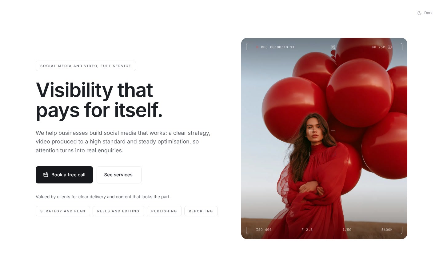
Previews need room, components do not.
Viewfinder HeroNew
Spotlight Reveal Hero
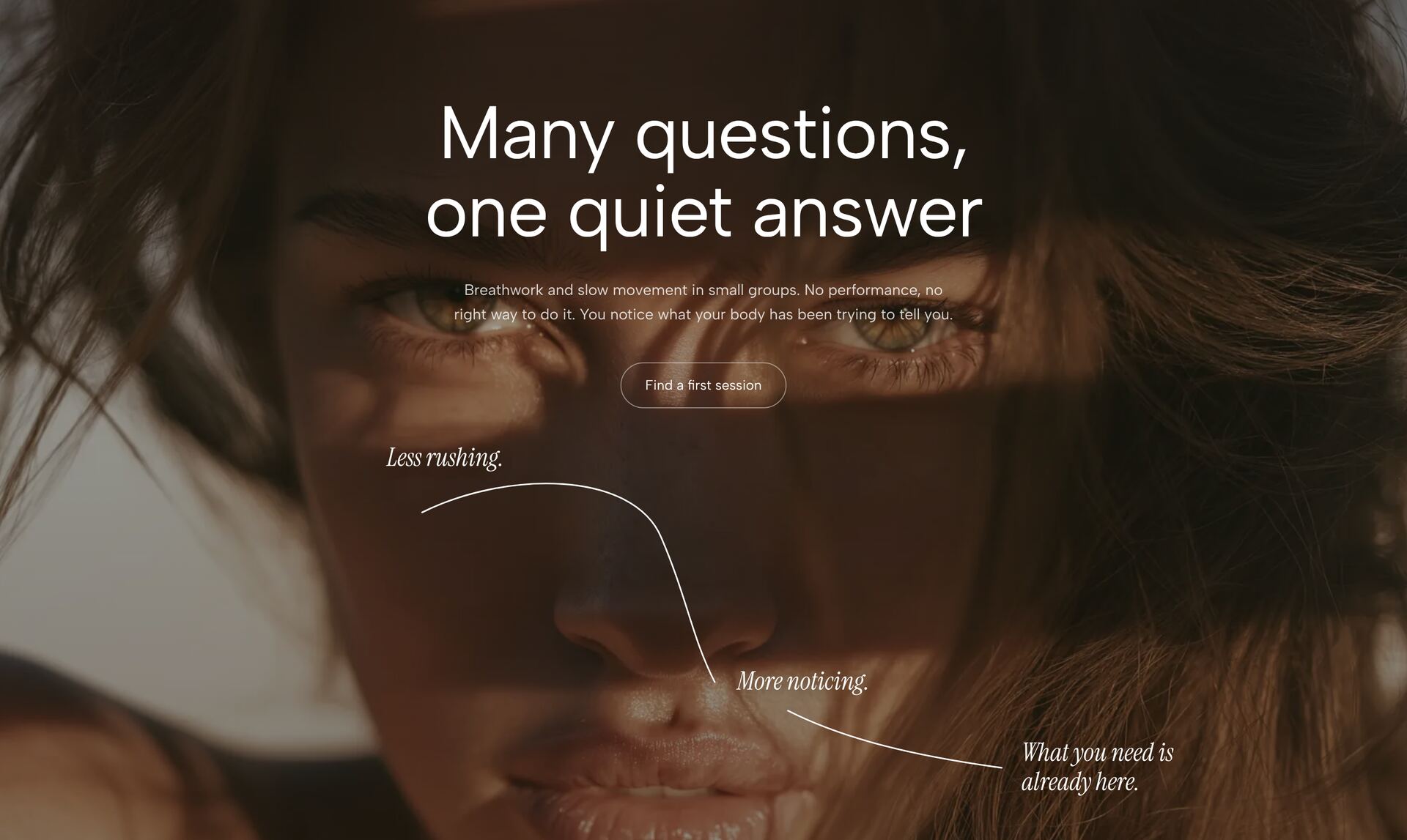
Turning Portrait Hero
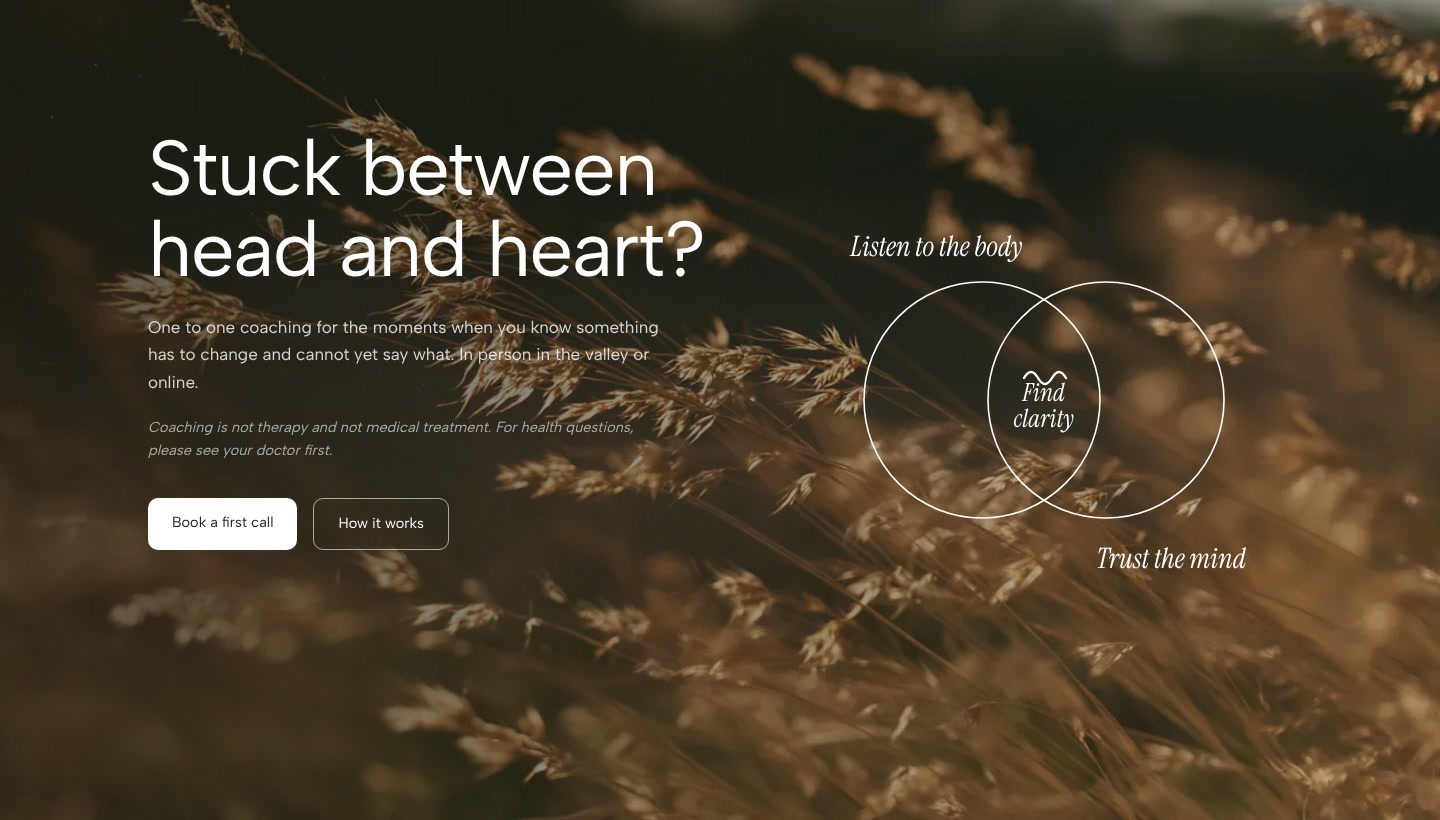
Venn Clarity HeroNew
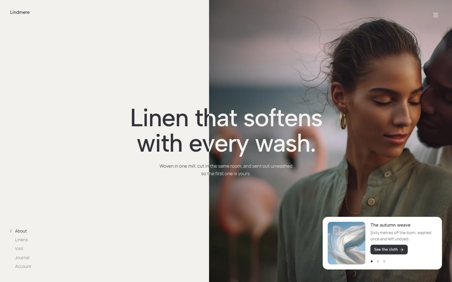
Split Headline Hero
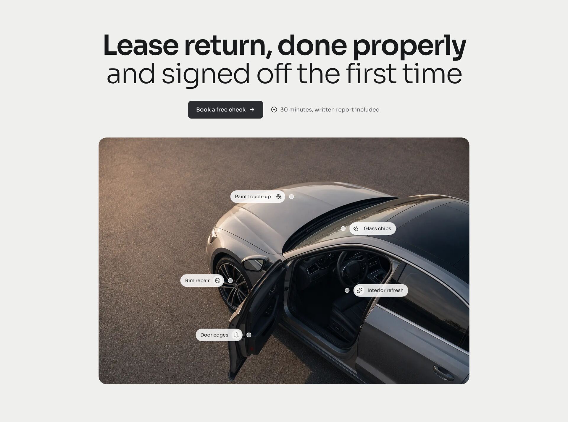
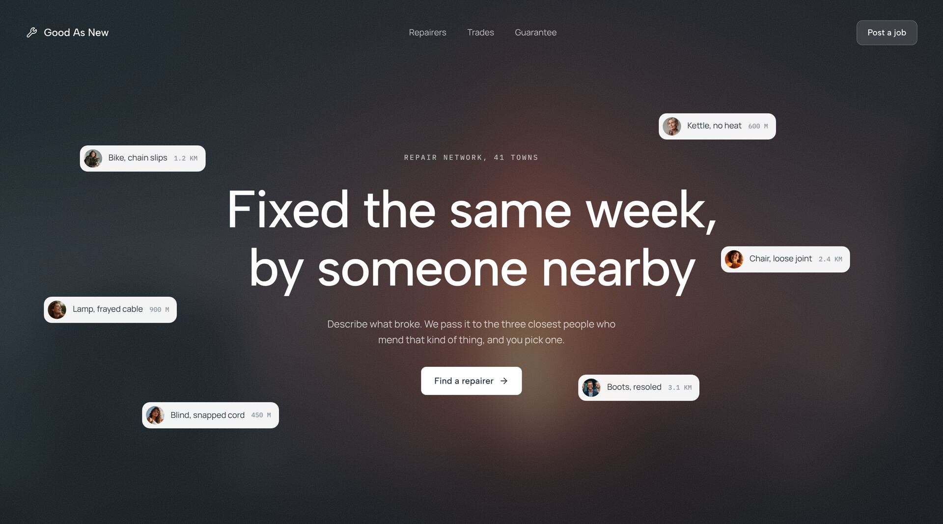
Service Pins Hero
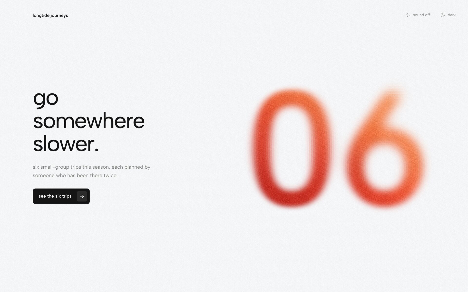
Sand Numeral Heroneeds GSAP + Three.js
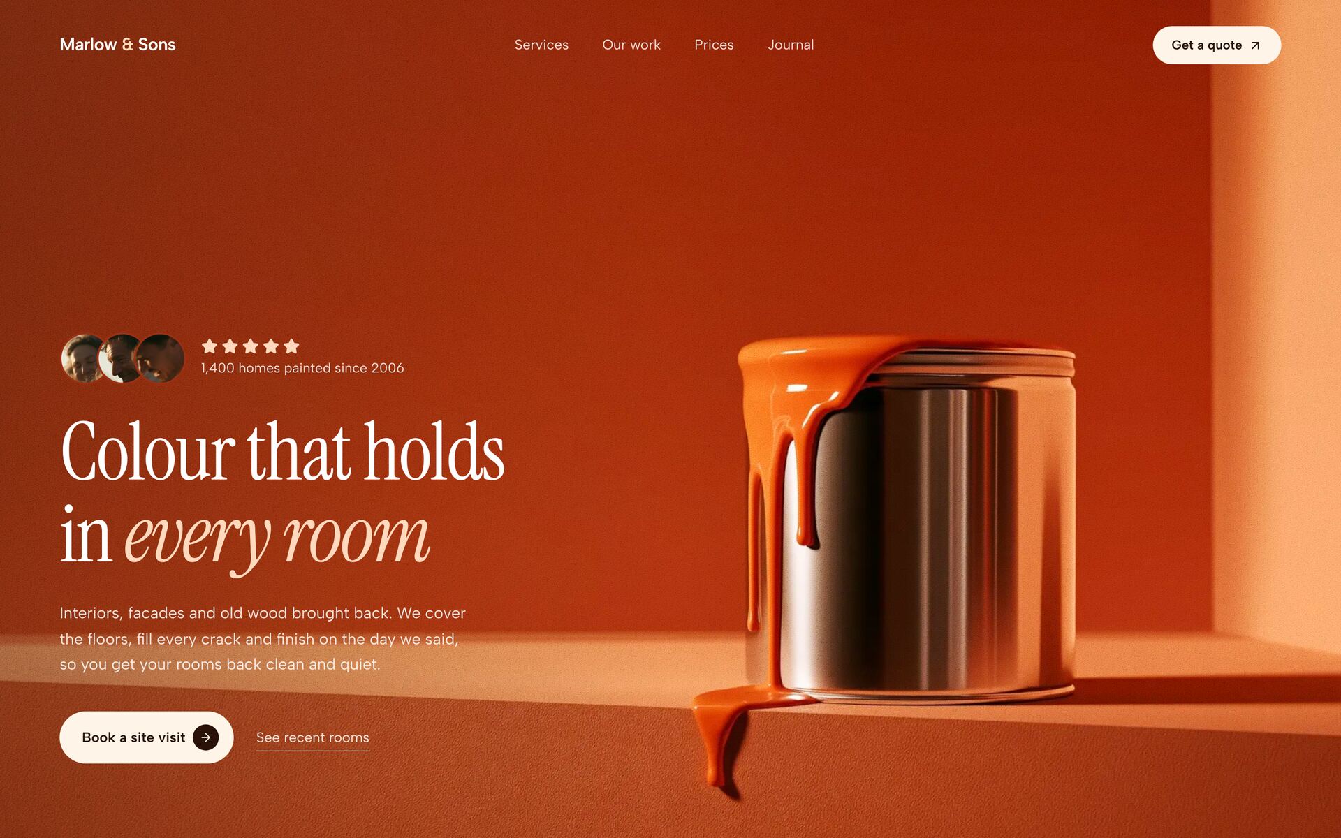
Paint Can Hero
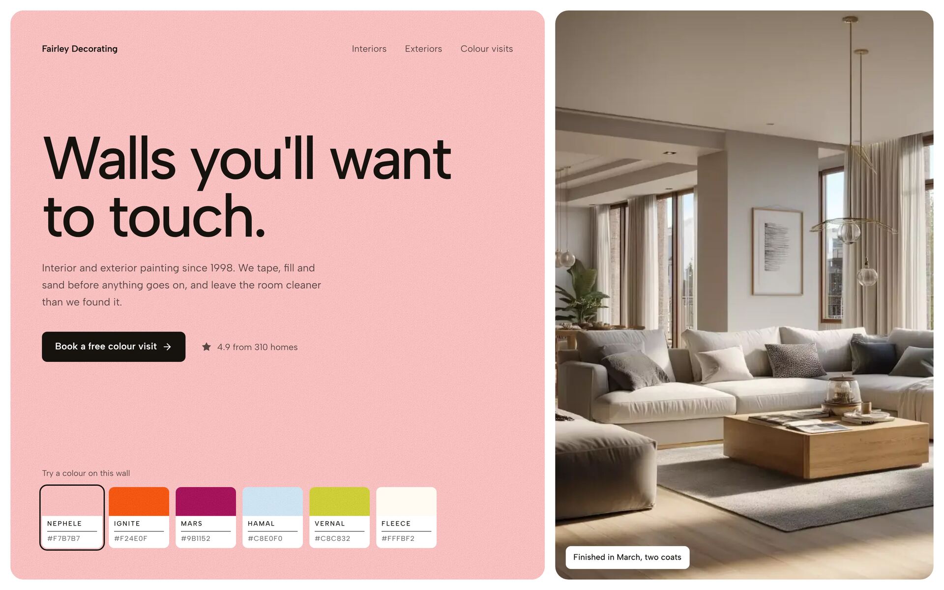
Brush Colour Hero
Cabin To Sky Film Hero
Inset Frame Hero
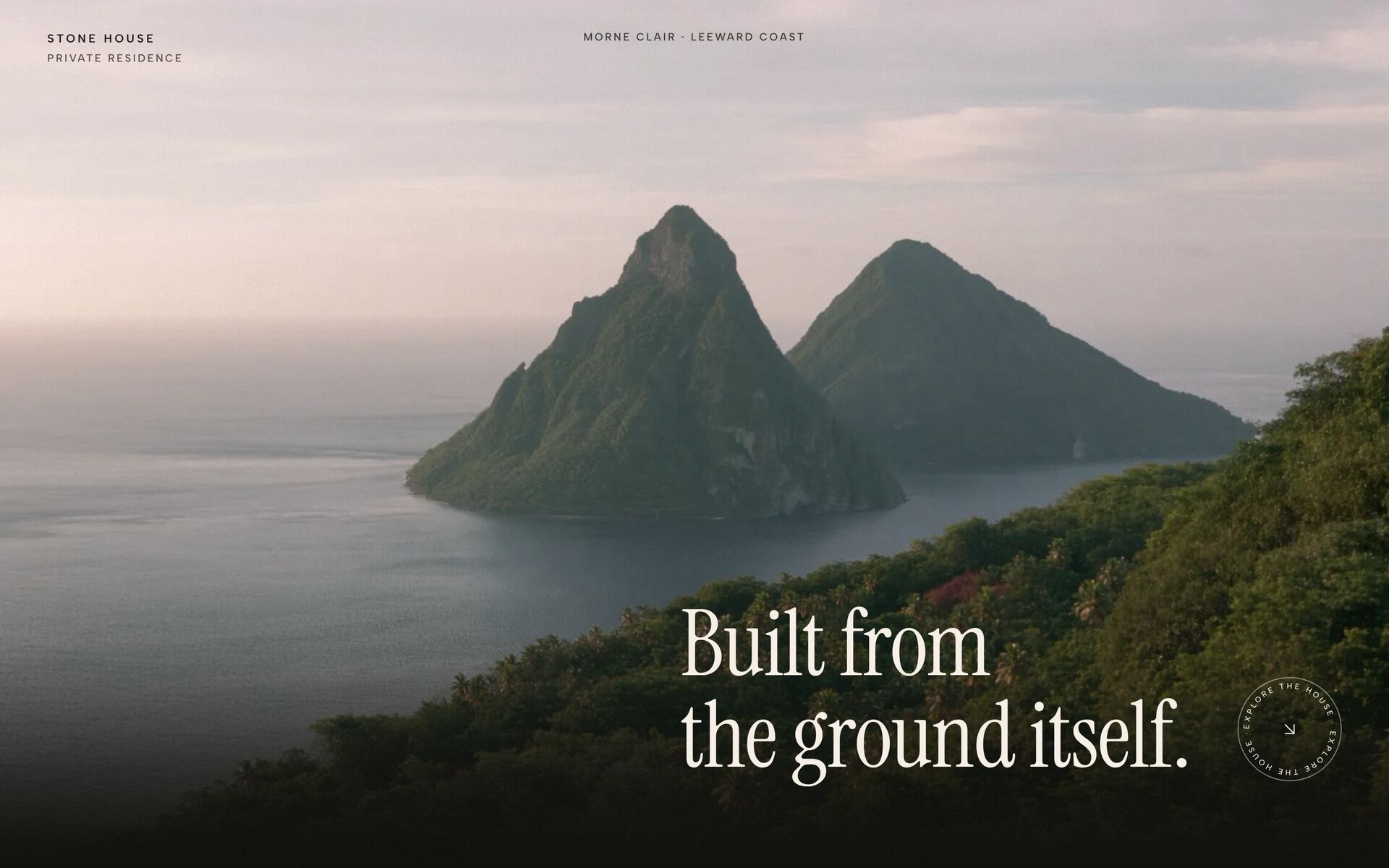
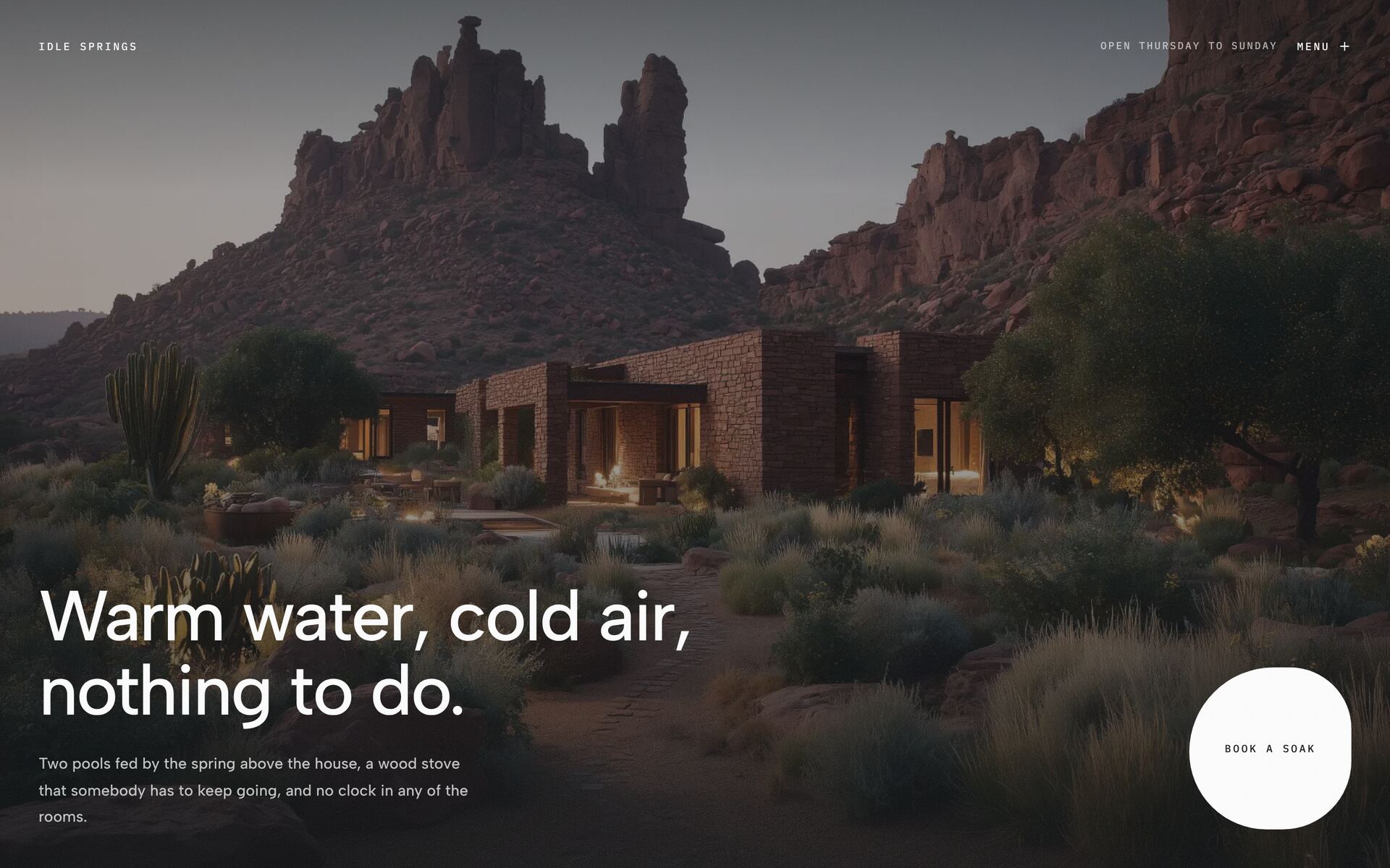
Stone House Scroll Hero
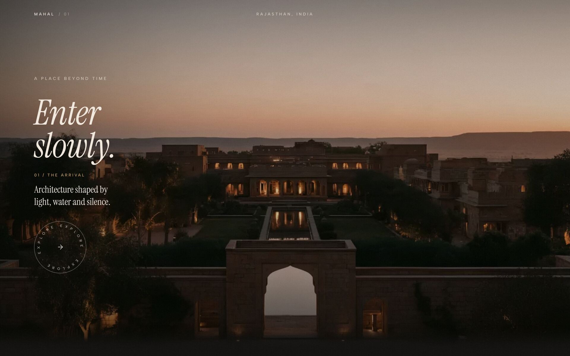
Arrival Palace Scroll
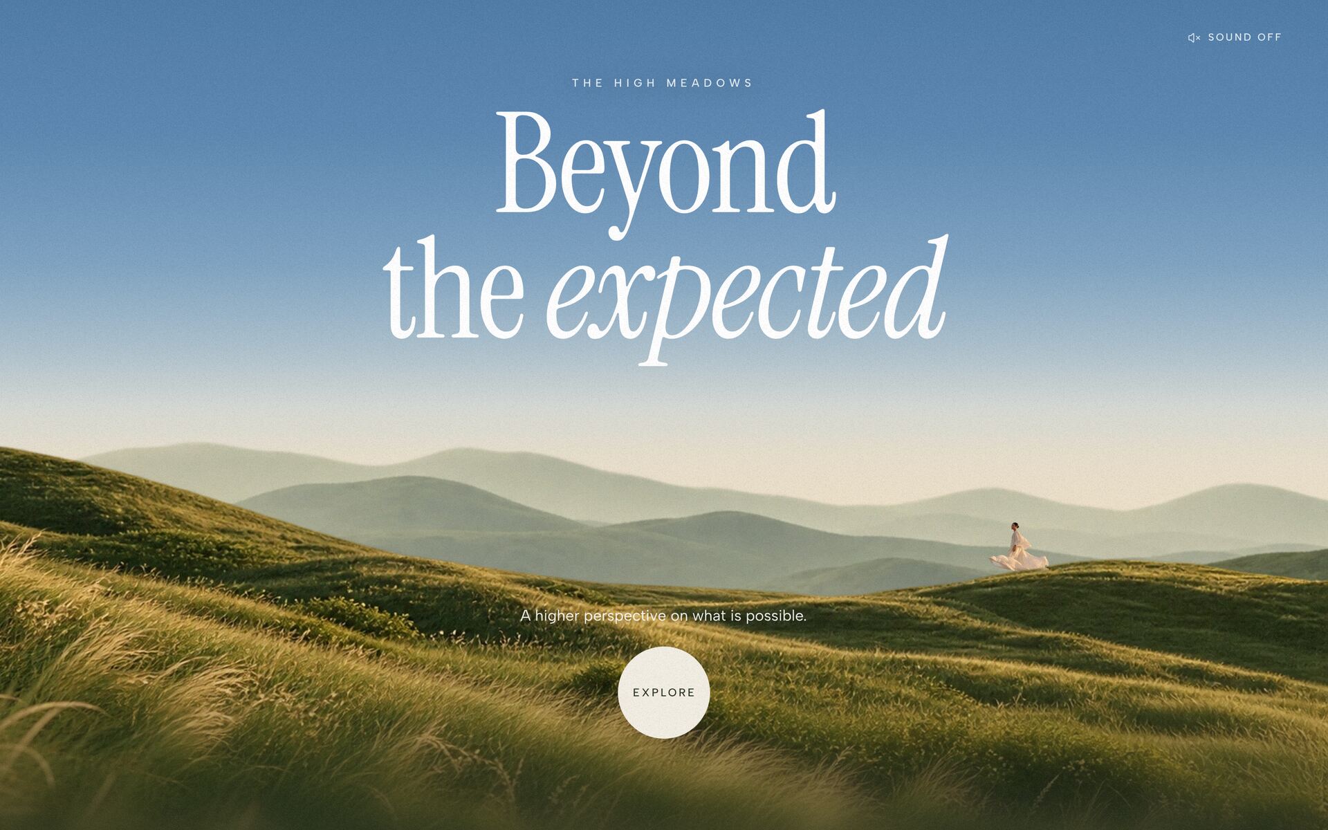
Parallax Landscape Hero
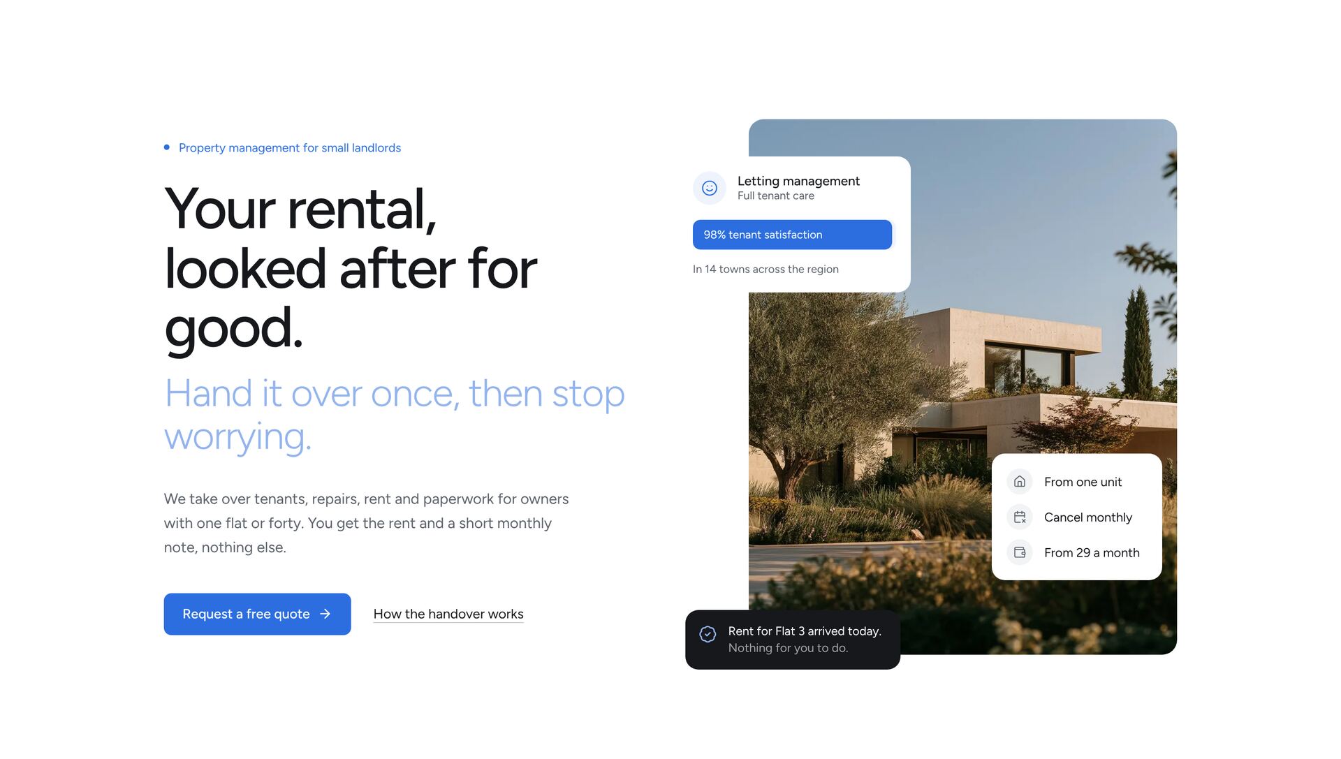
Handover Cards Hero
Drawn Path HeroNew
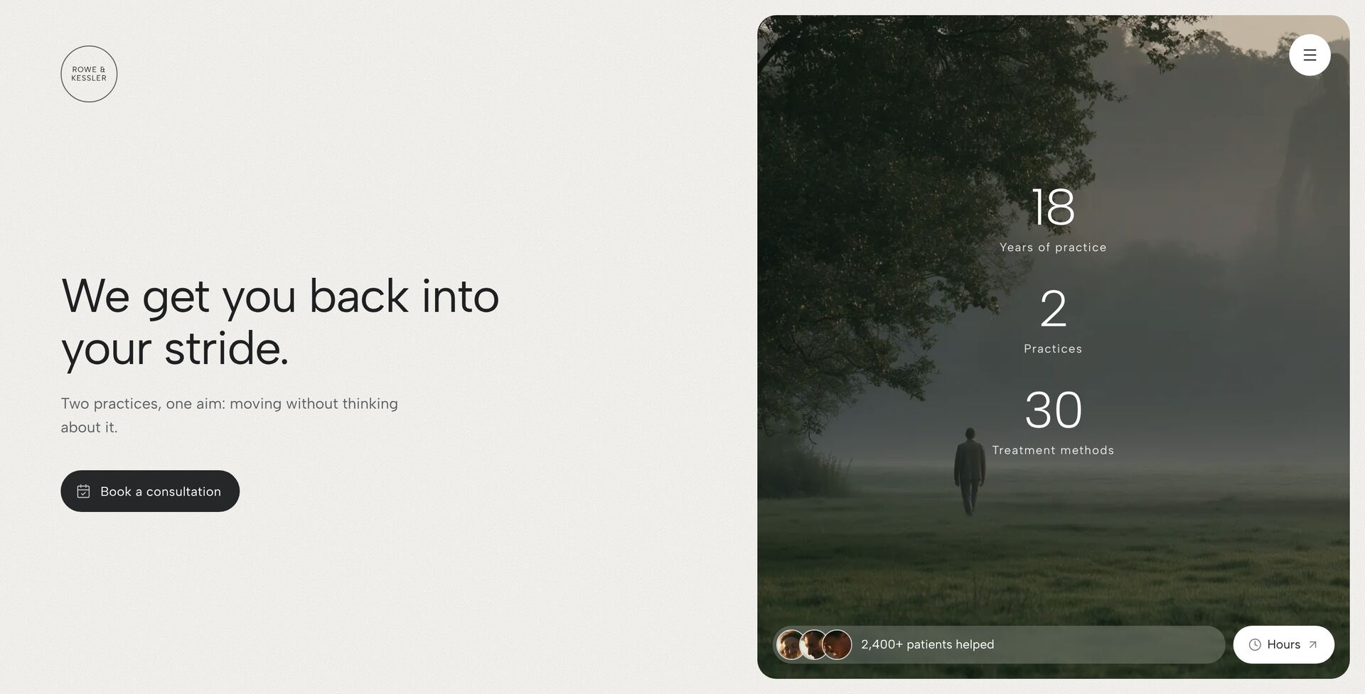
Stat Stack HeroNew
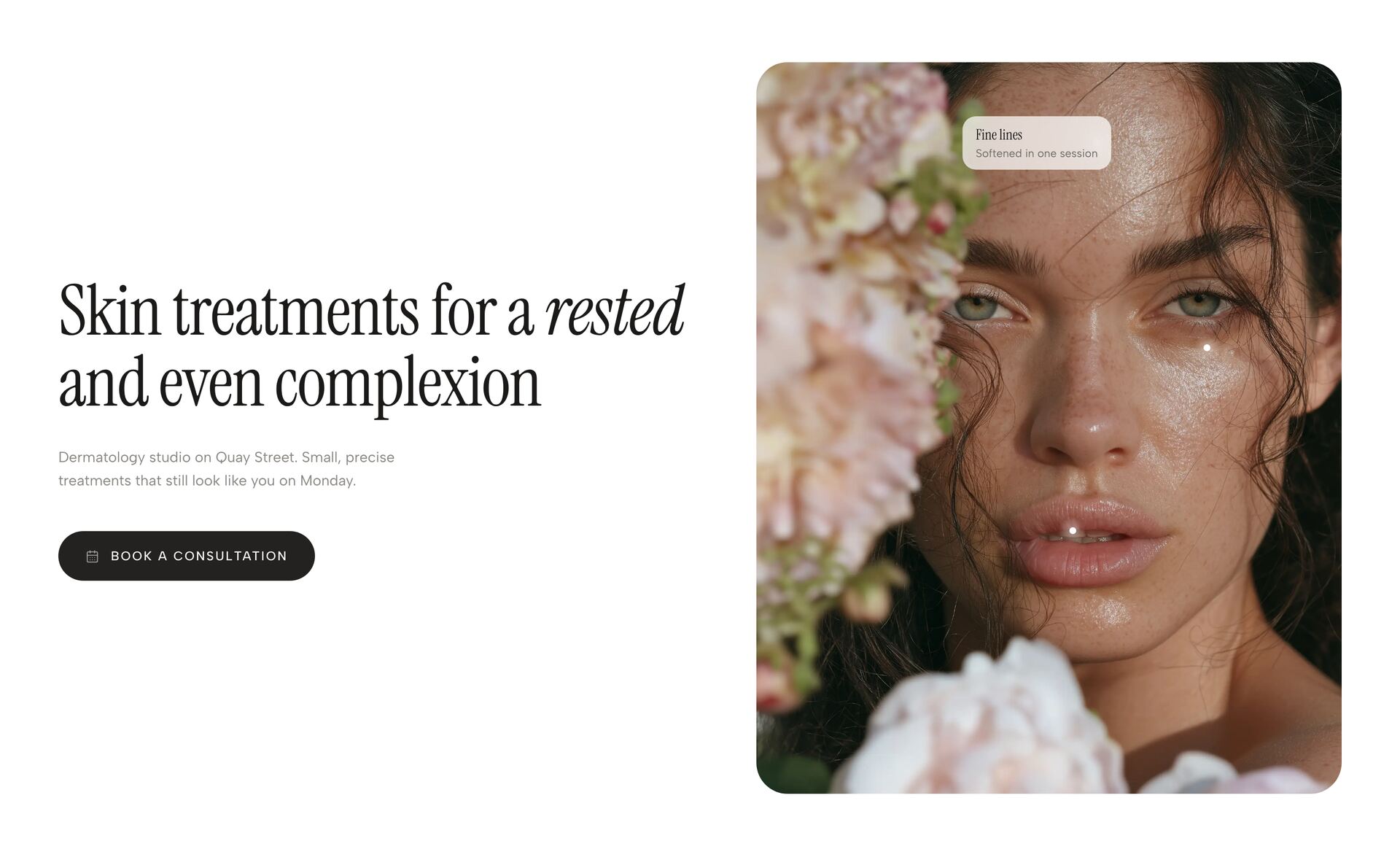
Pinpoint Portrait HeroNew
Spotlit Figure Hero
Drifting Deck Hero
Rings Profile Hero
Constellation Topic Hero
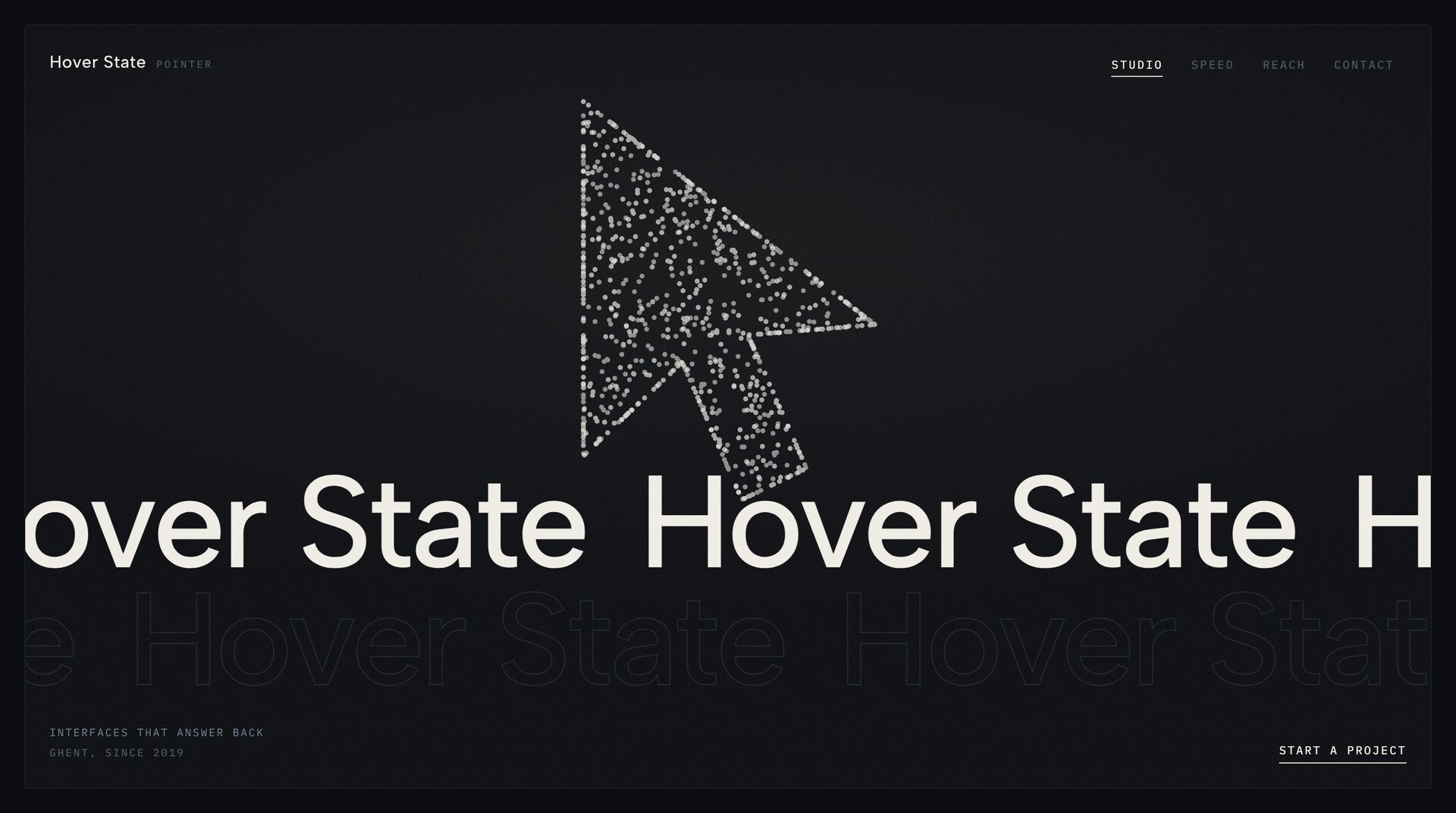
Point Cloud Symbol Hero
Blob Call Hero
Blur Echo Portrait HeroNew
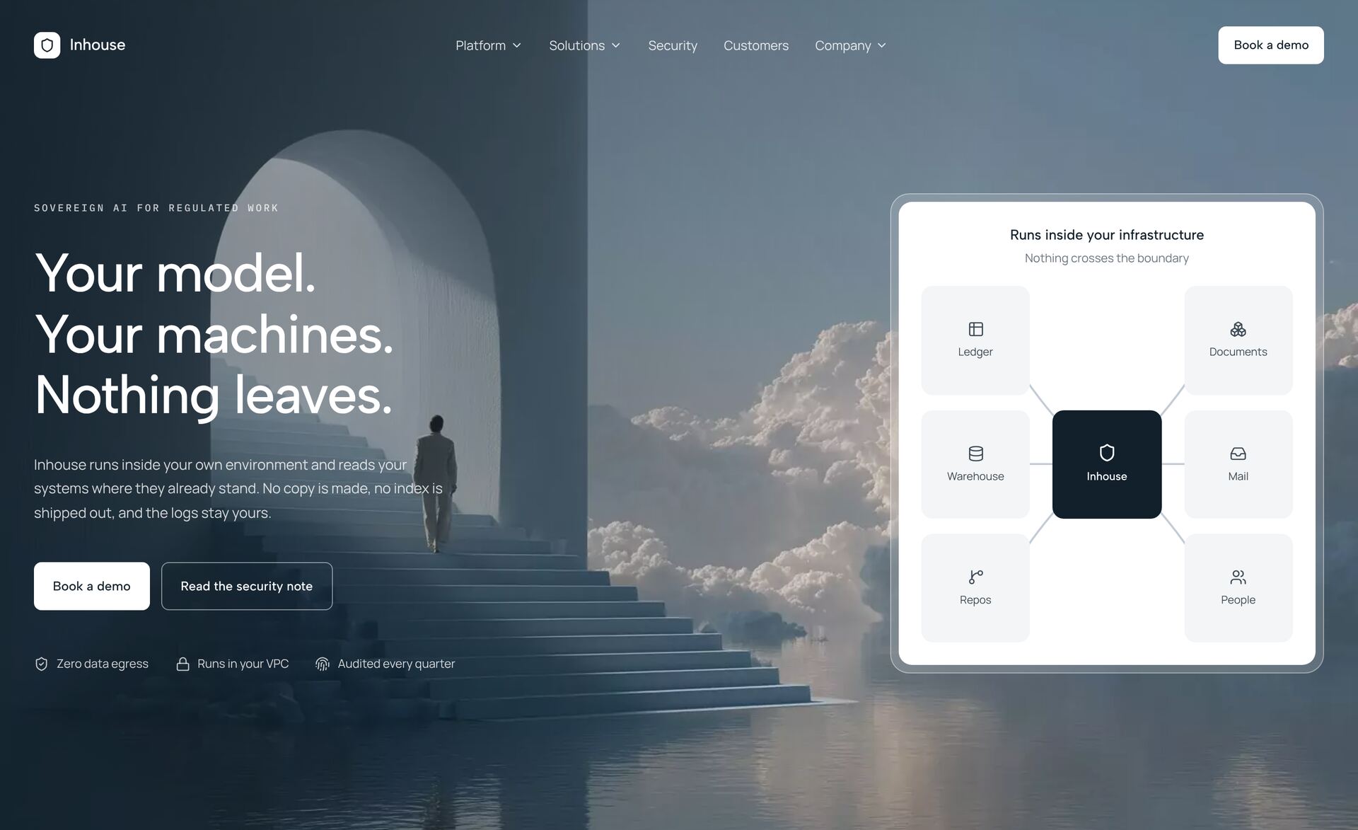
Sovereign Panel HeroNew
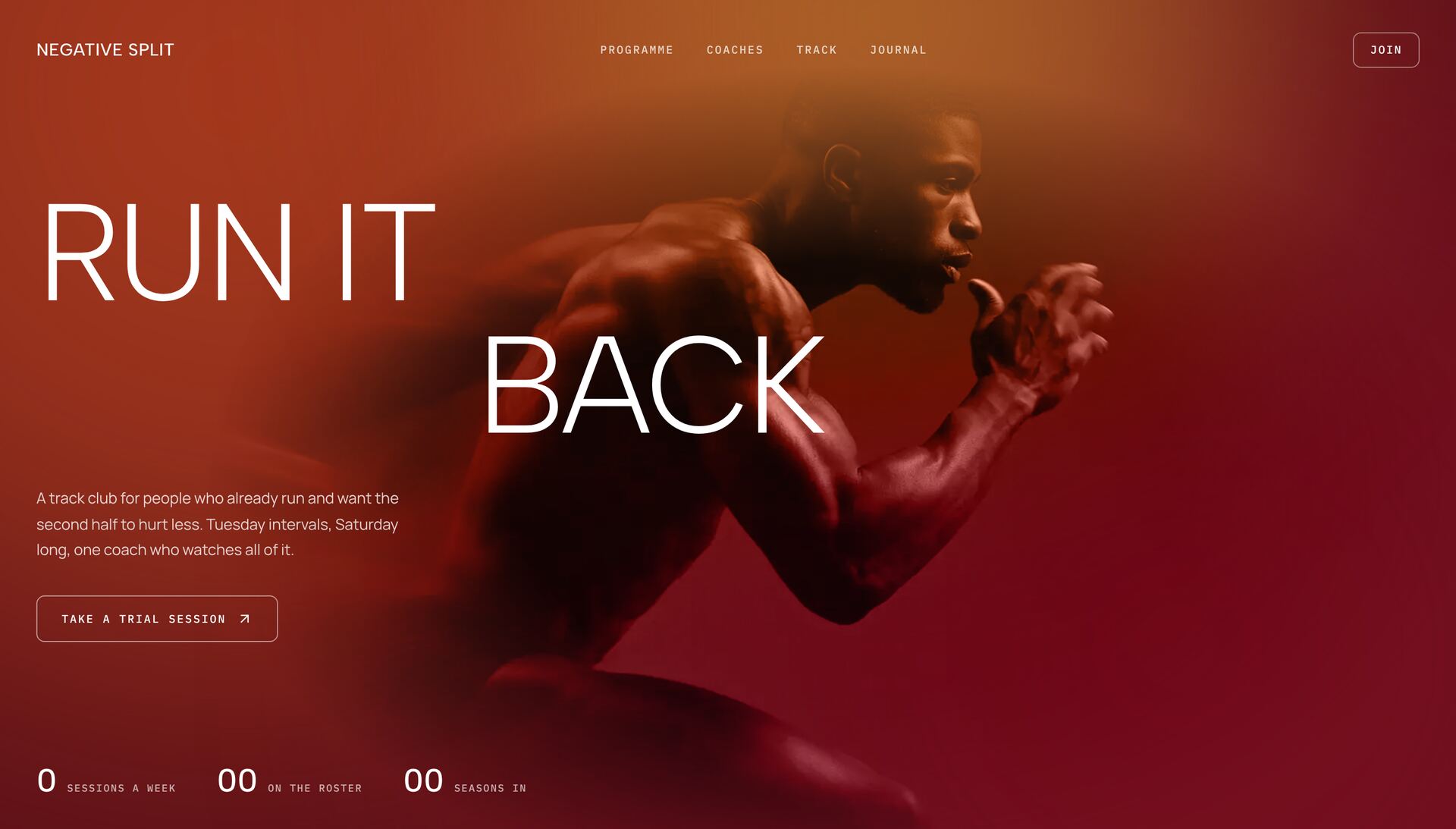
Motion Blur Gradient HeroNewneeds GSAP
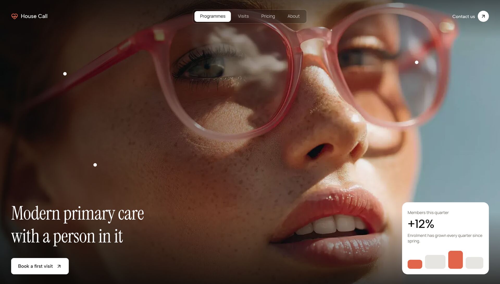
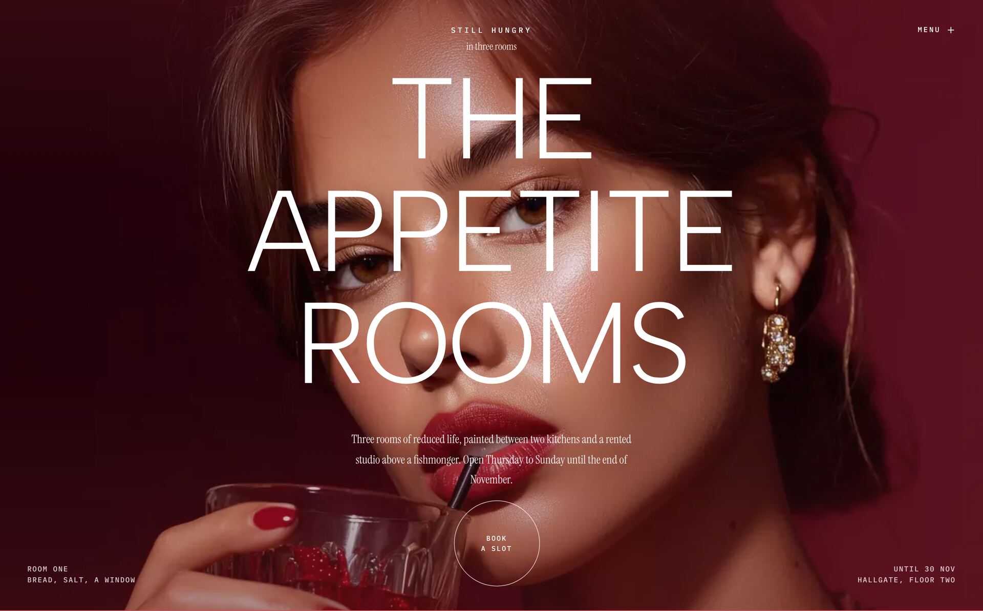
Poster Mouth HeroNewneeds GSAP
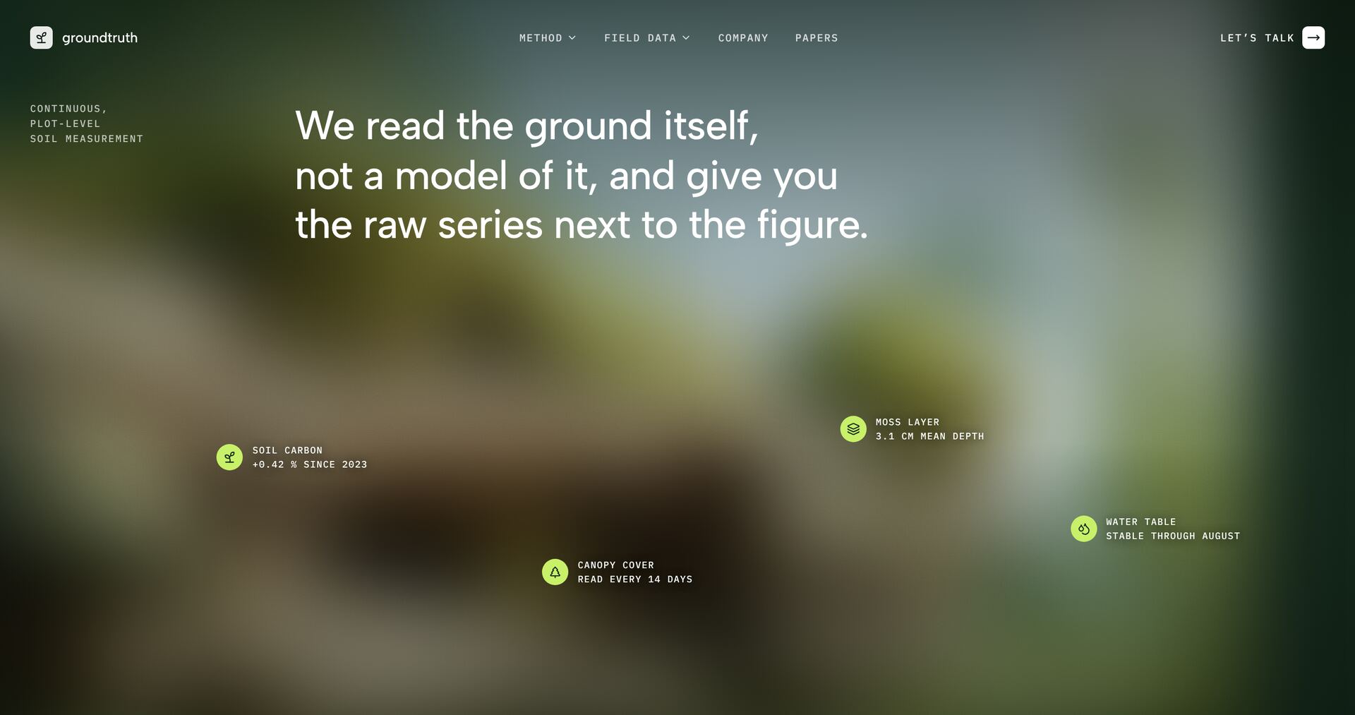
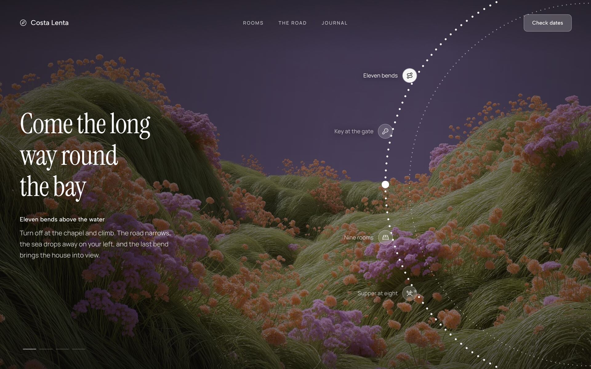
Moss Hotspot HeroNewneeds GSAP
Aurora Call HeroNew
Trust Bubble HeroNew
Turning Dial HeroNew
Weightless Object HeroNew
Drifting Panel HeroNew
Campaign Reel HeroNew
Stepped Reel HeroNew
Print Vortex Hero
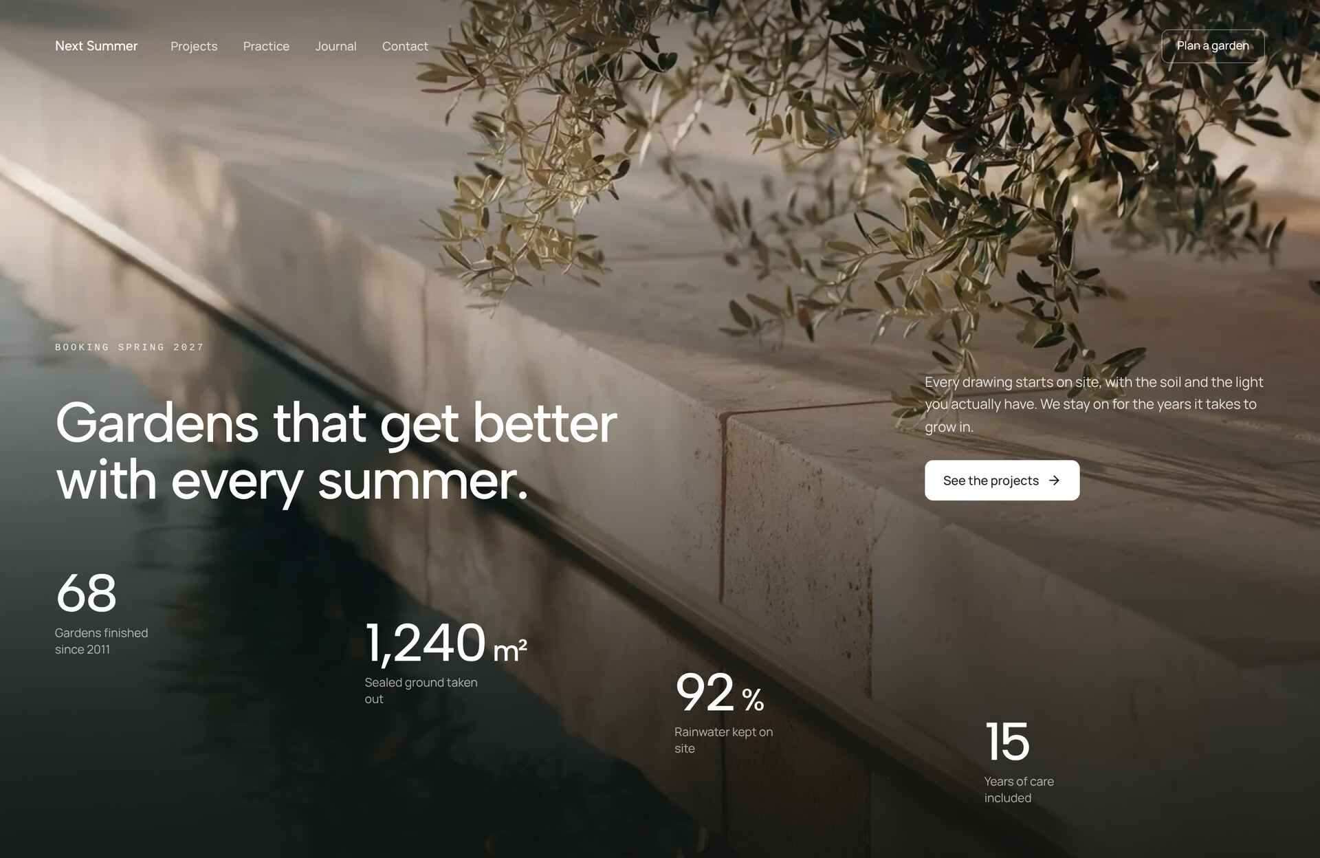
Terrace Count HeroNew
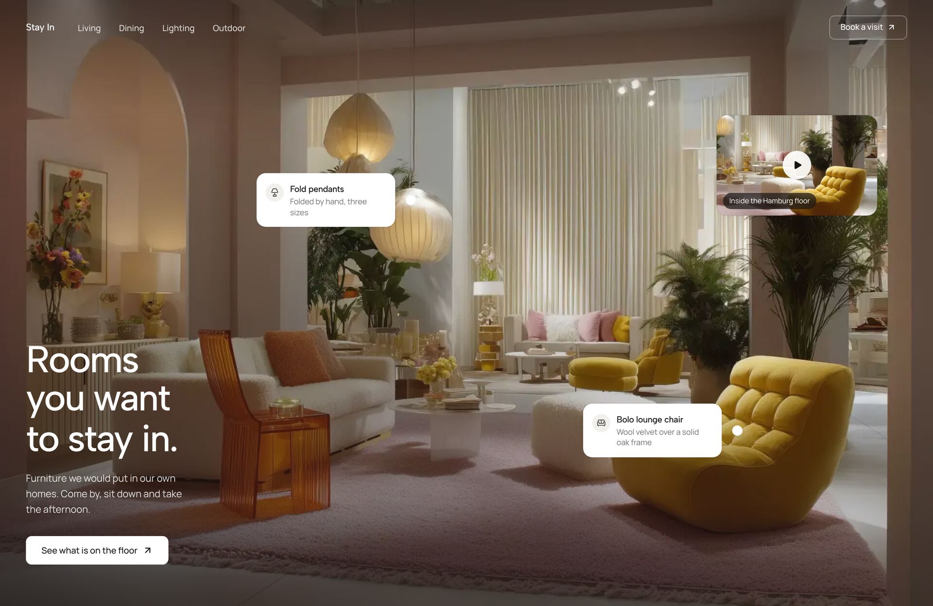
Showroom Spot HeroNew
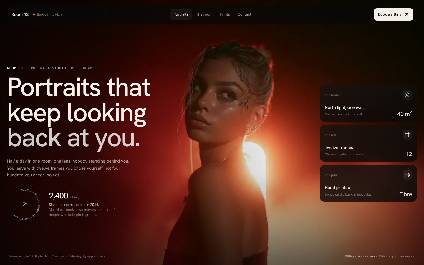
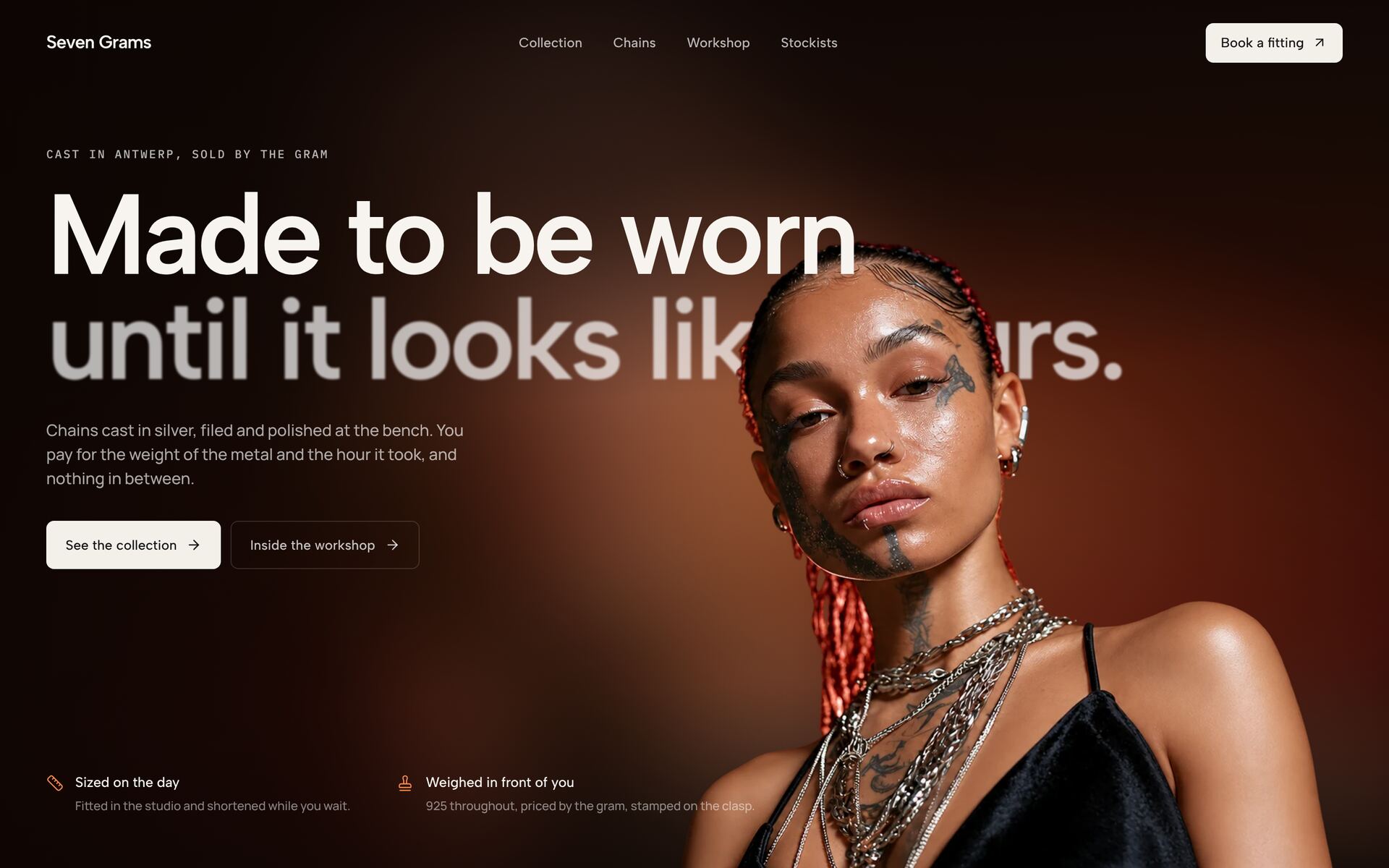
Ember Portrait HeroNew
Poster Launch CardNew
Meadow Glass Nav HeroNew
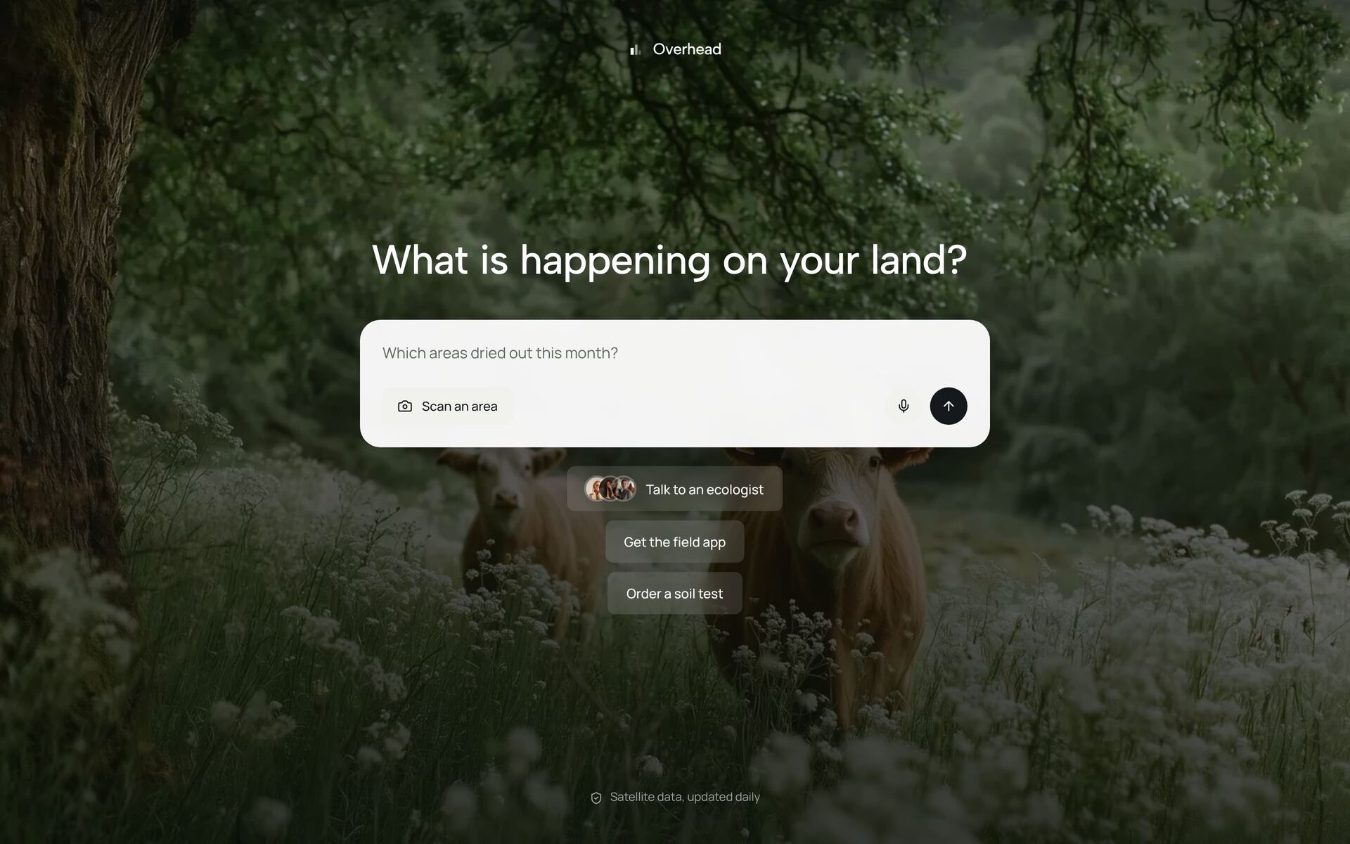
Wildland Prompt HeroNew
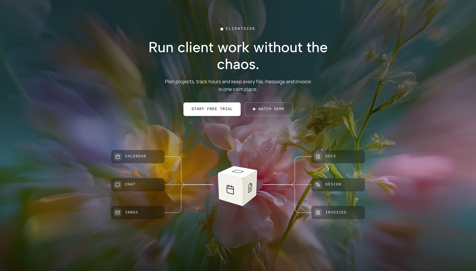
Workspace Hub HeroNew
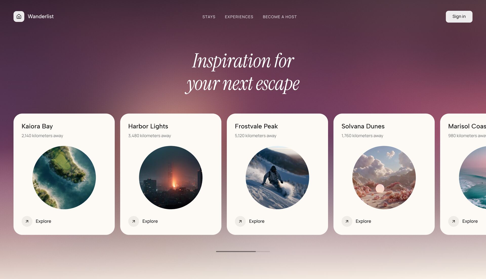
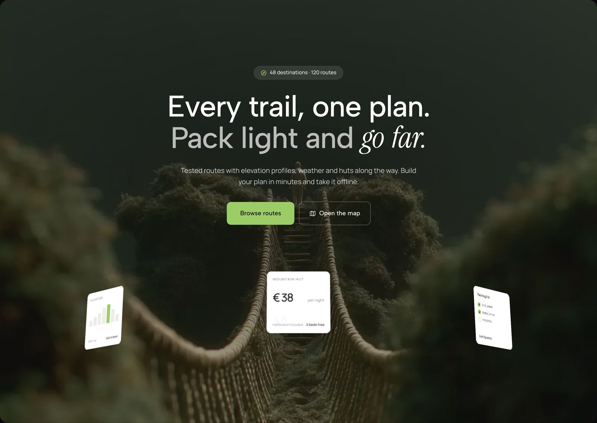
Travel Destinations HeroNew
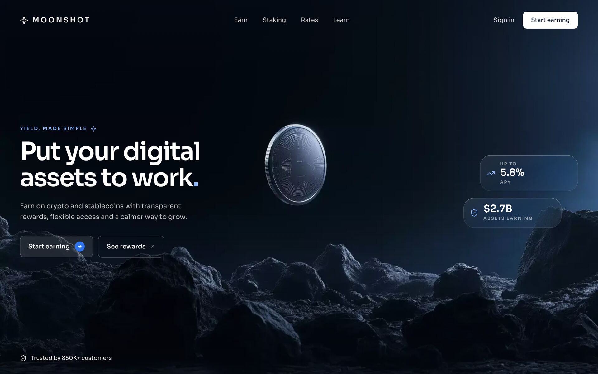
Lunar Yield HeroNew
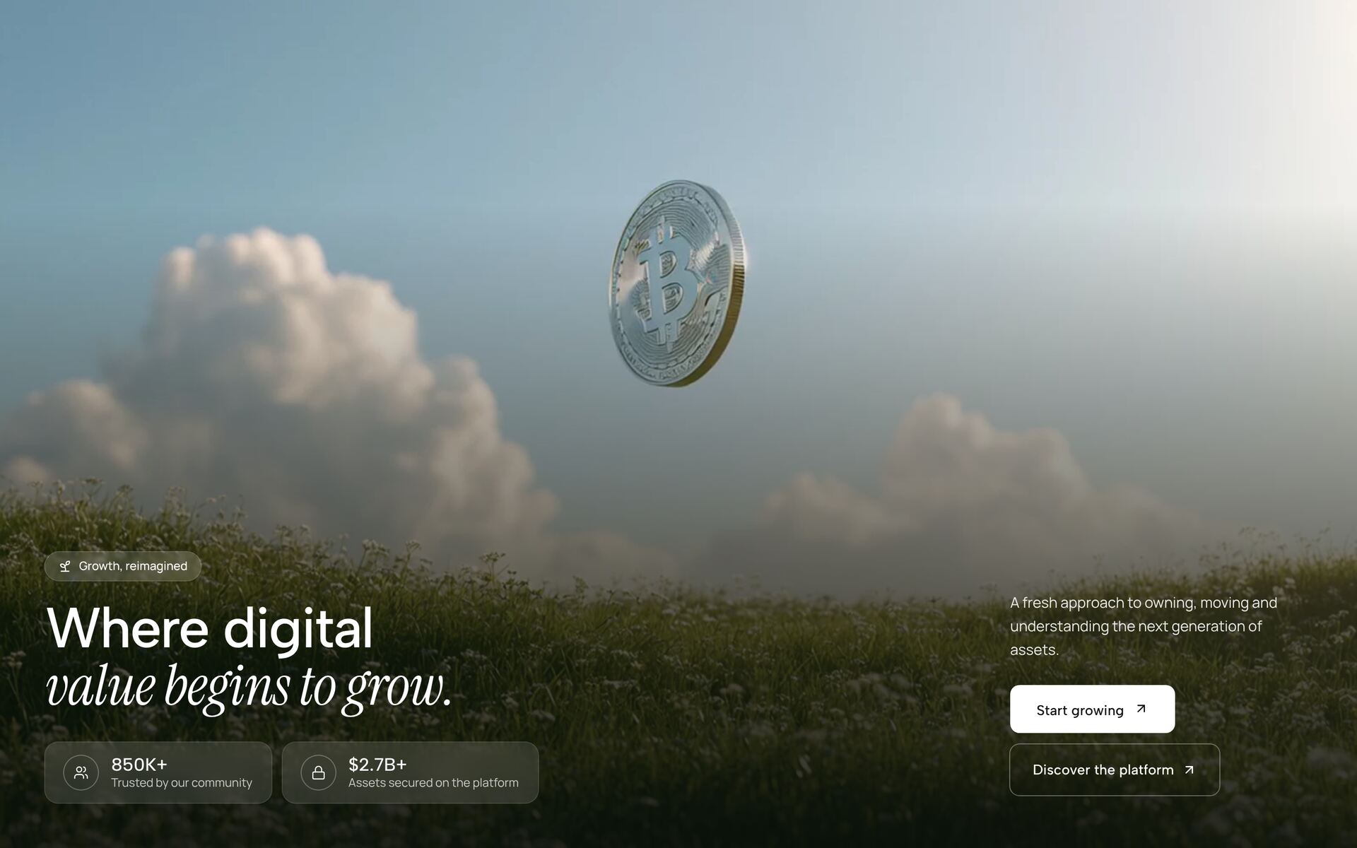
Growth Field HeroNew
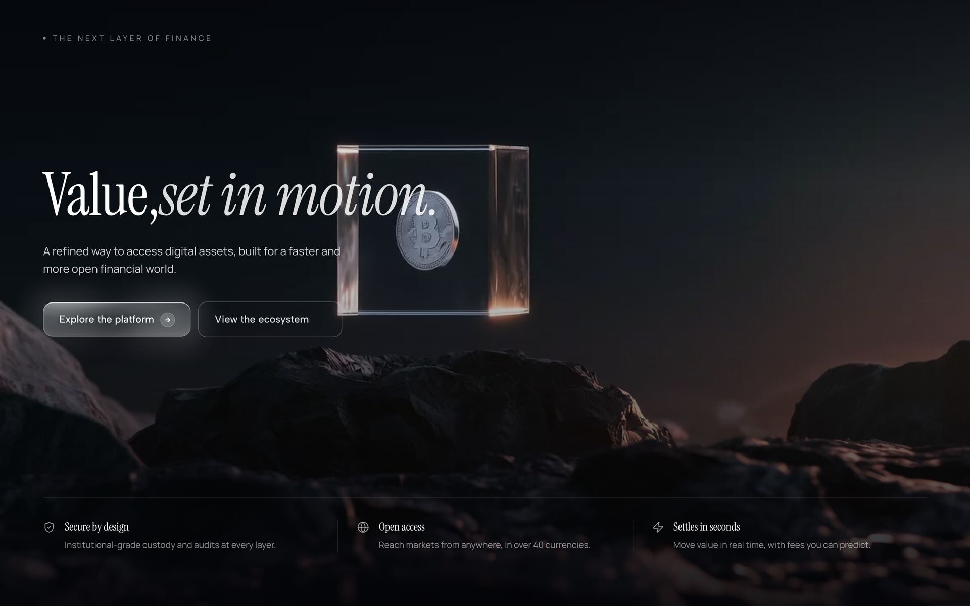
Suspended Value HeroNew
Procurement Split Hero
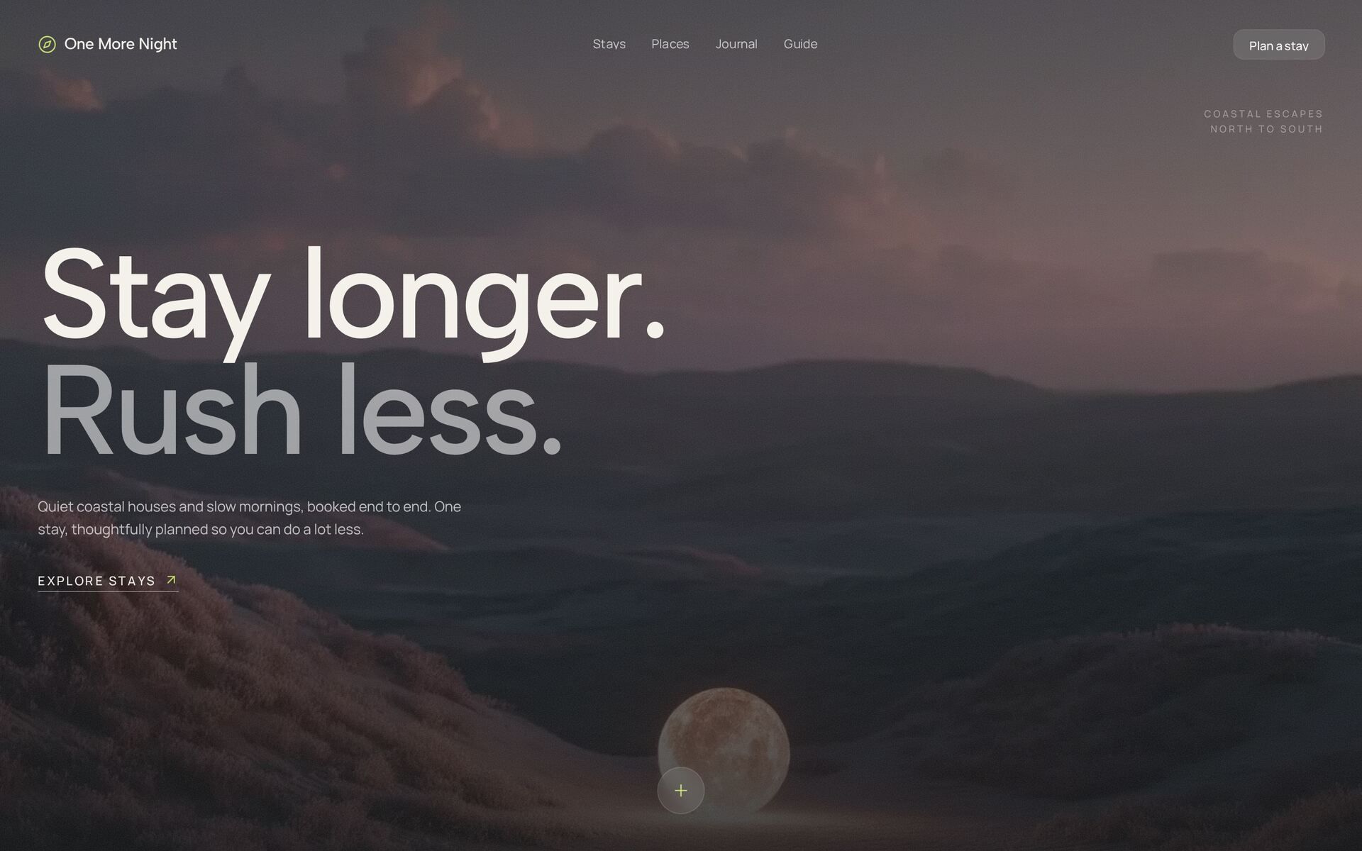
Night Arrival HeroNew
Shimmer Split HeroNew
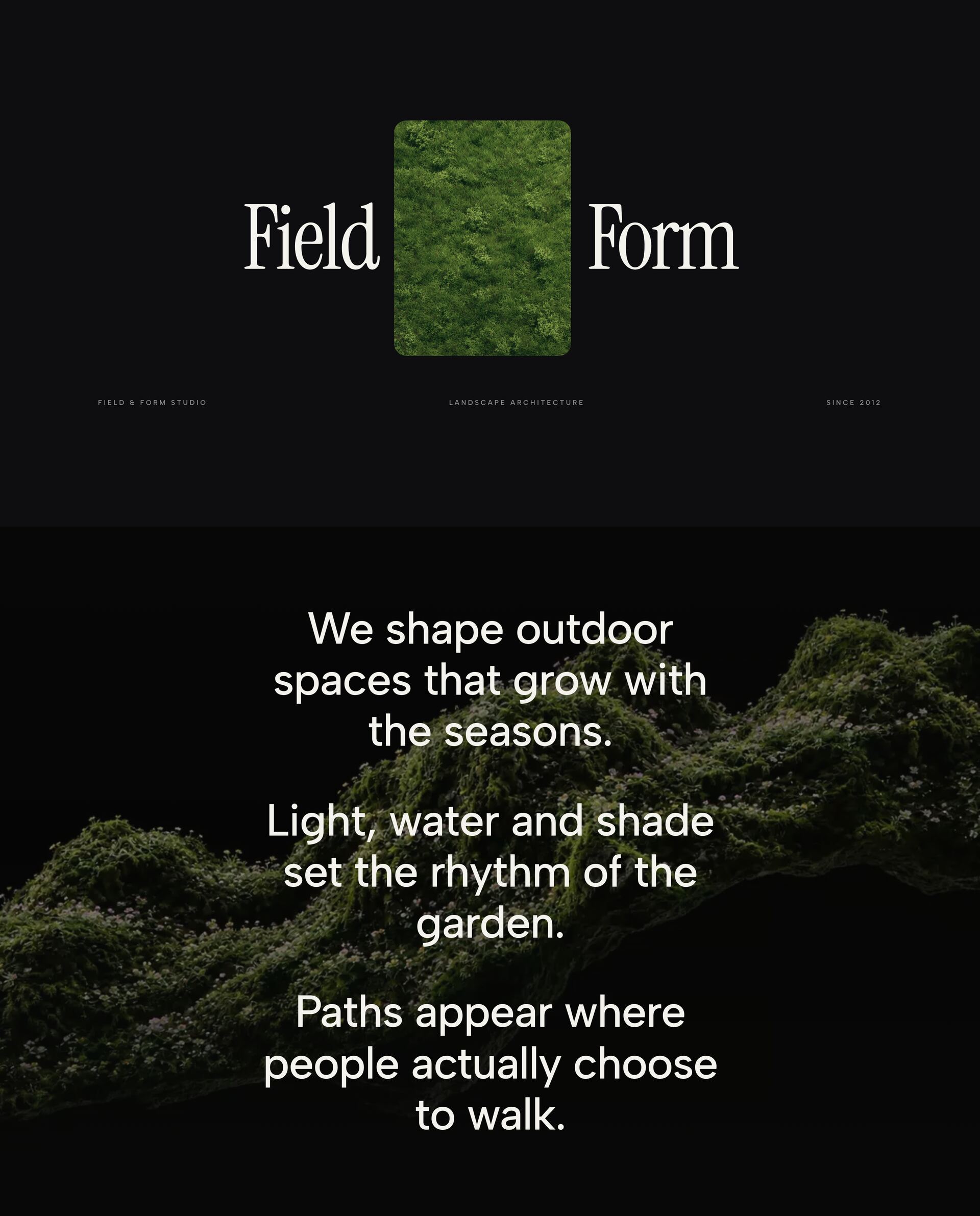
Field Form Scroll HeroNew
Curtain Reveal Hero
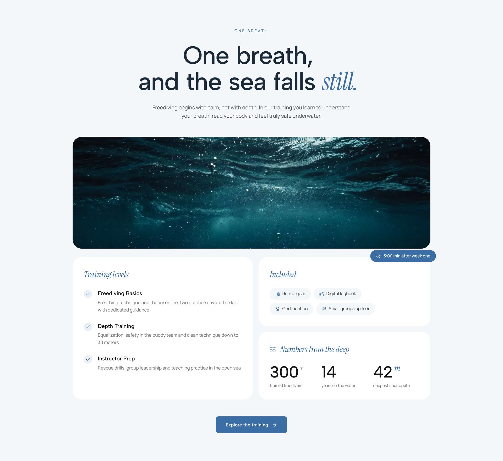
Freedive Academy HeroNew
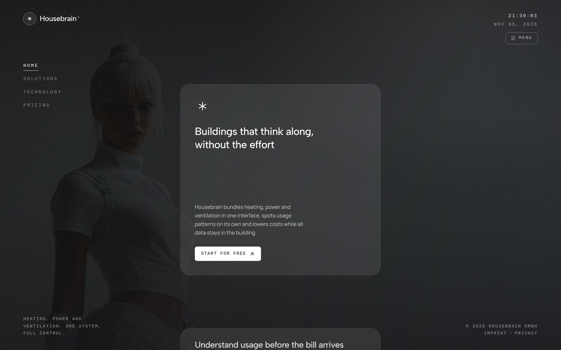
Live Clock Glass HeroNew
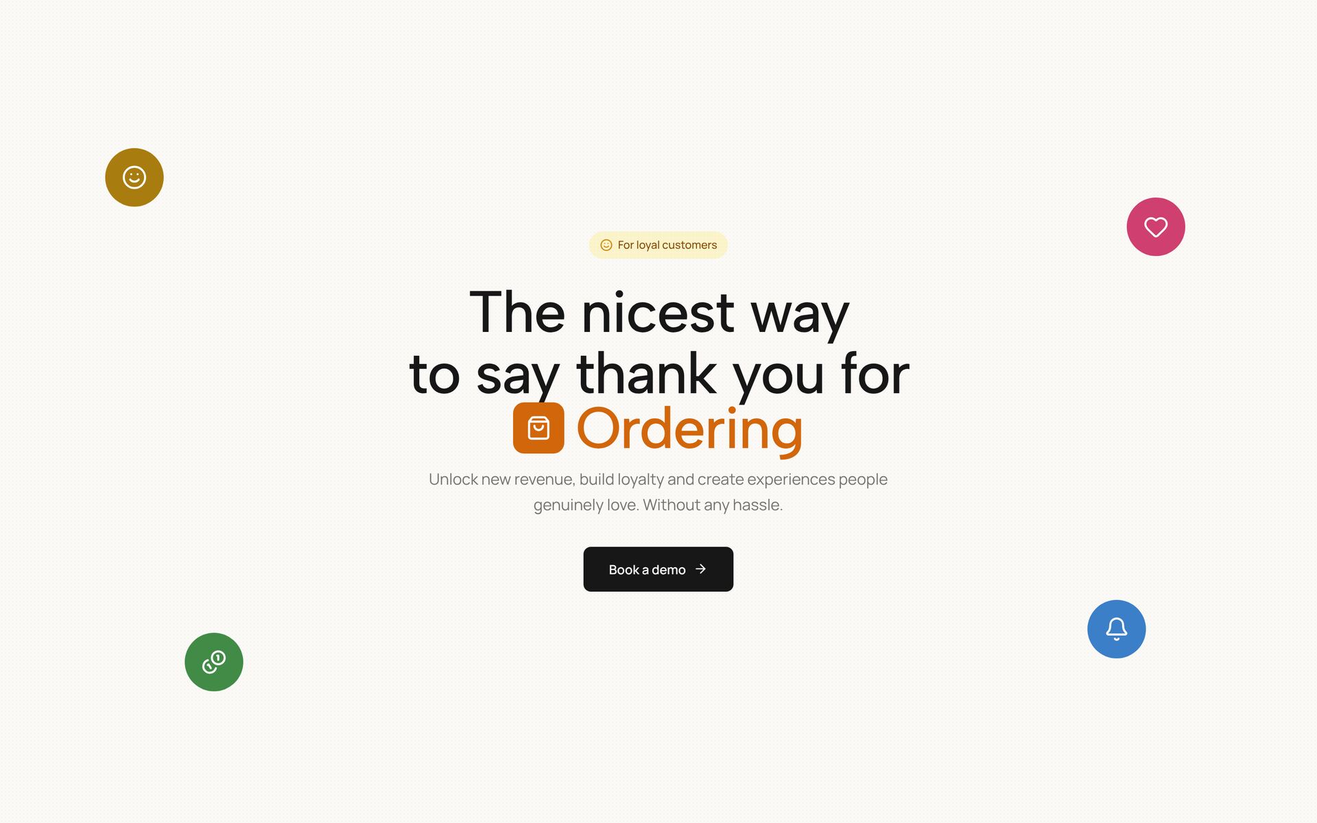
Bold Thanks Hero
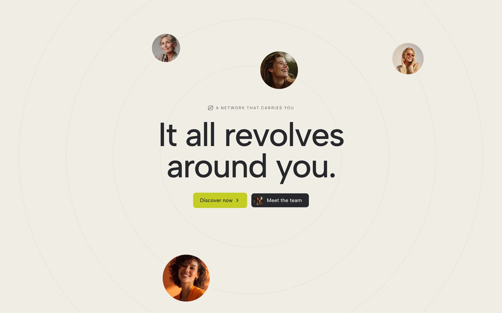
Orbiting Circles Hero
Thanks Rotating Hero
Dramatic Editorial Hero
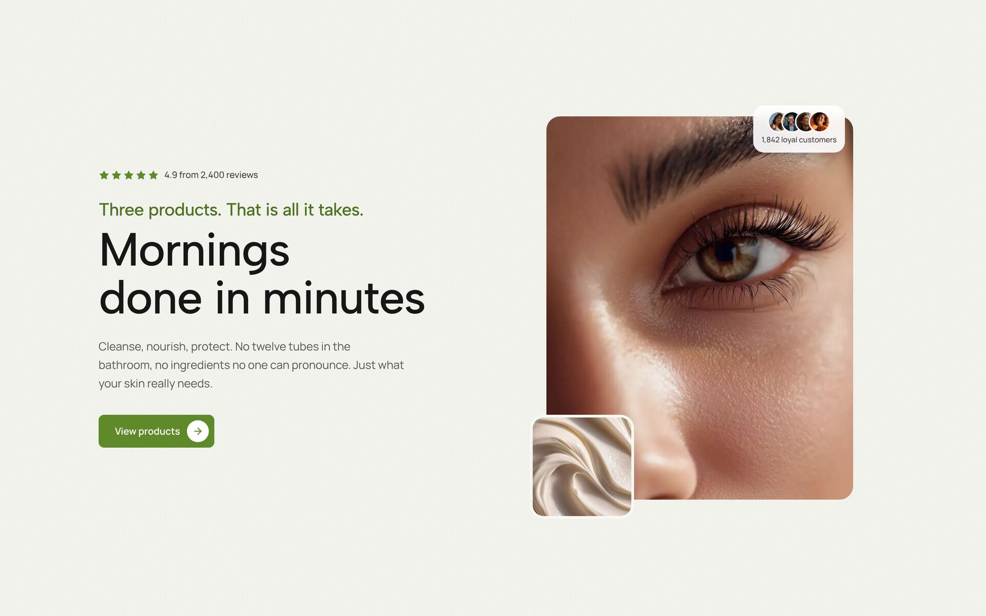
Beauty Glow Split Hero
Intelligent Partner Hero
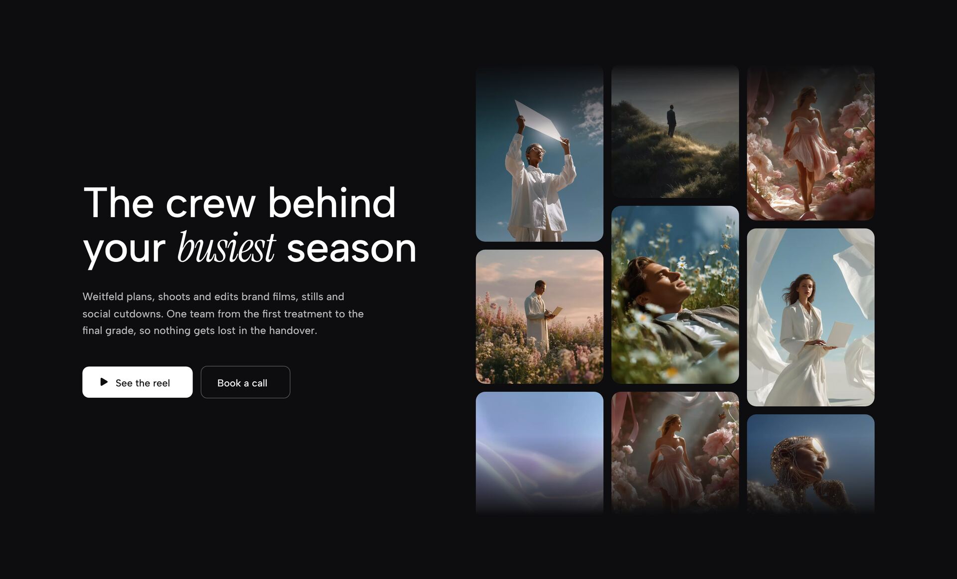
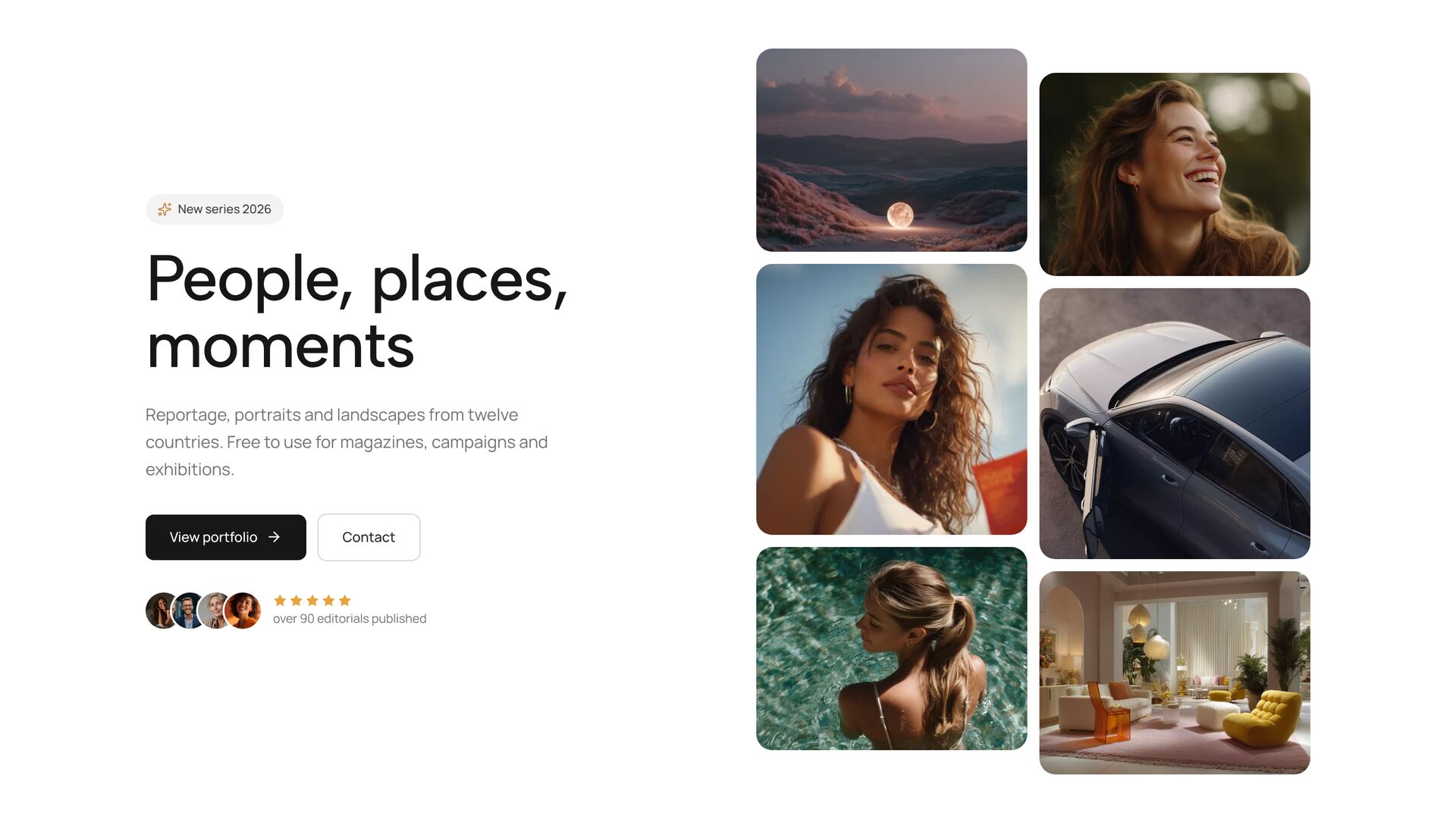
Masonry Collage Hero
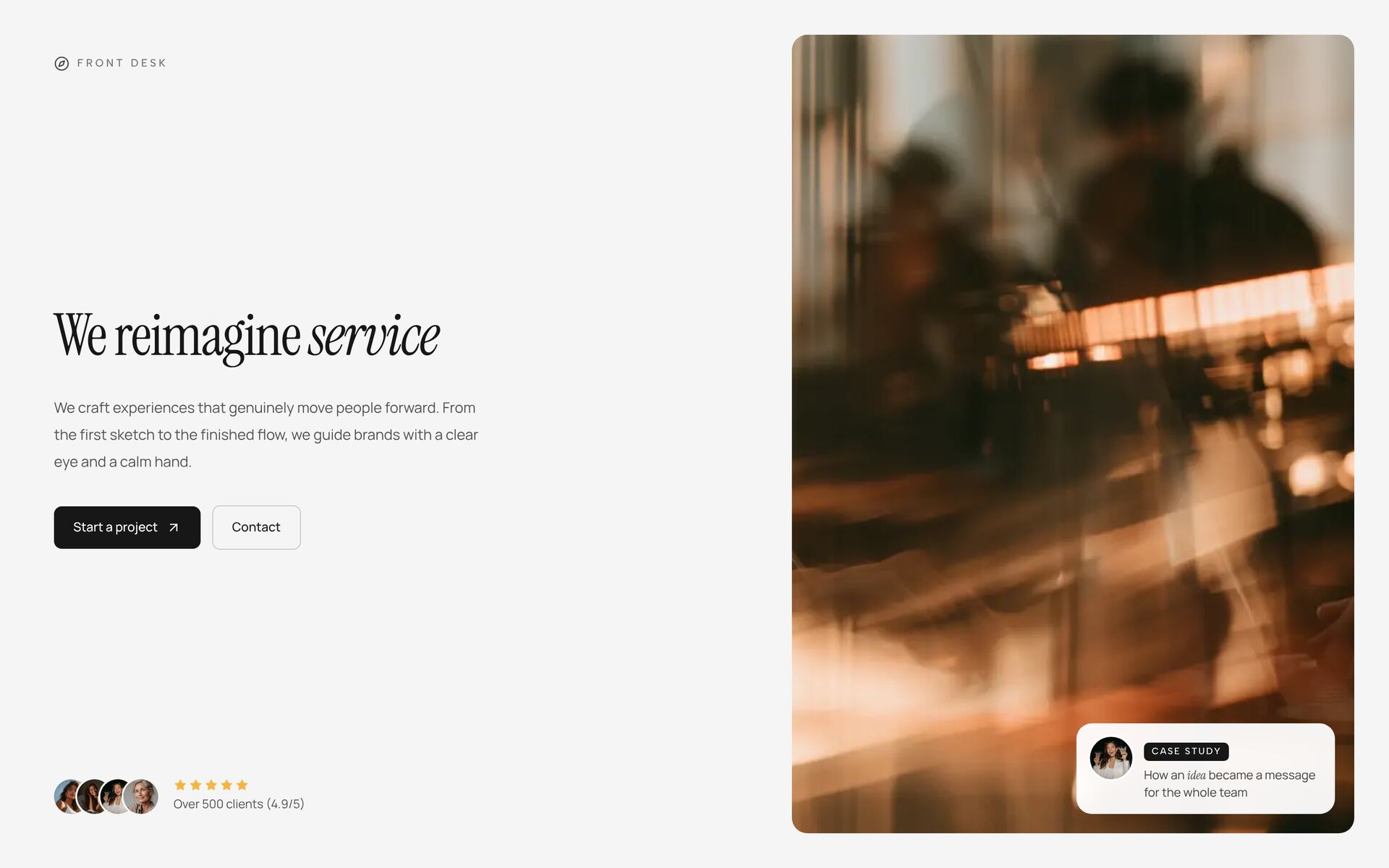
Service Design HeroNew
Evermind Editorial HeroNew
Forerunner Image HeroNew
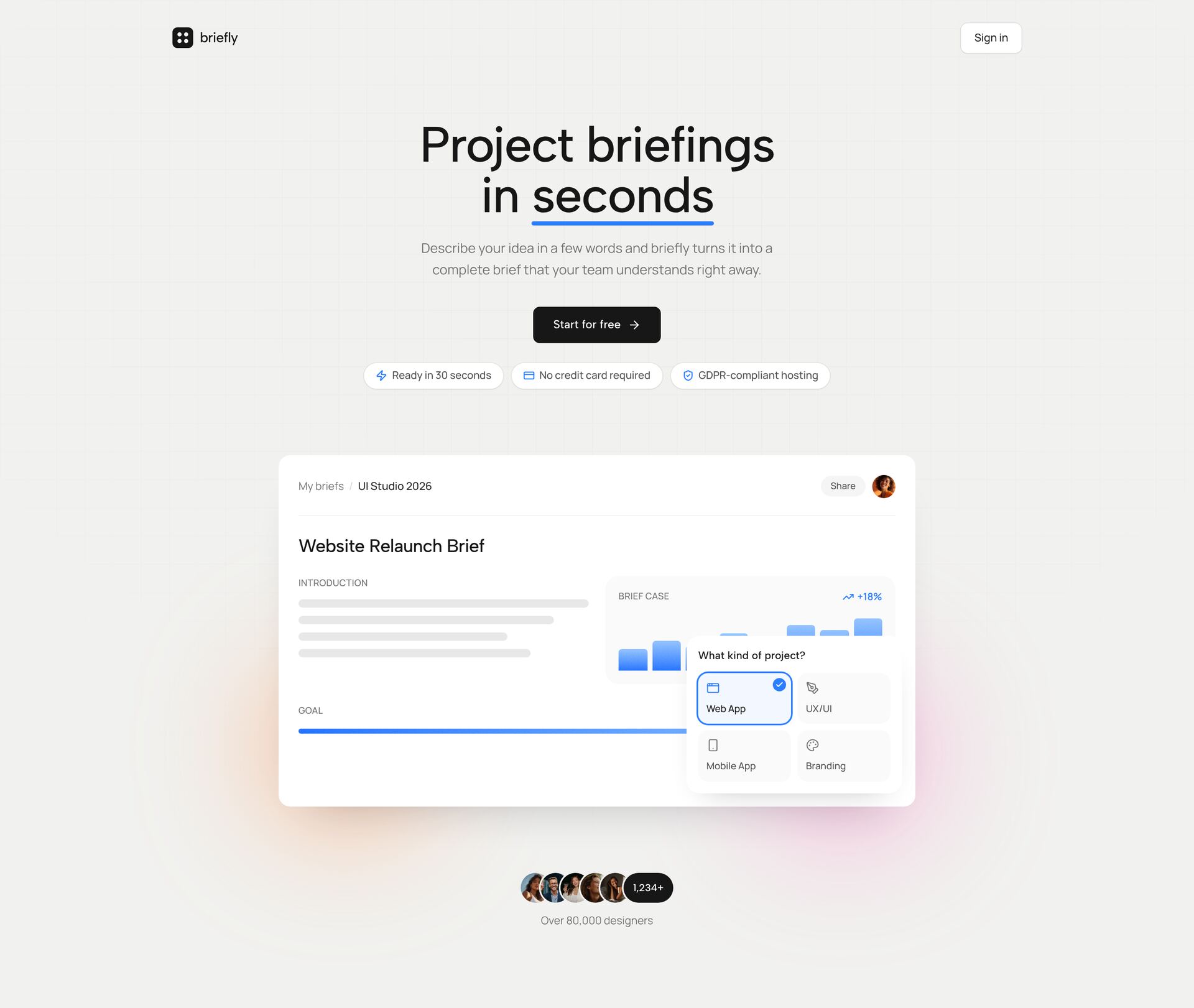
Product Hero DashboardNew
Glassmorphism Dashboard HeroNew
Giant Wordmark HeroNew
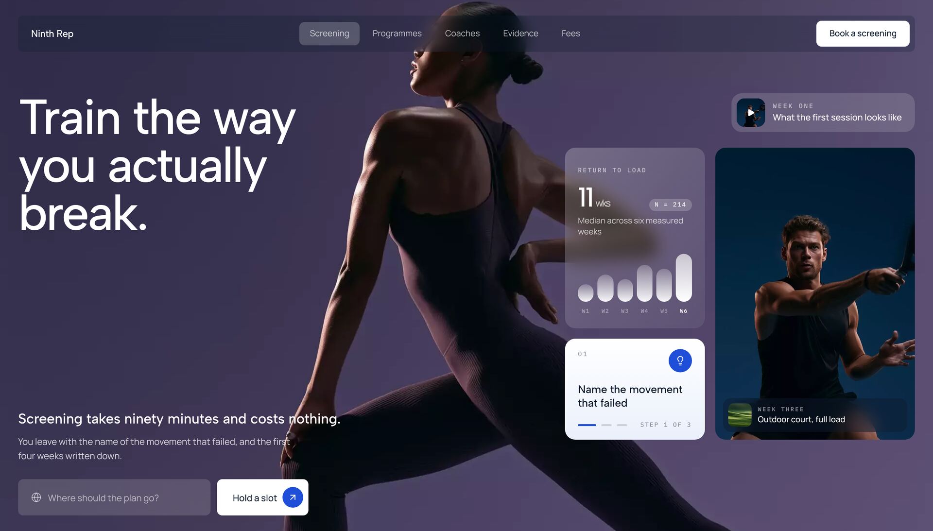
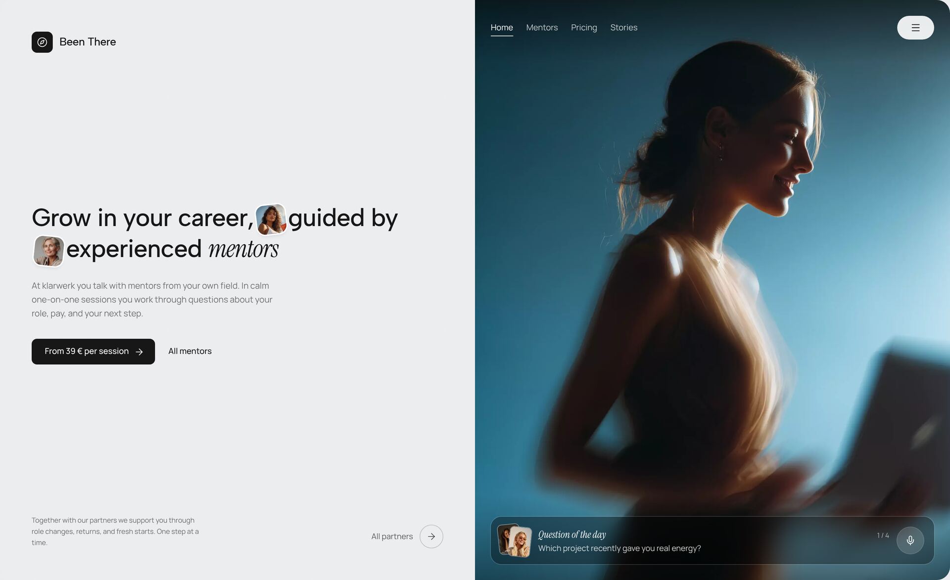
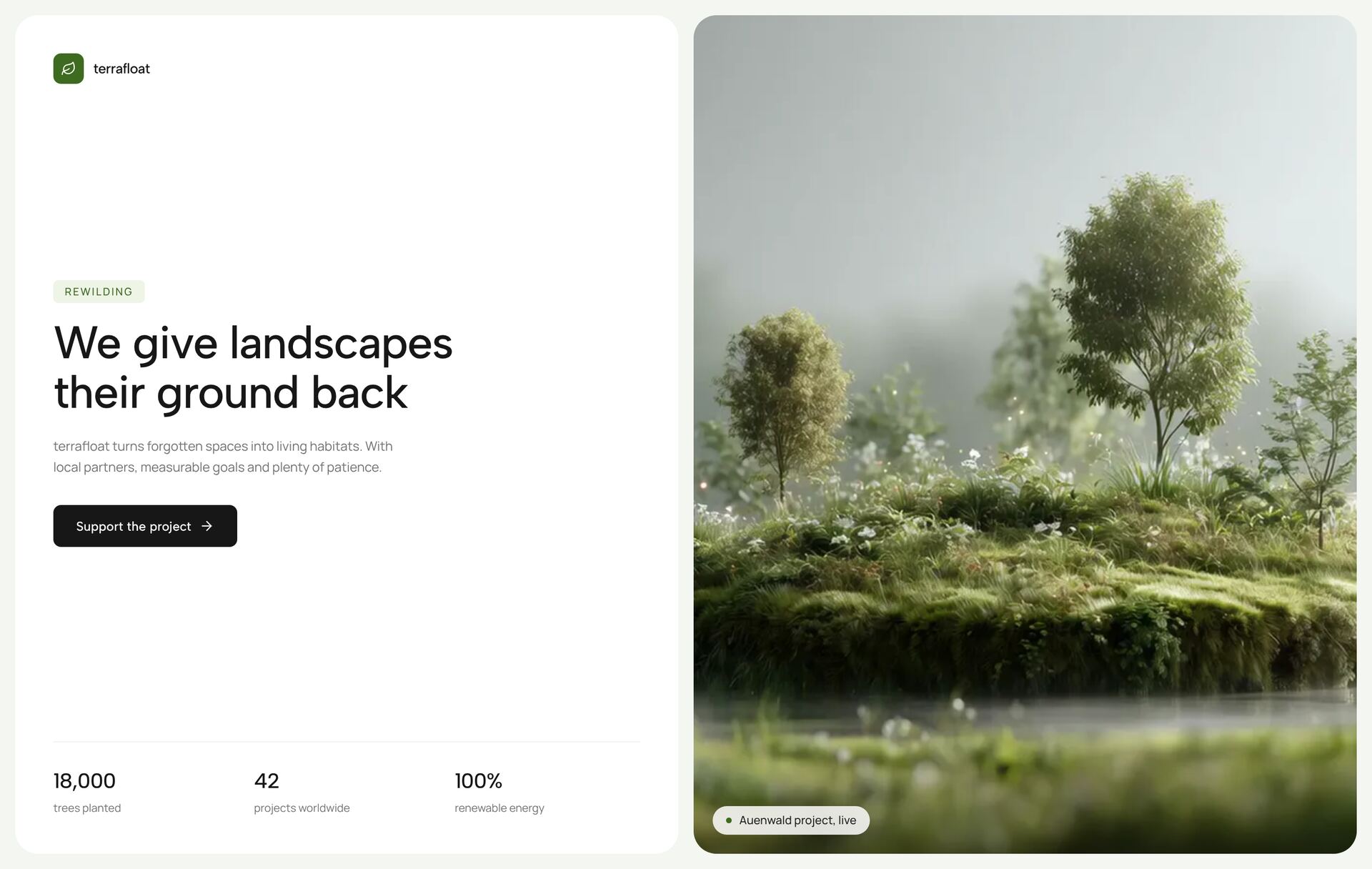
Coaching Split HeroNew
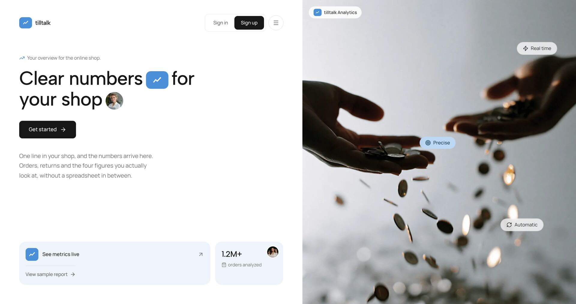
Analytics Split HeroNew
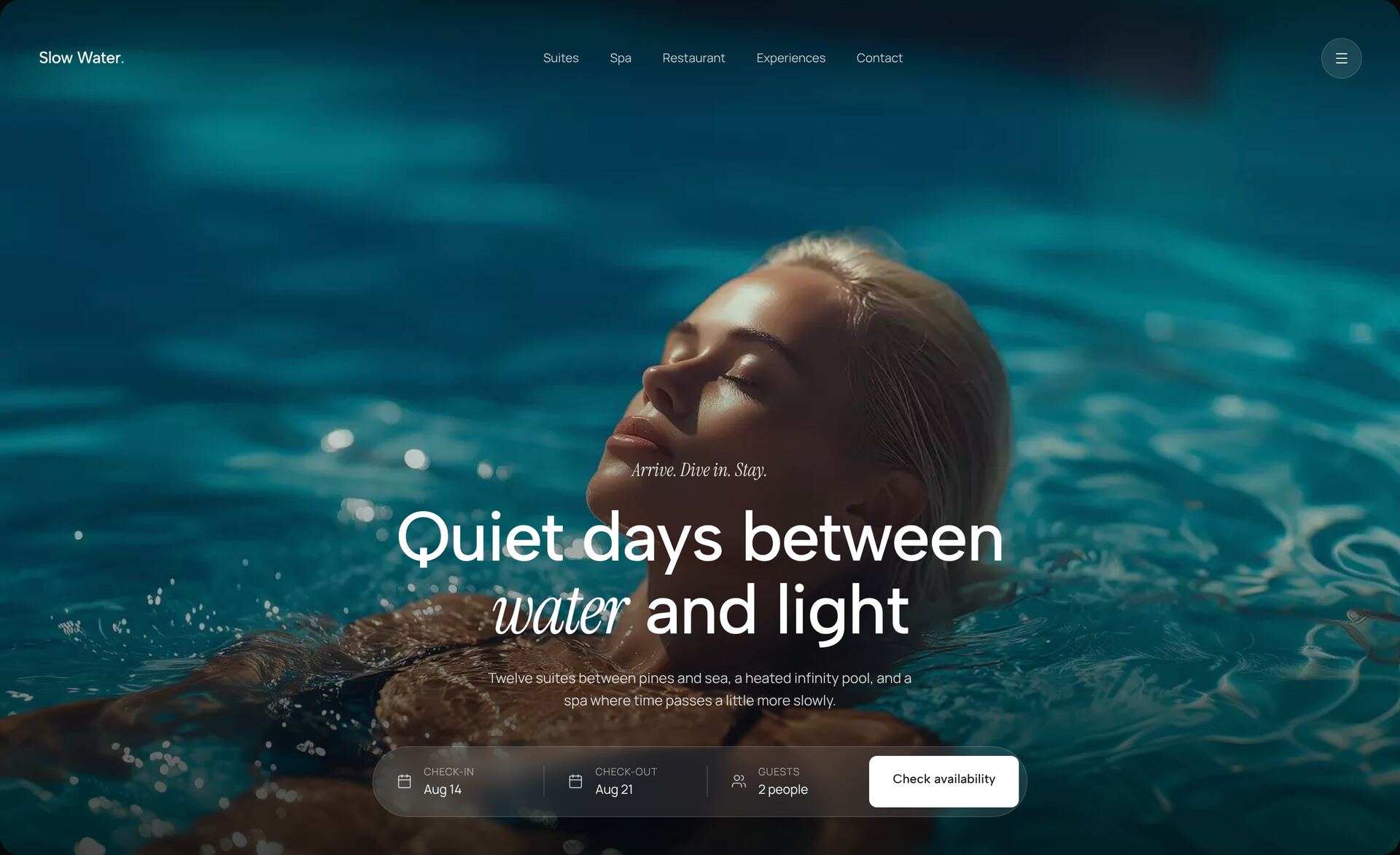
Resort Pool HeroNew
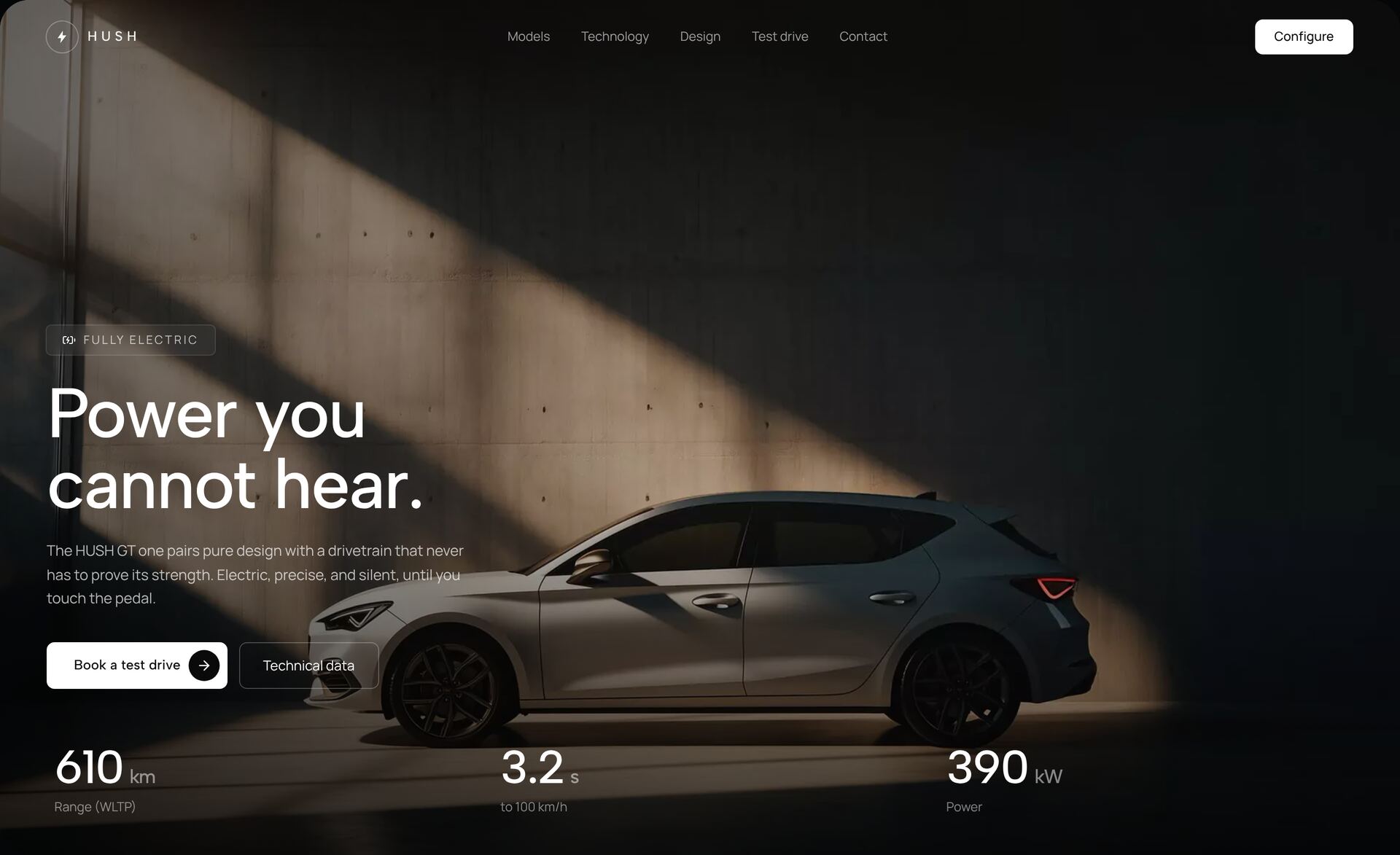
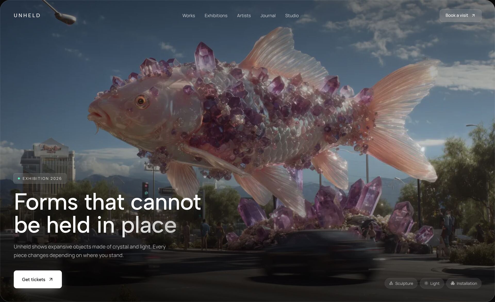
Automotive Spotlight HeroNew
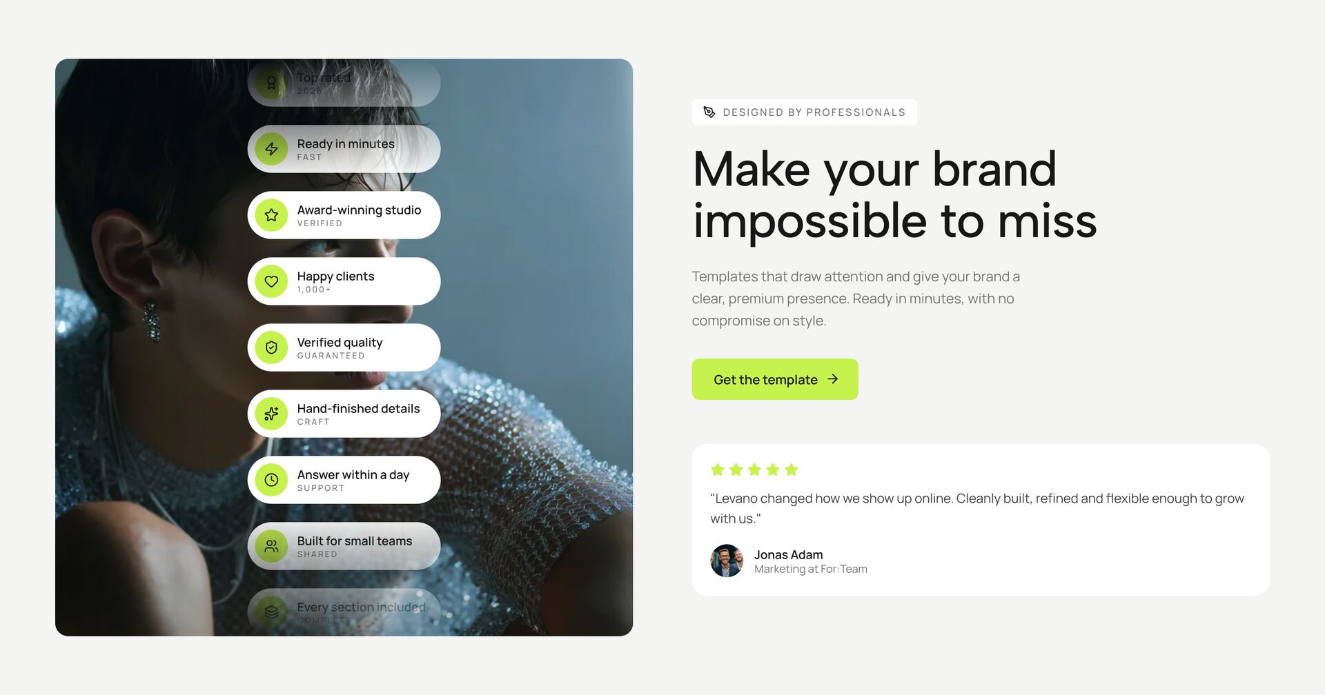
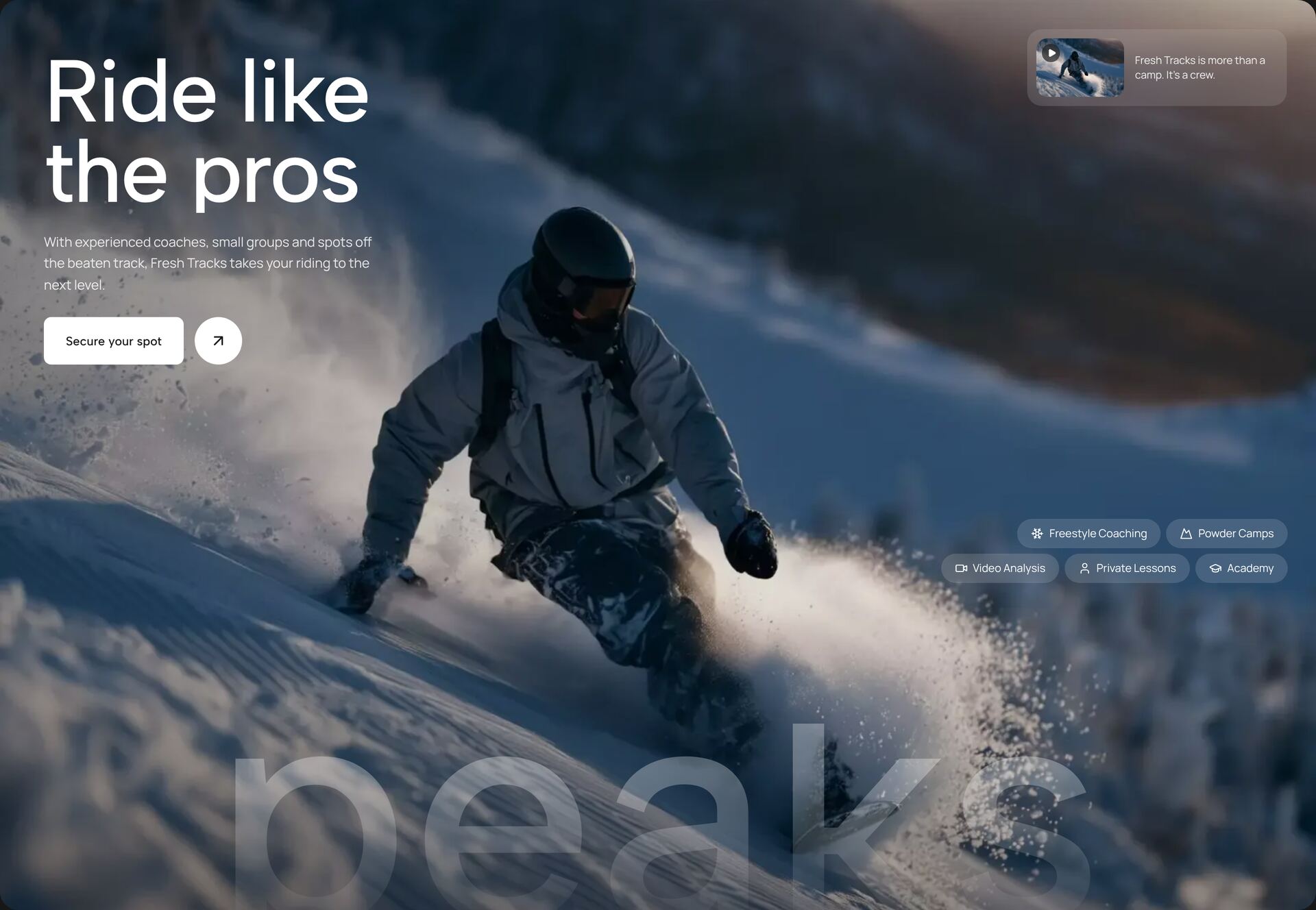
Staggered Chip HeroNew
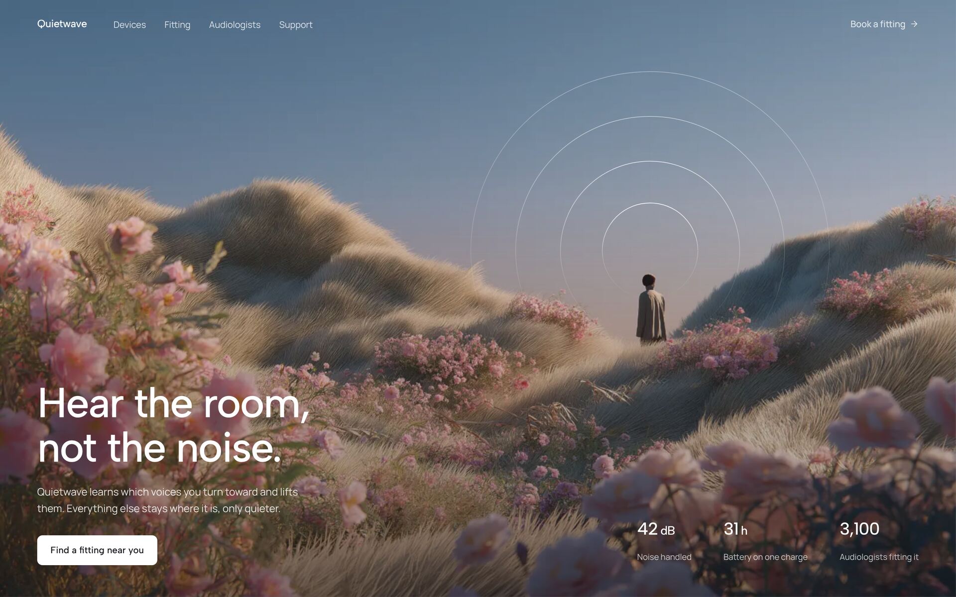
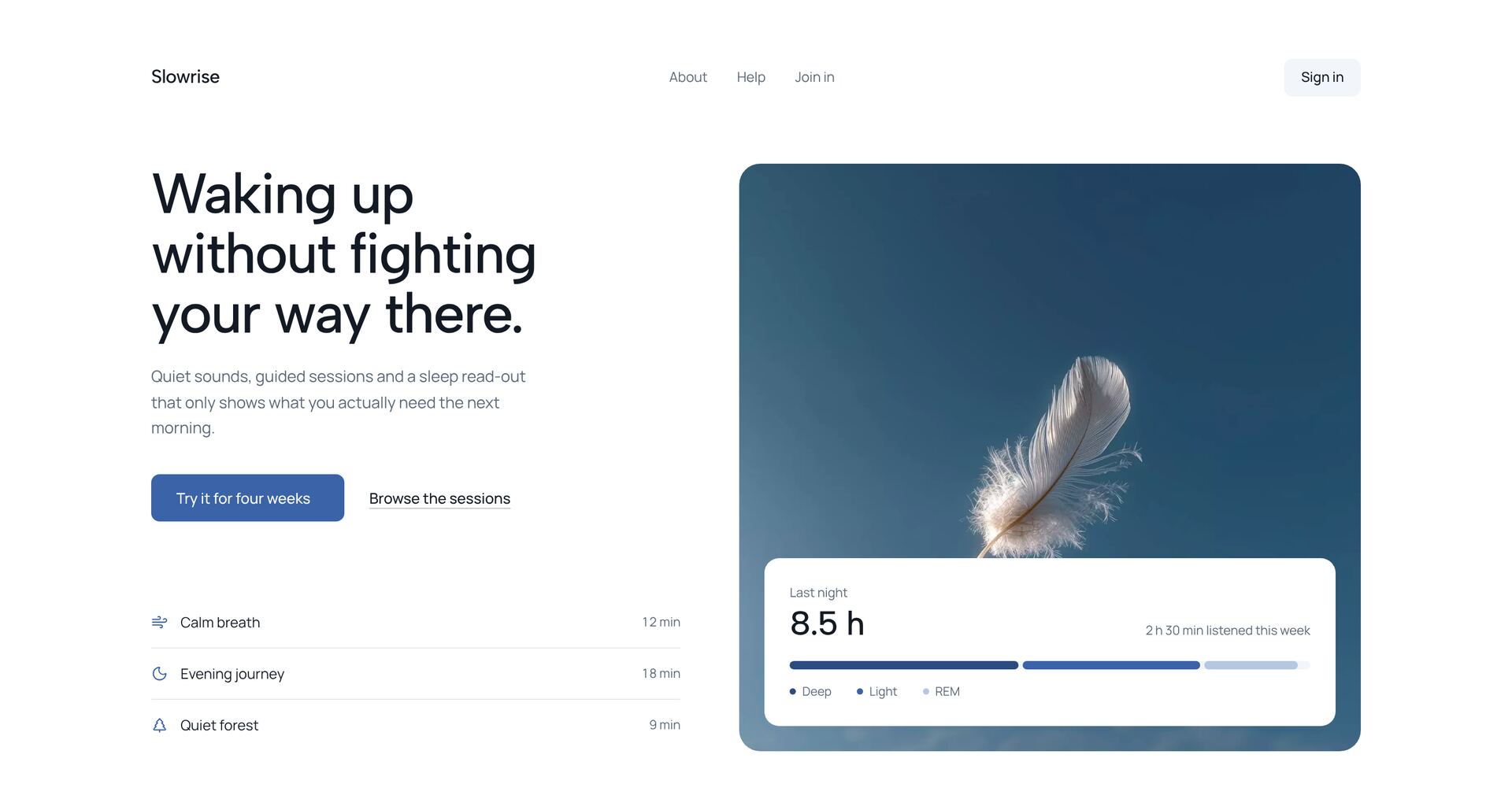
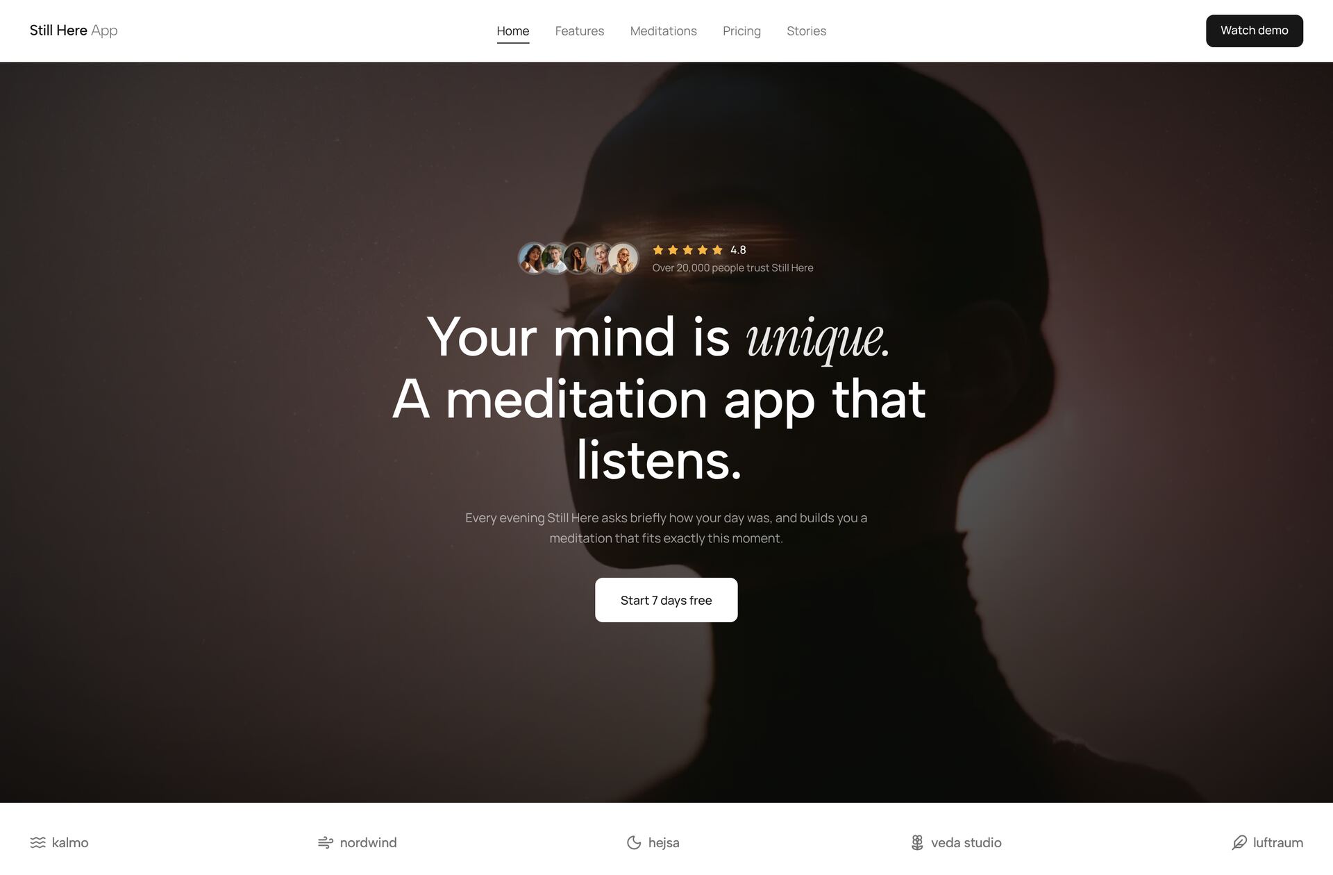
Meditation Trust HeroNew
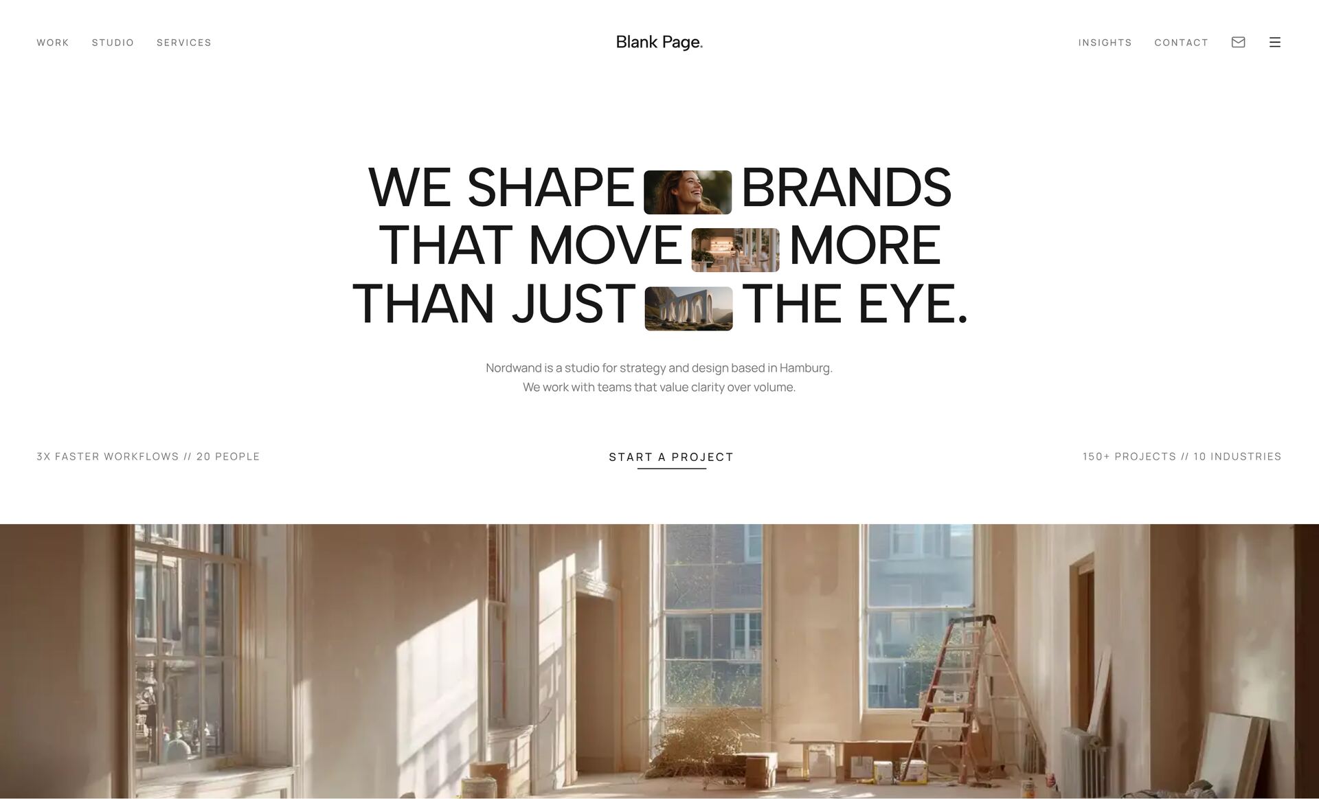
Inline Image HeroNew
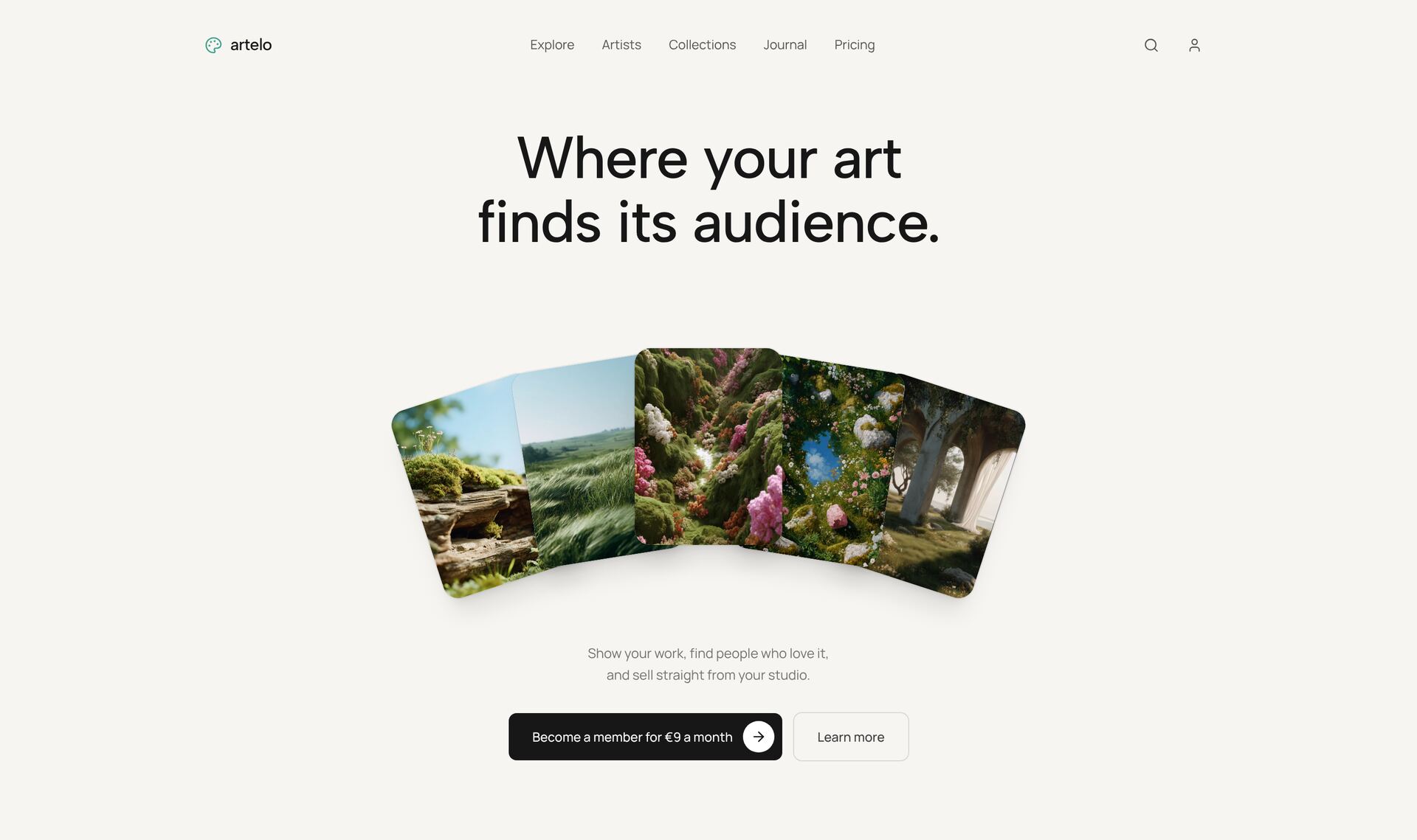
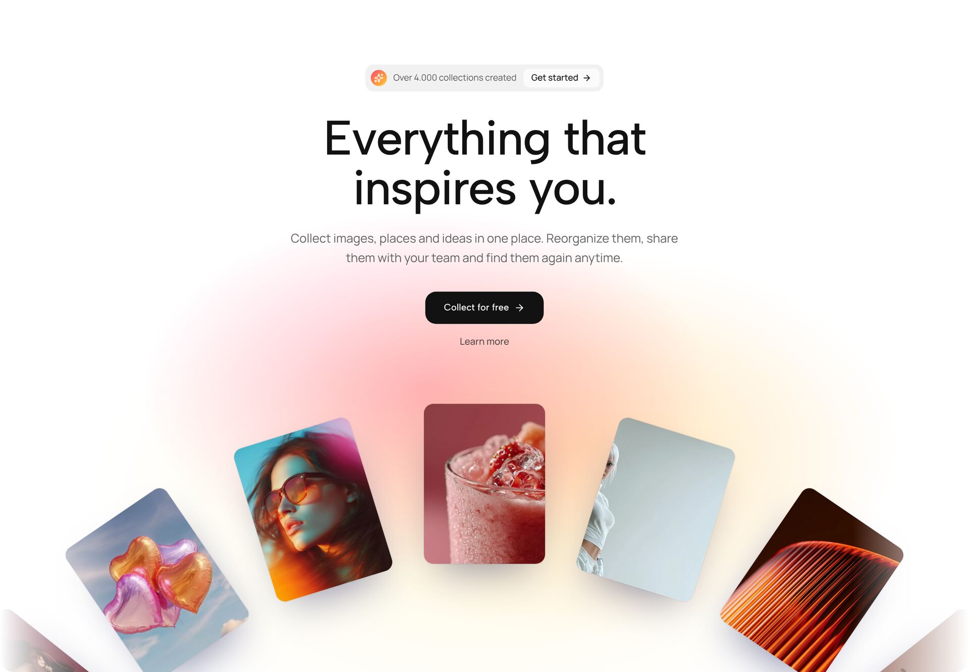
Fanned Cards HeroNew
Video Showcase HeroNew
Floating Island HeroNew
Orbit Gallery Hero
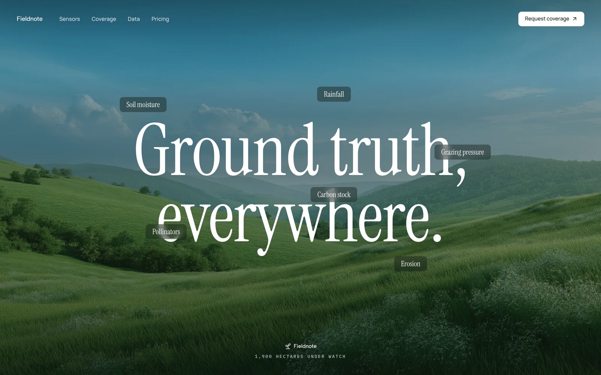
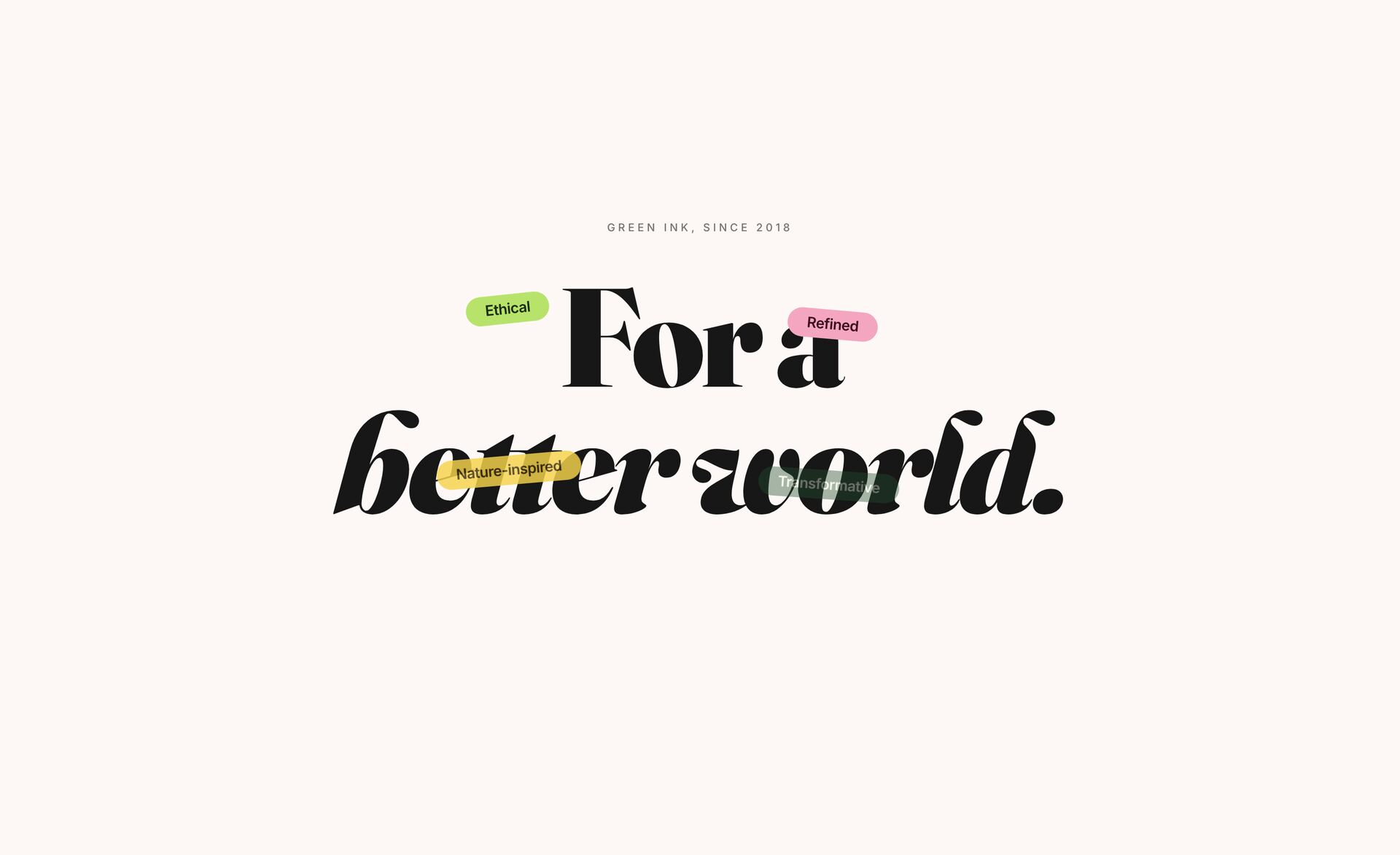
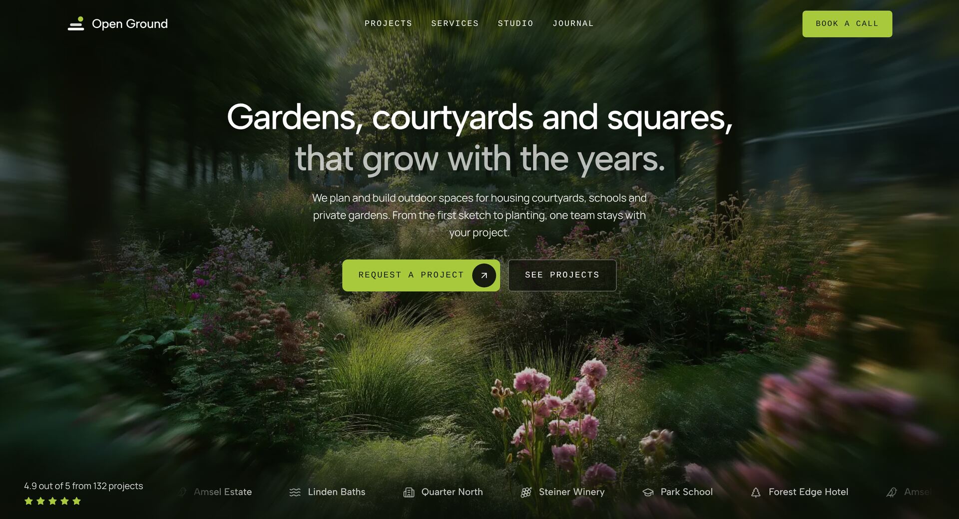
Verdant Headline Tags
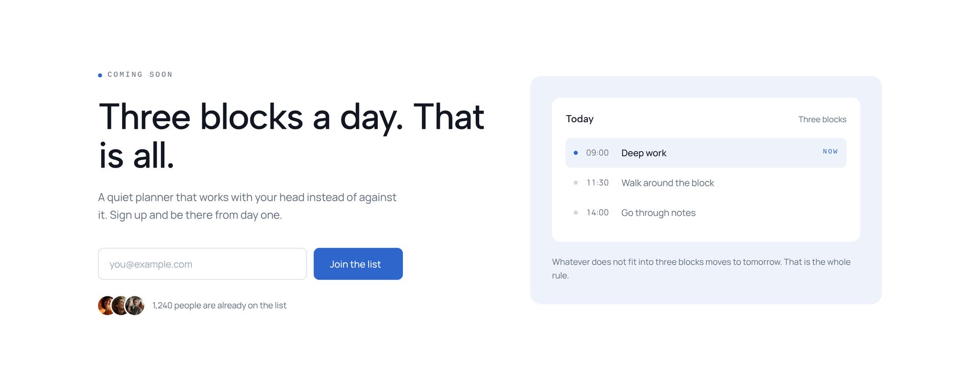
Waitlist Hero
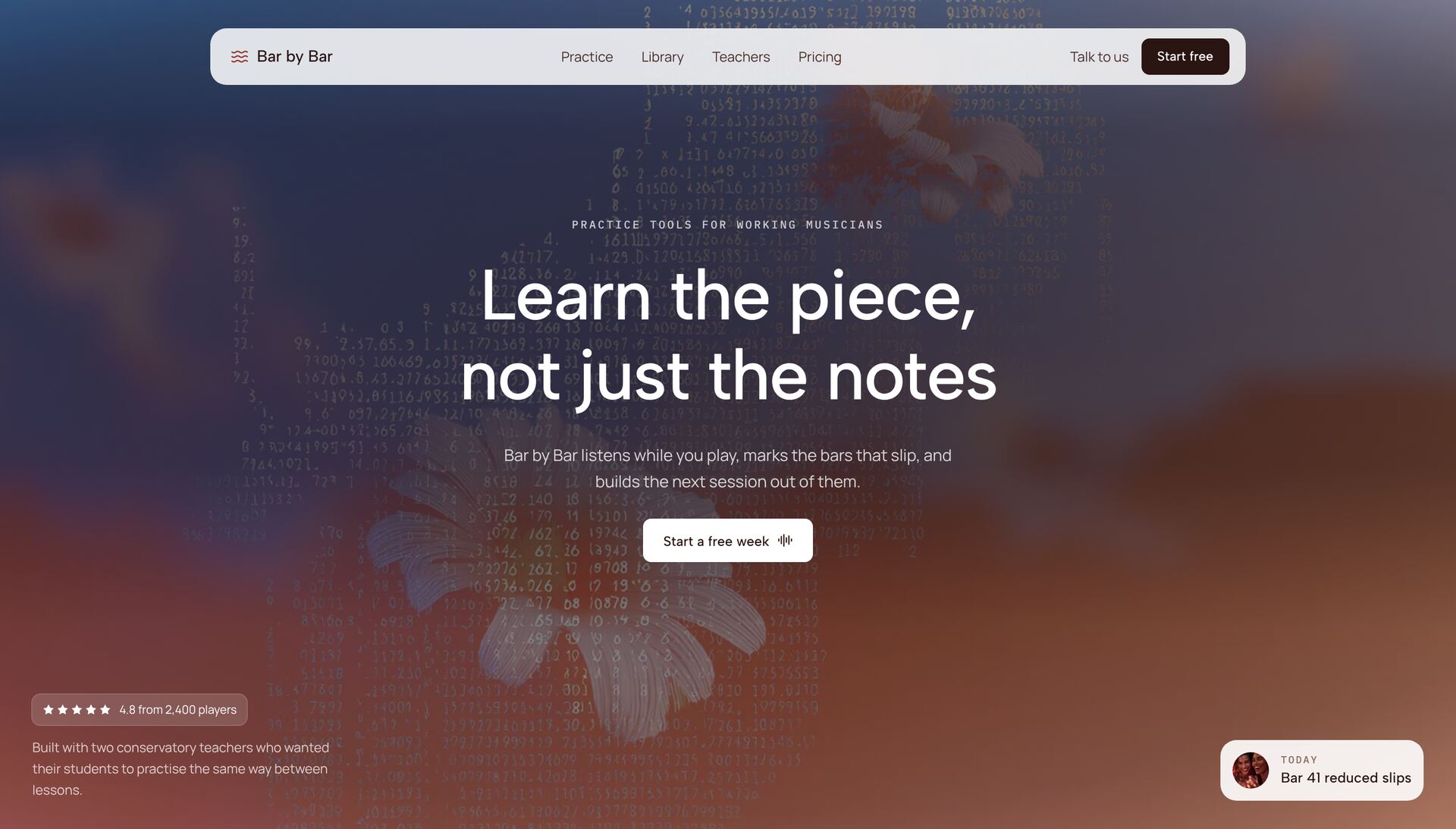
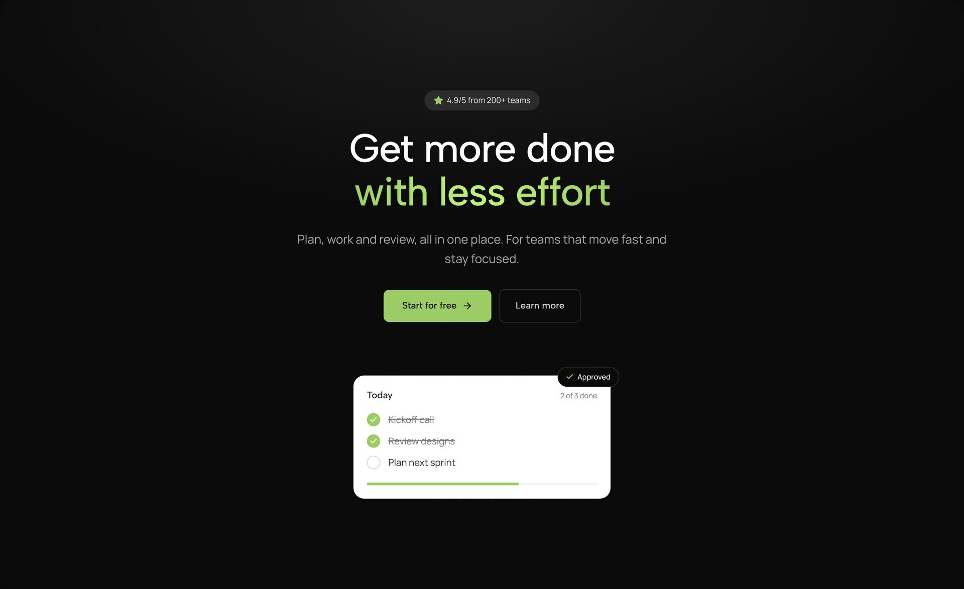
Gradient Hero Section
Card Orbit HeroNew
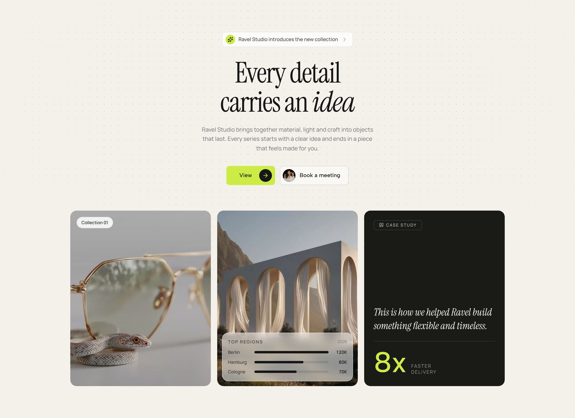
Trustbar Studio HeroNew
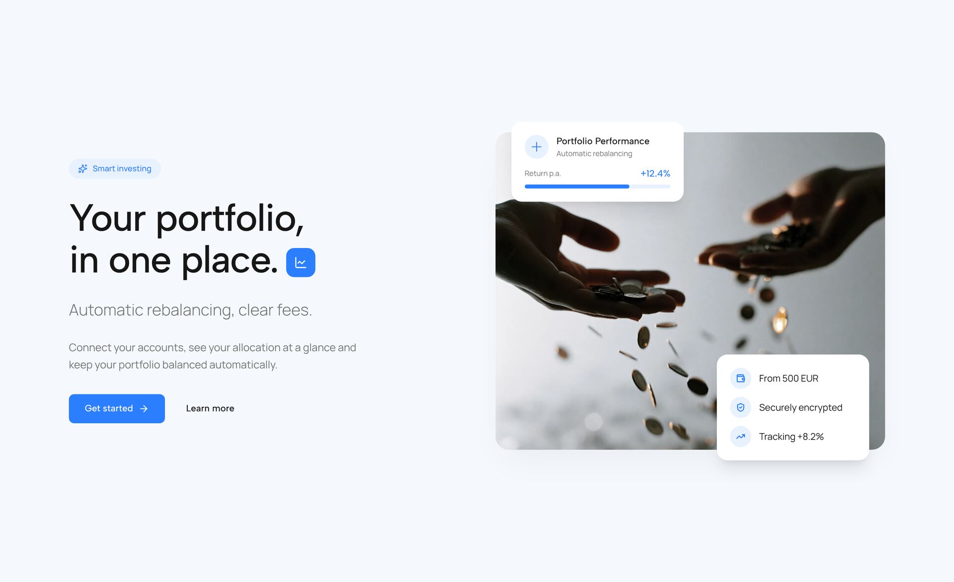
Fintech Split Hero
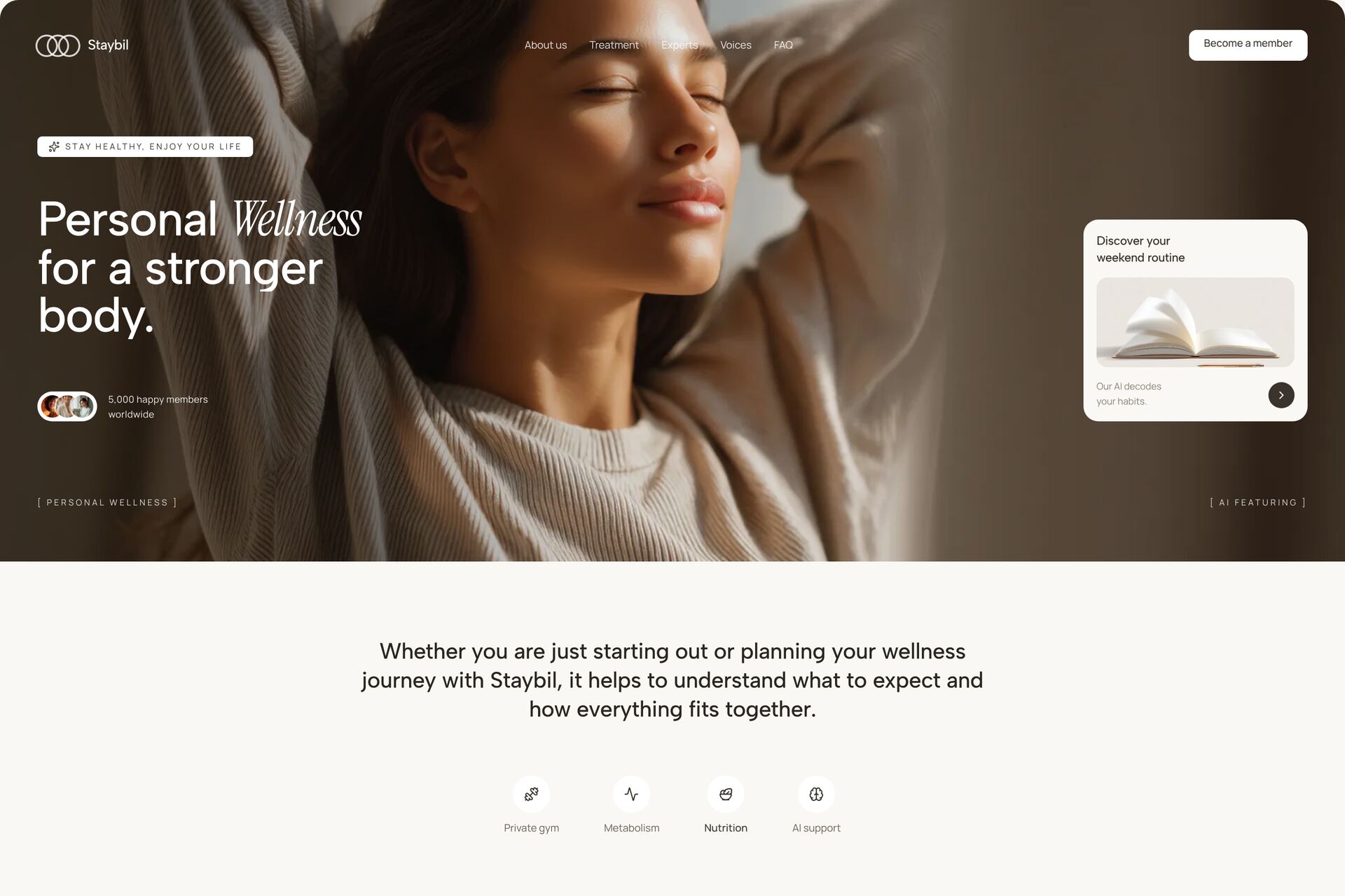
Staybil Wellness
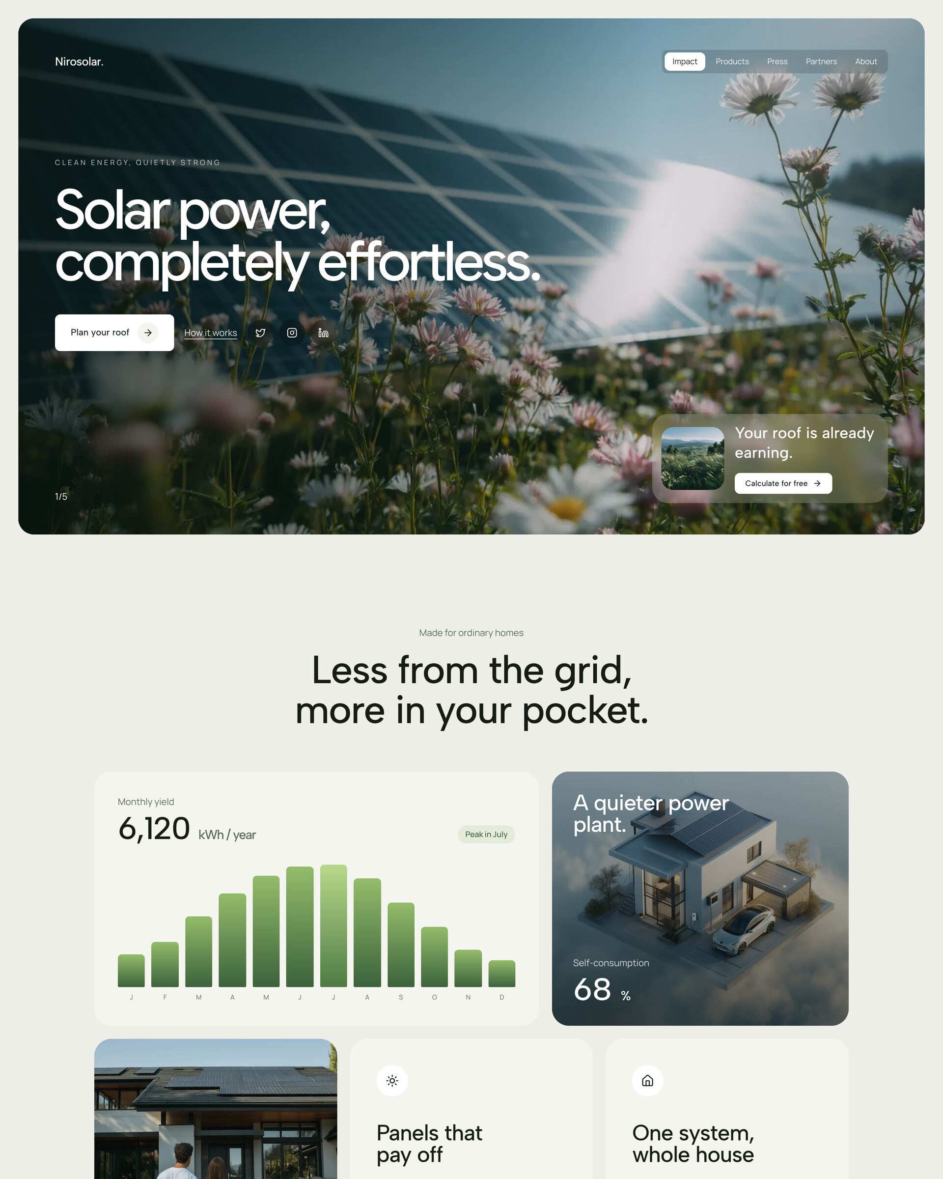
Niro Solar Energy
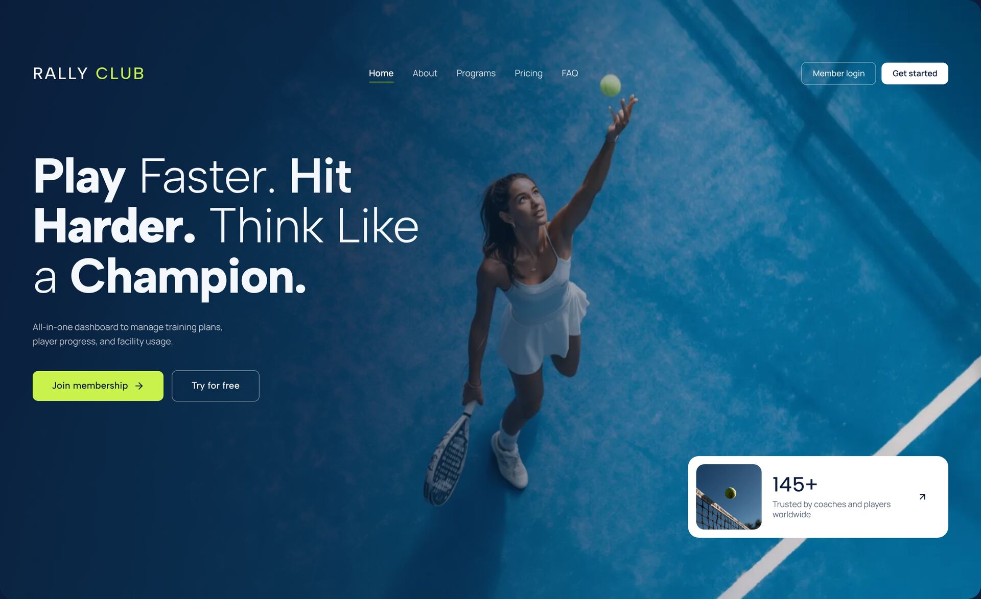
Court Culture Sports
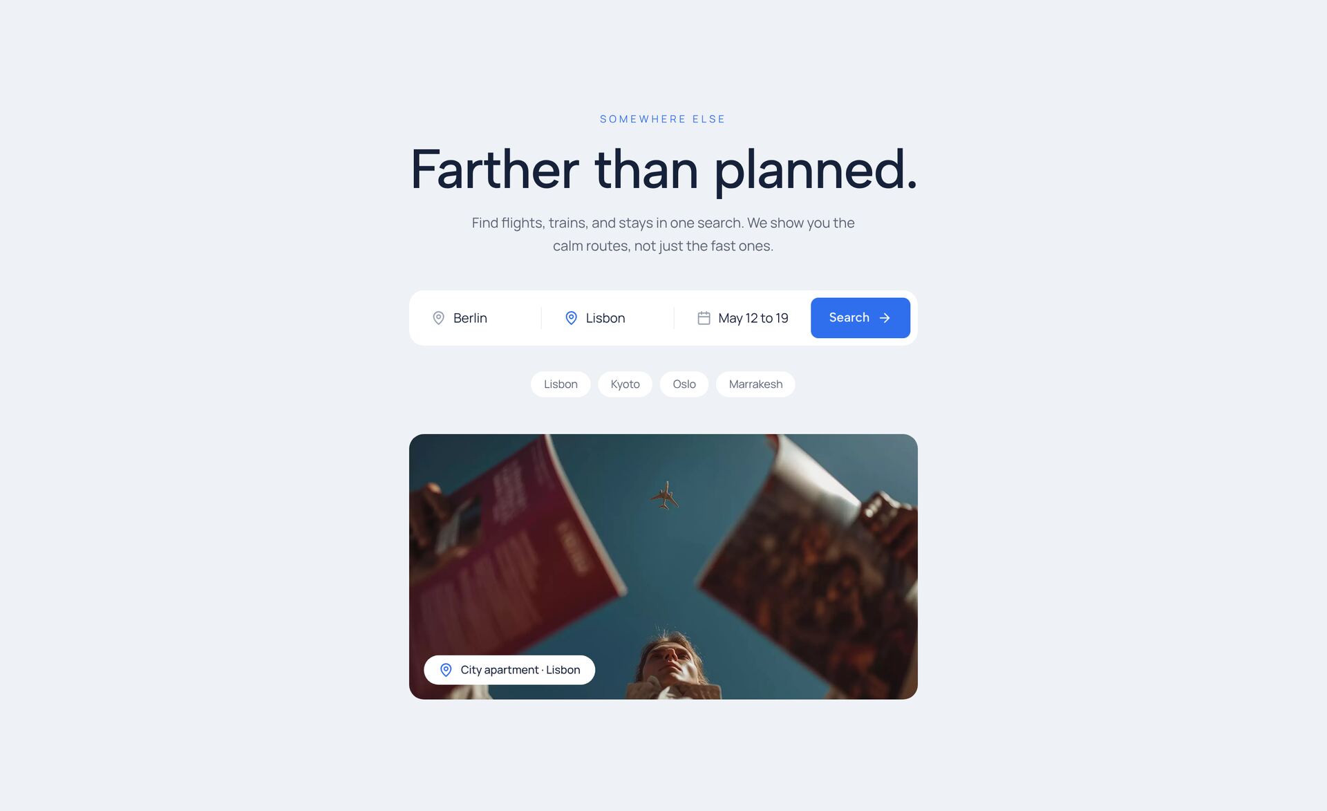
Atlas Travel
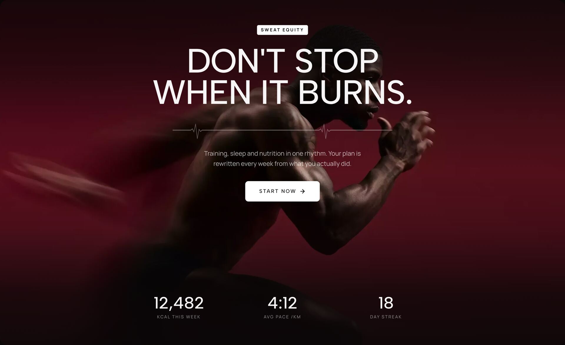
Pulse Fitness
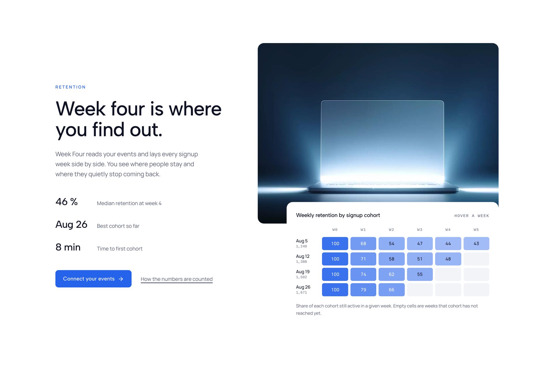
Cohort Analytics
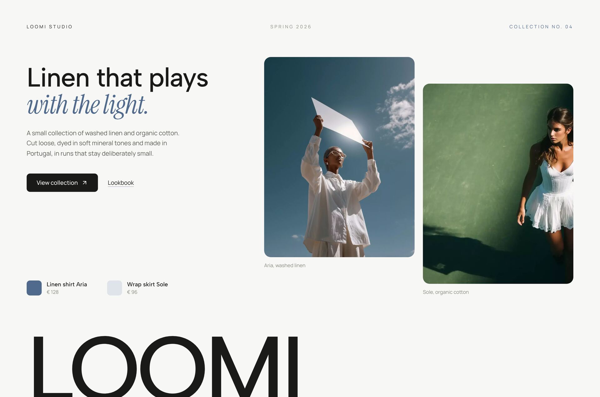
Loomi Editorial

What makes a hero section work?

A hero section has about three seconds to say what the page offers and what to do next. The heroes here solve that in different ways: a headline with one clear button, a product that turns as you scroll, a film that plays along with the page, or a portrait with a few lines beside it. Each one is a single React file styled with Tailwind CSS, so you can read it top to bottom and change it in place.

Pick by what you have to show. With strong photography, a full-bleed image hero carries the message. With a product, a split layout or an object hero keeps text and visual side by side. With little visual material, a typographic hero with motion in the words still feels finished. Every hero is checked at phone width, and animations switch off when the visitor has reduced motion turned on.

Related guides

More section categories

FAQ

Frequently asked questions

Six to ten words work best. The headline states the result, a subline of one or two sentences adds the how. Most heroes here are set for two lines on desktop and three to four on a phone.

Yes. Images and videos are plain URLs in the file, so you swap the address and keep the layout. For full-width backgrounds use an image at least as wide as the screen, 1920 pixels for desktop, otherwise it looks soft.
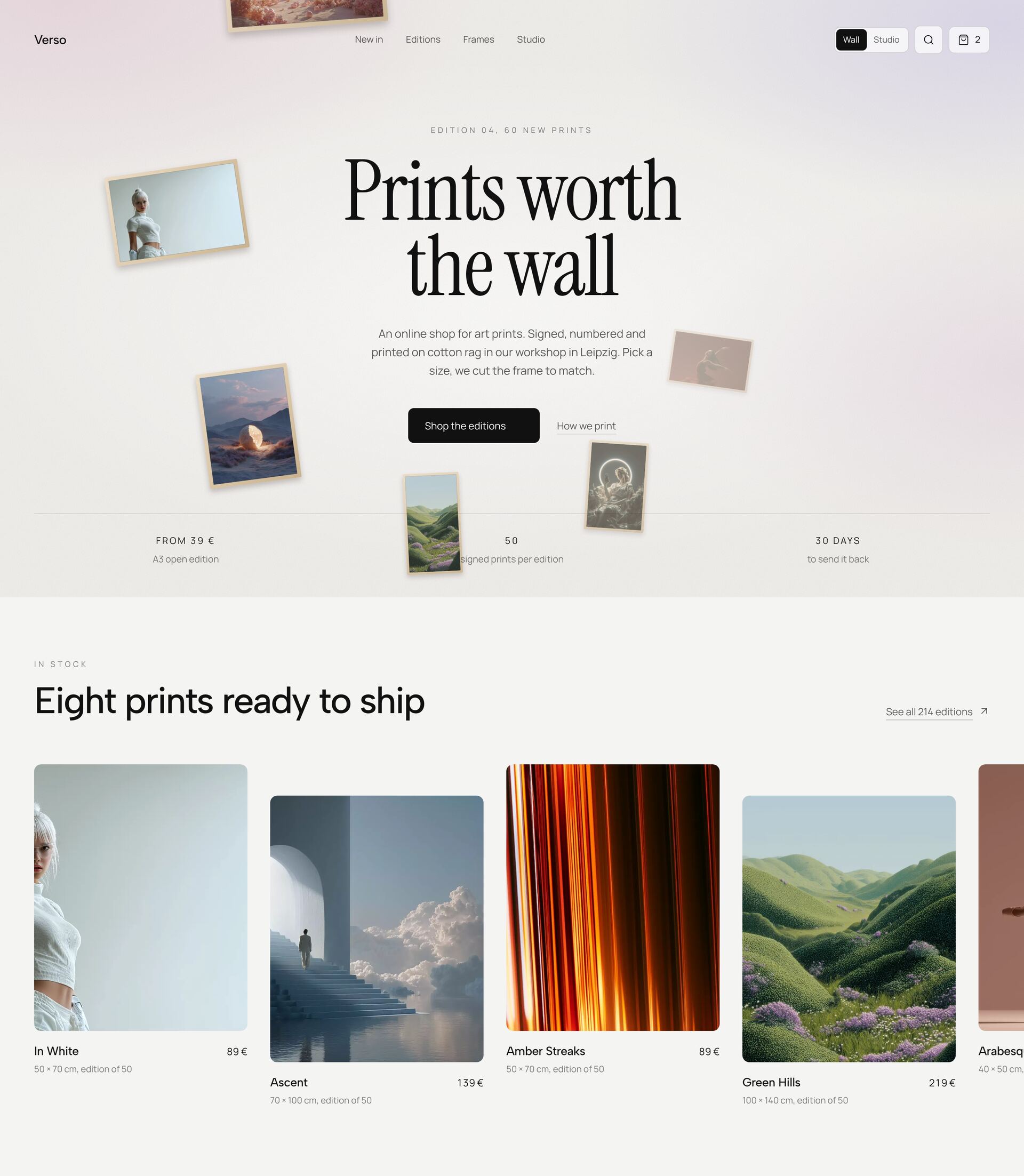
Yes. They react to normal touch scrolling. With reduced motion turned on, the hero shows its final state without the animation.
Six heroes are free in full, including the code. Premium unlocks every hero and every other category, for your own projects and client work.

Didn't find your question? We're happy to help.

Get in touch