






Which menu fits how many pages?
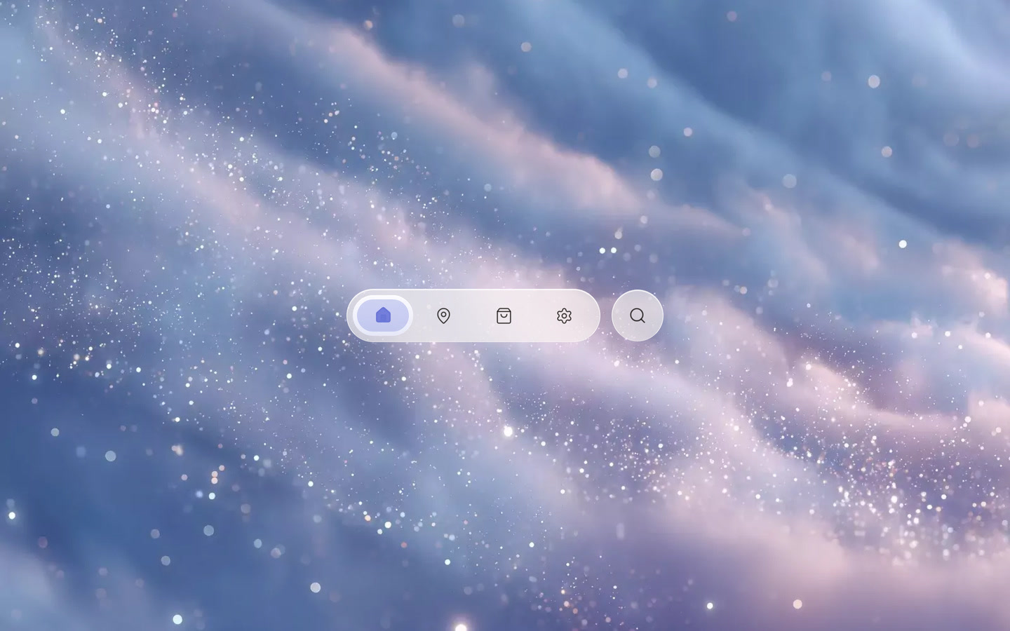
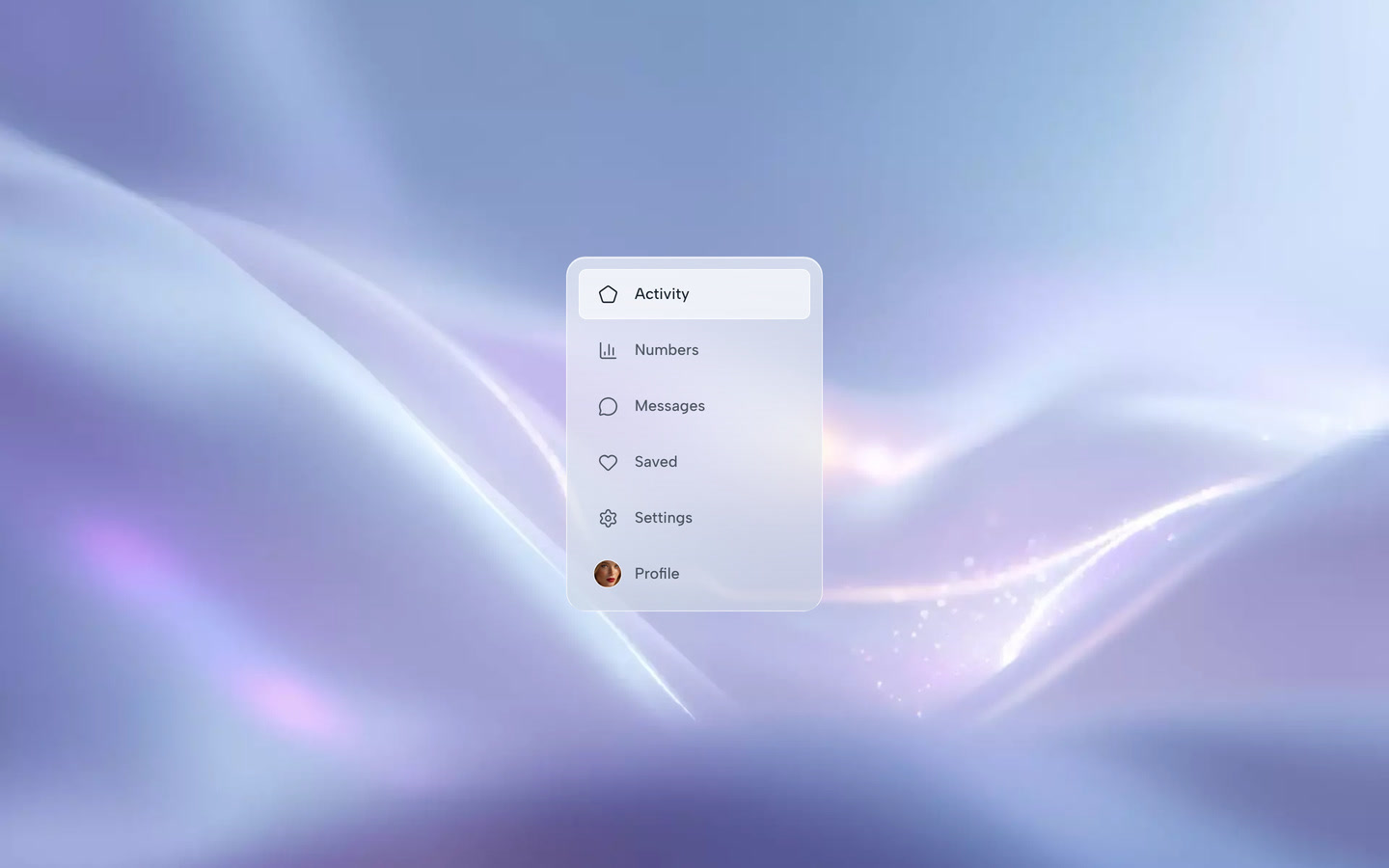
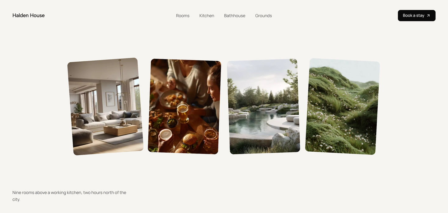
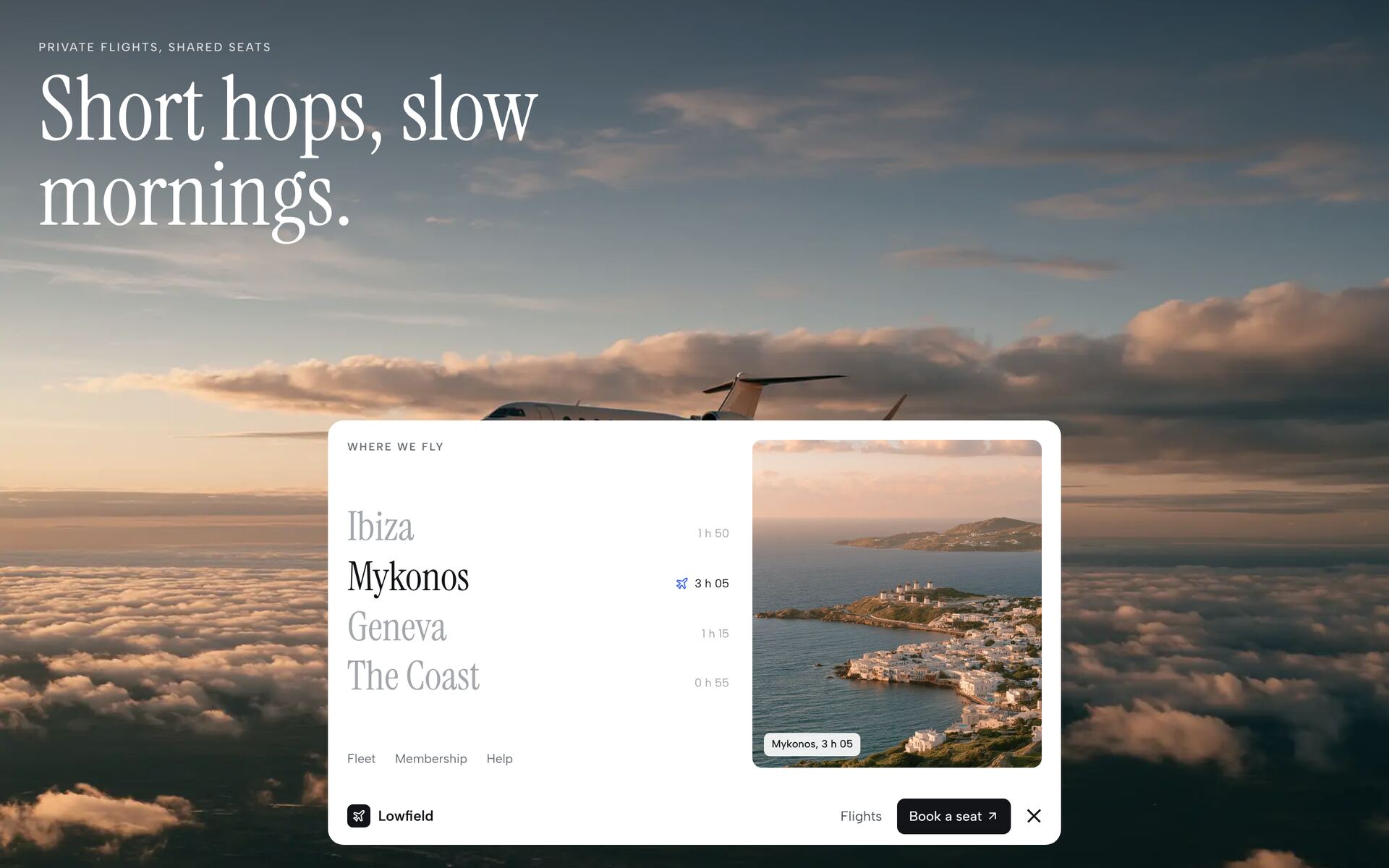
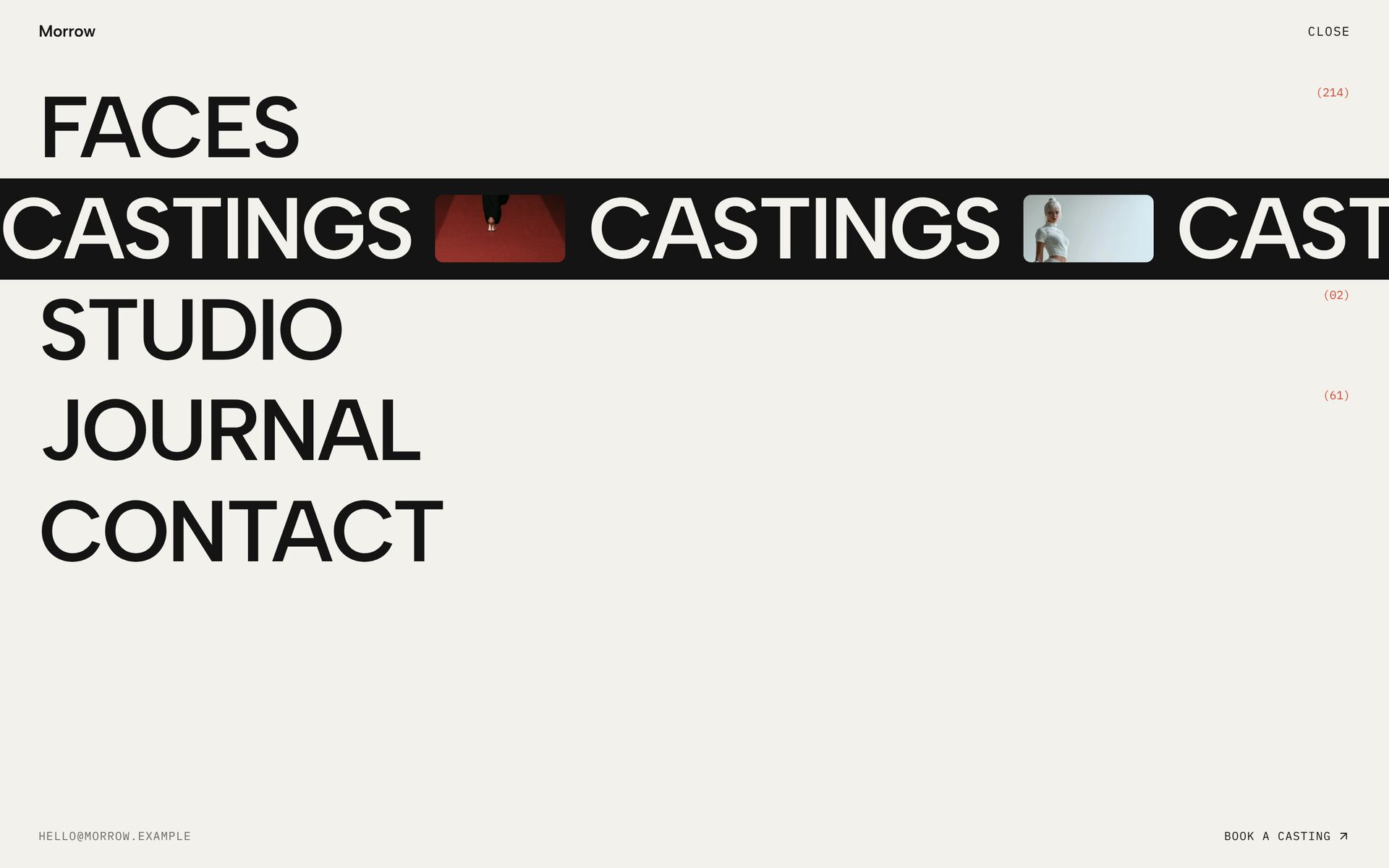
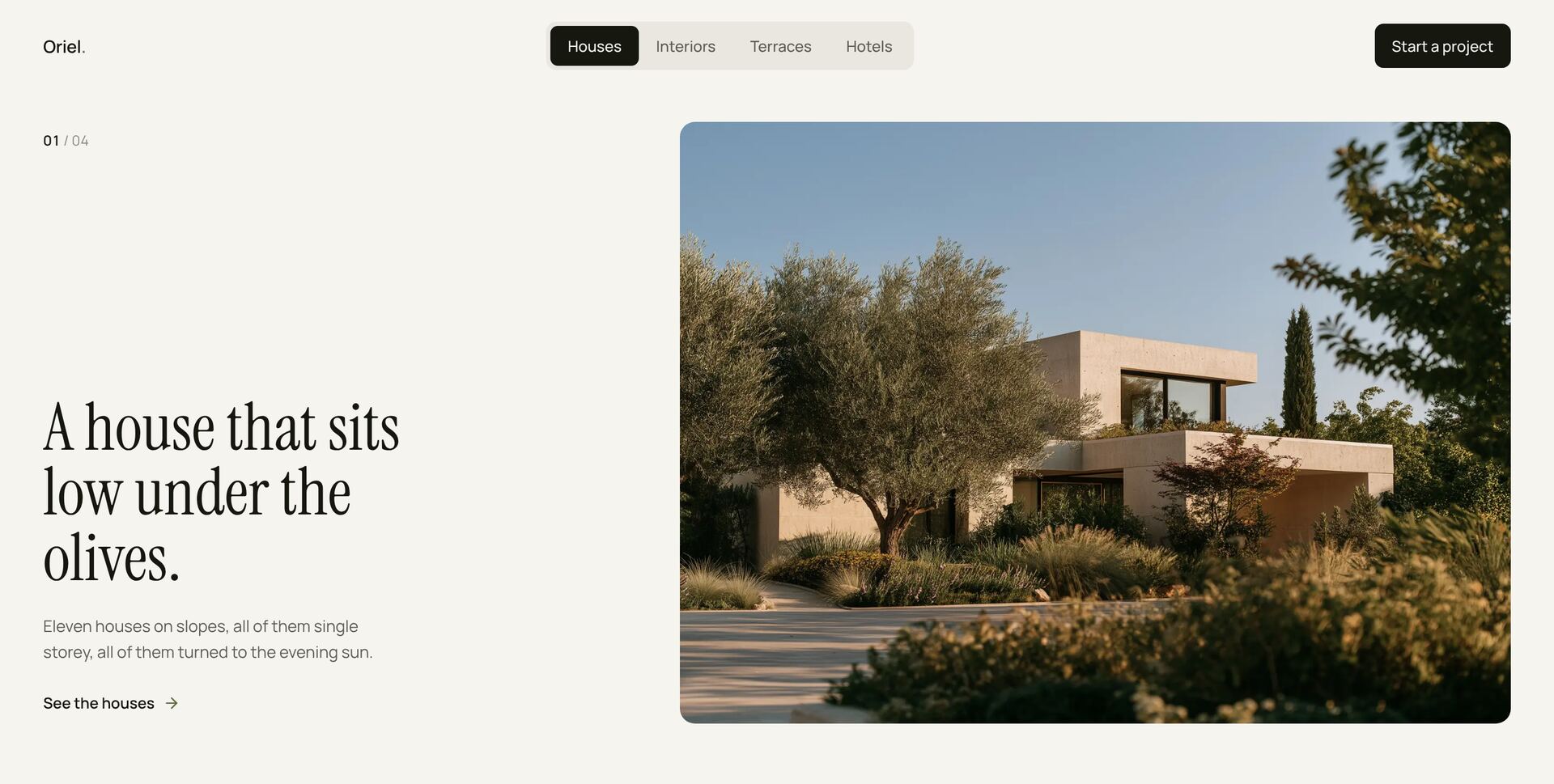
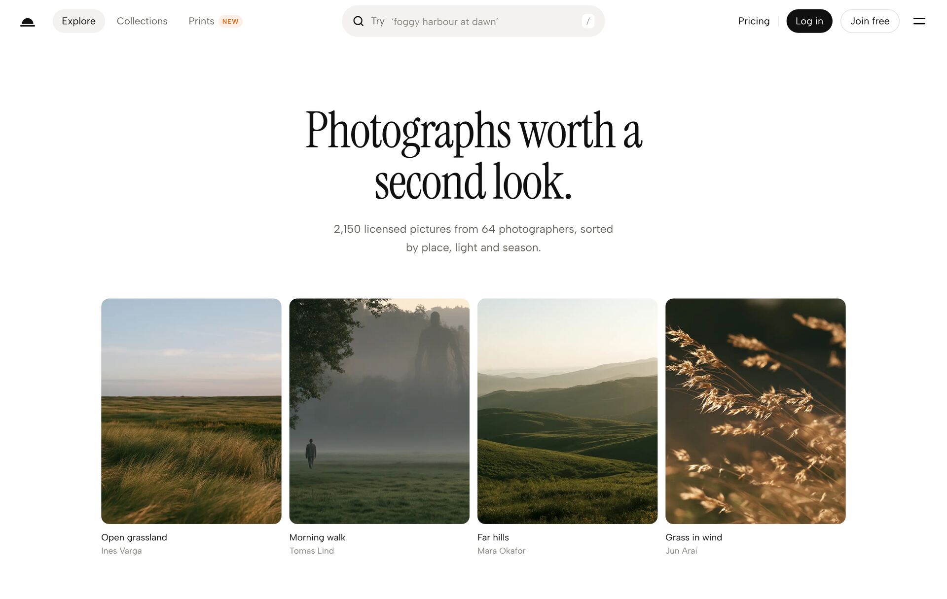
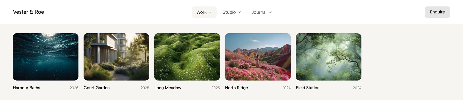
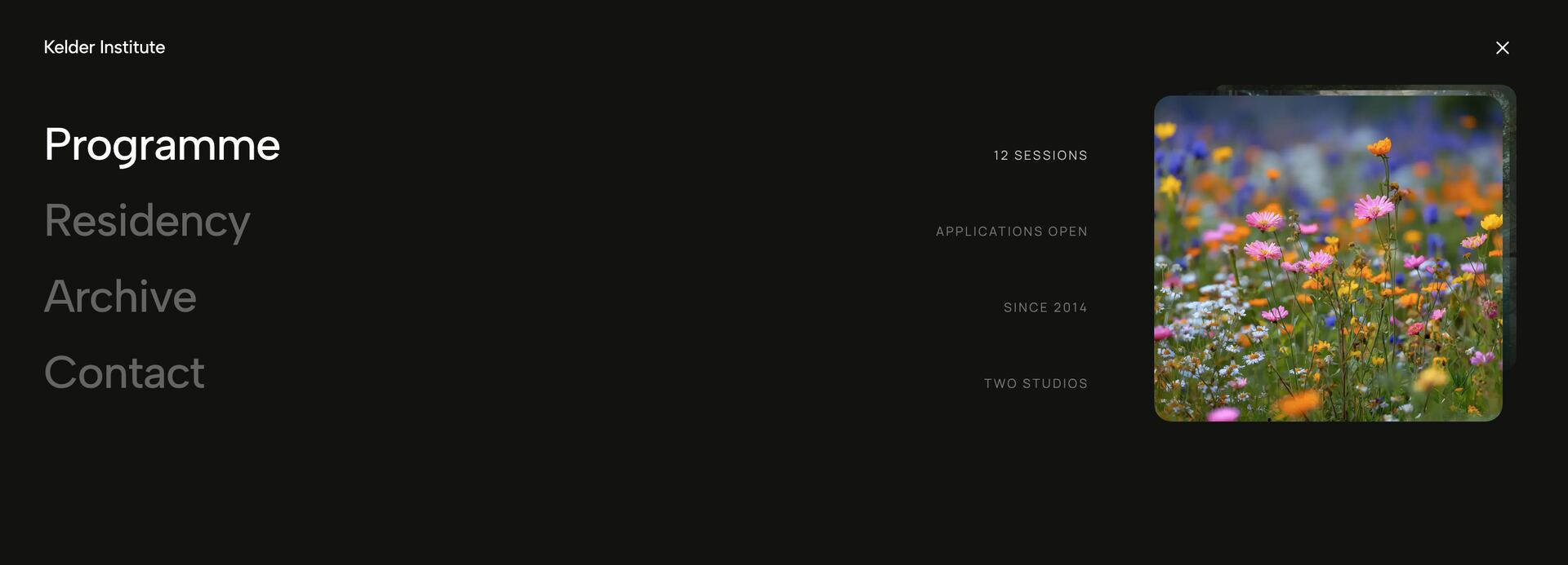
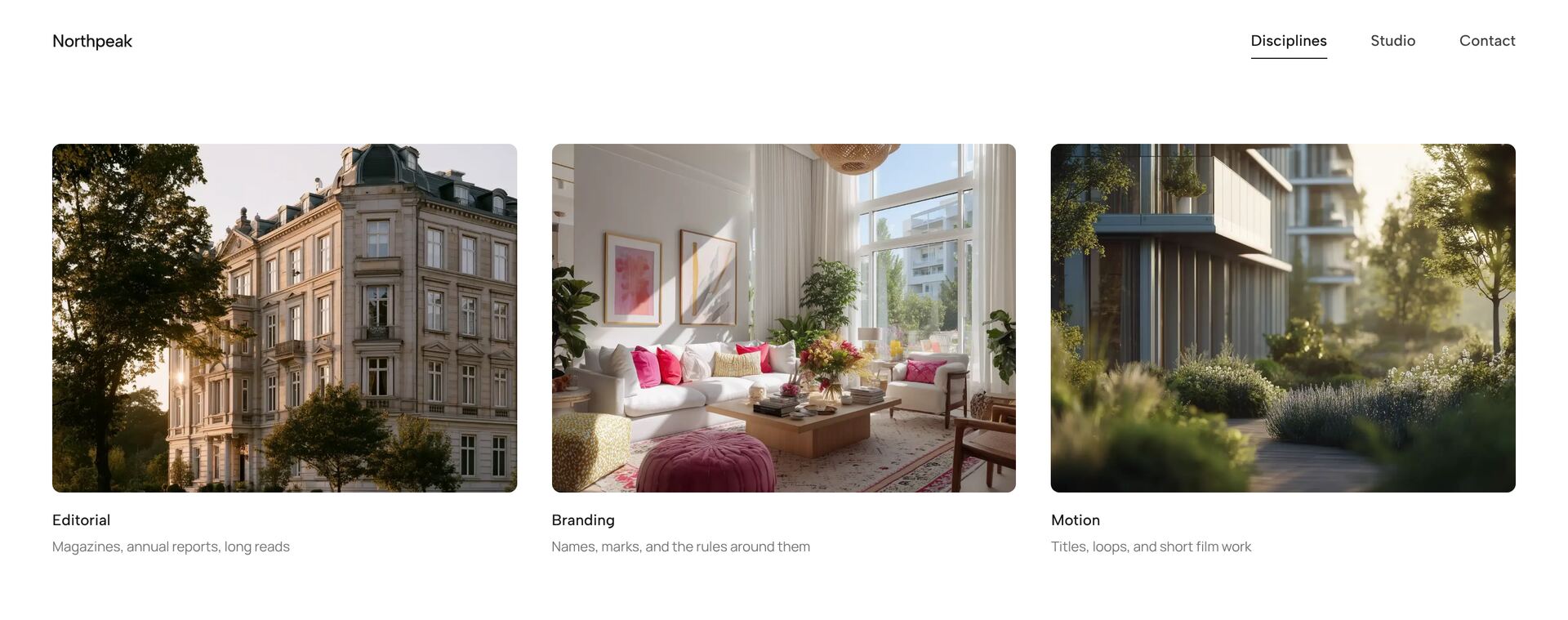
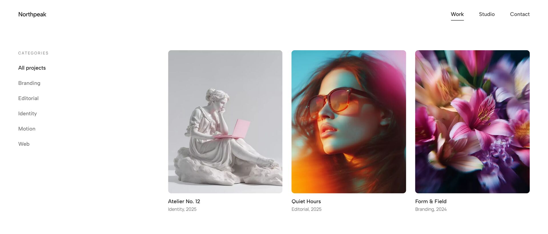
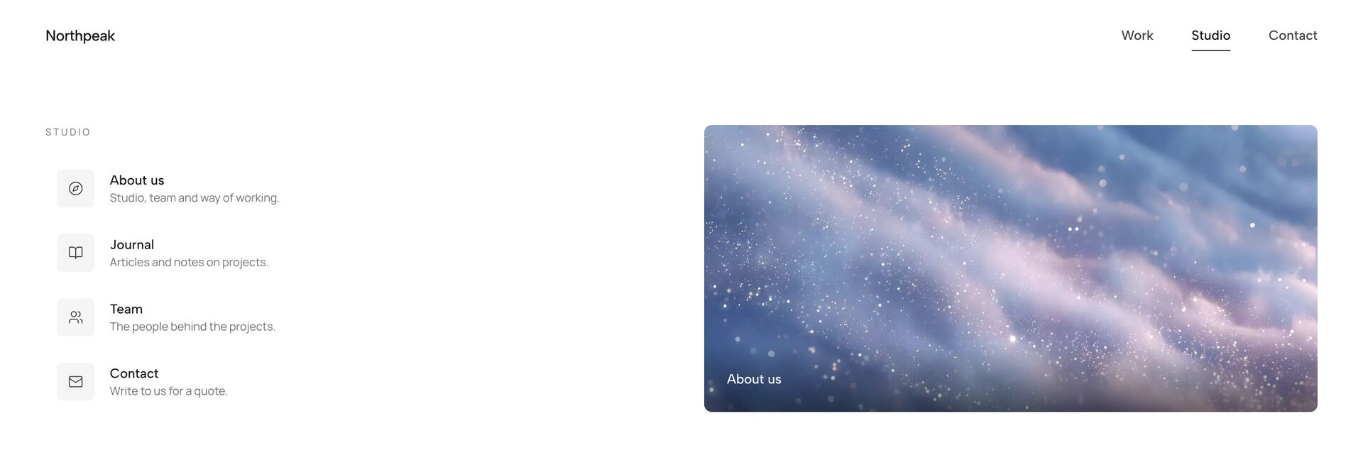
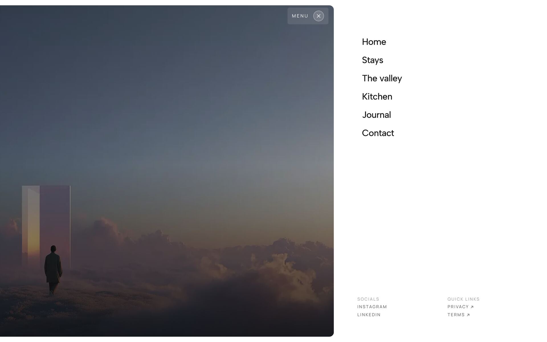
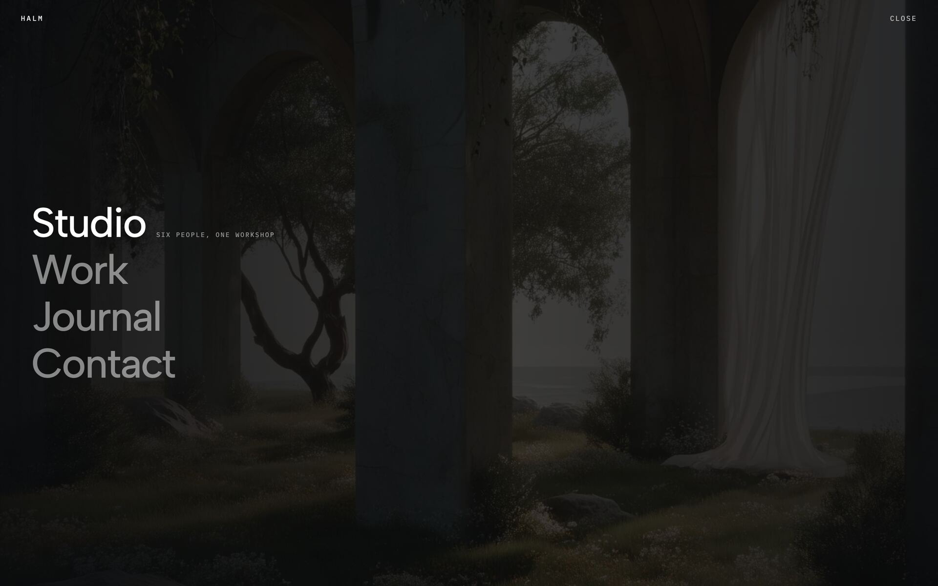
A navigation follows the amount it has to carry. Up to five destinations fit a slim bar, such as a pill that shrinks as you scroll or a dock in which the marker glides along. From a dozen pages in several groups, a mega menu with images, icons or a preview helps. For sites with strong imagery there are menus that take over the whole screen and drawers that slide in from the side.
The 15 menus here are React components with Tailwind CSS and framer-motion. They open and close by keyboard and show a clear focus. On small screens they switch to a mobile layout of their own. The entries live as data in the source, so you add or reorder them without touching the animation.
Related guides
Frequently asked questions
Yes. The navigations open and close via keyboard and return clear focus states.
Yes. On small screens the navigations switch to a fitting mobile display.
Yes. The menu items live as data in the source code and can be added to or reordered freely.
Didn't find your question? We're happy to help.
Get in touch