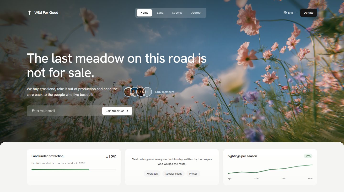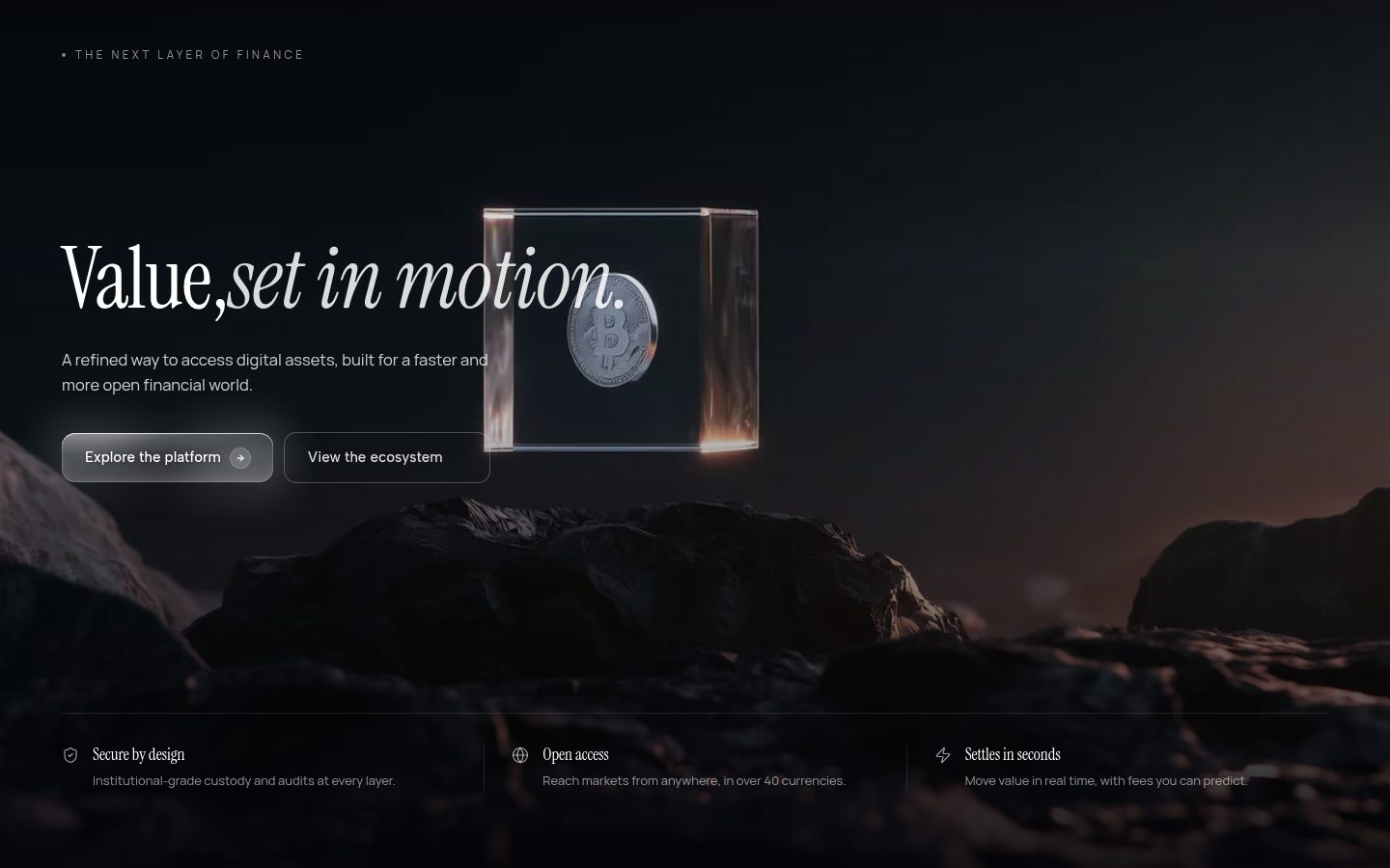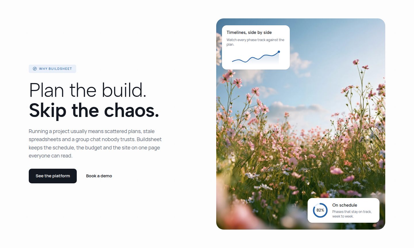
The hero is your page's first impression. In a few seconds it decides whether visitors stay. This guide shows how to build a hero with React and Tailwind CSS that loads fast, communicates clearly and convinces with calm motion.
- A hero answers three questions right away: what this is, why it matters to you and what you do next.
- Structure beats effect. Layout and typography first, motion after.
- The hero image is usually the largest element on the page and decides your loading time.
- Motion guides the eye. A fade and a short move upwards are almost always enough.
What a good hero has to do
A hero answers three questions right away: what this is, why it matters to me and what I do next. Everything else is secondary.
Keep the text block short. A clear headline, one or two sentences of explanation and one unmistakable action are enough. Too many options paralyse the decision.
What is it?
Eyebrow and headline say in one glance what is on offer here.
Why should I care?
Two sentences that name the benefit. Not the company history.
What should I do next?
One action, clearly emphasised. Everything else is a text link.
- "Websites for medical practices, live in four weeks"
- One button, a text link next to it
- Two sentences that back the headline up
- "Digital solutions for tomorrow"
- Three buttons side by side
- One paragraph with five sentences
Every question has its place in the hero. Drop one and you owe the answer somewhere else.
Structure with Tailwind
A centered grid with generous spacing covers most heroes. More important than the classes is that the type size grows with the width, otherwise you need a separate rule for every device.
<section className=" px-6"> <div className="mx-auto flex flex-col "> <p>Eyebrow</p> <h1>Headline</h1> <p>Two sentences</p> <div className="flex "> <a>Book a call</a> <a>Work</a> </div> </div></section>
Point at a highlighted class to see where it applies in the preview.
Five classes decide the whole structure. Everything else is content.
<h1 className="font-display font-semibold leading-[1.04]" style={{ fontSize: "clamp(2rem, 5vw, 4rem)" }} Websites für Arztpraxen, in vier Wochen live</h1>
Images and loading time
If you use a background image it is almost always the largest element in the first viewport and therefore decisive for the Largest Contentful Paint. Serve it in a modern format, at the right size and with high priority.
- Format
- WebP
- Size
- 142 KB
- Dimensions
- 1600 × 1000
- Loading
- priority
- alt
- set
Five values decide whether the hero image carries the page or slows it down.
<img src="/heros/praxis.webp" alt="" fetchPriority="high" decoding="async" className="h-full w-full object-cover"/>
Great heroes remove decisions.
Three arrangements that work. Which one fits is decided by the imagery, not by taste.
Subtle animation with framer-motion
Motion should guide the eye, not distract. A gentle fade of the headline on load is usually enough. Skip long distances and fast changes.
- initial
- opacity 0, y 12
- animate
- opacity 1, y 0
- duration
- 0.5 s
- ease
- cubic-bezier(.22, 1, .36, 1)
- stagger
- 80 ms
Twelve pixels of travel and half a second. A hero needs no more.
The same motion, just started with an offset. The switch shows what reduced motion does.
<motion.h1 initial={{ opacity: 0, y: 12 }} animate={{ opacity: 1, y: 0 }} transition={{ duration: 0.5, ease: [0.22, 1, 0.36, 1] }}
Mistakes we keep seeing
Most weak heroes do not fail on the technical side, they fail on a decision nobody made.
- Three equal buttons. Offering everything recommends nothing. One primary path, at most a second one as a text link.
- A headline that only names the industry. Name what you do and who for. The rest goes further down.
- An image that only fills space. If the motif is interchangeable it is ballast. More whitespace beats an arbitrary stock photo.
- Motion for its own sake. Everything wobbling at once holds nobody.
If your hero stops working without the image, the text was the problem.
How to go about it
Building goes faster if you work in this order instead of deciding everything at once.
- Write the headline first. No layout, just one sentence. If it works bare, it works set as well.
- Set the text on the grid. Sizes via clamp, cap the reading width, keep spacing generous.
- Add the image. As WebP, at the right size, with high priority. Only then think about effects.
- Put the motion on top. A fade and a few pixels upwards, staggered. Then check it once with reduced motion.
If you would rather not start from zero: the library holds finished hero sections built exactly this way, as source code to drop in.