Features
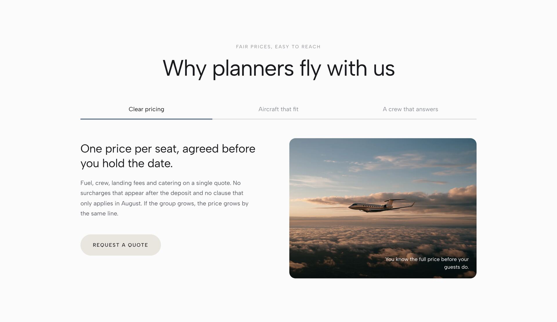
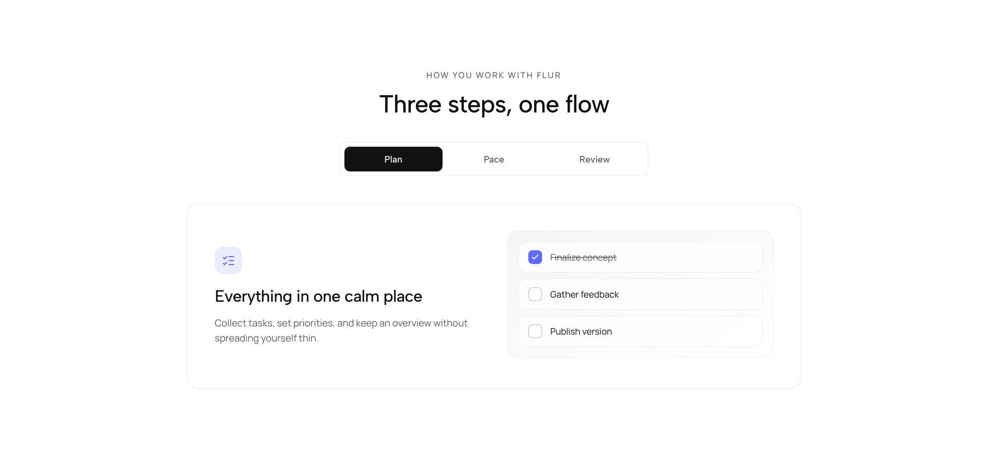
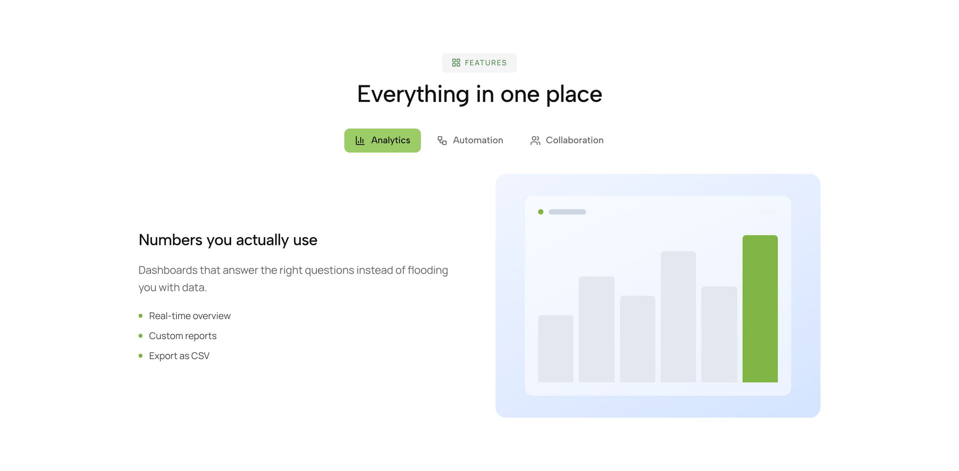
Presentations of product features and capabilities, including switchable feature tabs.
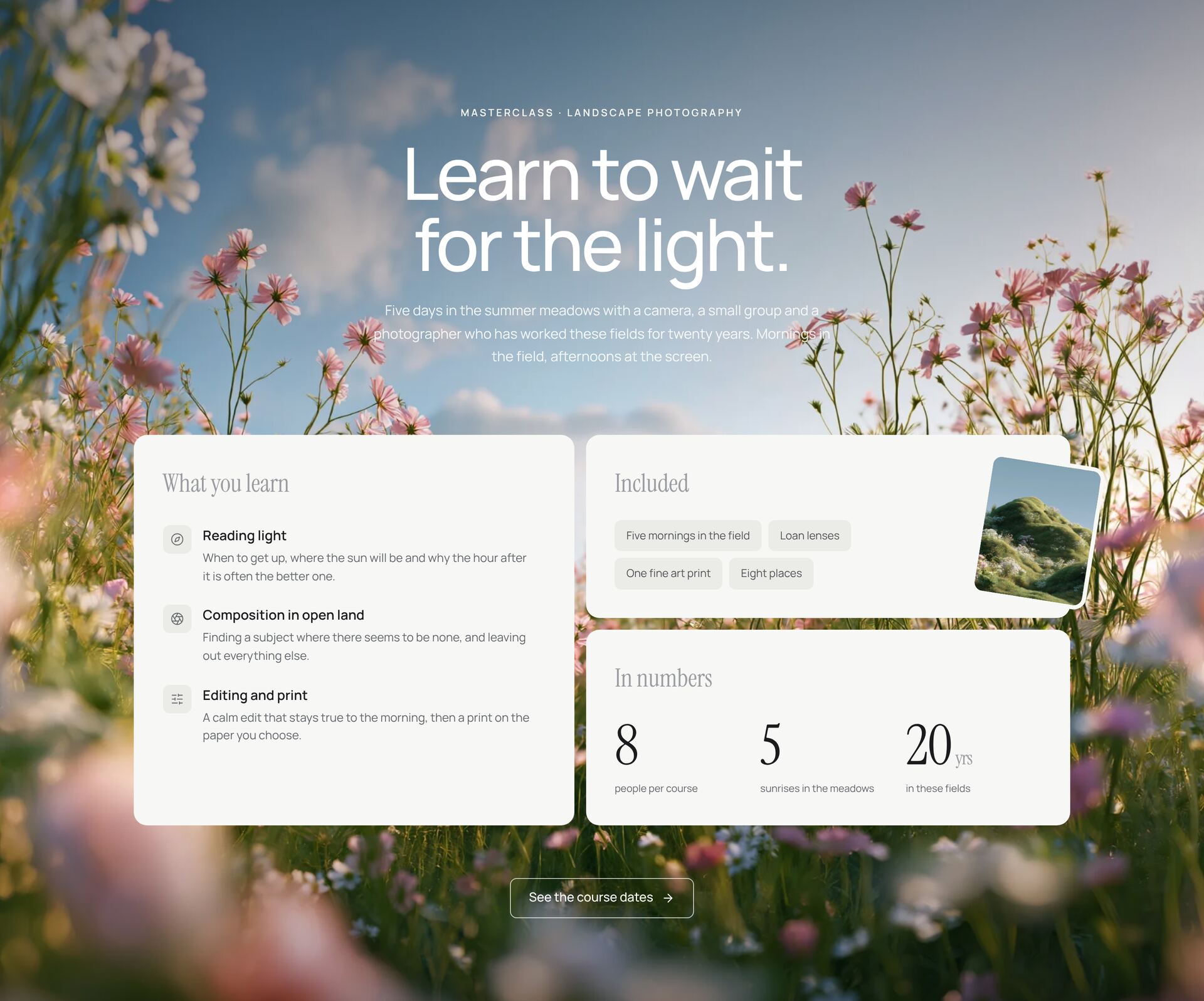
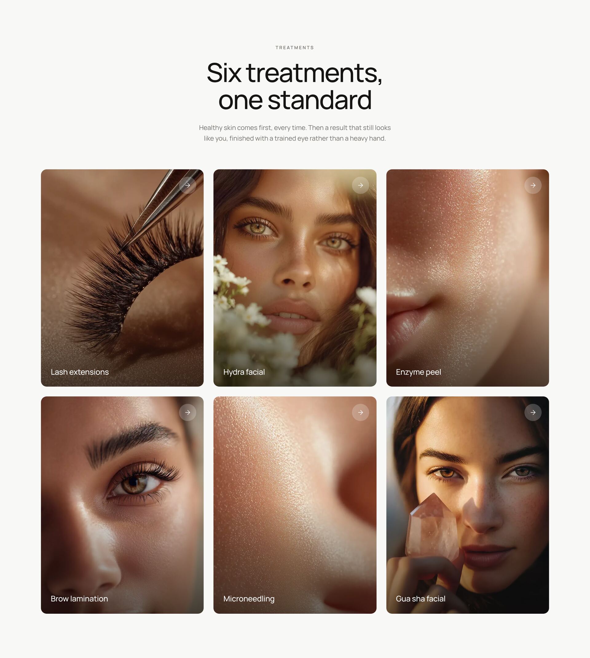
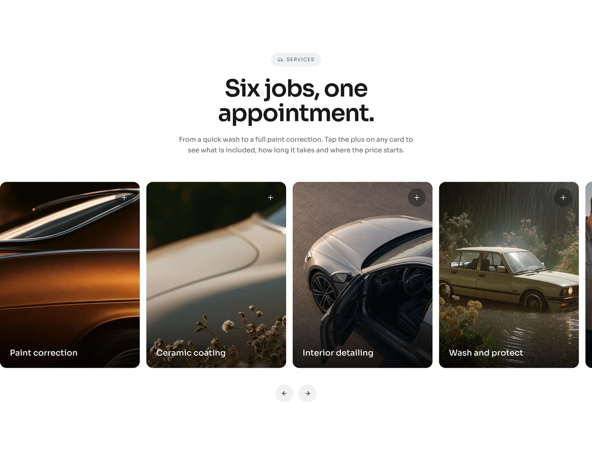
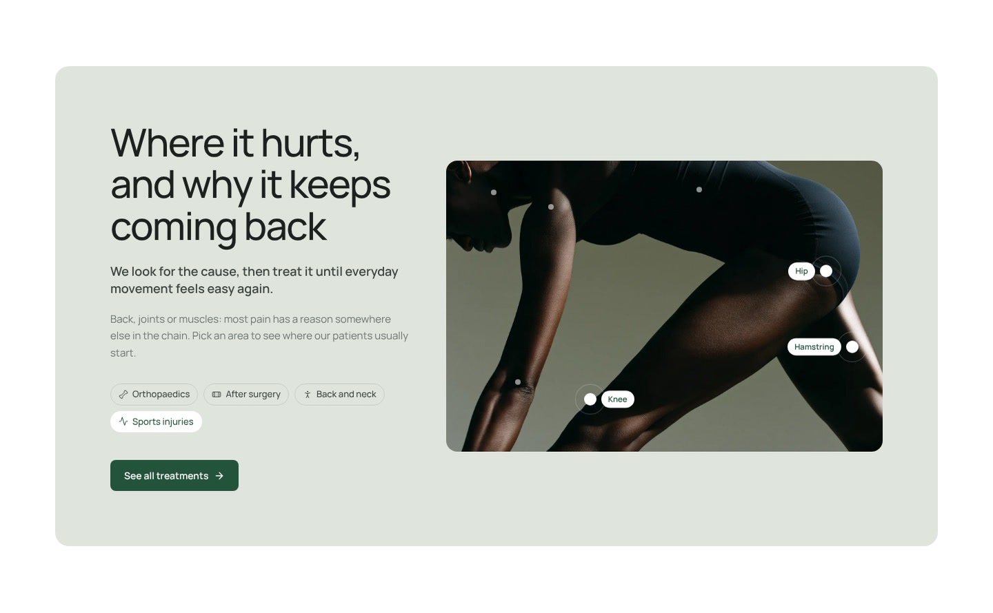




How do you present product features?
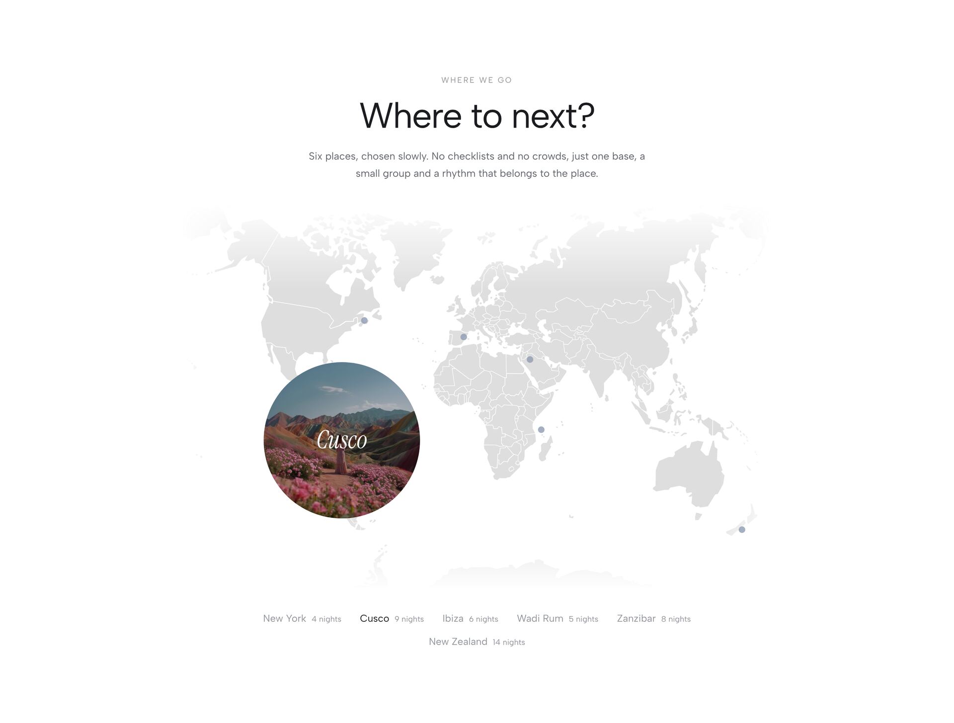
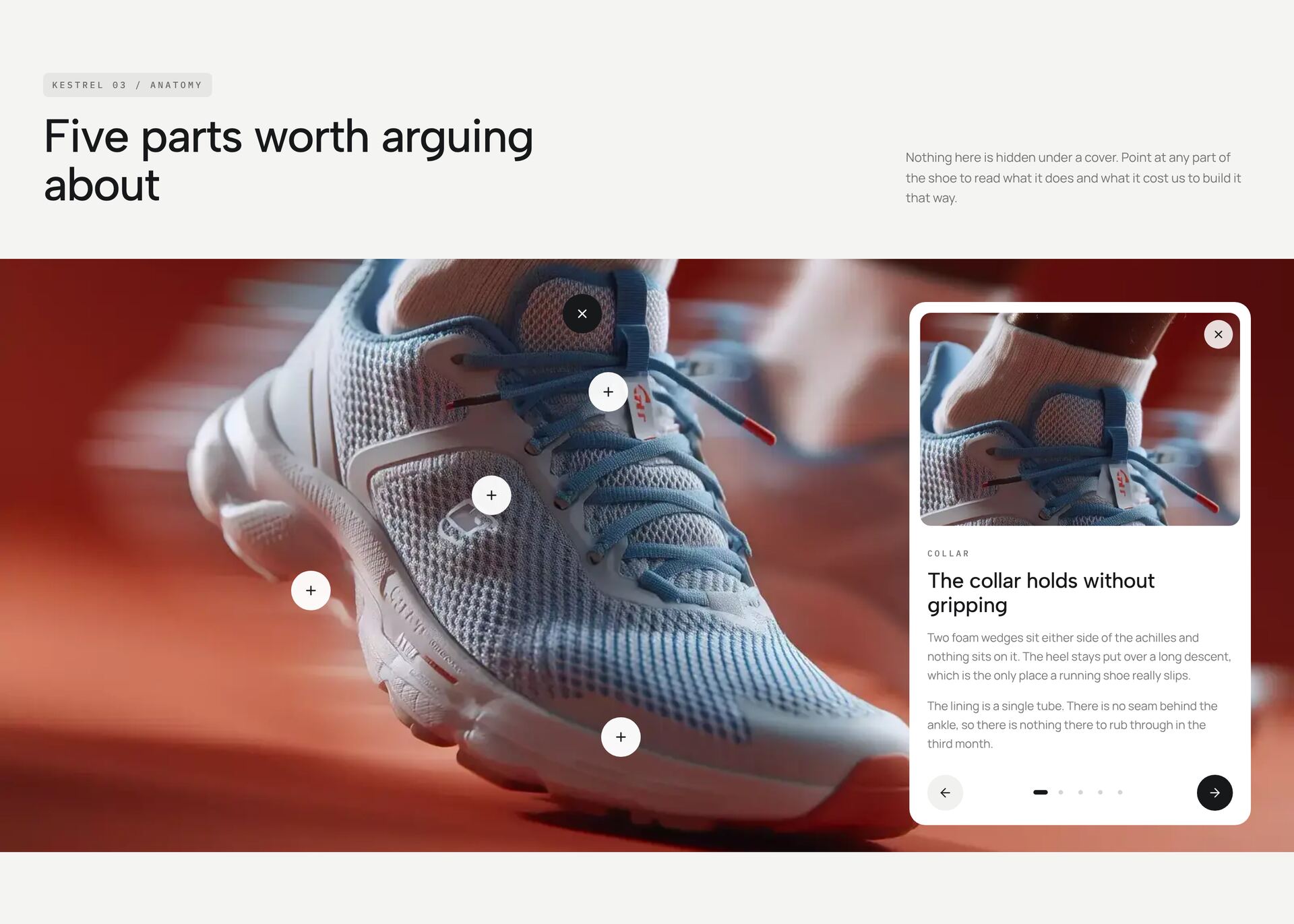
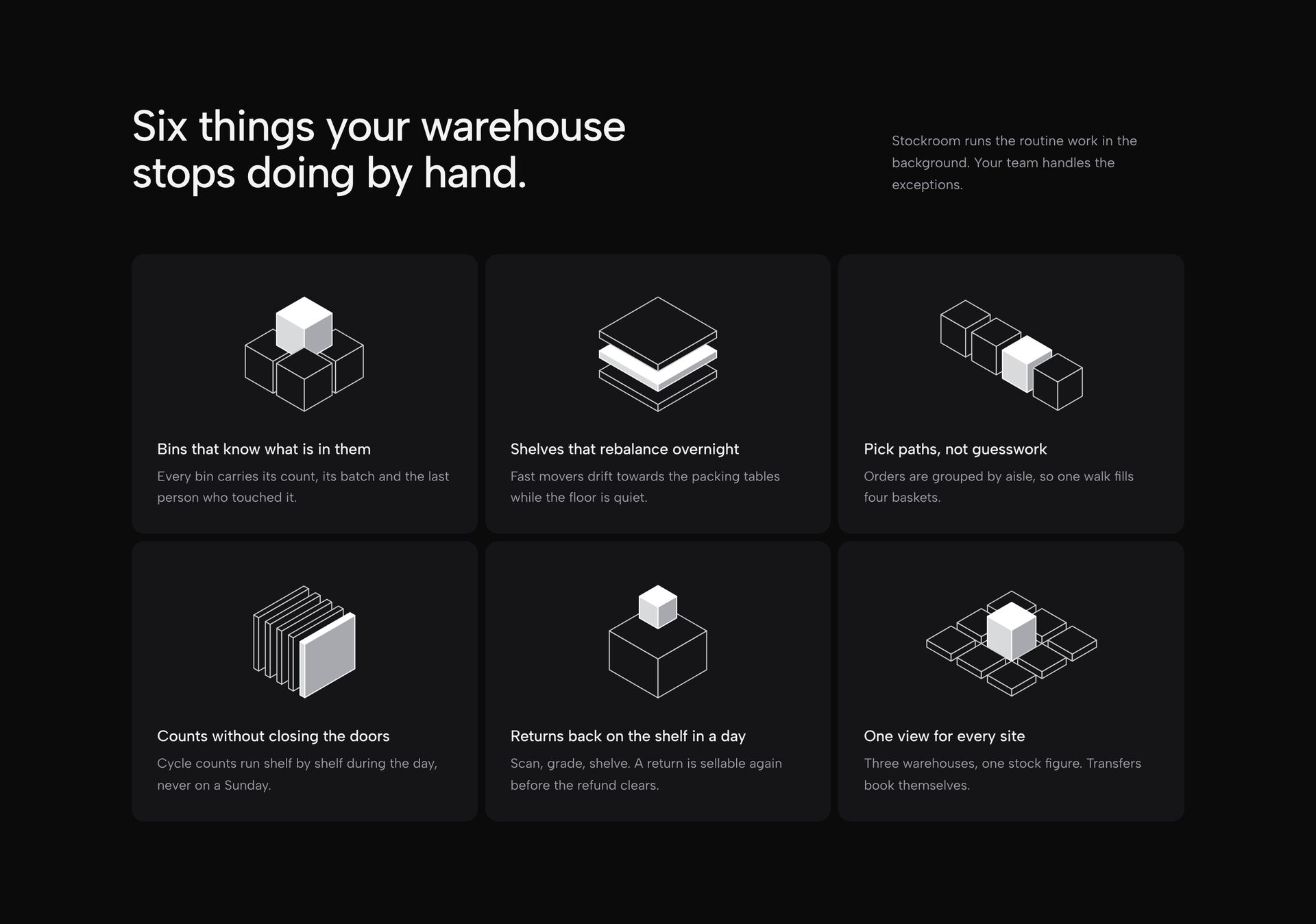
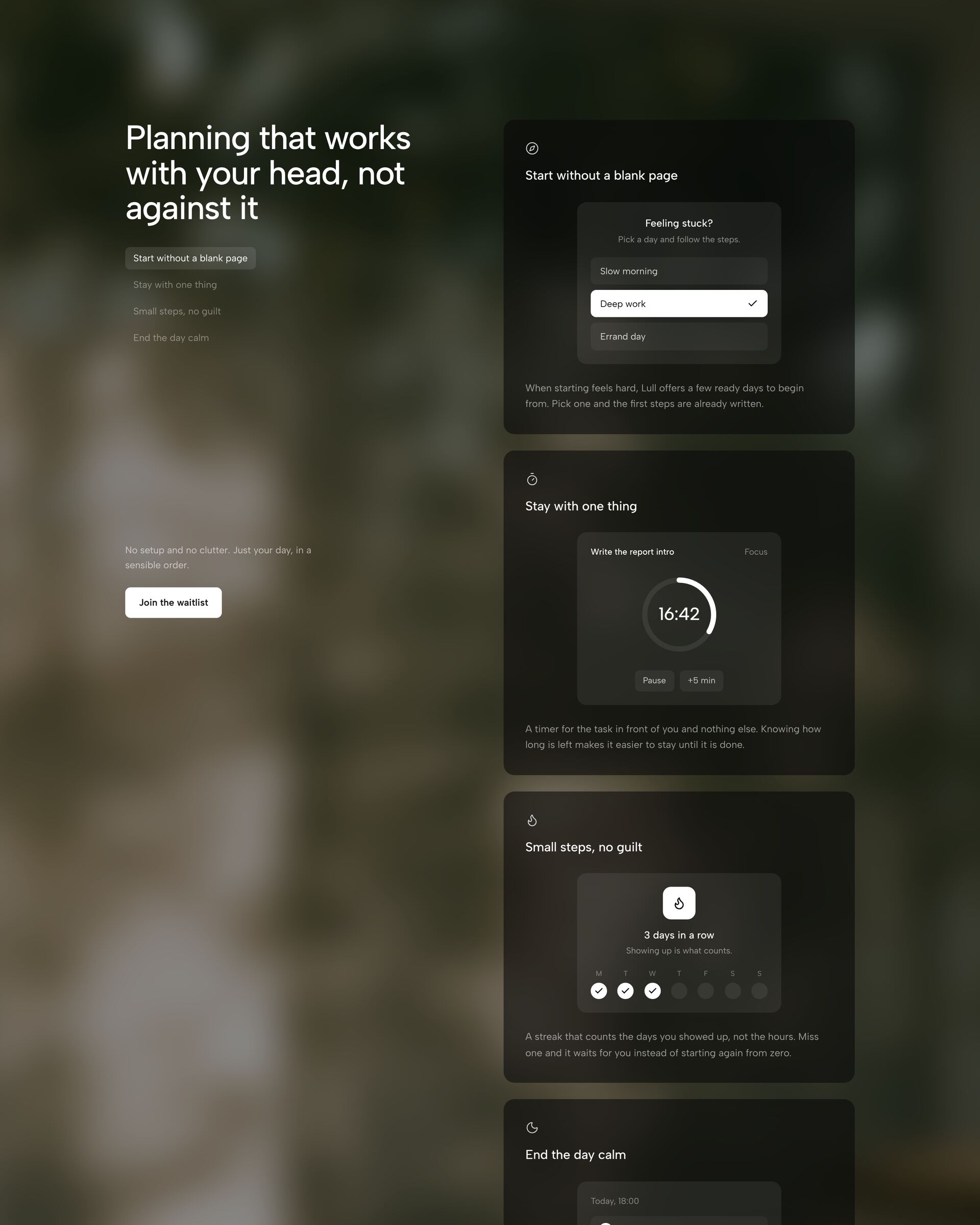
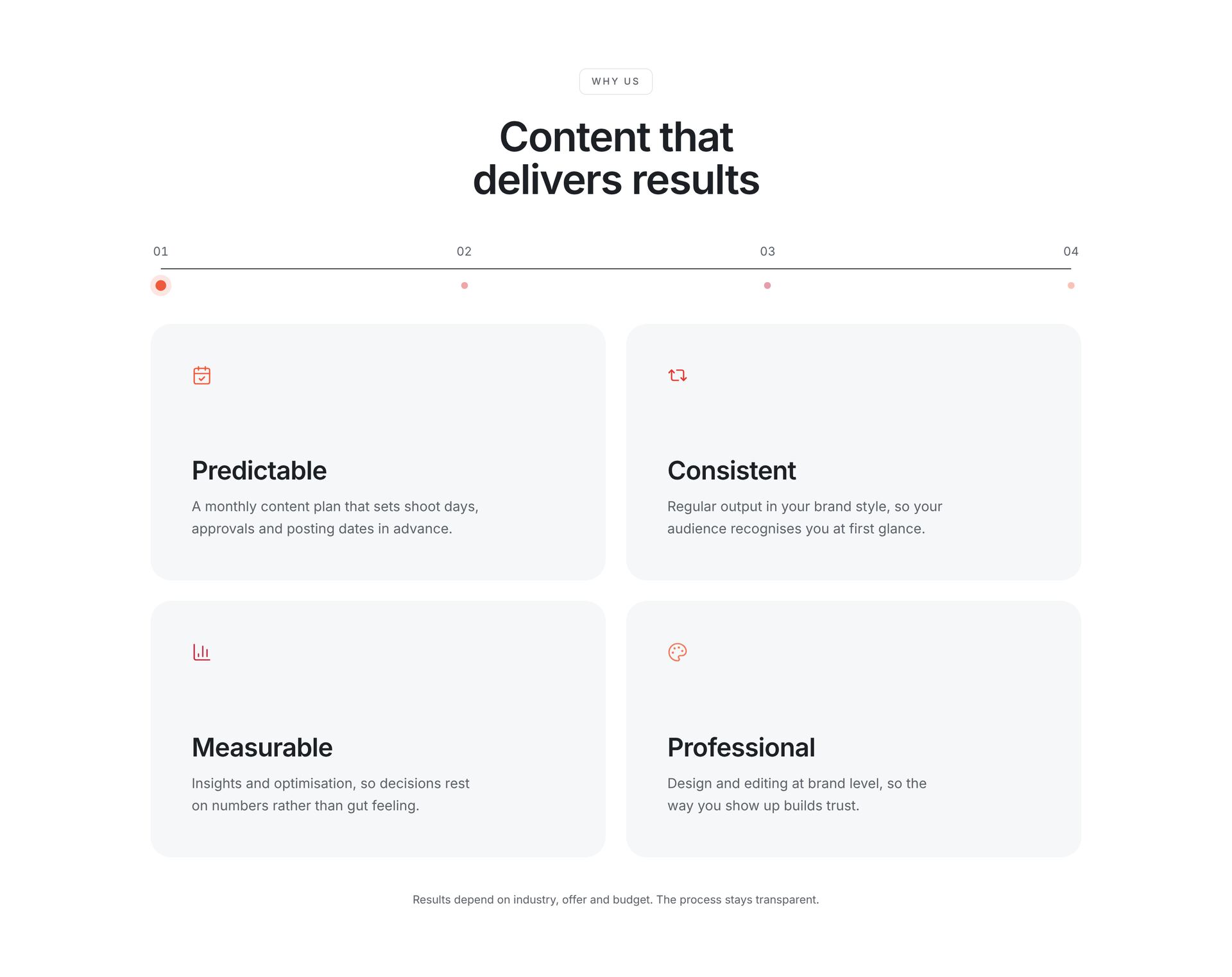
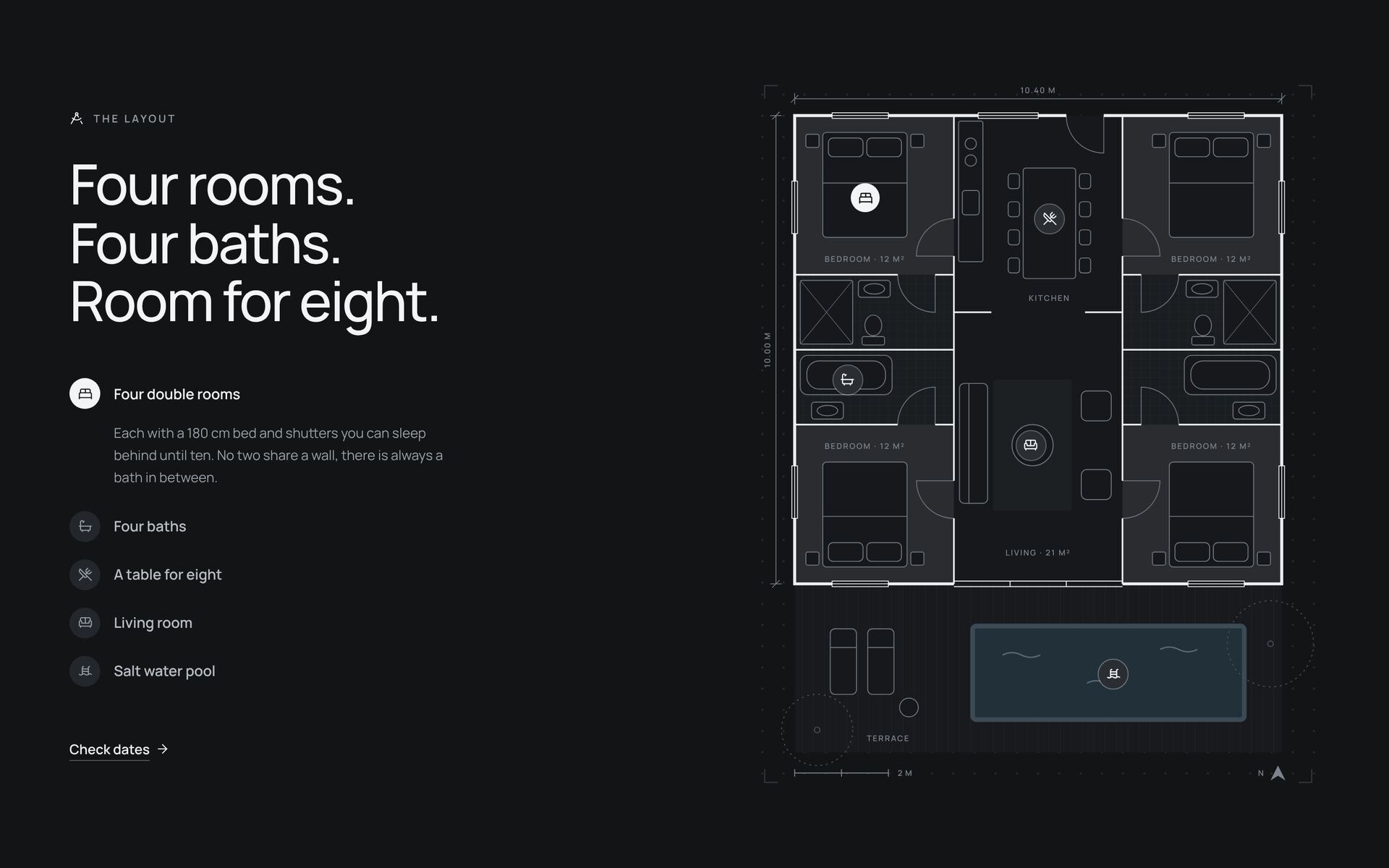
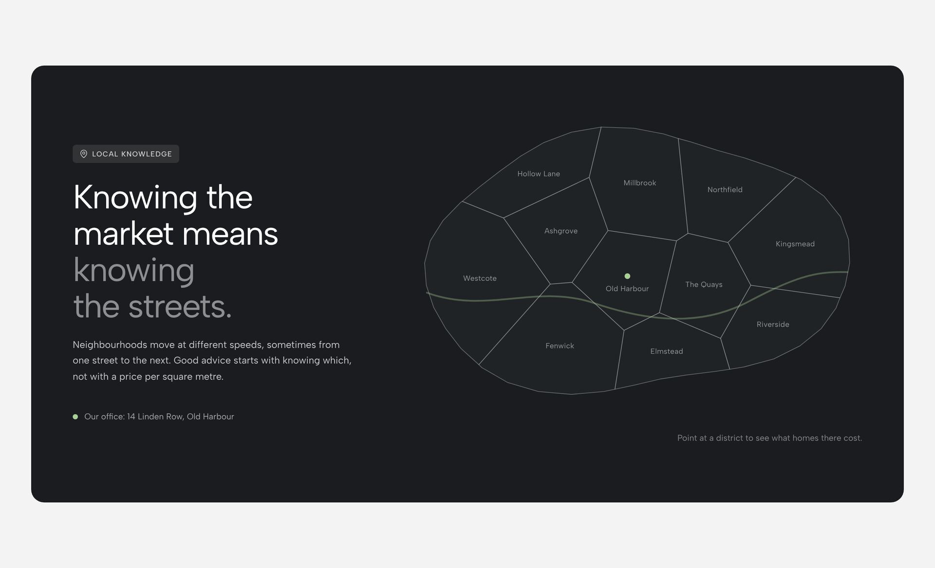
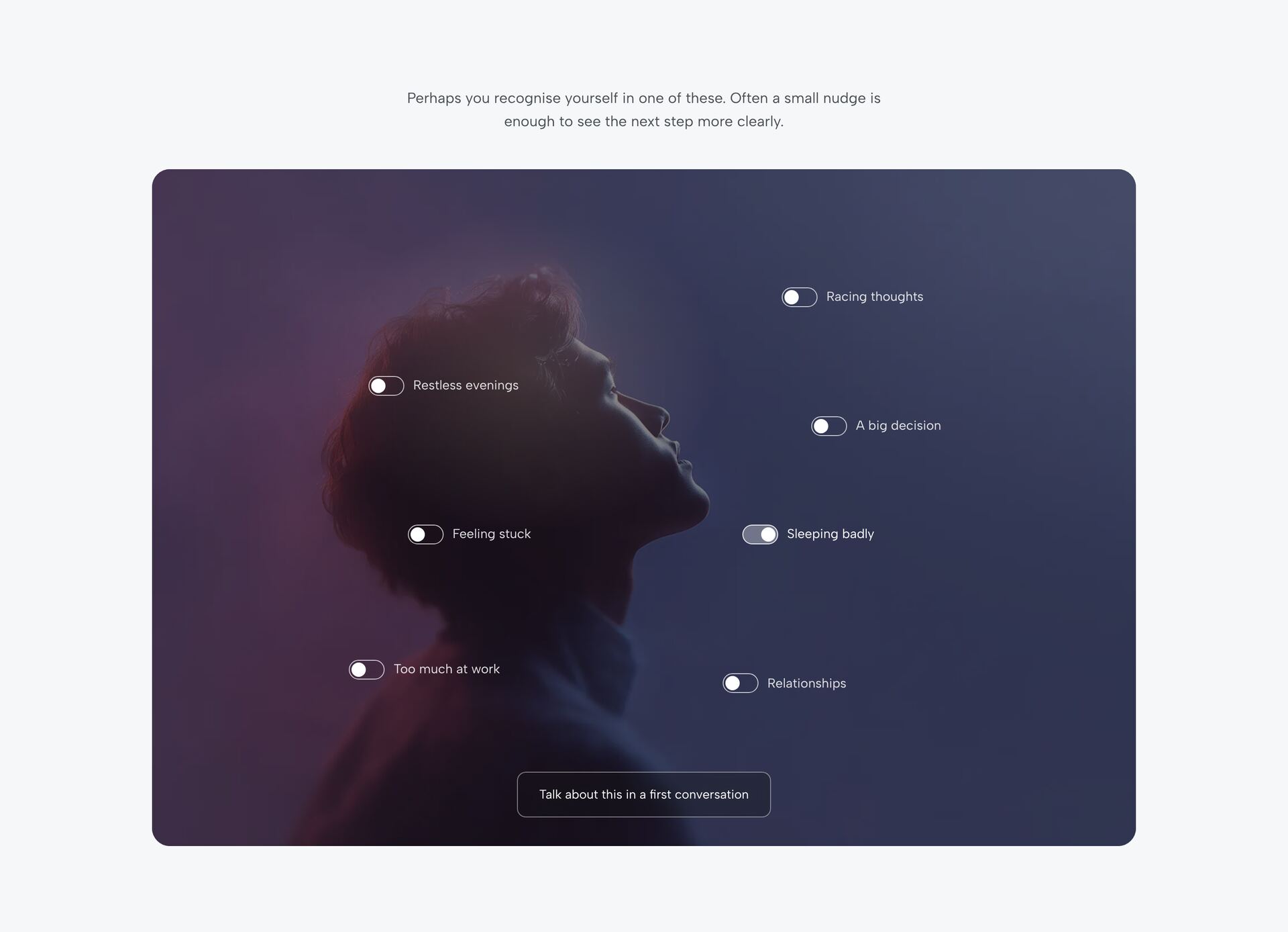
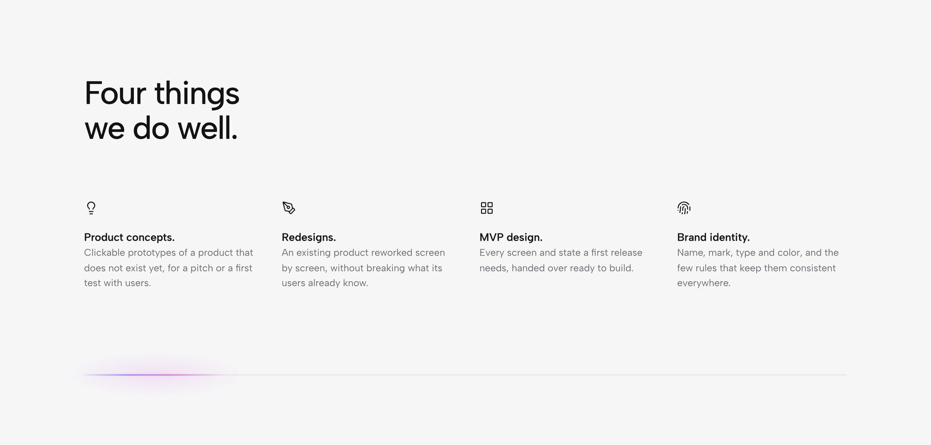
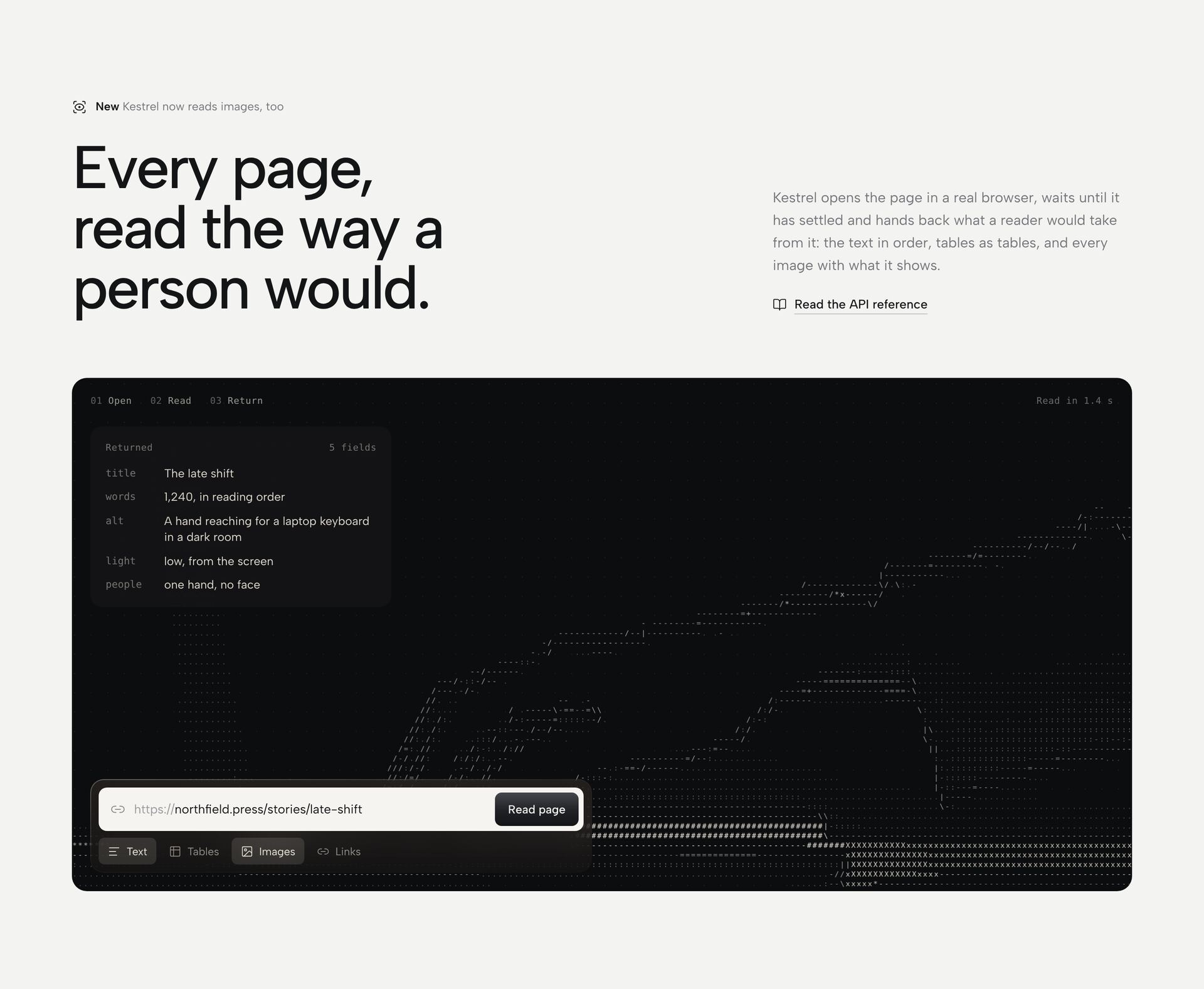
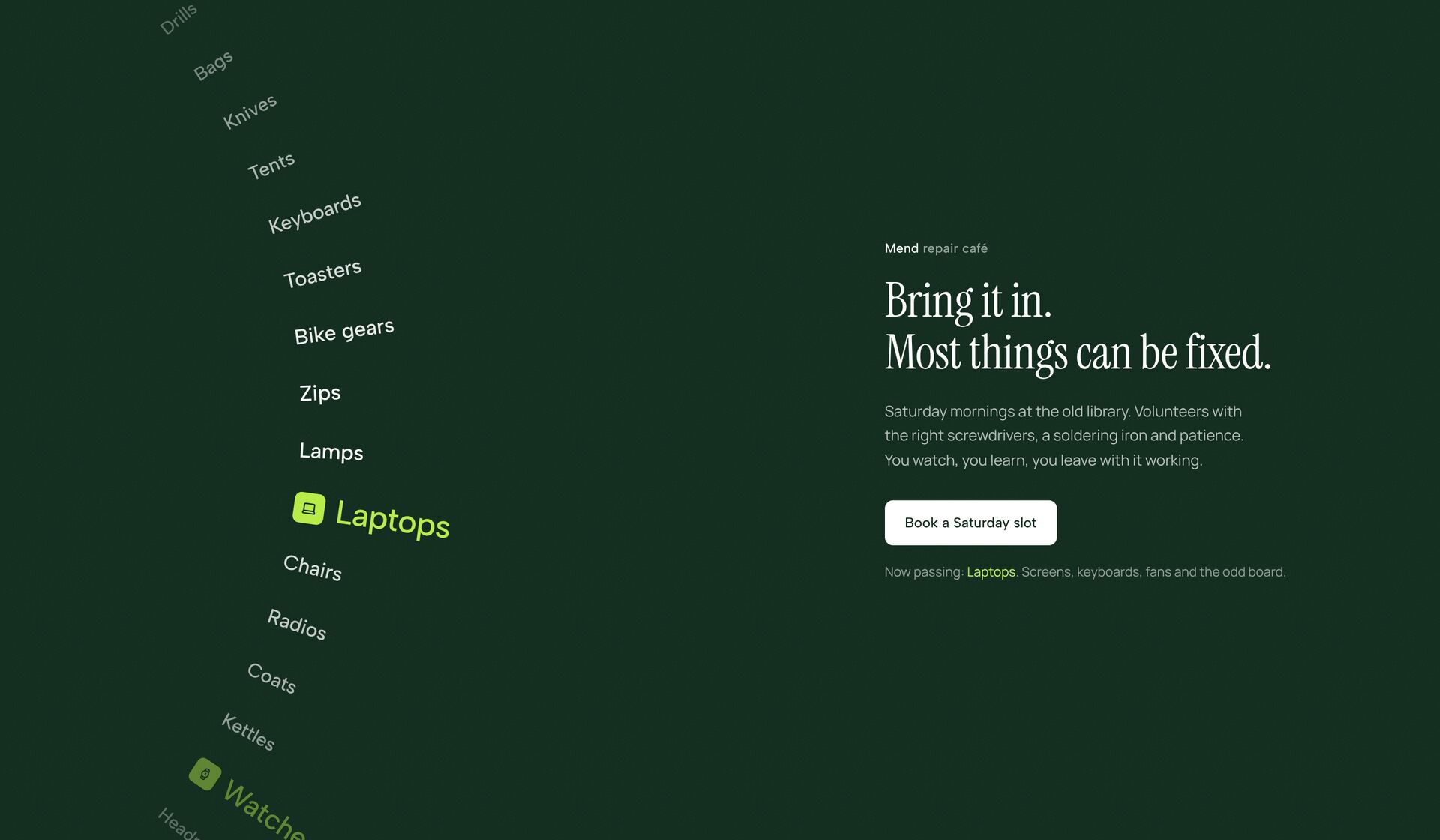
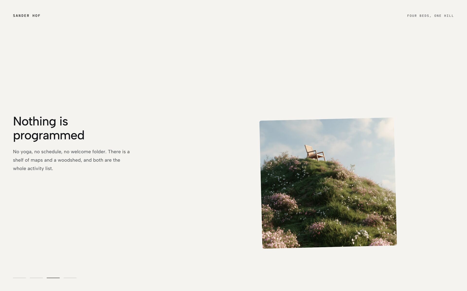
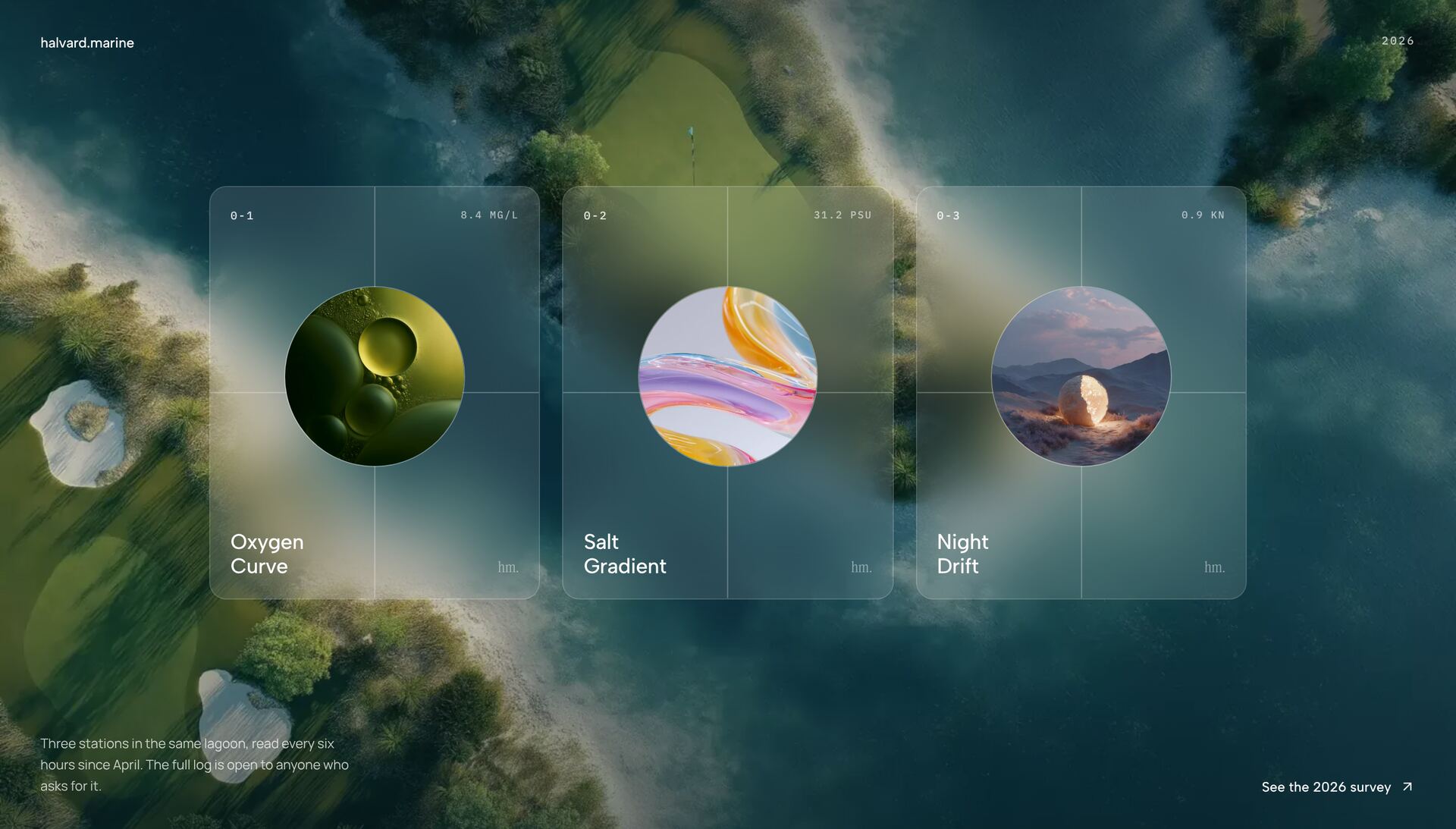
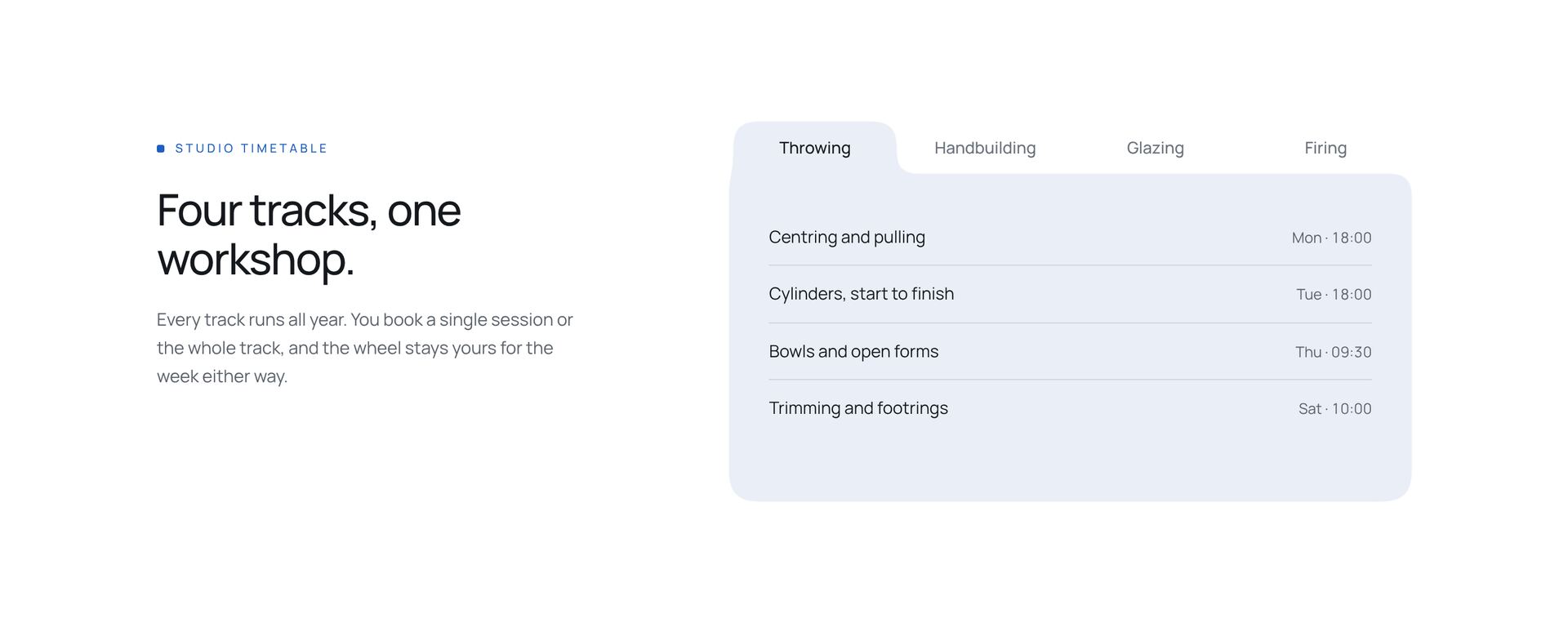
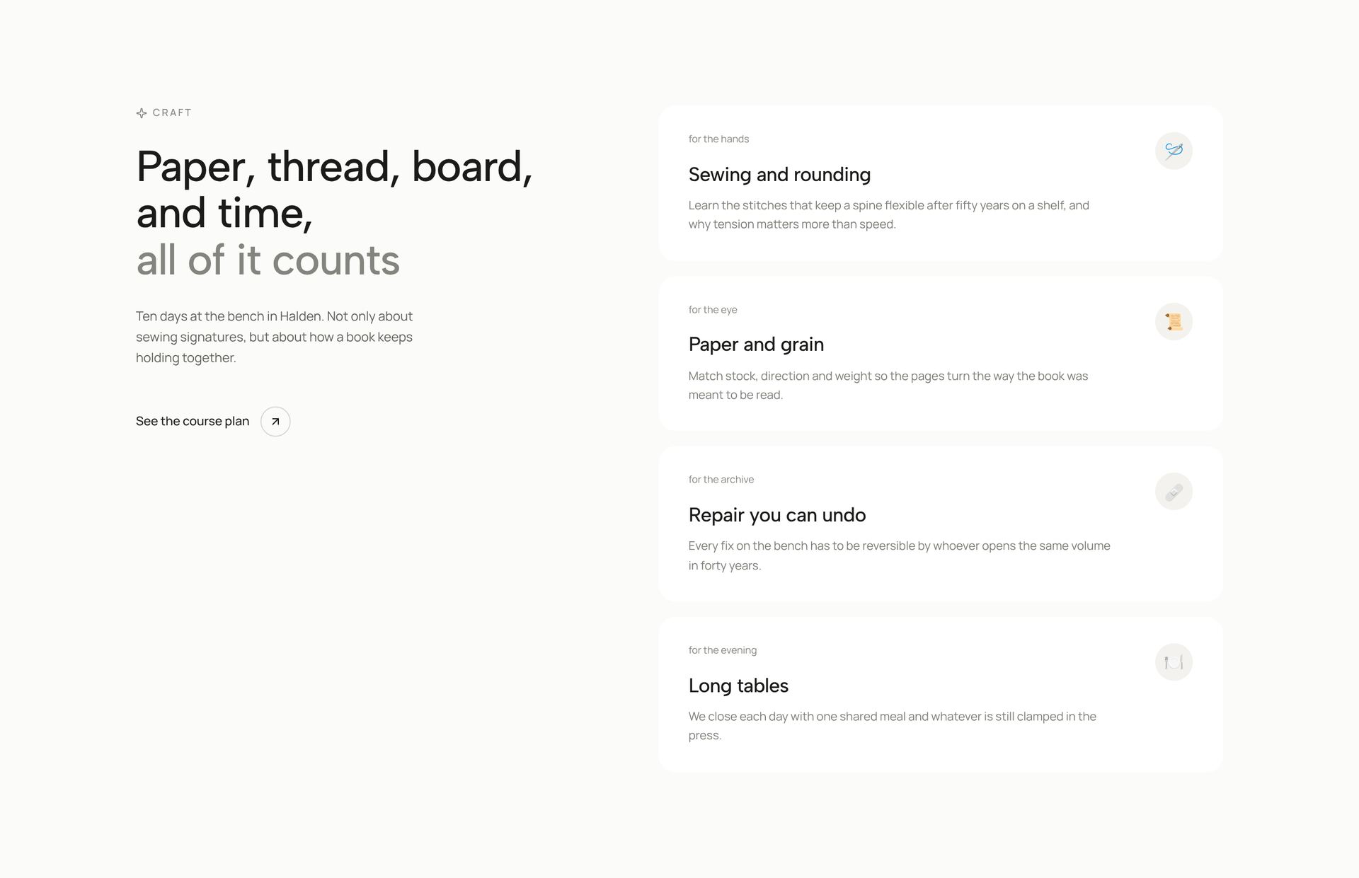
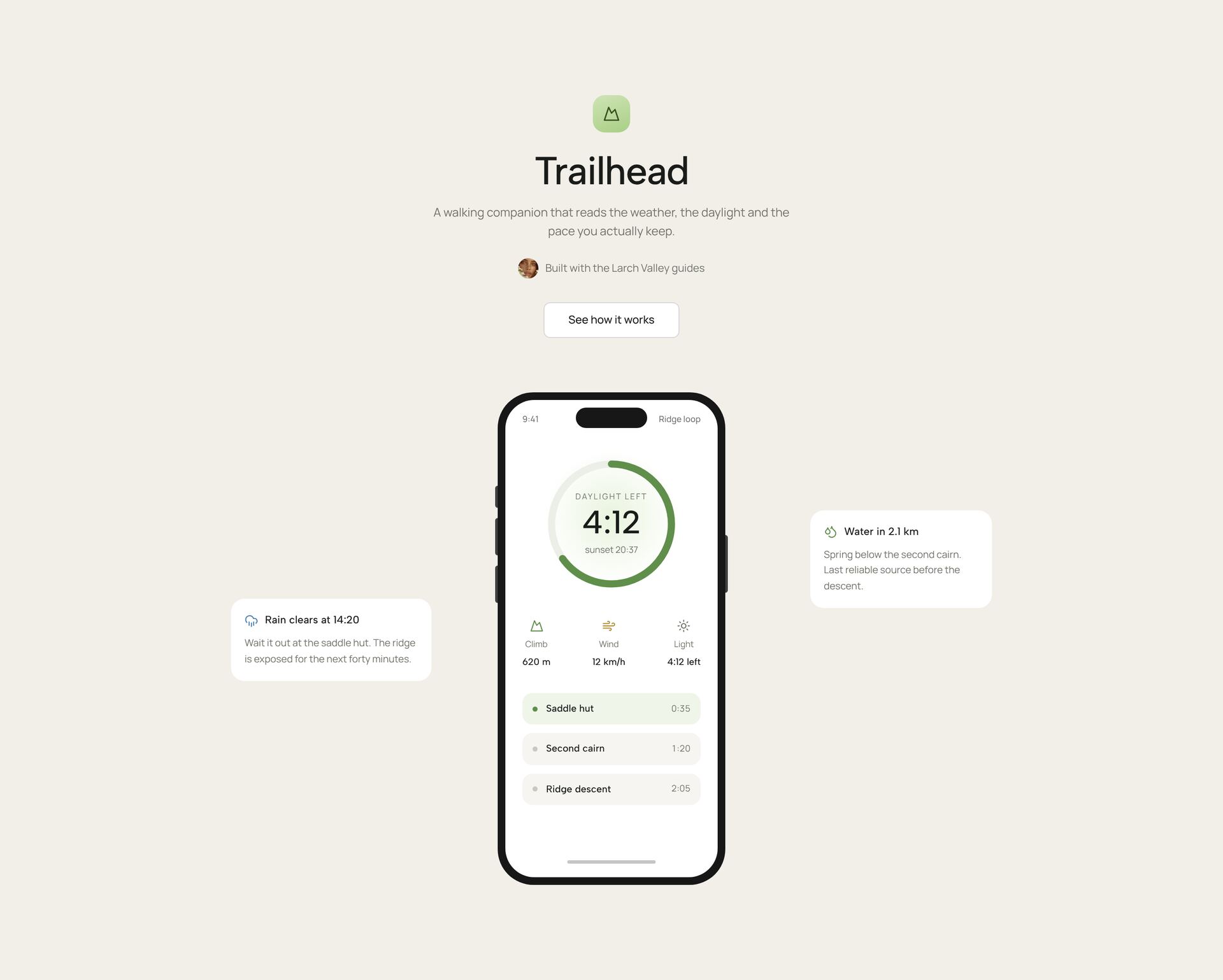
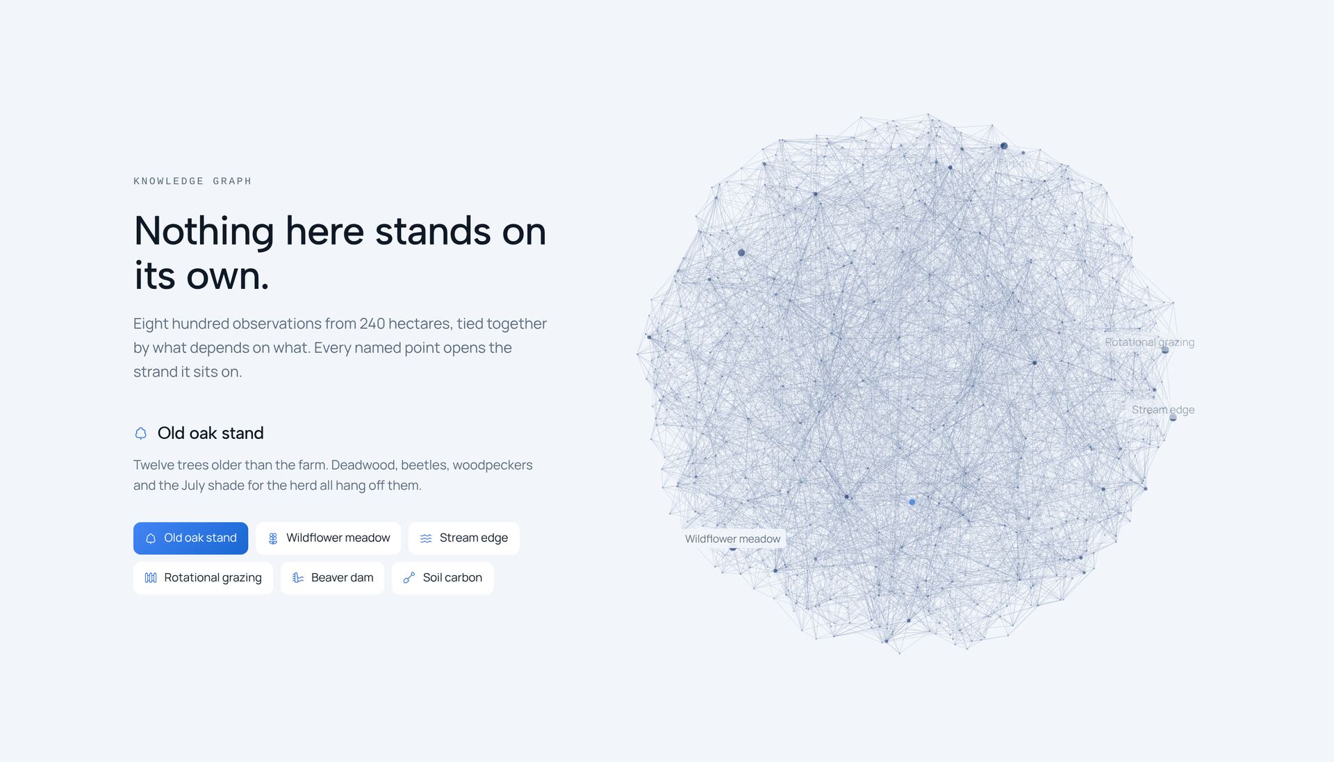
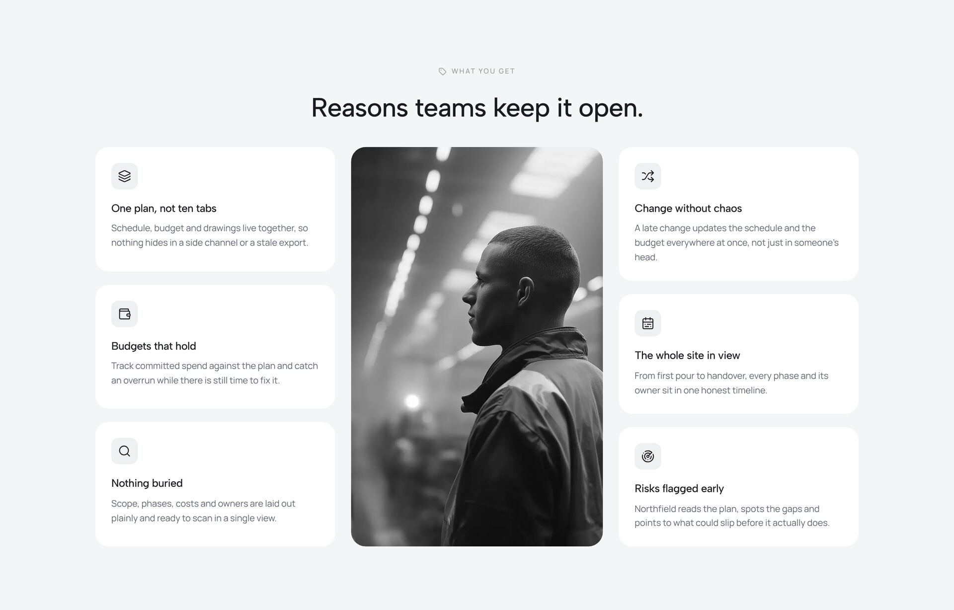
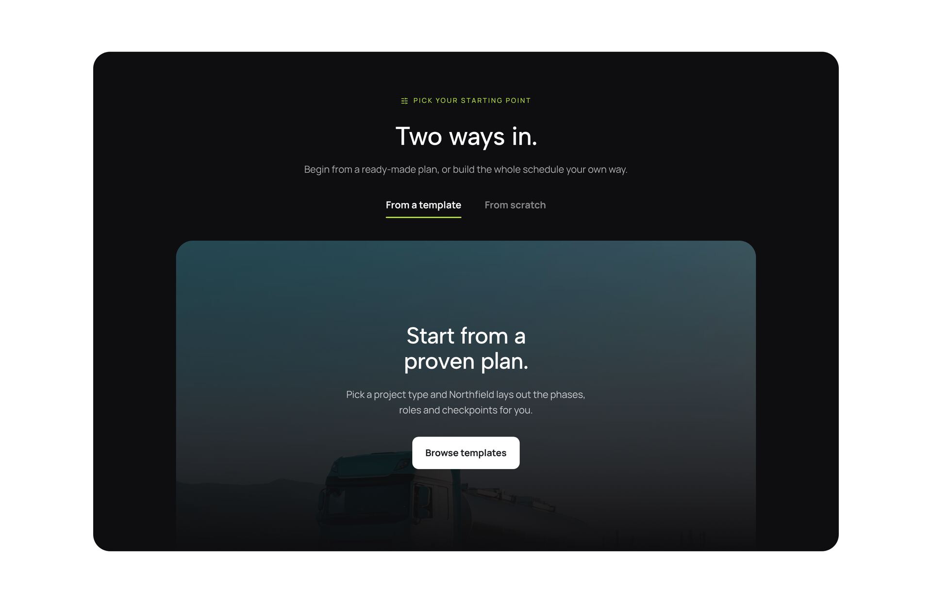
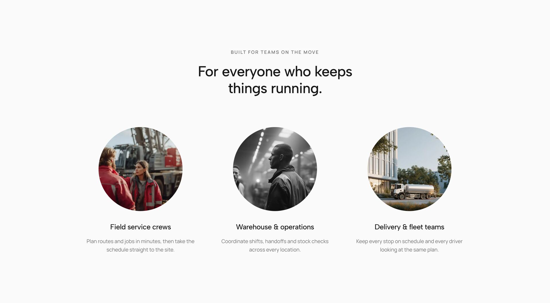
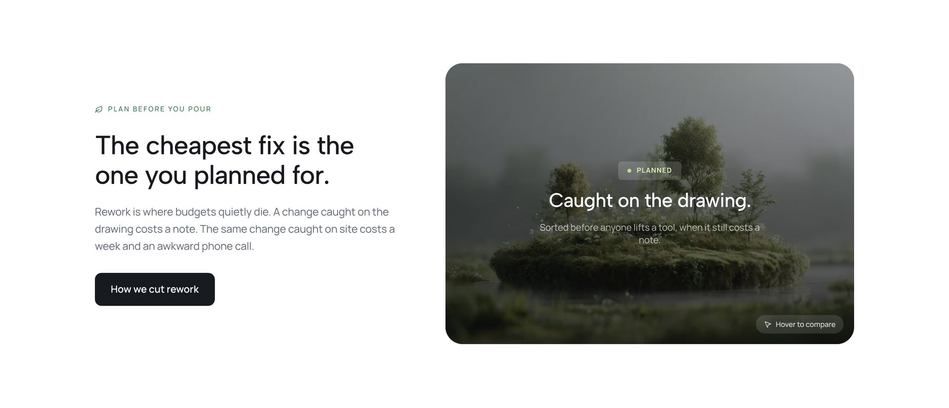
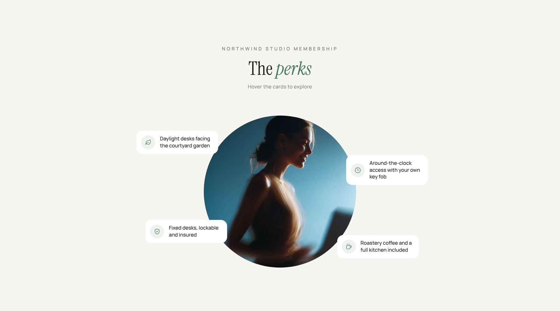
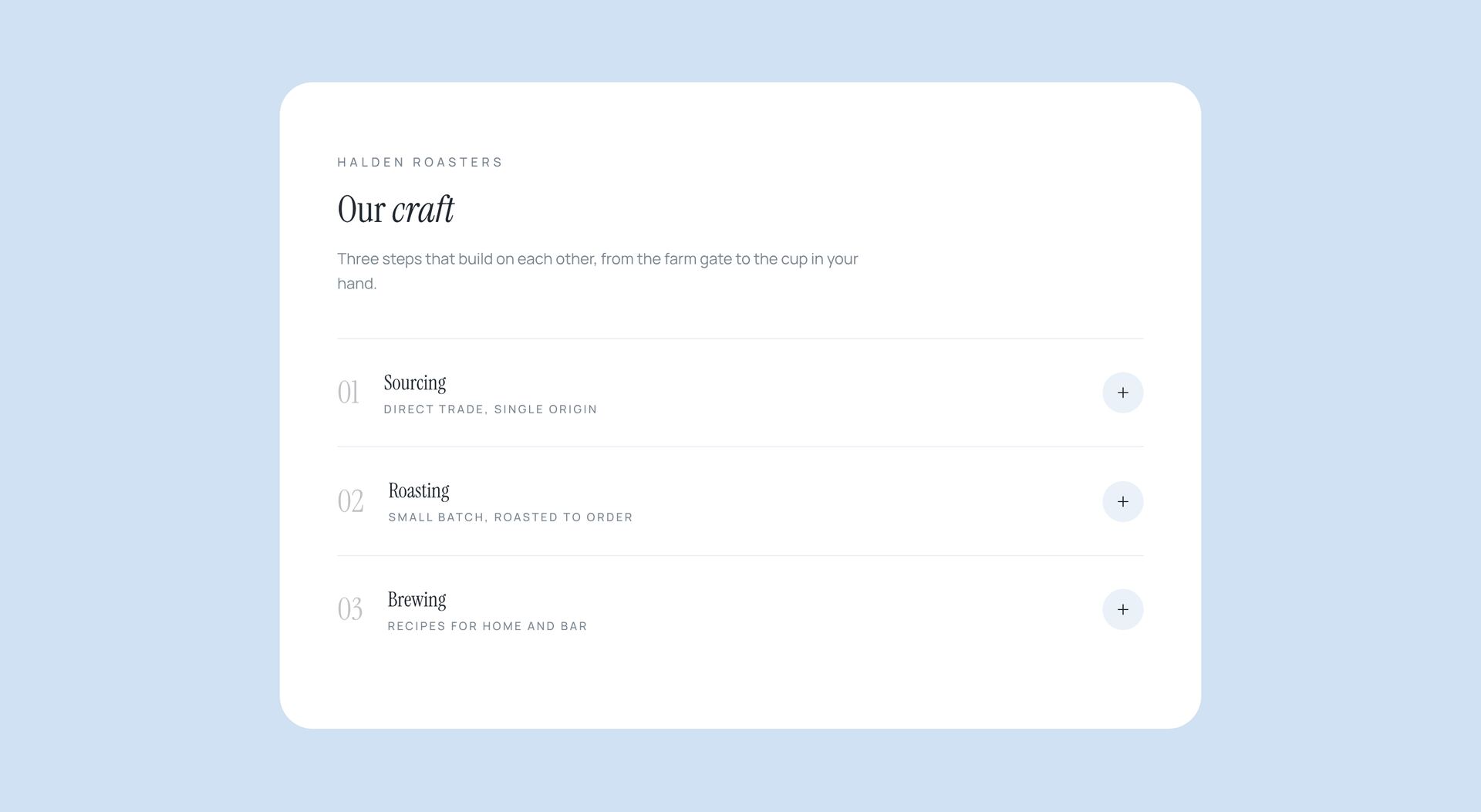
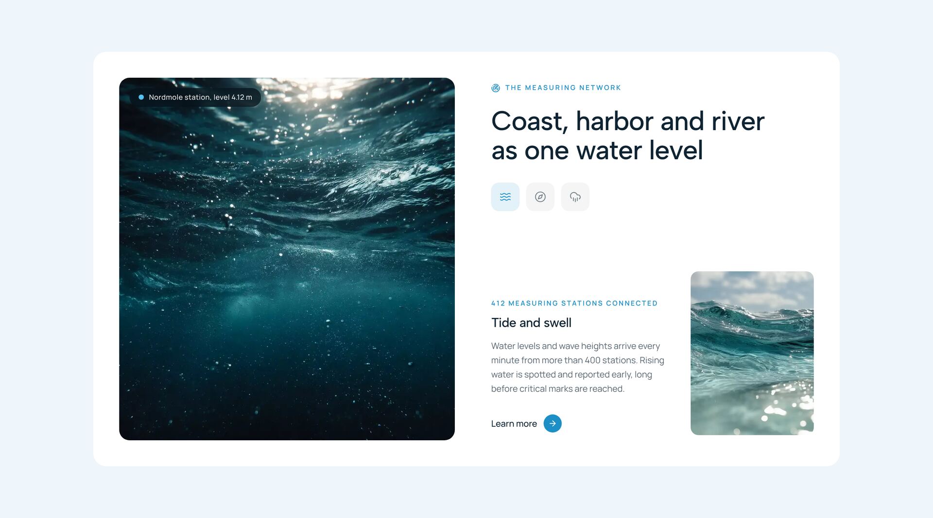
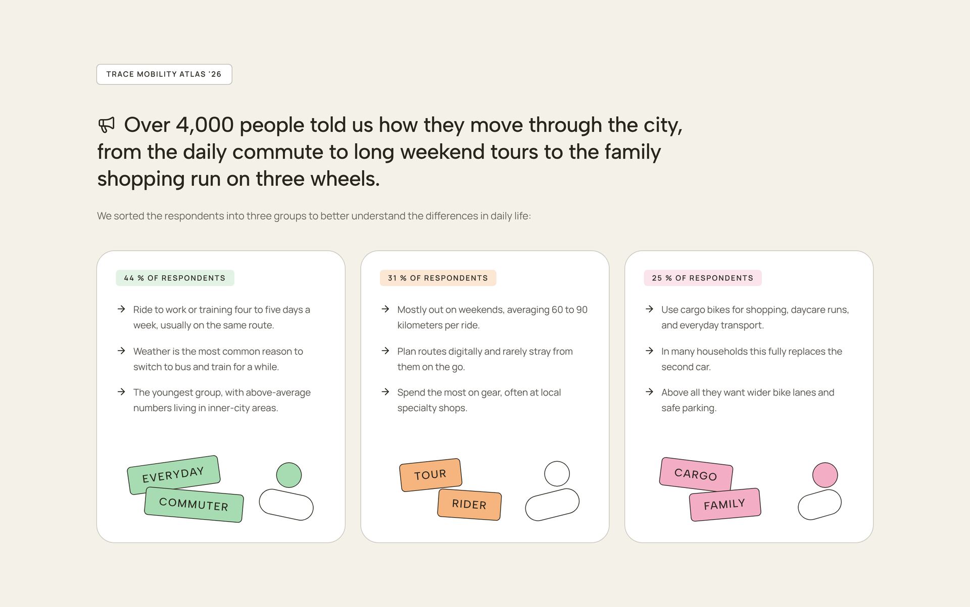
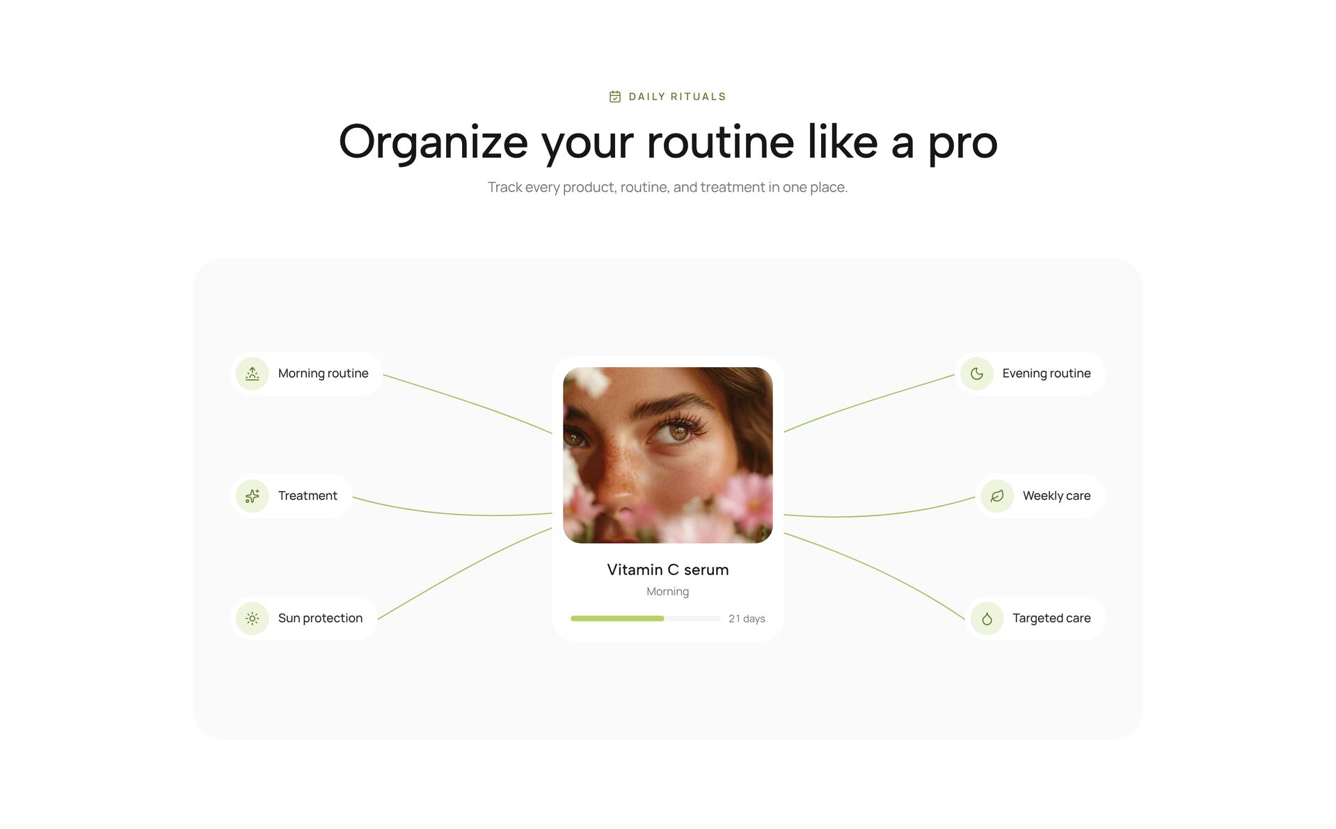
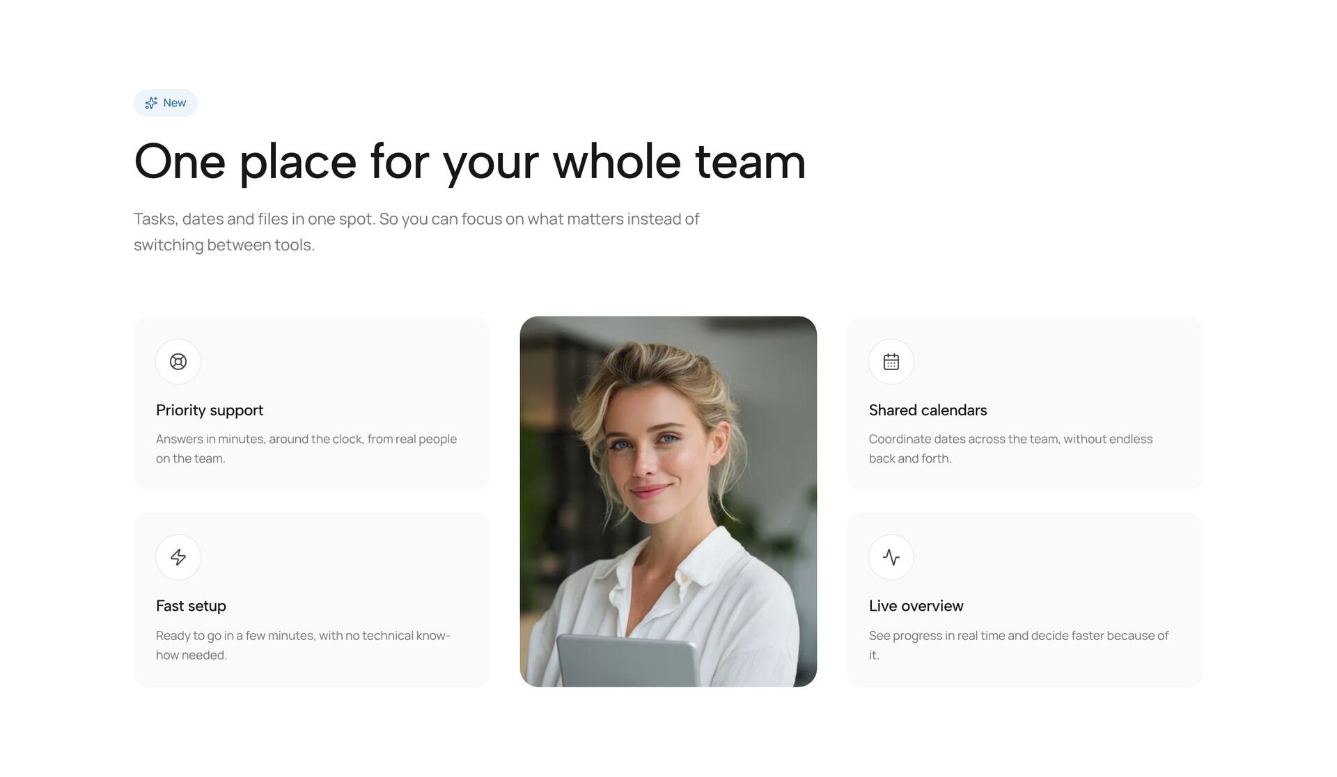
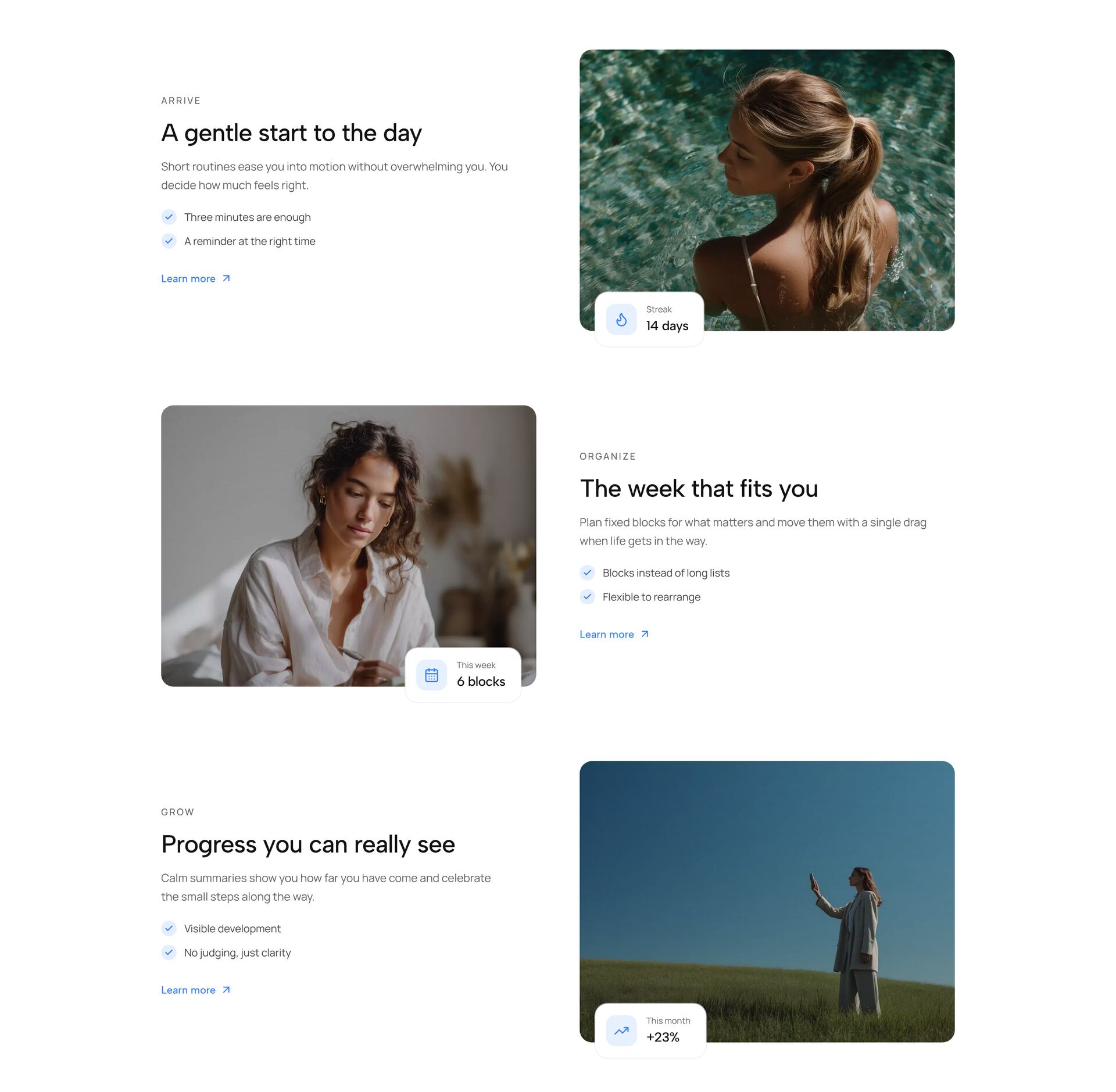
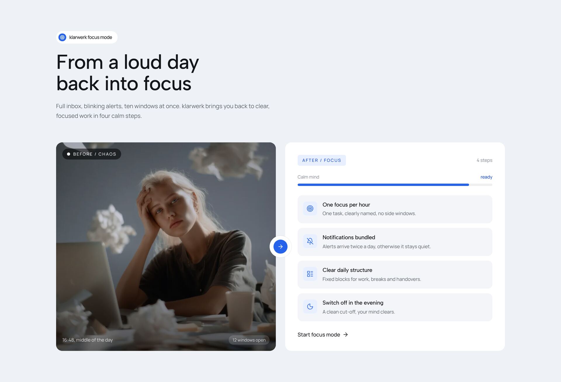
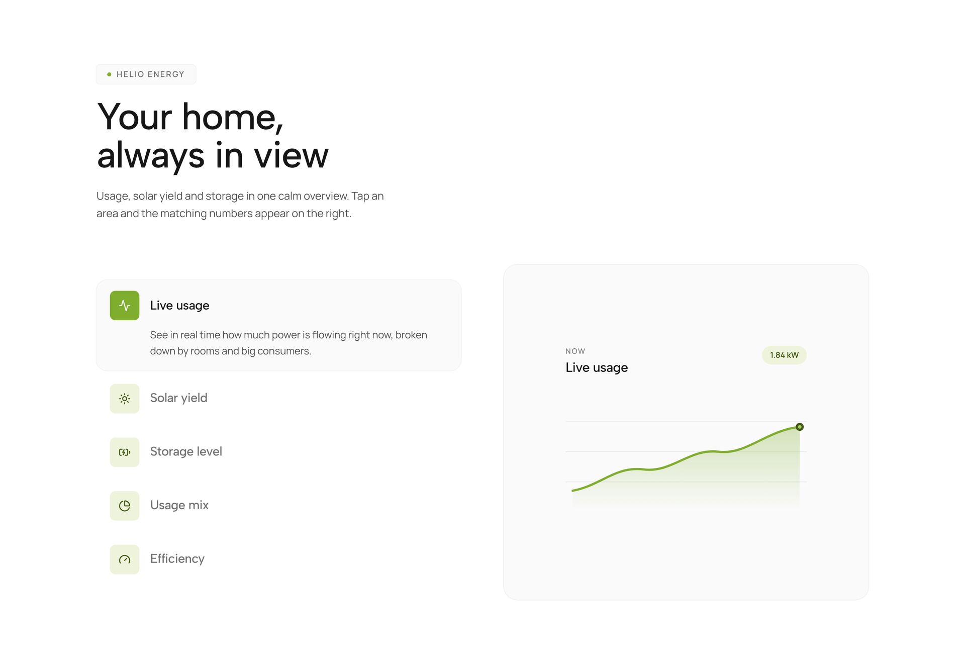
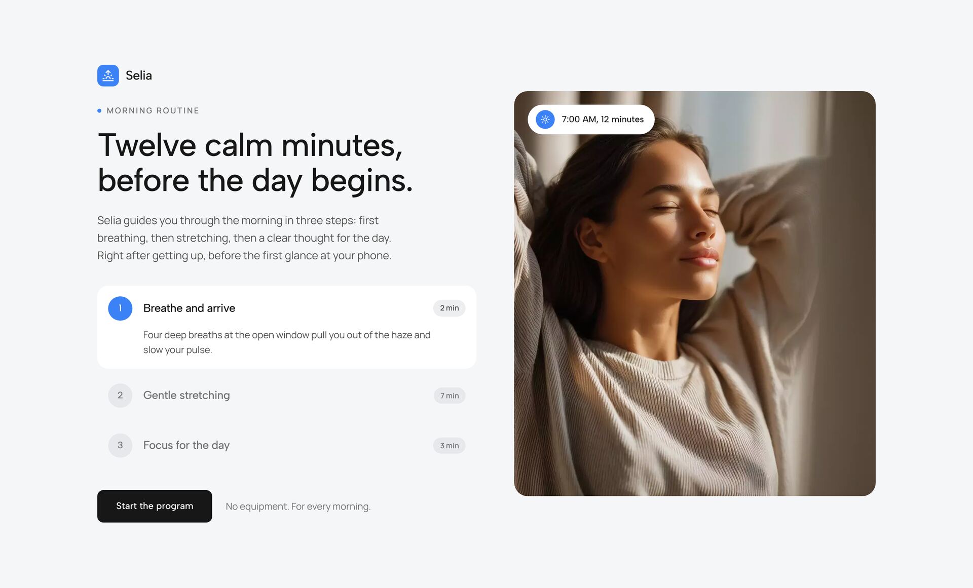
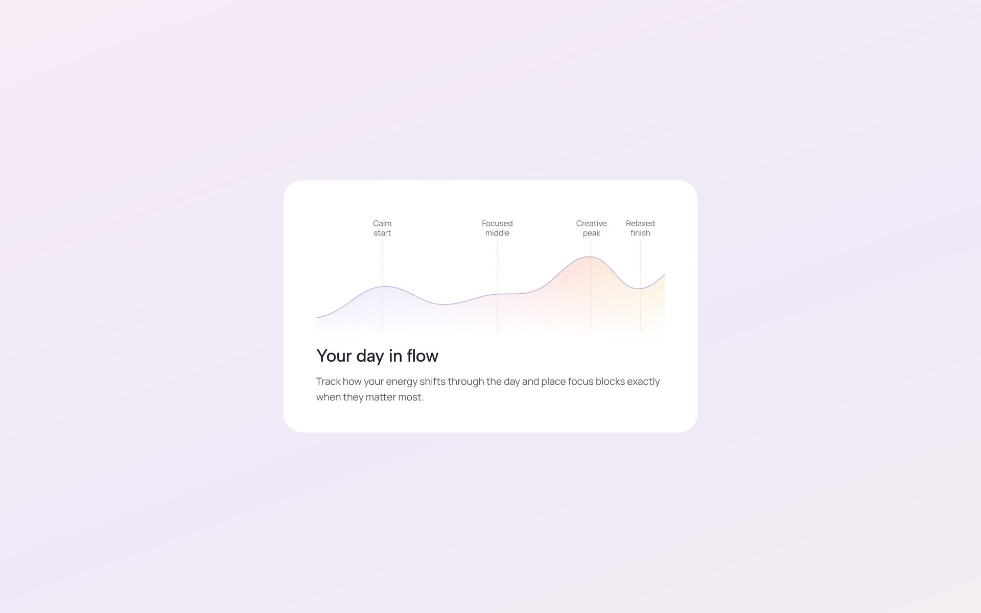
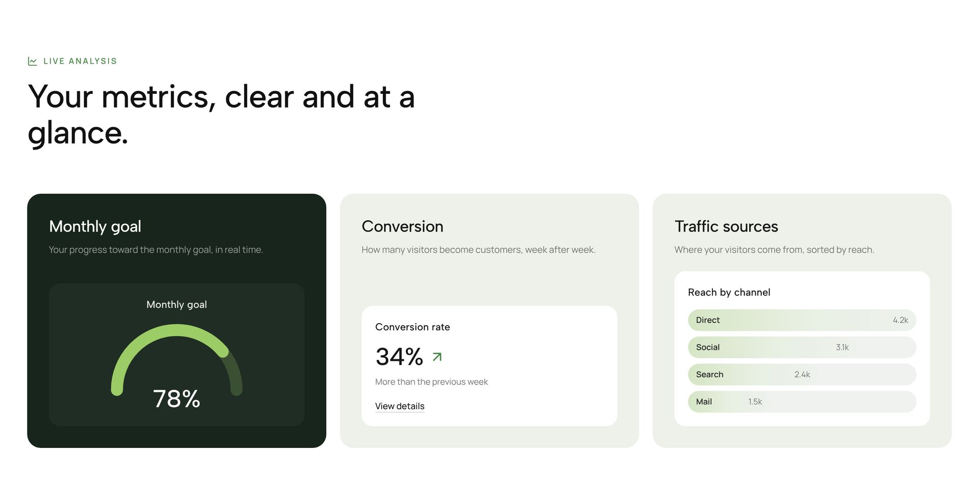
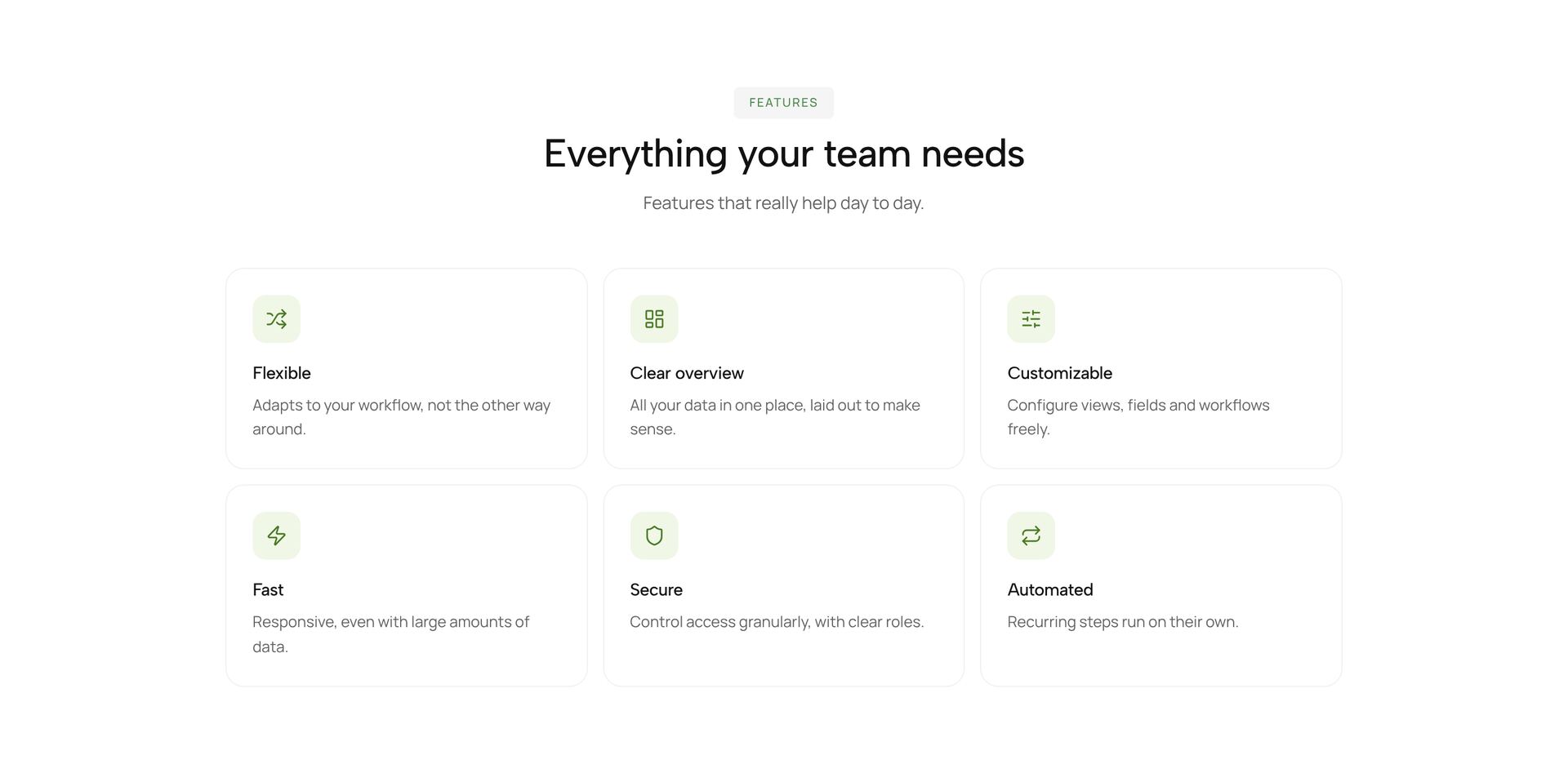
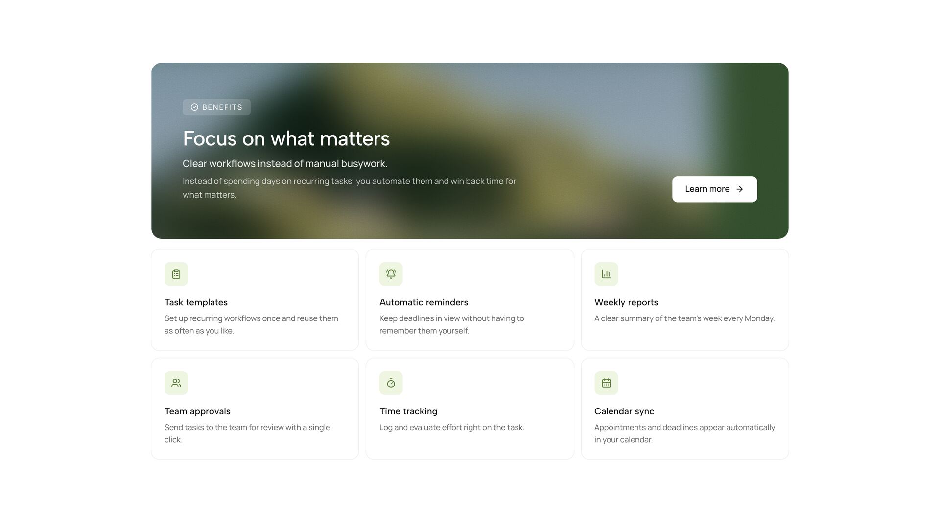
A feature section explains what a product does and why that matters to the person reading. The sections here cover most ways of showing it: tabs that switch between functions, a product image with hotspots, cards that open on hover, a scroll tour through a floor plan, before and after comparisons, alternating text and image blocks, and grids with icons.
Lead with the benefit and put the feature second: “Invoices go out on the first of the month” says more than “Automated billing”. Three to six features per section are easy to take in; more belong in tabs or a second section. Each section is one React file using Tailwind CSS, framer-motion and lucide icons, so you replace text, icons and images without touching the layout.
Related guides

More section categories
Frequently asked questions
Three to six. Beyond that, readers skim and stop comparing. Group the rest into tabs or a second section with a different layout.
Images when the feature is visible, such as a screen or a product detail. Icons when it is abstract, such as security or speed. Mixing both in one grid looks uneven.
Yes. Screenshots are plain image URLs in the file. Use images at twice the displayed size so they stay sharp on high-resolution screens.
Didn't find your question? We're happy to help.
Get in touch