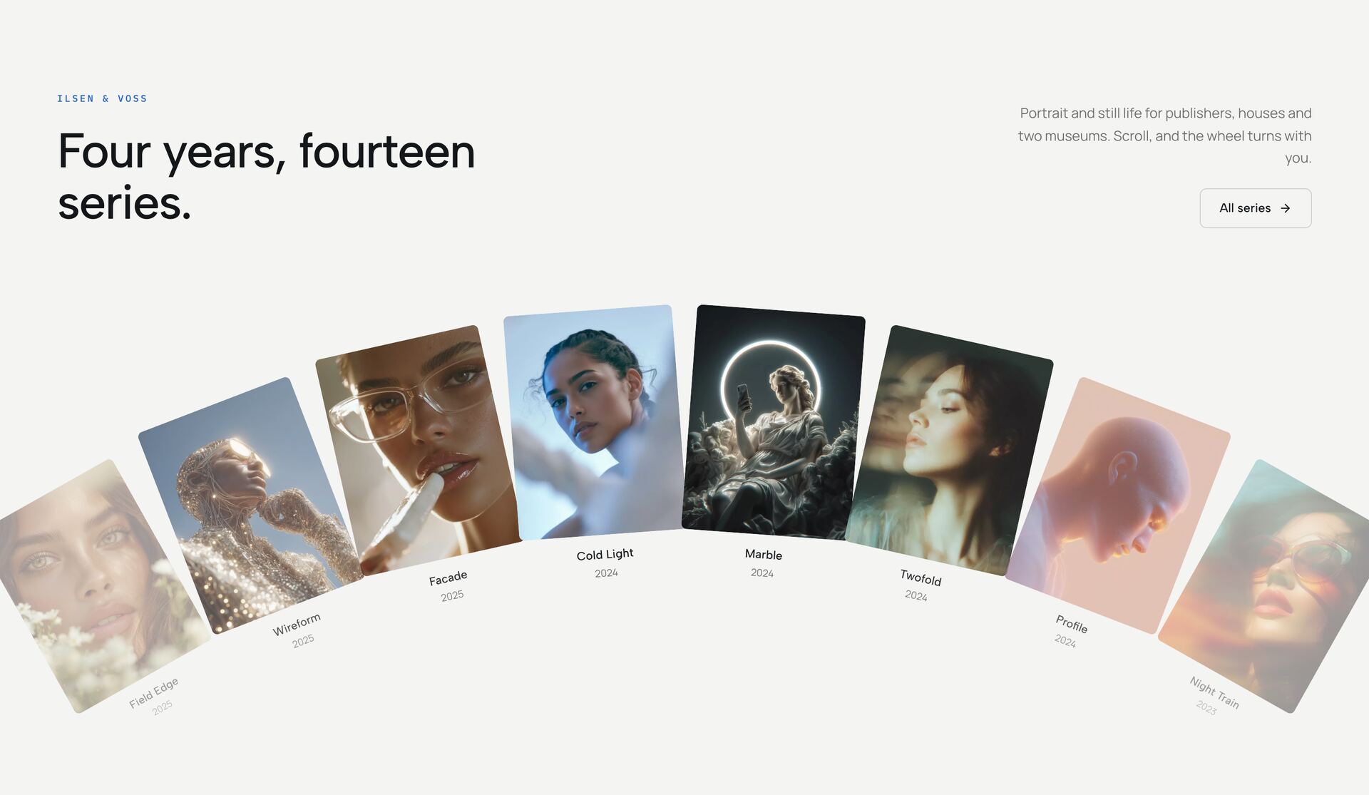
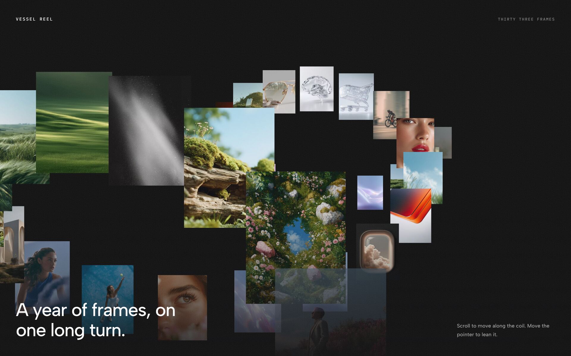
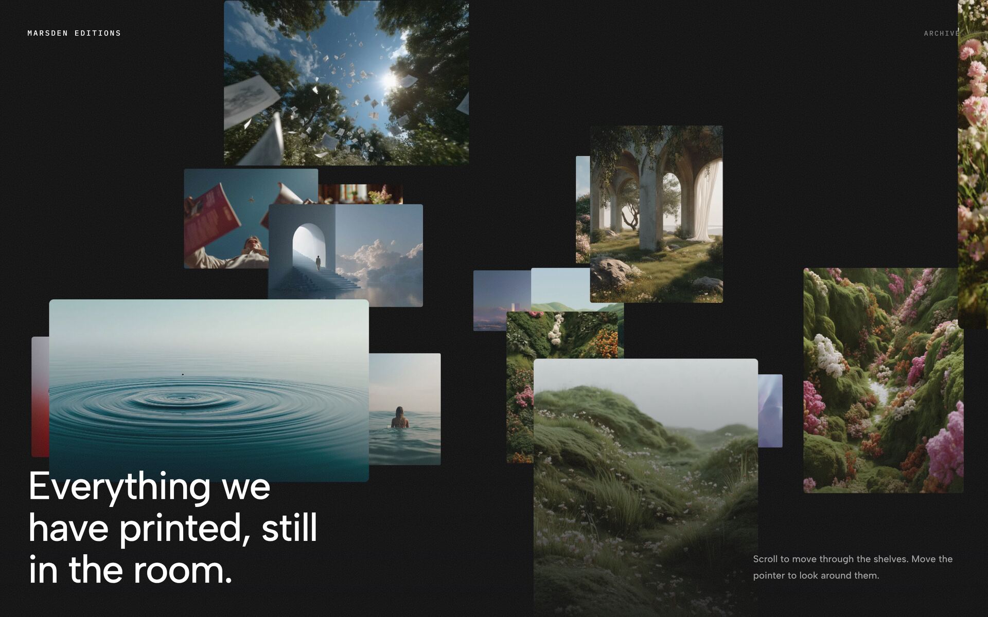
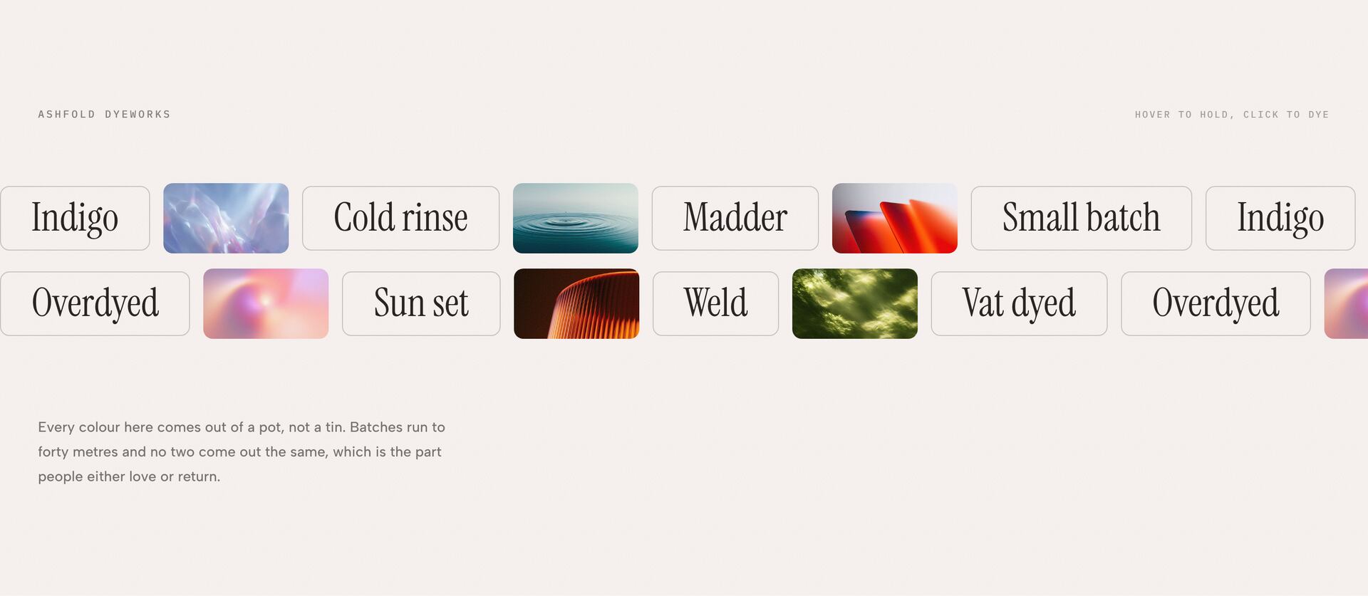
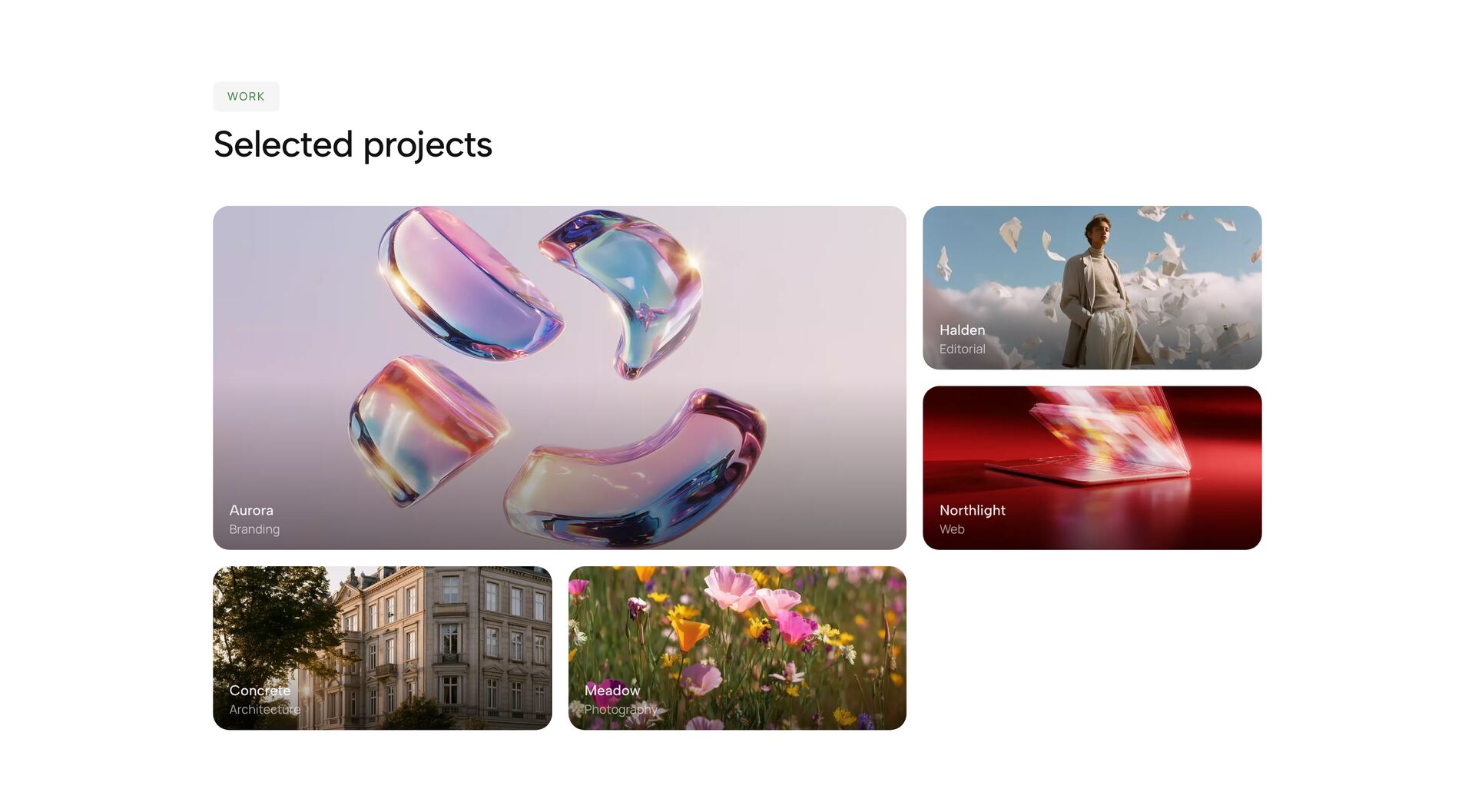
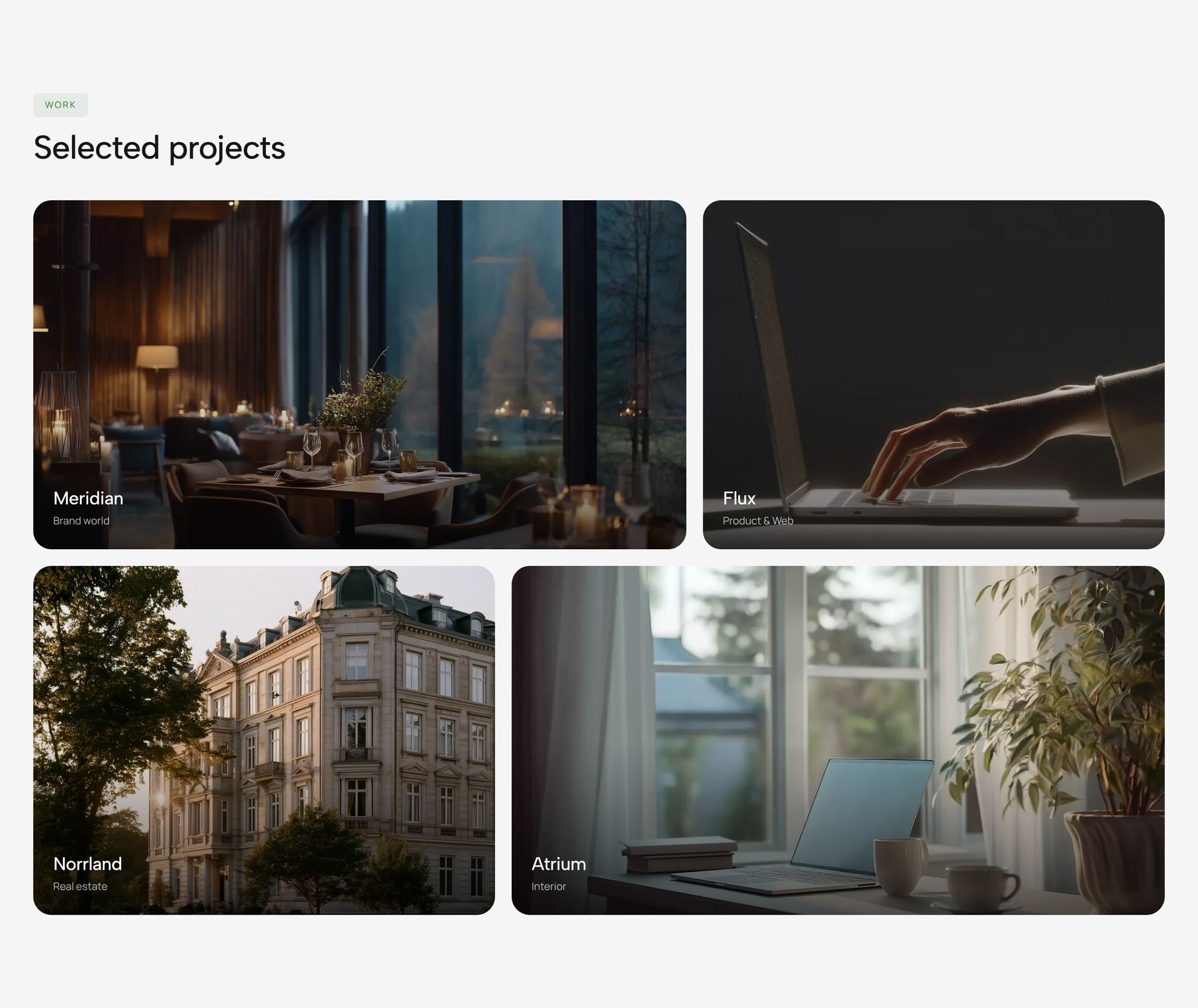

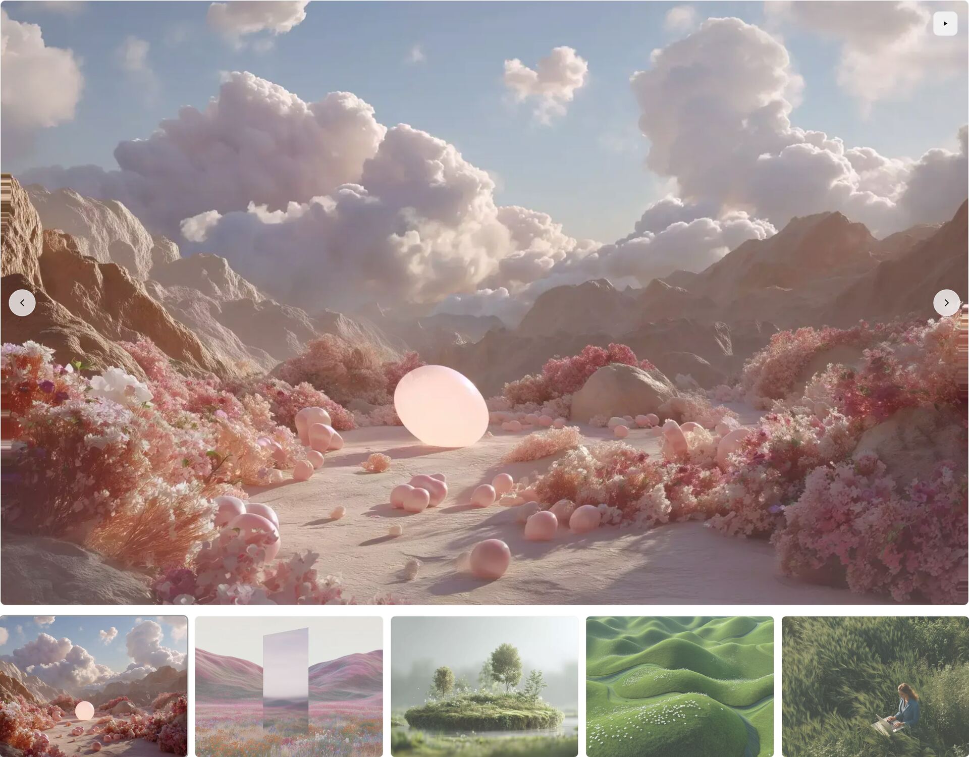
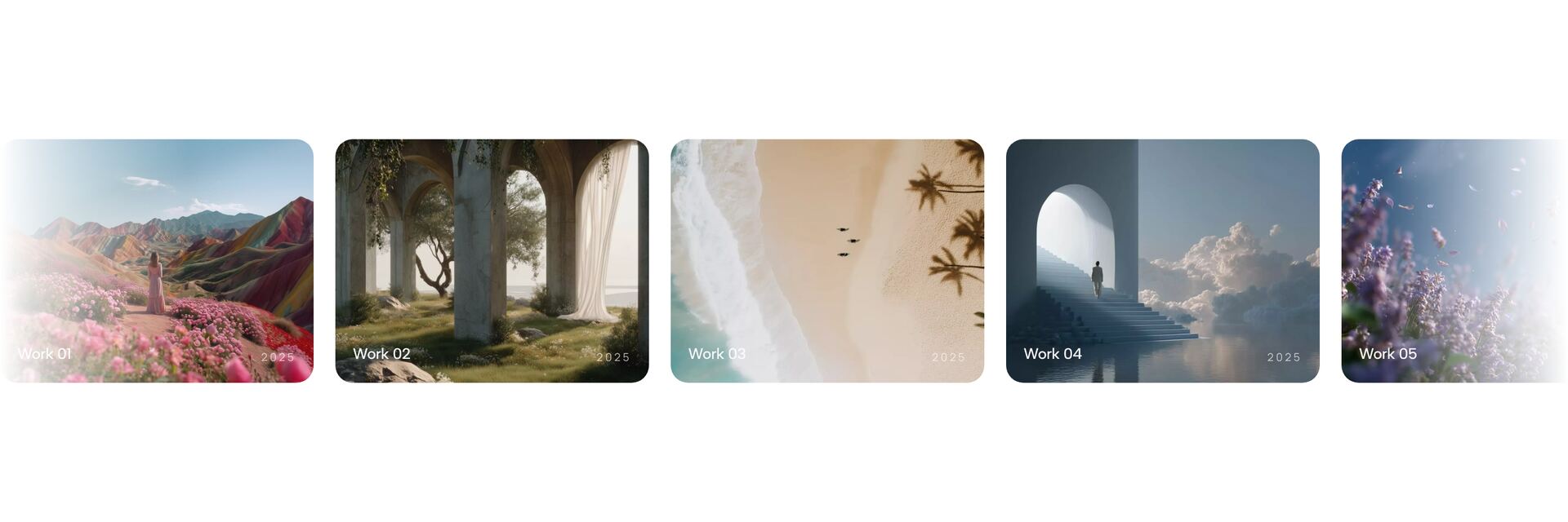
Which gallery layout fits your images?
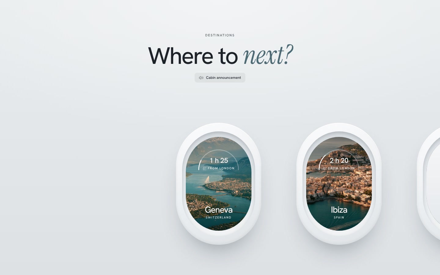
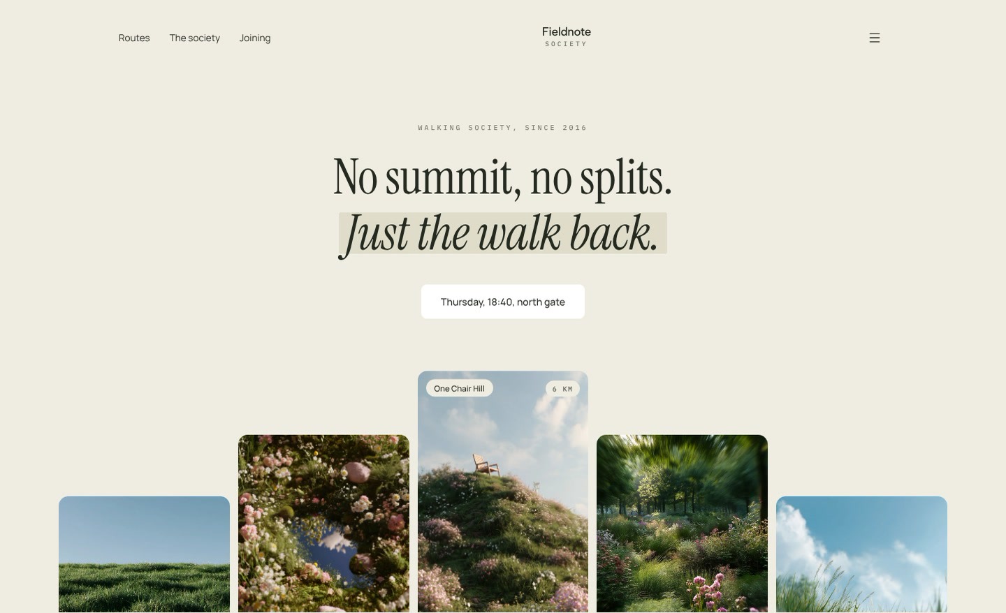
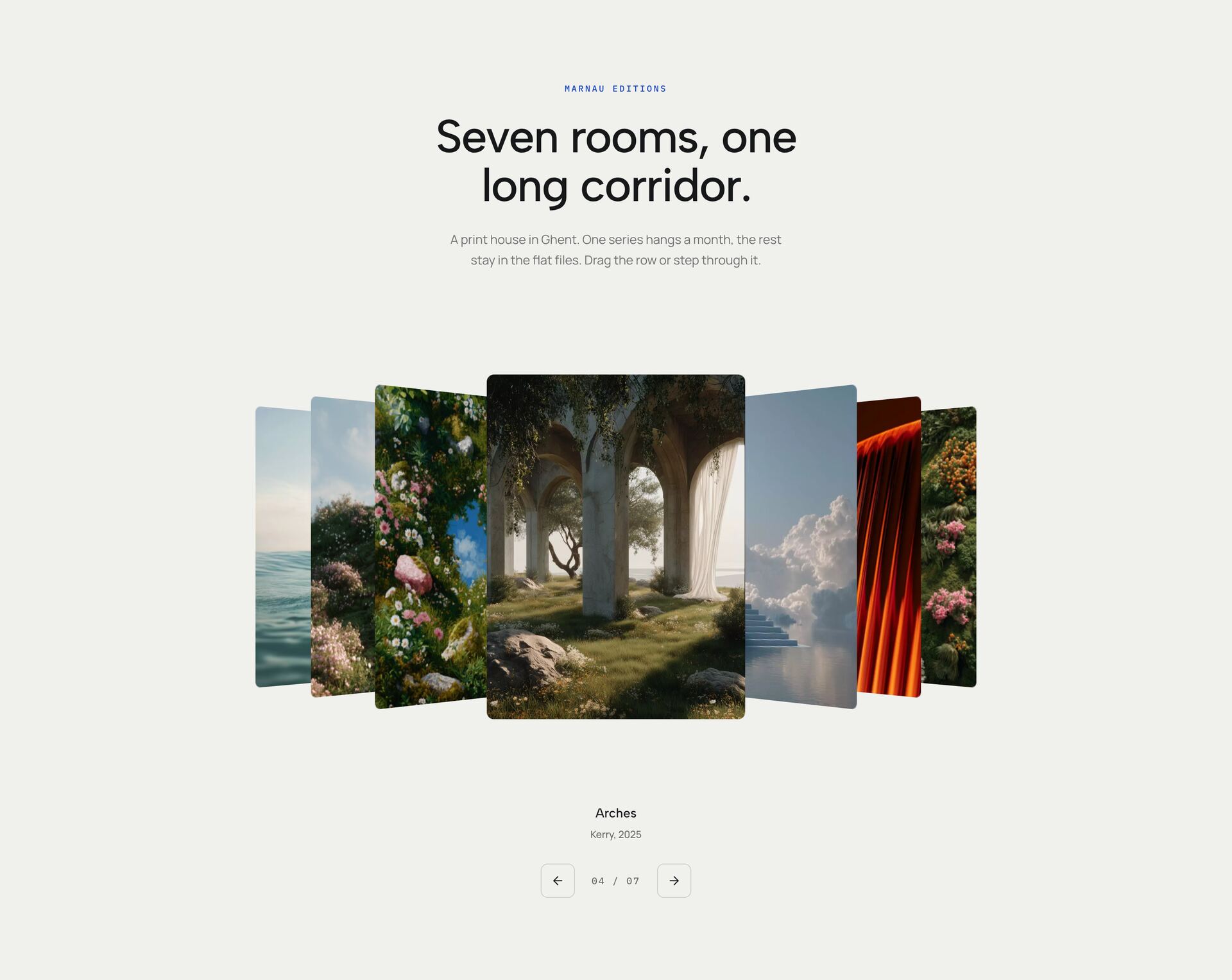
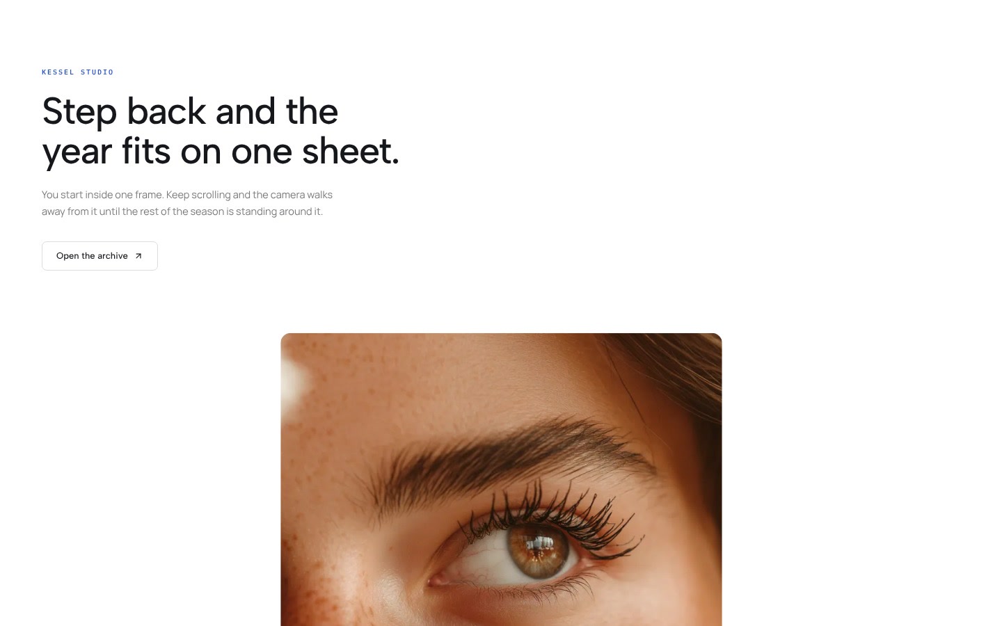
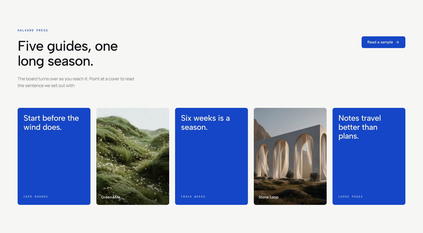
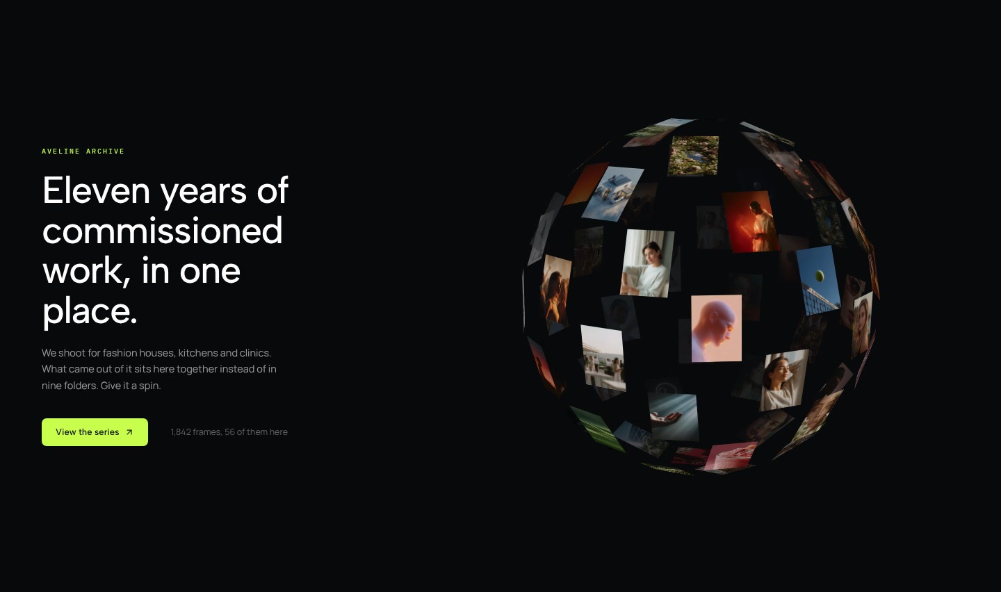
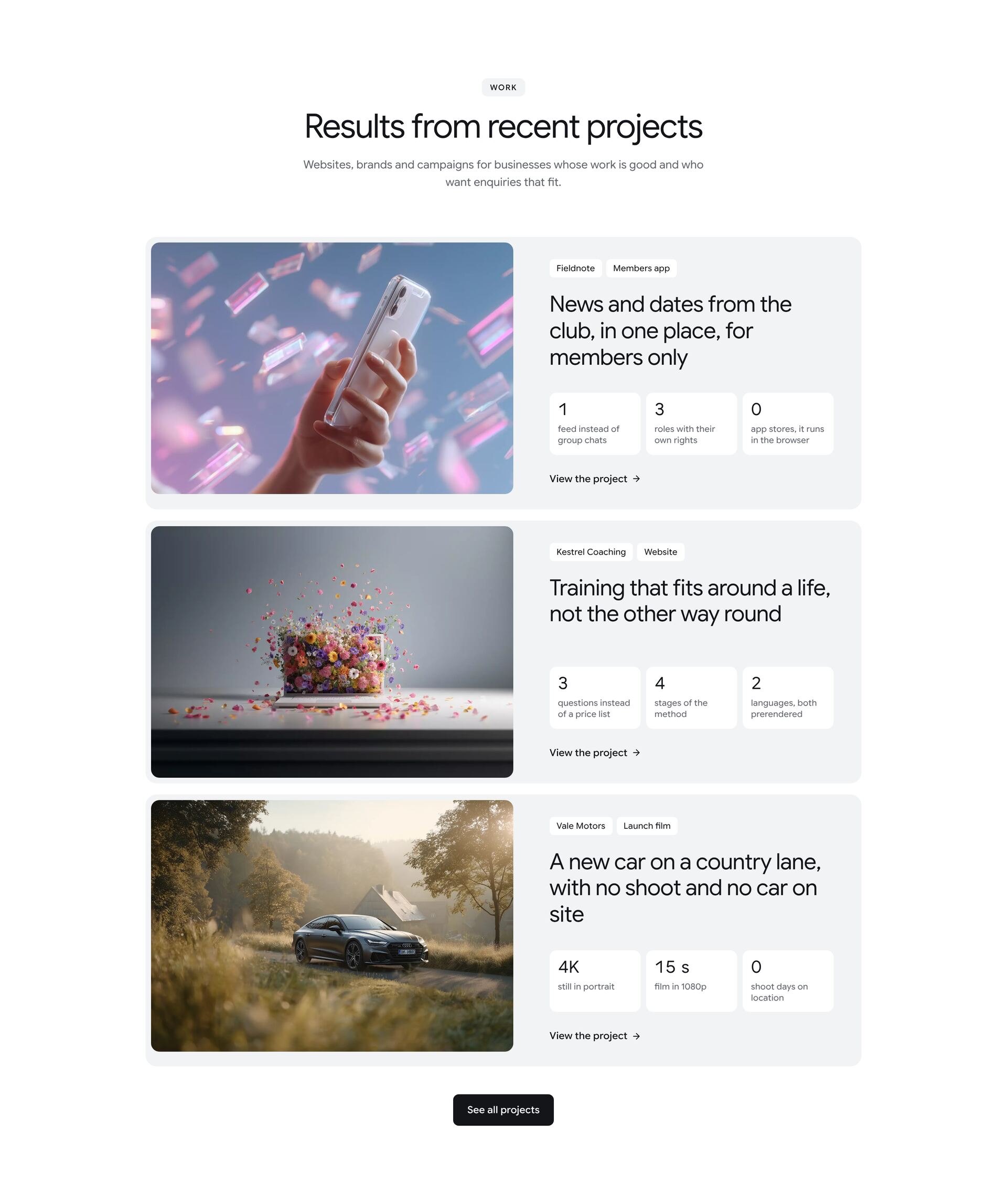
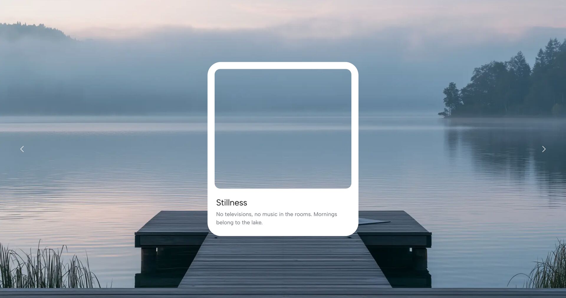
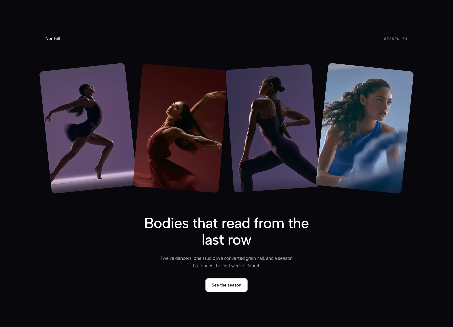
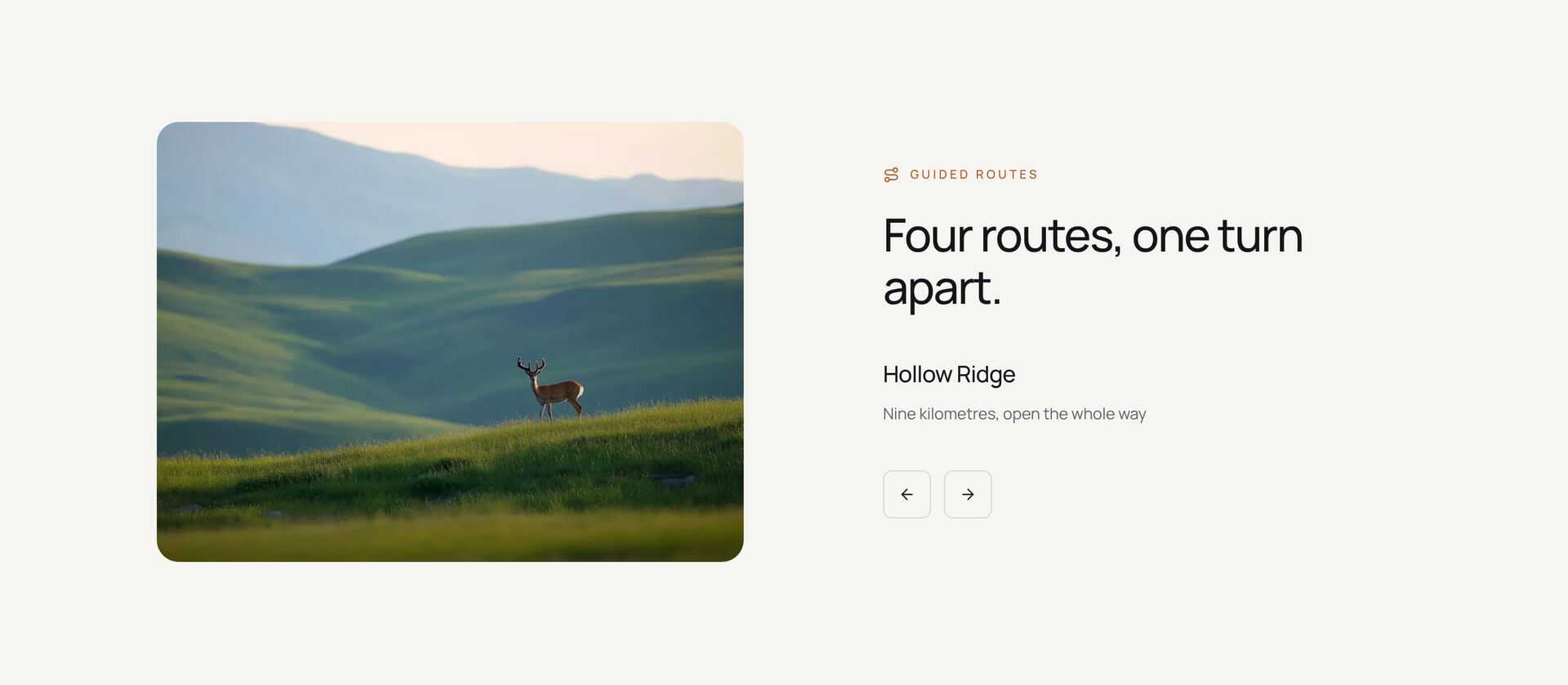
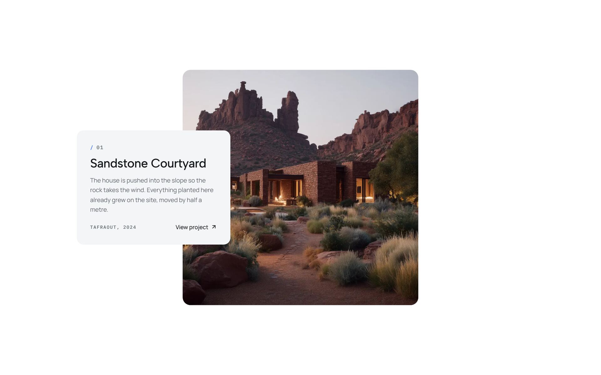
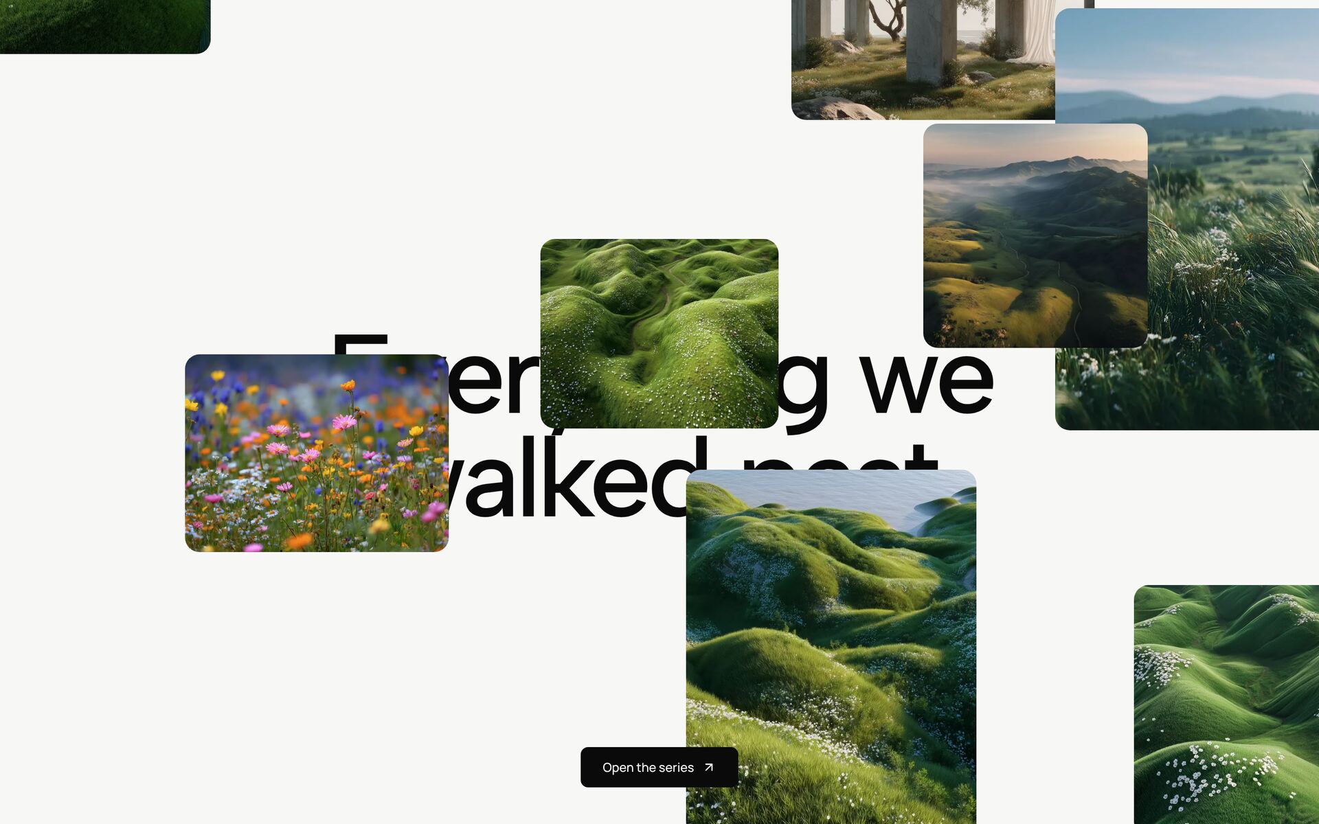
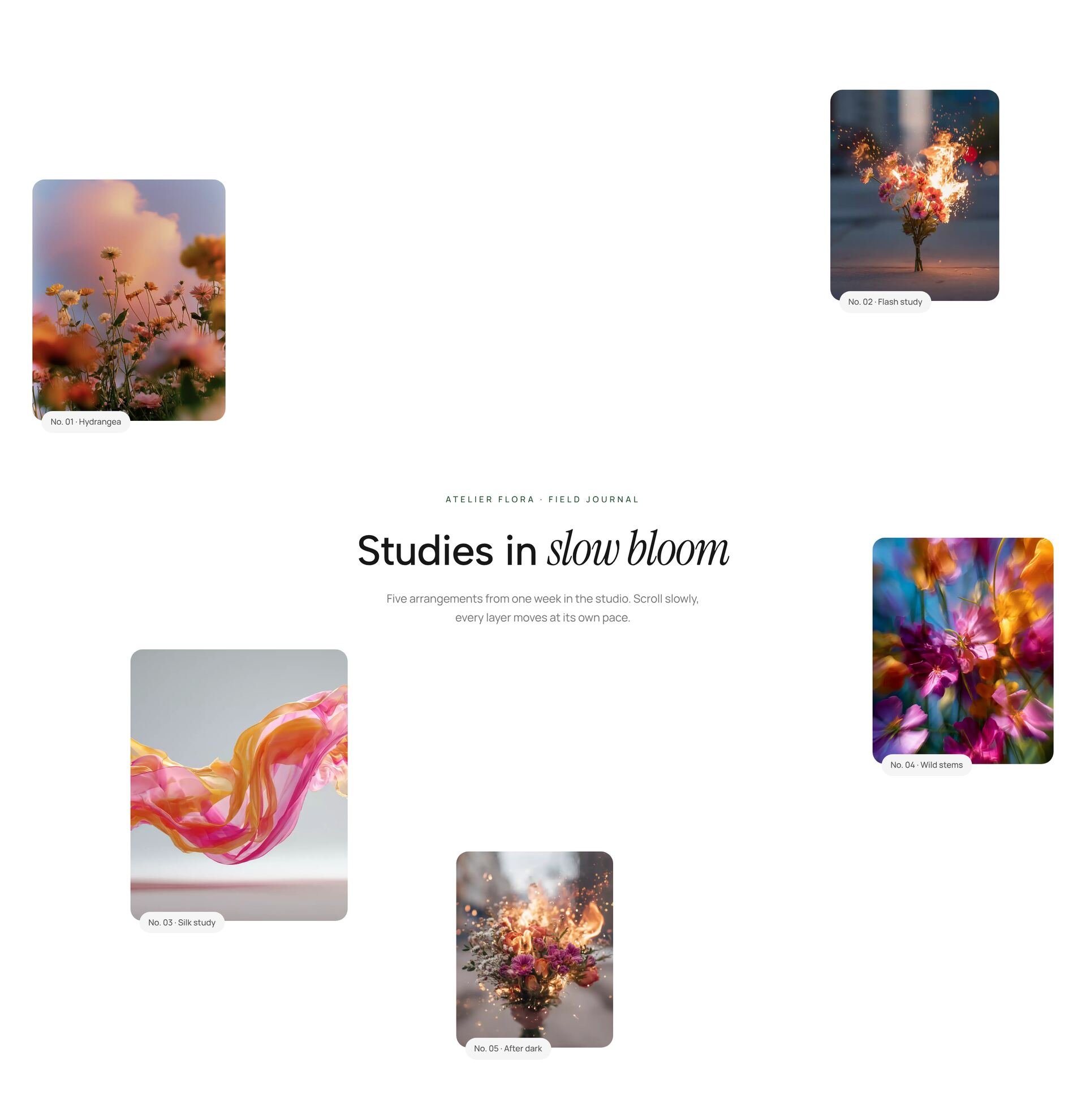
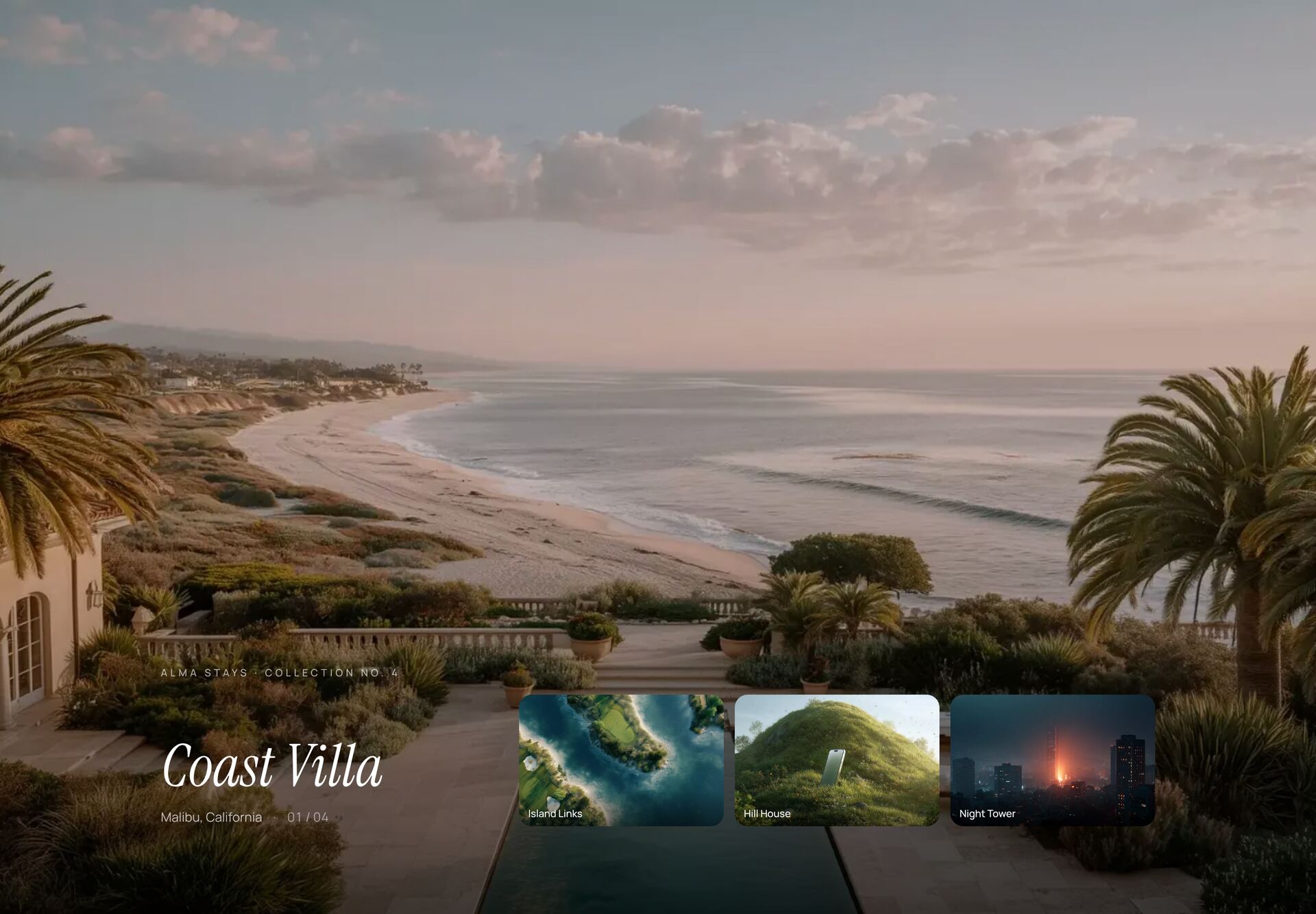
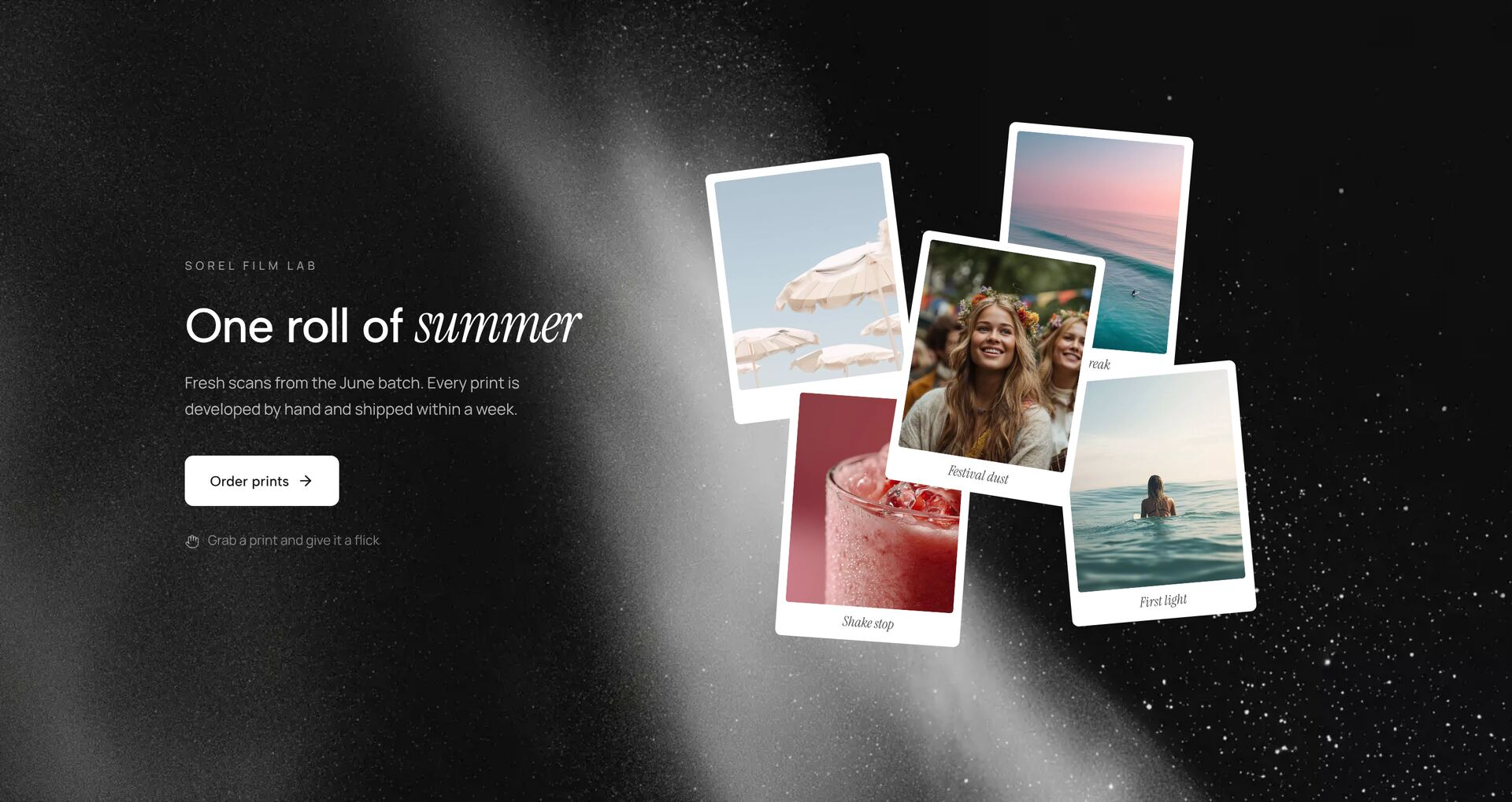
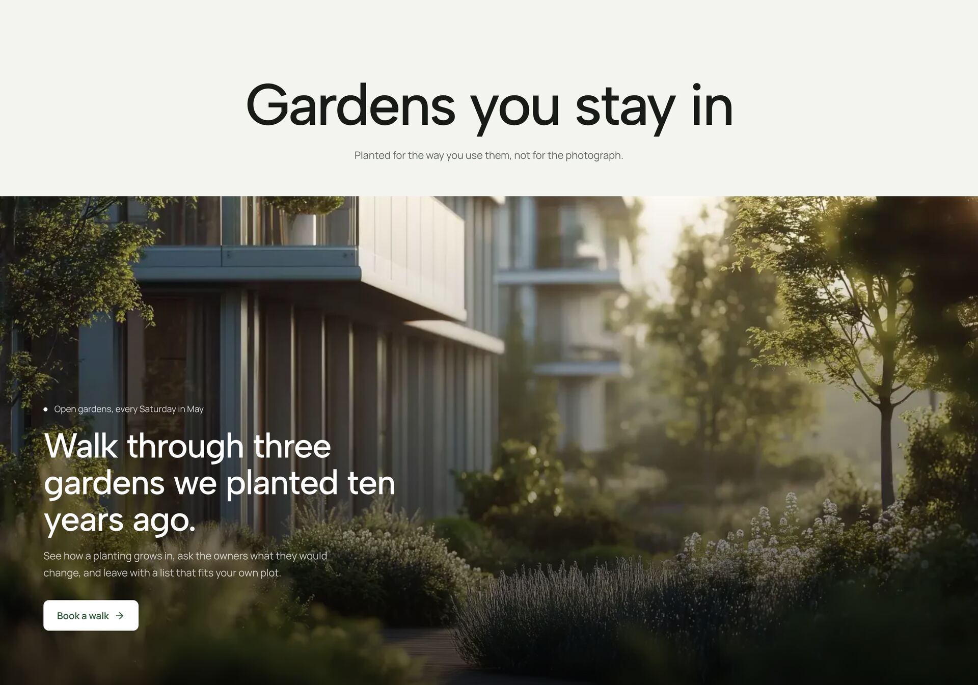
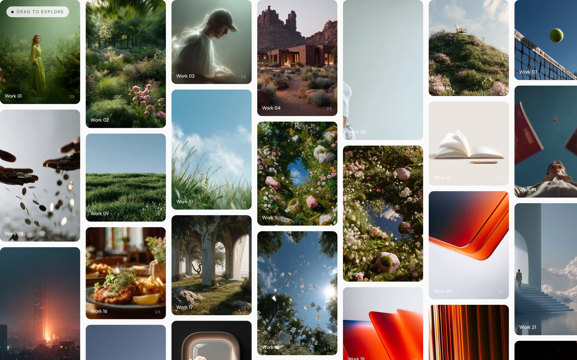
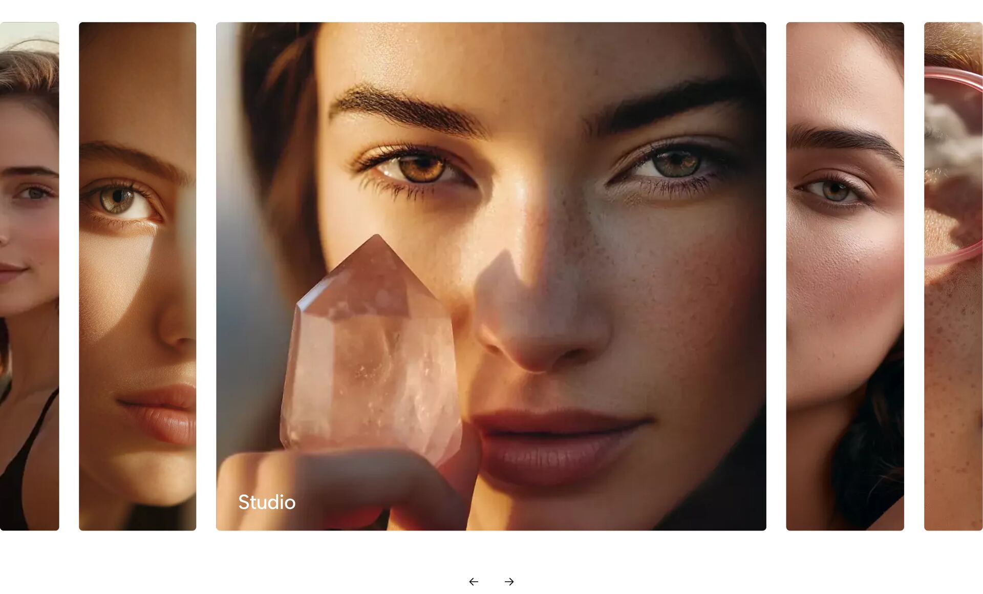
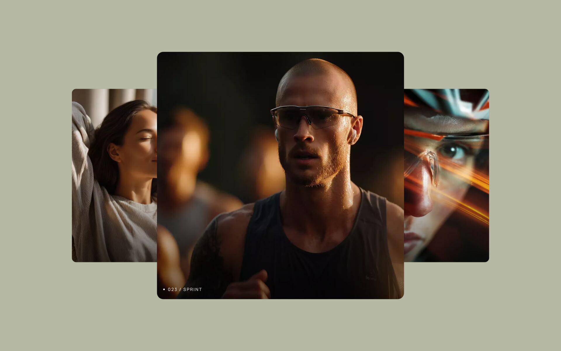
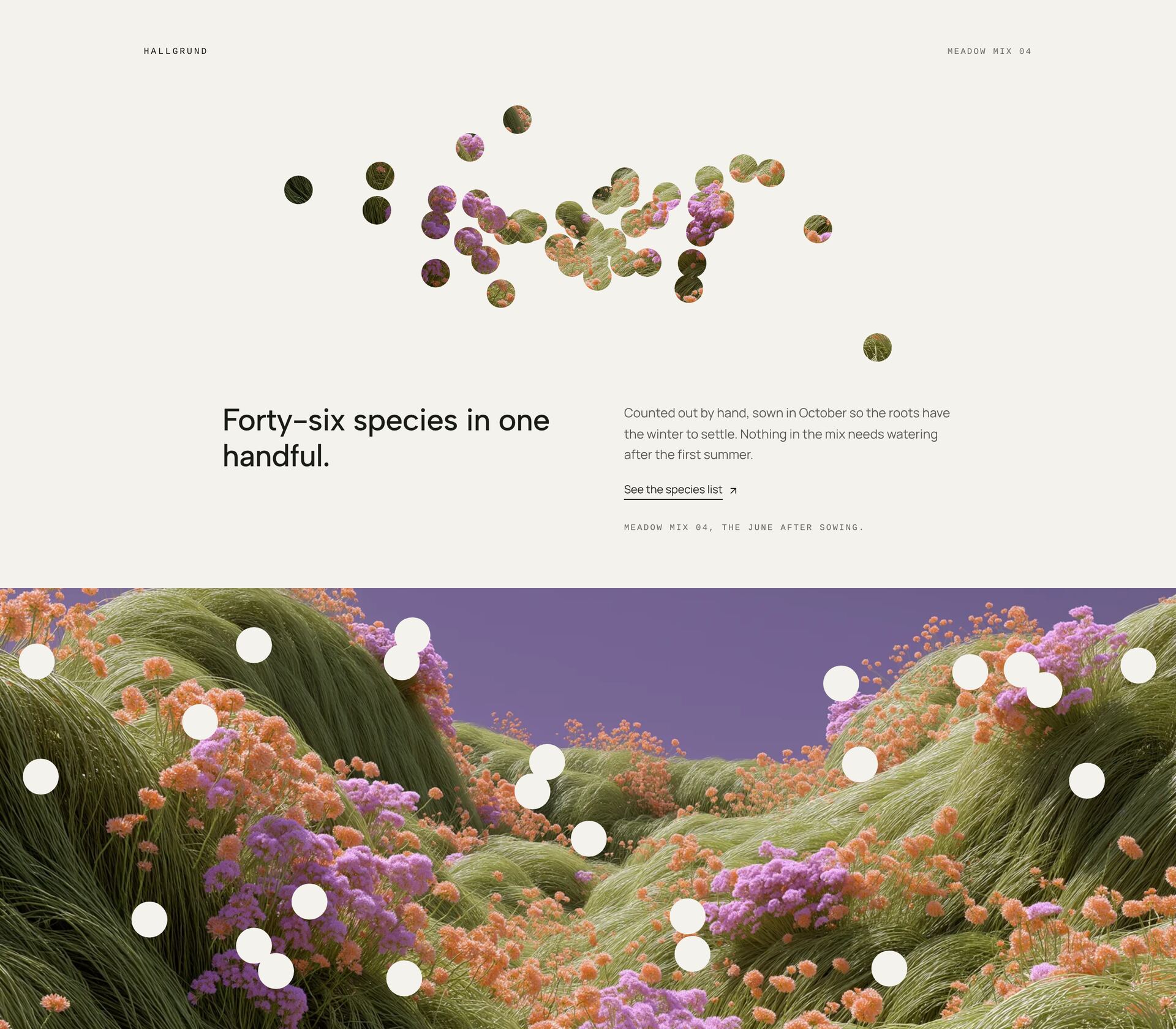
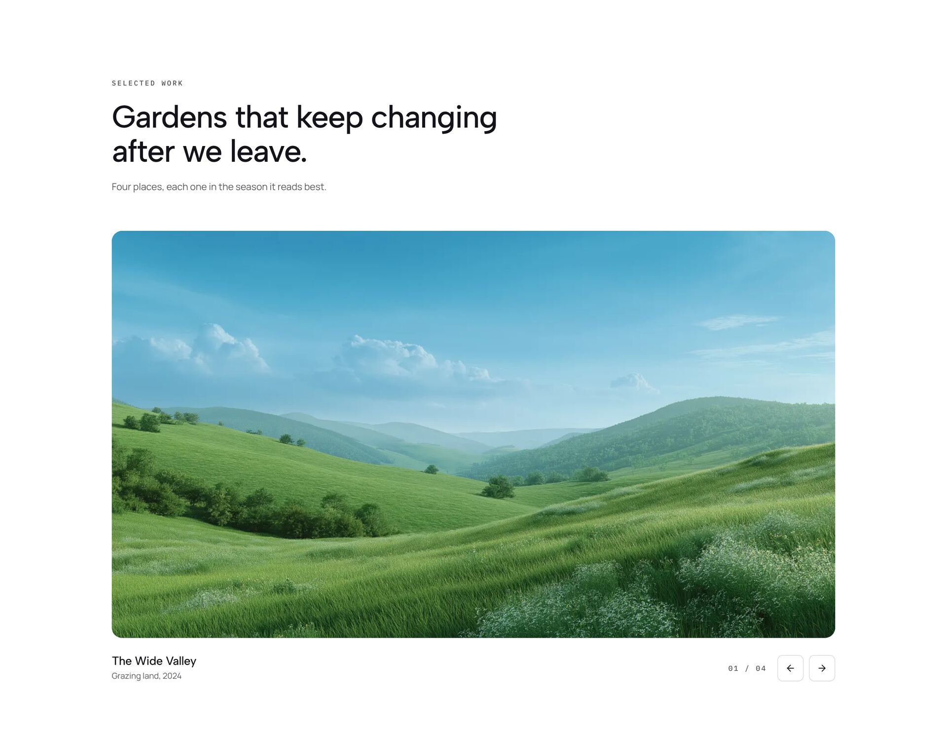
A gallery shows work, places or products through images first. The galleries here go from calm grids and asymmetric project layouts to moving formats: endless marquees, columns that drift at different speeds, a sphere or a wheel of images, cover flow, cards you can throw, a draggable endless grid and images that follow the cursor.
Choose the layout by what the images need. Portfolio work wants a calm grid with room around each piece; the mood of a brand or a venue can take more motion. Use images of a similar style and light, sized for the space they get on screen. Images are plain URLs in the file, and moving galleries stop or slow down when reduced motion is on. Each section is a single React file with Tailwind classes.
Related guides

More section categories
Frequently asked questions
Eight to twenty for a section on a landing page. A full portfolio belongs on its own page with filters.
Not if the images are sized properly. Use WebP or AVIF at about twice the displayed width and lazy-load images below the first screen.
A grid when each image should be looked at, such as portfolio work. A moving gallery when the overall impression counts more than each picture, such as a venue or a brand world.
Didn't find your question? We're happy to help.
Get in touch