

How do you write a call to action that gets clicked?
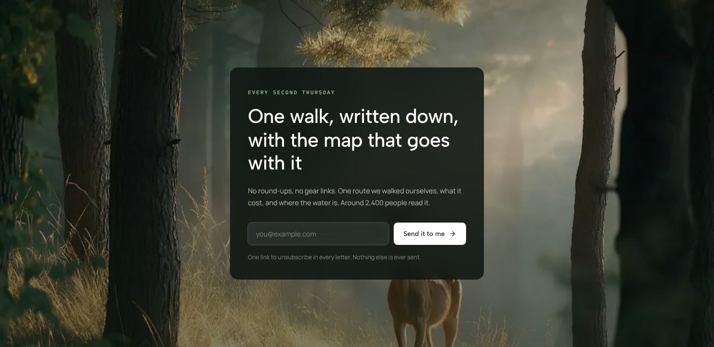
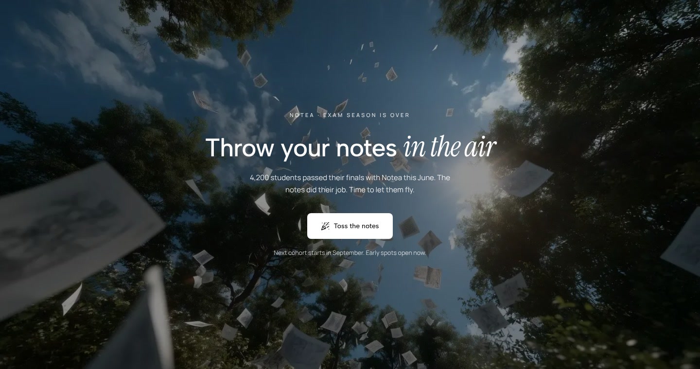
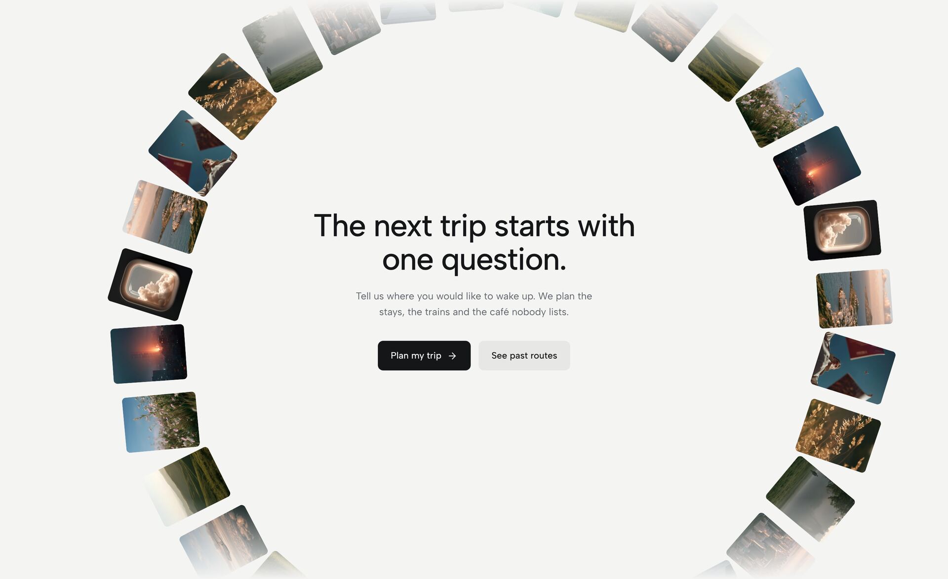
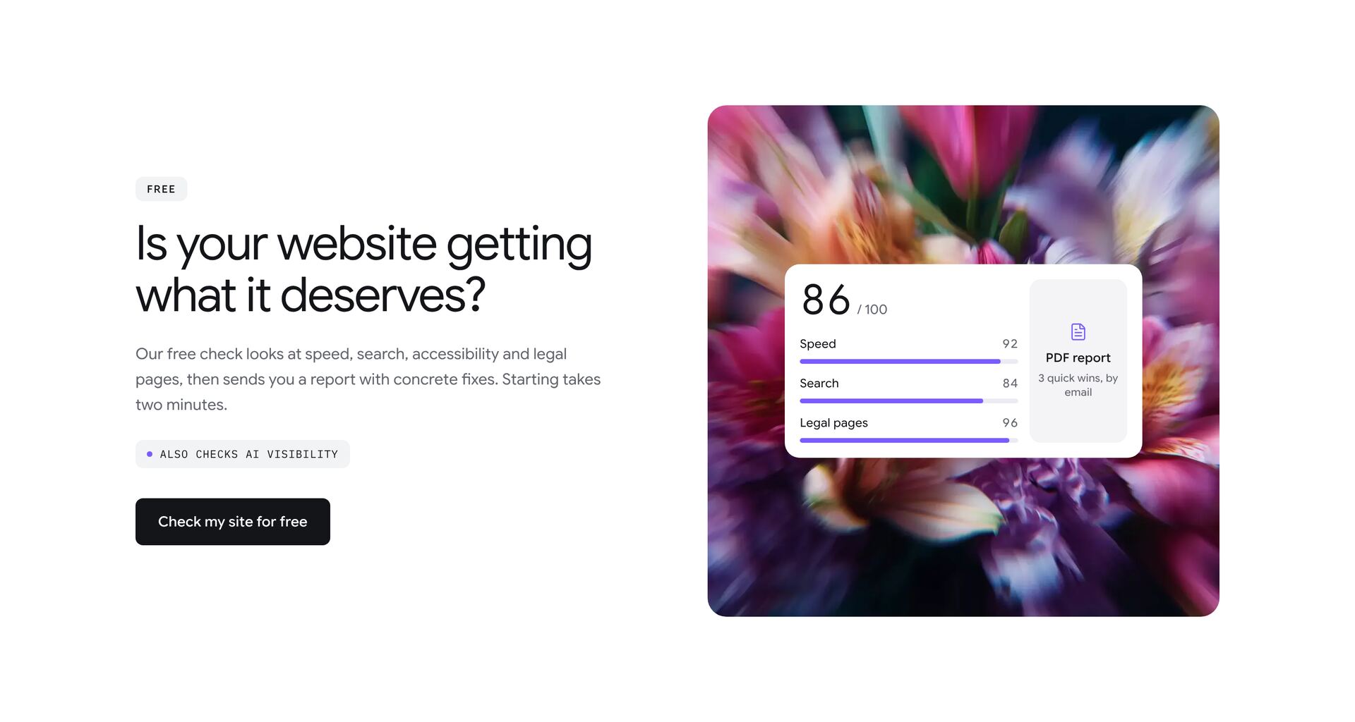
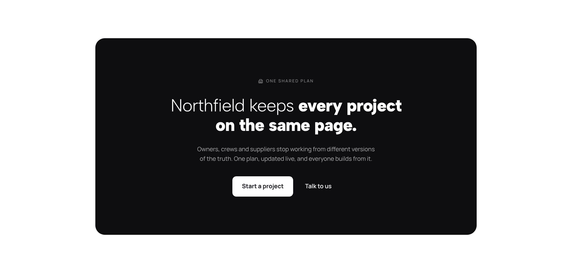
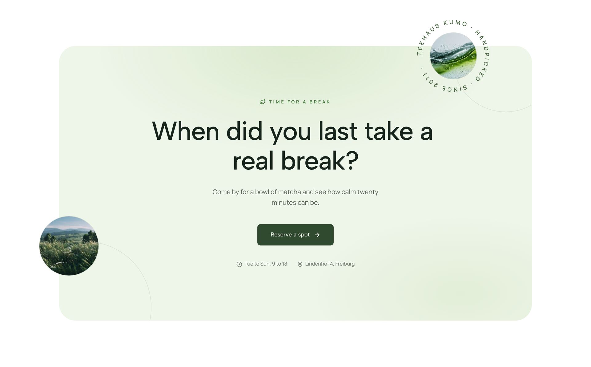
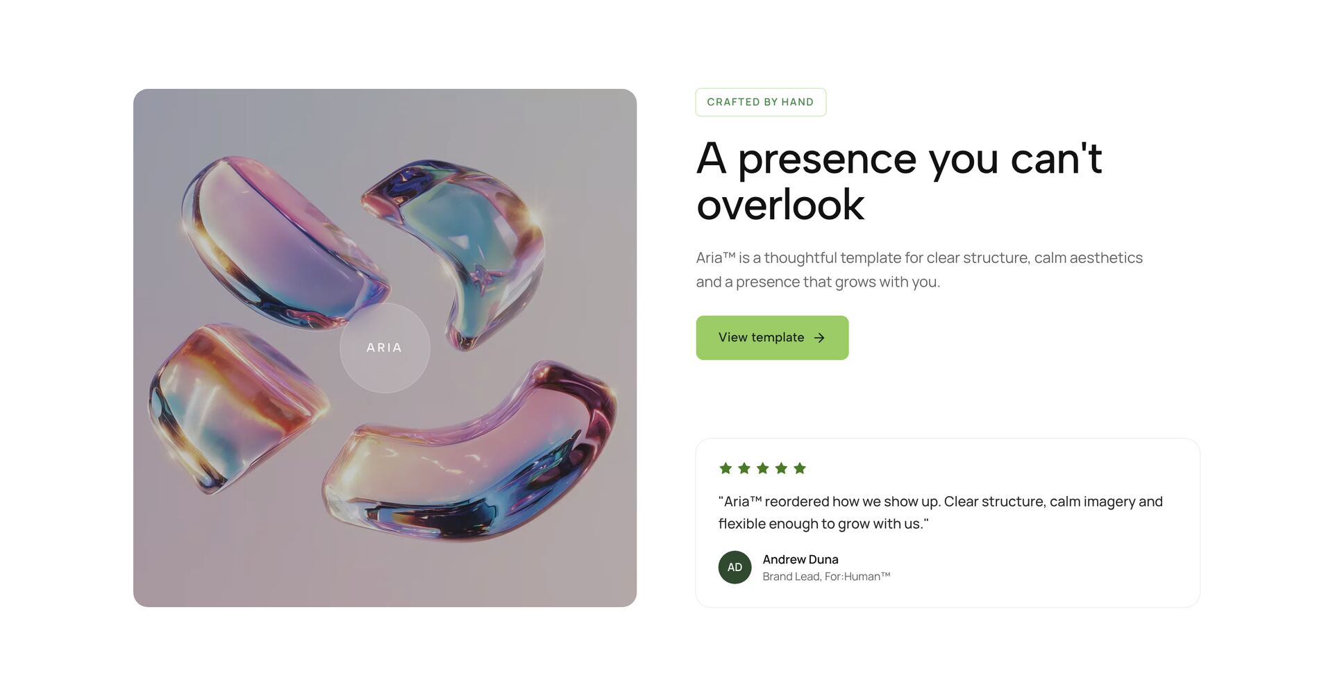
A call-to-action section sits near the end of a page and asks for one thing: book a call, start a trial, join a list. The sections here range from a quiet banner with a single button to cards with an image, newsletter forms and a small celebration when someone clicks. They are built to close a page, so they work best after the visitor has seen what you offer.
Keep the text short and the action specific. A button that says what happens next, such as “Book a 20-minute call”, gets more clicks than “Learn more”. One main action per section is enough; a second, quieter link catches people who are not ready yet. Each section is one React file with Tailwind classes, so wording, colour and link targets are easy to change.
Related guides

More section categories
Frequently asked questions
At the end of the page, and once more right after the strongest proof, such as a testimonial or the pricing table. A visitor who has scrolled that far has the information to decide.
One main button. A second, visually quieter link is fine for people who need more time, for example to view pricing. More options split attention and lower the clicks on the main action.
Yes. The forms are plain React with a submit function you replace. Point it at Brevo, Mailchimp, ConvertKit or your own API route.
Didn't find your question? We're happy to help.
Get in touch