How do you compare plans or products clearly?
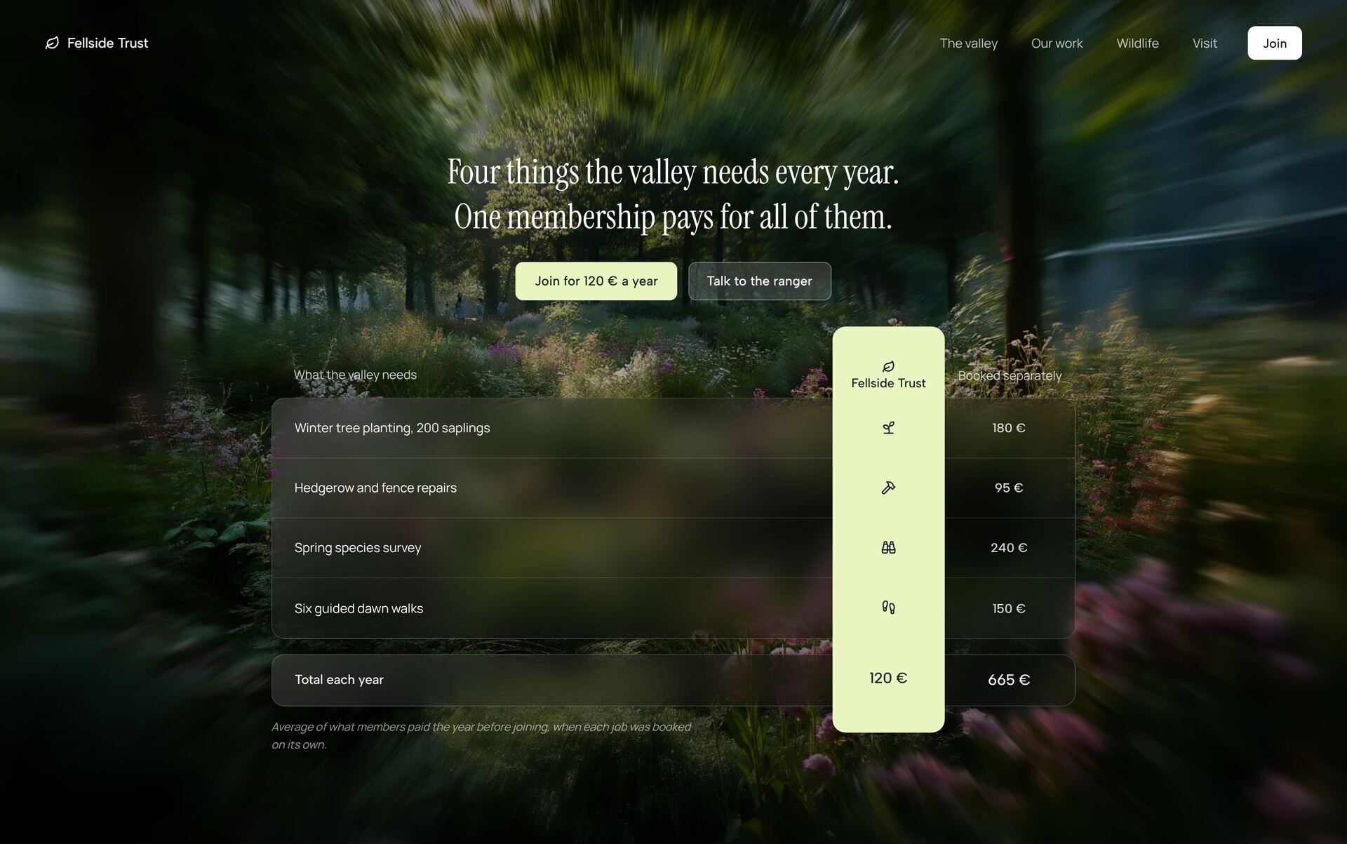
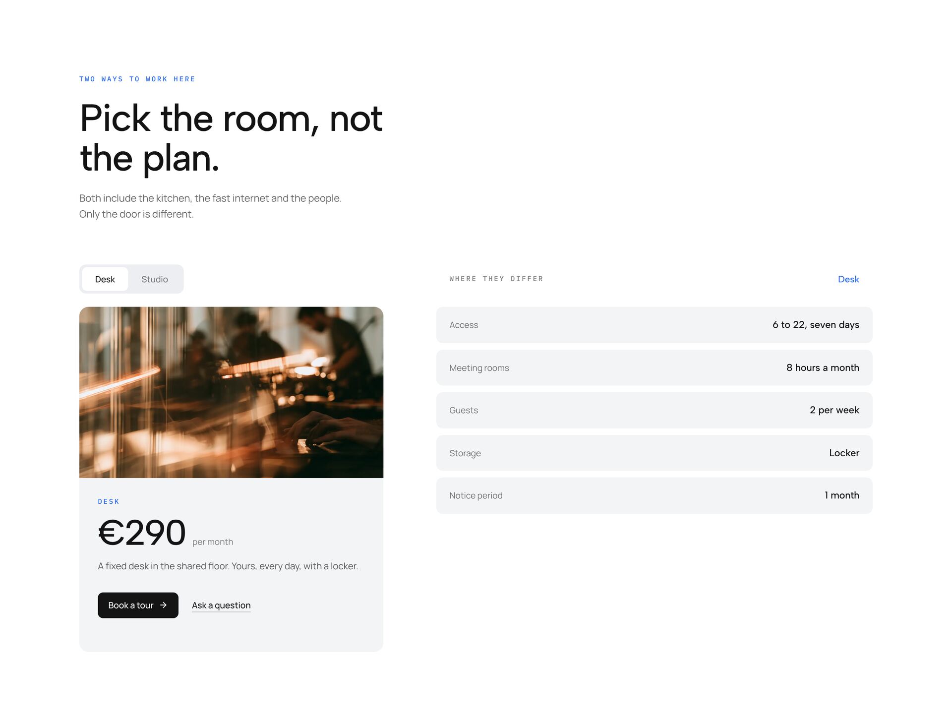
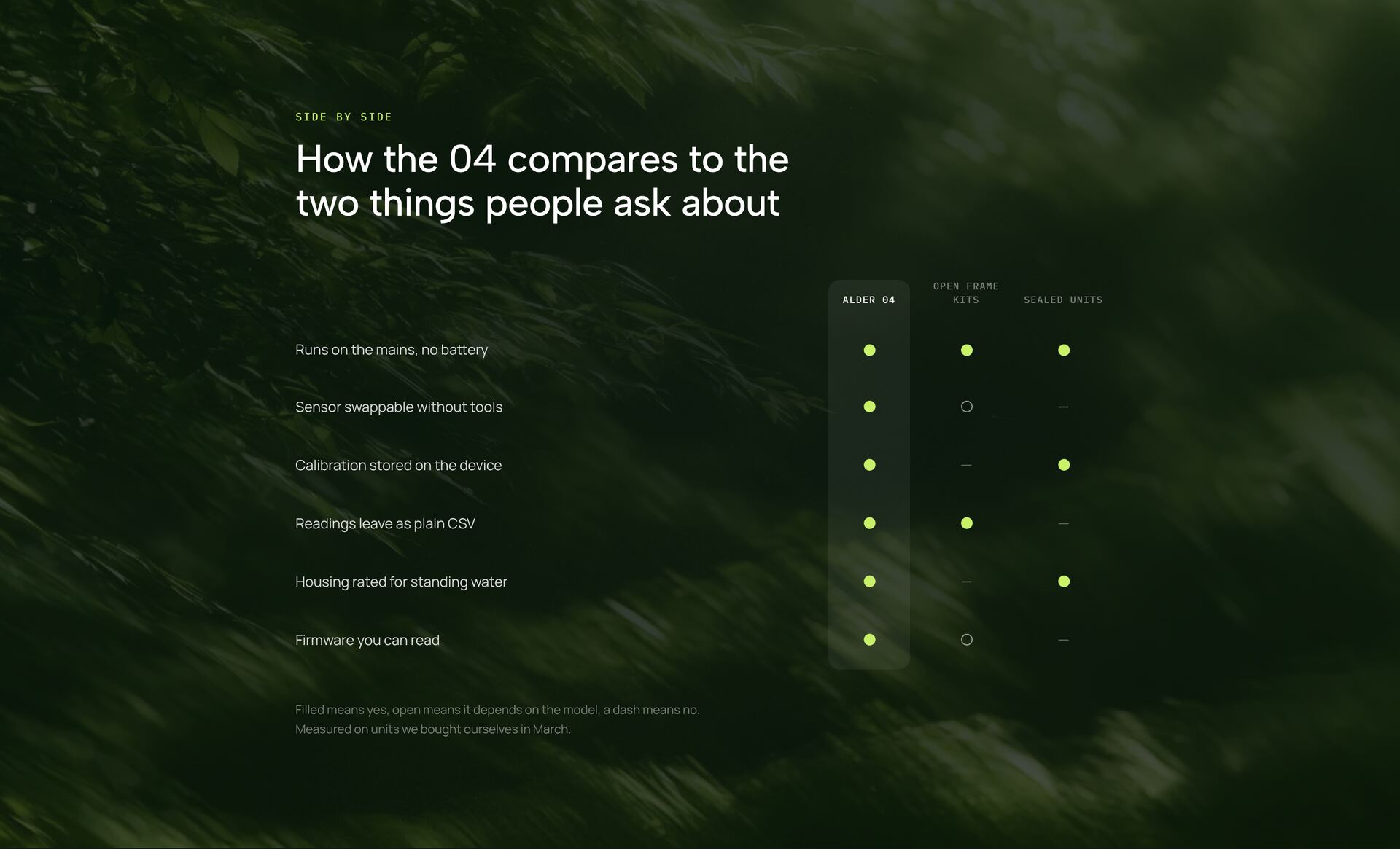
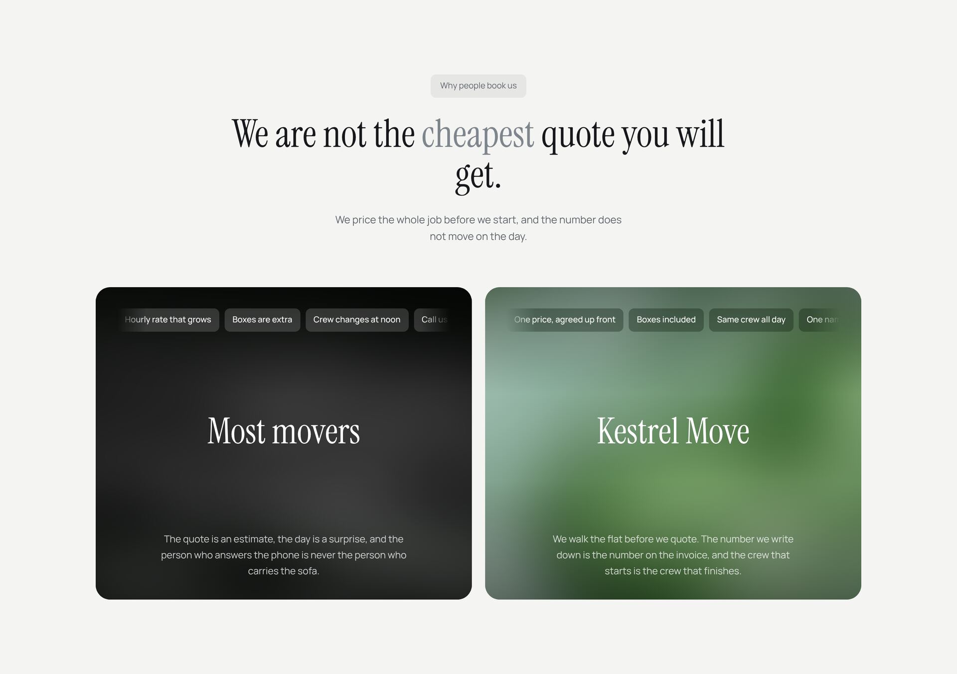
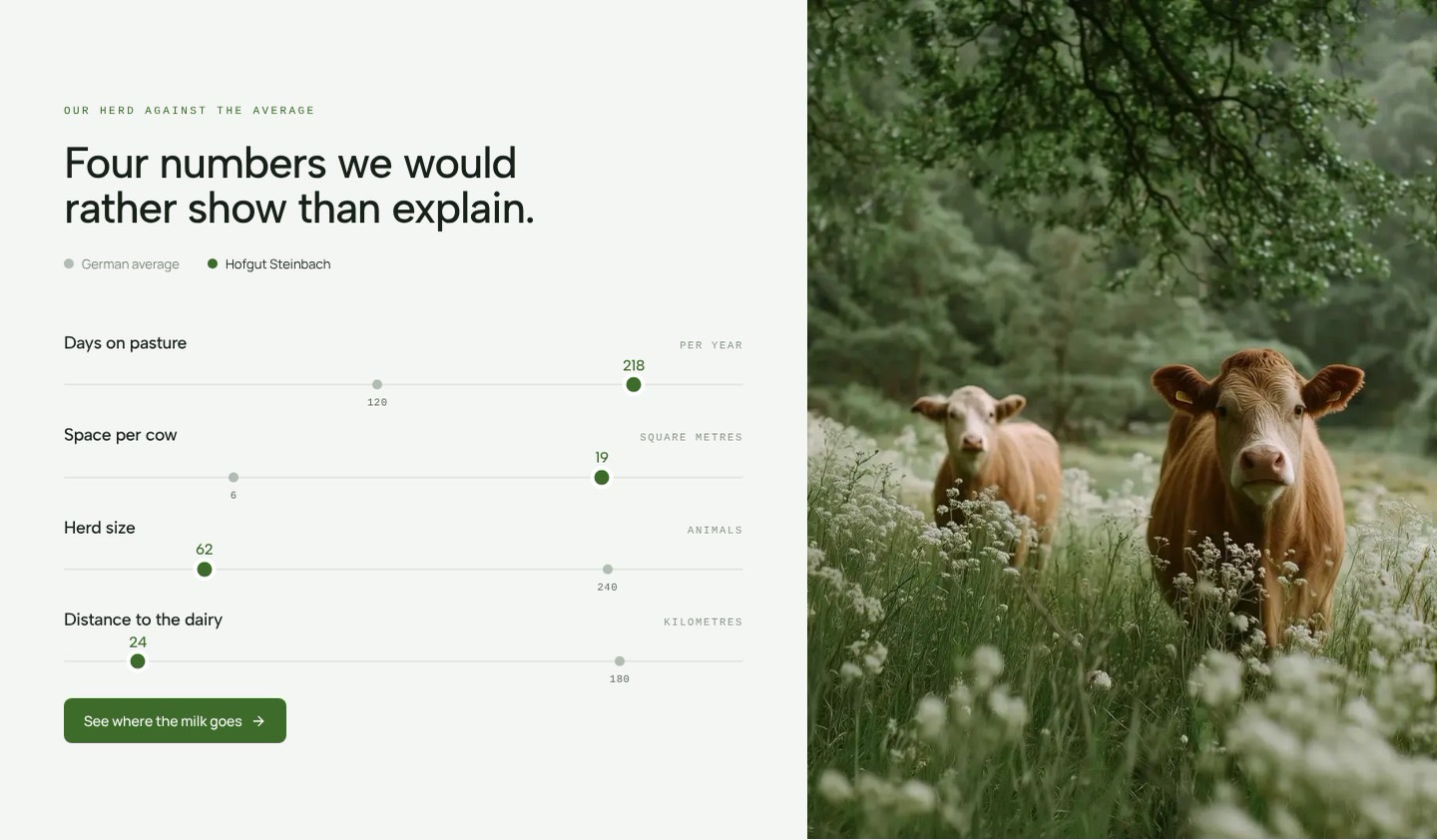
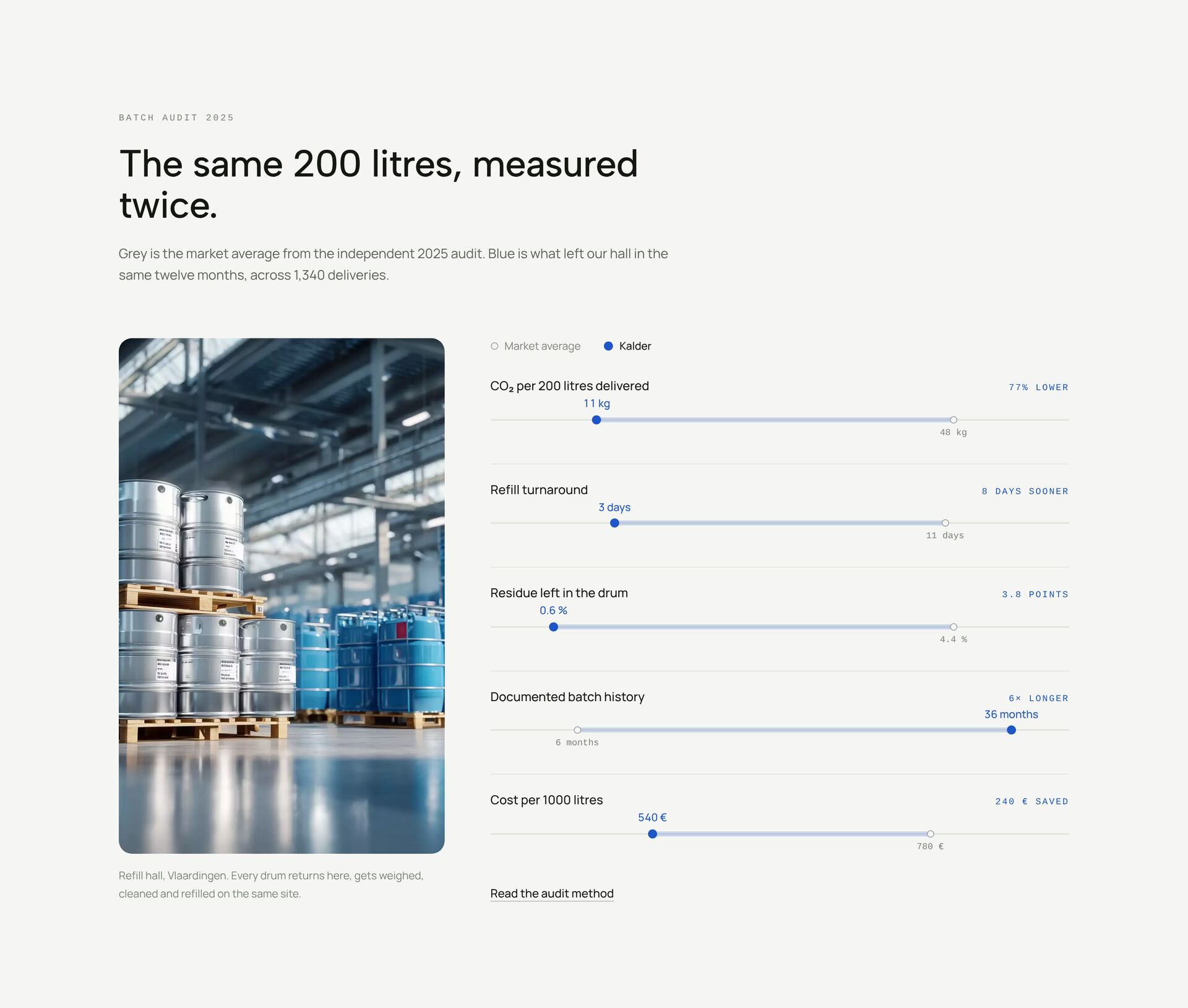
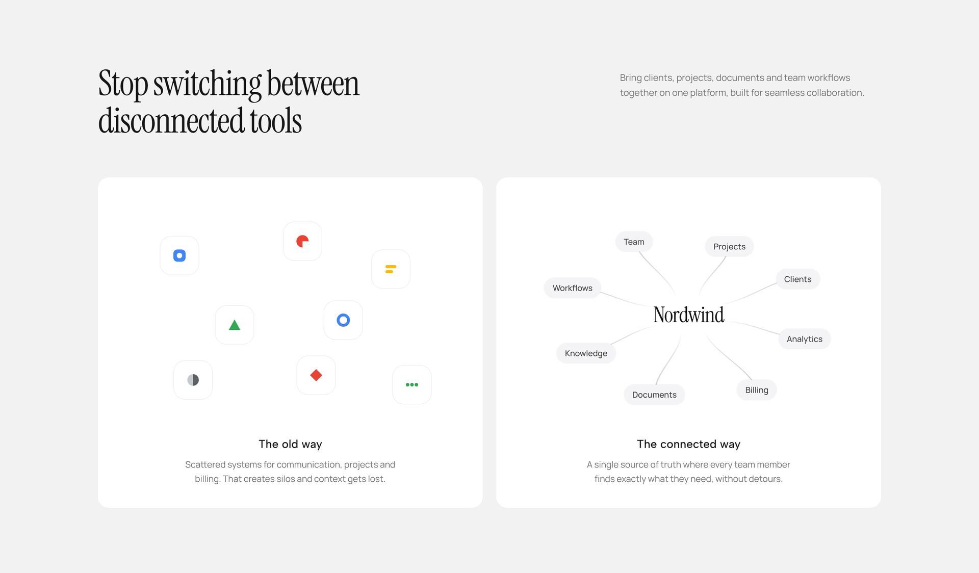
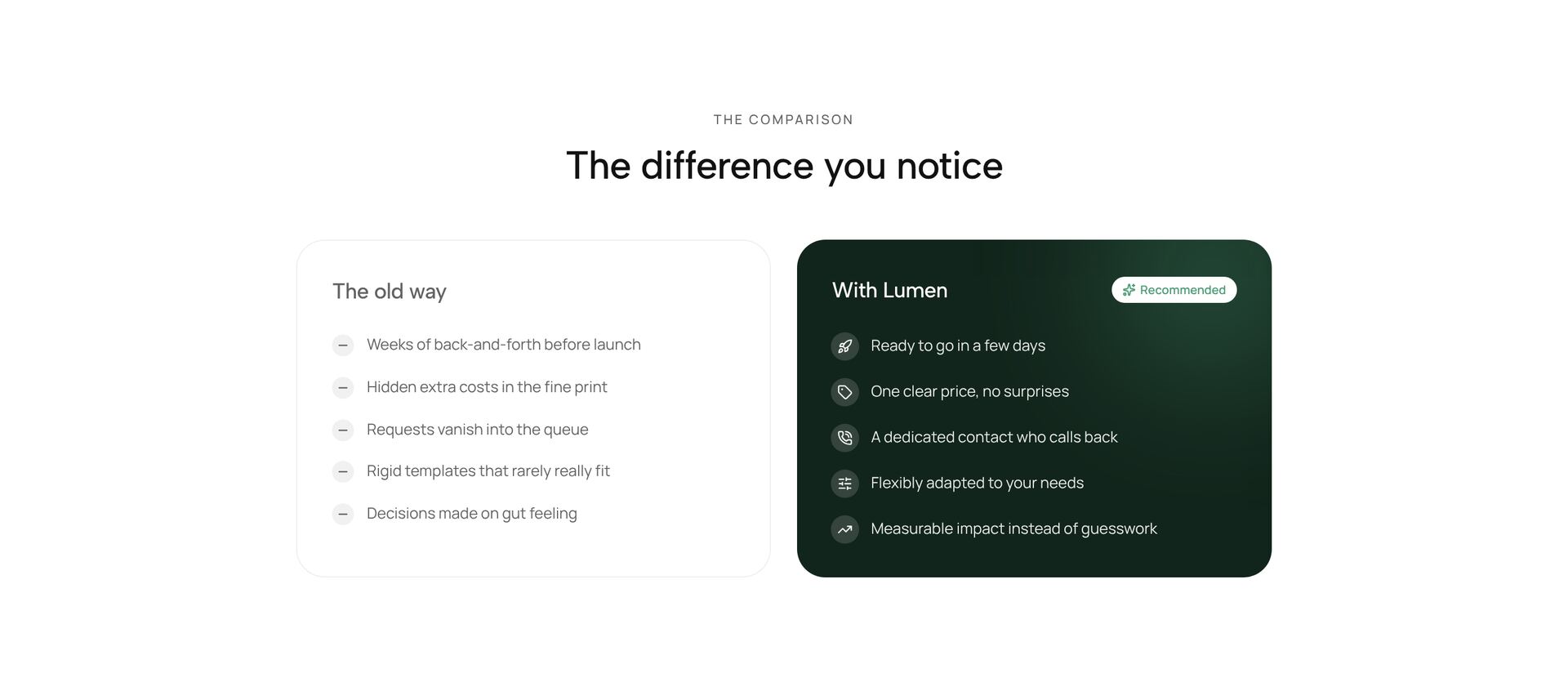
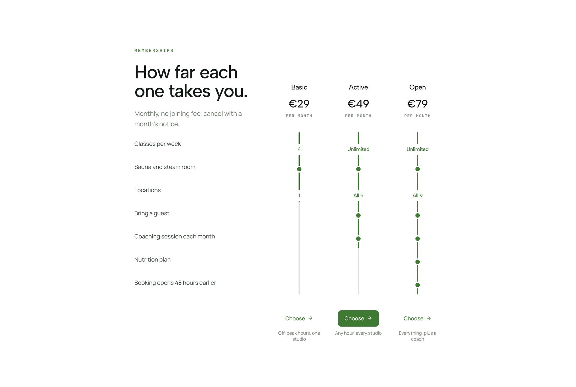
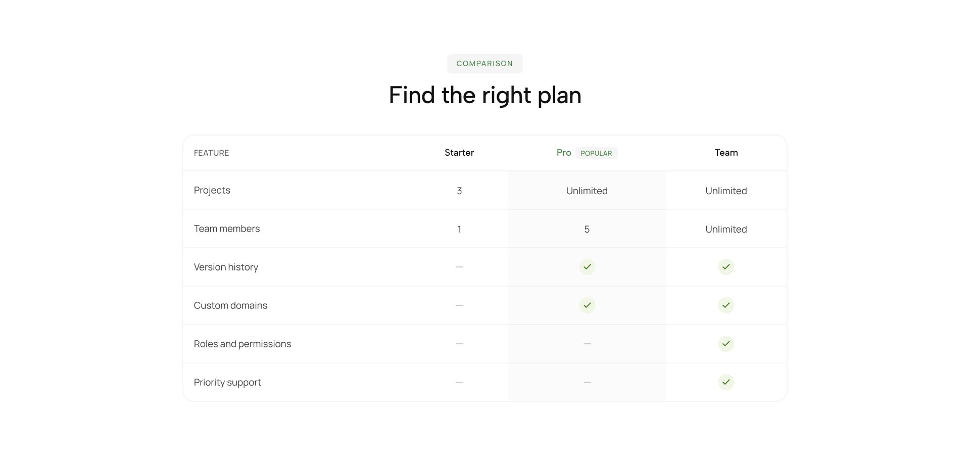
A comparison section puts options side by side so the difference is visible at a glance. The sections here compare plans in a table with checkmarks, set your approach against the usual one in two columns, measure a gap with numbers, or show a before and after. They suit pricing pages, switching pages for people coming from another tool, and product pages with several models.
Compare on the points buyers actually decide on, usually five to eight rows. Use the same wording in every column so the eye can scan across, and mark the column you recommend. Long lists of features that every option has hide the real difference. Each section is a single React file with Tailwind classes, with the rows as simple data you can edit.
More section categories
Frequently asked questions
Five to eight. List only the points where the options differ. What every option has fits into a single line below the table.
In the EU, comparative advertising is allowed if it is objective and verifiable. Comparing against the usual way of doing things instead of a name avoids the question altogether.
Wide tables scroll sideways or turn into one card per option. The sections here are set up for phone width, so check which behaviour suits your content.
Didn't find your question? We're happy to help.
Get in touch