Most landing pages do not fail on design, they fail on order. Show the price too early and you lose. Take too long to get to the point and you lose as well. This guide describes a sequence of eight sections that holds up in practice, and what belongs in each one.
- A landing page has an order, not a collection: promise, proof, offer, objection, action.
- Every section has exactly one job. A section without one gets cut.
- Trust comes before price. Someone still in doubt will not read a table.
- One goal per page. Two equal calls to action halve each other.
Why order matters more than looks
A landing page is a conversation that only runs one way. You cannot ask follow up questions, so you have to answer your visitors' questions in the order they come up. First: what is this. Then: does it concern me. Then: can I believe it. Only after that: what does it cost.
Reordering that works against the reader. A pricing block right under the hero meets someone who does not yet know what they would be paying for. A testimonial at the very bottom meets someone who left long ago.
The good news: the sequence does not depend on the industry. Software, trade work or a course, the questions in the reader's head are the same.
1. Hero: promise, visual, one way forward
The hero answers in one sentence what someone gets and who it is for. Use the headline for the promise, not for the company name. One line below sets the context, that is enough.
Add a visual that actually shows the product, not a stock symbol. One button, clearly named, for example Book a call or Start the demo. Two equally strong buttons side by side split the attention in half.
If you already have proof, a short note belongs right under the button: one number, three logos or a rating. Nothing more.
Great heroes remove decisions.
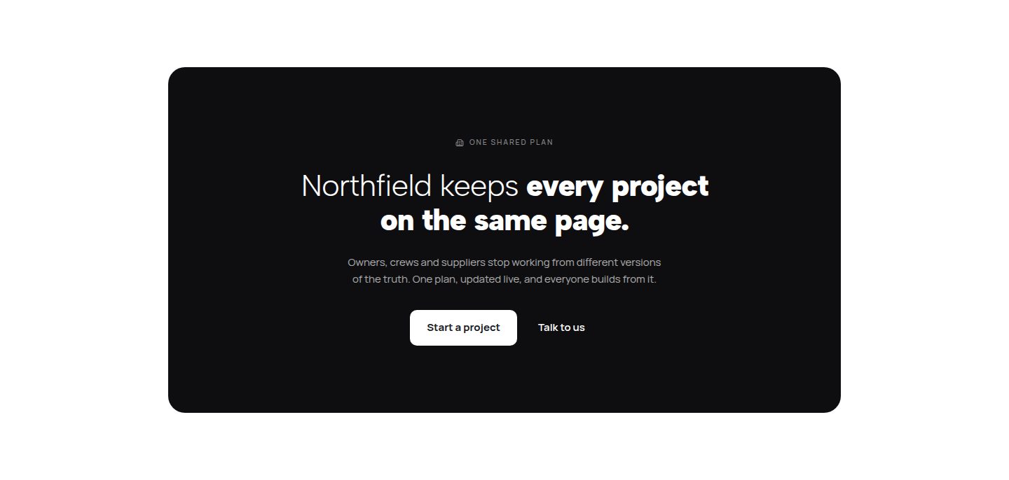
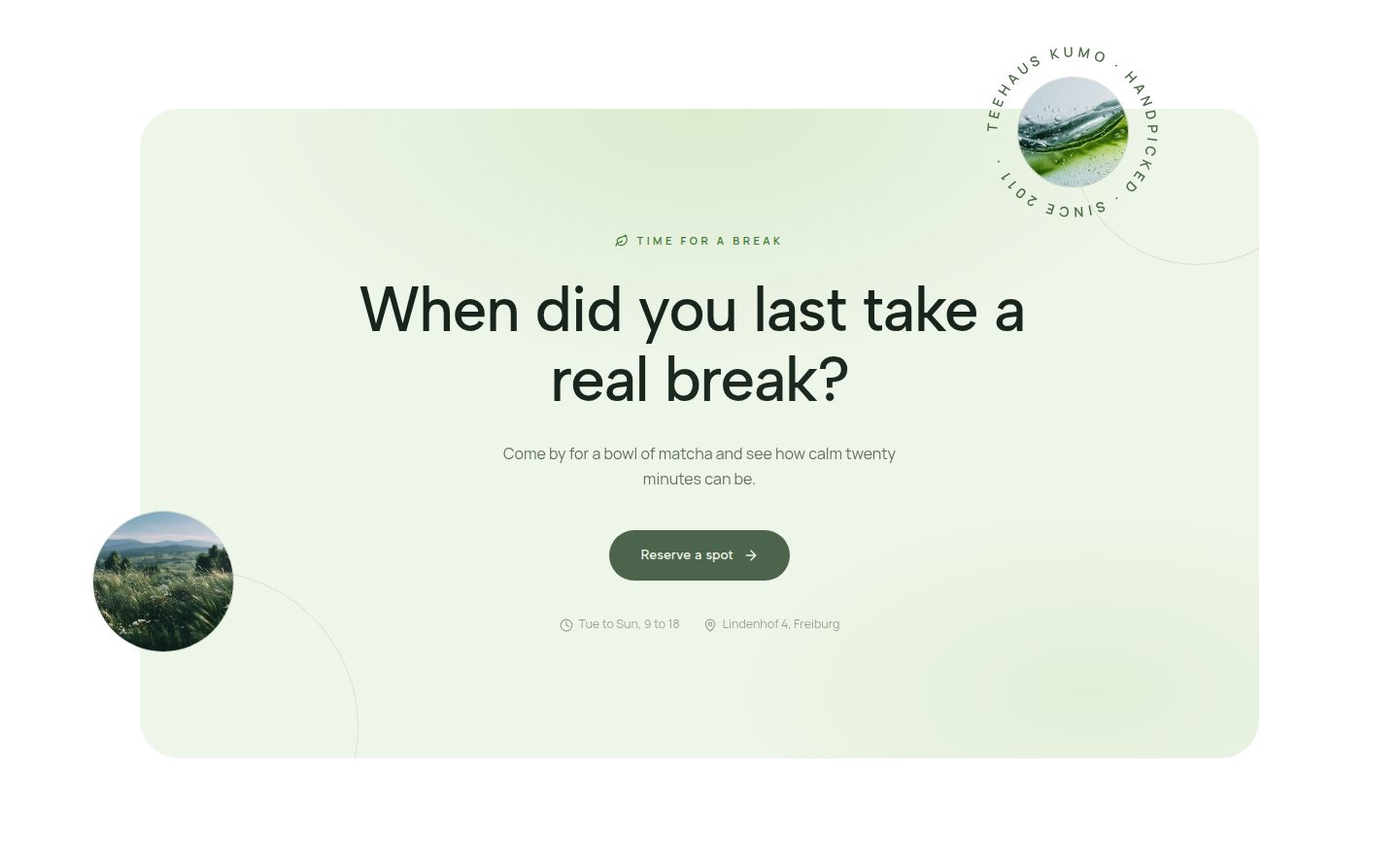
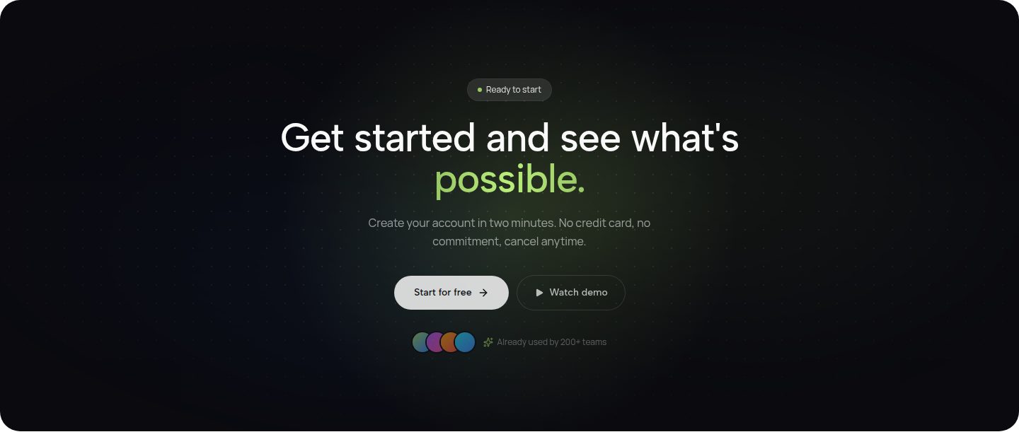
Three arrangements that work. Which one fits is decided by the imagery, not by taste.
2. Problem: name the pain, do not dress it up
The second section shows that you know the problem. One sentence is often enough if it is precise. Instead of generic lines about efficiency you describe the actual situation: quotes live in three spreadsheets and nobody knows which one is current.
The second half matters: what happens if it stays that way. Lost hours, duplicated work, missed deadlines. That consequence turns an annoyance into a reason to act.
Keep it short. Staying in the problem too long reads as lecturing.
3. Outcome: the state afterwards
Now you describe what daily work looks like once the problem is gone. Not the features, the outcome: a quote that is ready in four minutes, and everyone sees the same version.
A before and after comparison works well here as long as it stays honest. Two columns, three rows each, no exaggeration.
This section is the step from attention to interest. Whoever nods here keeps reading.
- Role and permission management
- Automated versioning
- Central data storage
- Real-time synchronisation
- Everyone sees only what concerns them.
- There is only ever one valid version.
- The quote is ready in four minutes.
- Nobody asks which file is current any more.
4. Proof: numbers, names, faces
From here on your claim needs backing. Testimonials with a photo, a full name and a role work best. An anonymous quote with five stars no longer convinces anyone.
Numbers help when they are specific. Instead of hundreds of happy customers, use 340 workshops since 2021 or reply time under two hours. Specific numbers read as measured, round numbers read as guessed.
Logos are the weakest signal but they cost little space. Set them as a calm row, not as a colourful wall.
5. Benefits: three to five, from the reader's side
Now you can go deeper. Pick three to five points and write them as benefits, not as features. Not roles and permissions, but everyone only sees what concerns them.
One icon per point is enough, and it has to match the content. The same checkmark three times says nothing. If a point already carries a number, it does not need an icon as well.
More than five points reads like a checklist. Whatever is left belongs in the documentation, not on the landing page.
6. Pricing: three options, one recommended
Three tiers are the proven layout: a cheap entry, the actual offer and a larger variant. The middle card is highlighted because most people pick the middle when they are unsure.
Each card lists four to five points, written as benefits. The price is large, the billing period small underneath. If you offer a trial, it belongs next to the button, not in a footnote.
Hide nothing. Extra costs that only appear in the cart cost you more trust than they bring in.
7. FAQ: the five to seven real objections
The FAQ is not a place for comfortable questions. Collect the objections that actually come up in a sales call and answer them directly: contract length, cancellation, data storage, effort during onboarding, refunds.
One honest answer to an uncomfortable question is worth more than three answers to harmless ones. If something is not possible, write that down. It saves both sides time.
Five to seven questions are enough. Nobody reads past that.
8. Close: the promise once more
The last section repeats in your own words what the reader gets and puts the same button in front of them again. Anyone who read this far should not have to scroll back up.
No new arguments, no second price list. One sentence, one button, done. If you like, a small note underneath that removes the last hurdle: no card required or cancel any time.
Finally, check the page on a phone. That is where most visitors read it, and that is where your order proves itself.
Sections that are almost always missing
Most landing pages have too many sections and a gap all the same. These three are missing most often.
- The objection. What holds people back? Price, effort, contract, doubts about quality. Addressing it openly wins more than working around it.
- The proof in numbers or images. One sentence from a real customer beats three paragraphs about your own attitude.
- The next step in plain words. Not "learn more" but book a call or see the price. People click what they understand.
Cut every section whose job you cannot name in one sentence.
How to check your order
The order is right when someone can read the page top to bottom without jumping back.
- Write down one job per section. One sentence, not a title. Sections without a job stand out by themselves.
- Read the headlines only. Do they add up to a story? If not, either the order is wrong or the headlines say nothing.
- Hand the page to someone without context. After thirty seconds ask what is on offer and what to do. That is the whole test.