
Vercel
The autonomous stack for every app and agent.
Color system
Names come from the color value itself, so the same color is called the same everywhere. Click a swatch to copy its hex value.
- 3 brand colours against 7 neutrals. The brand works with several chromatic colours side by side.
- Text on the ground sits at 19.8 to 1 and reaches AAA.
- The accent #000000 sits at 19.8 to 1 on the ground and carries body copy as well.
- The ground #F8F8F8 sits at 97 per cent lightness, so the scheme is built light. Flipping it means checking every pair again.
Brand colors
Neutrals
Contrast
Typography
- One typeface for everything: GeistSans. Hierarchy has to come from size and weight alone.
- The scale runs from 14px to 64px, a factor of 4.6 across 3 steps.
- From the second step to the first it is 1.1. The gap is tight, so a heading needs weight or space on top.
GeistSansAaBbCc 0123| Step | Size | Sample |
|---|---|---|
| h1 | 64px | Vercel |
| h2 | 56px | Vercel |
| body | 14px | Vercel |
Spacing and shape
- The base unit is 4px. Every spacing value is a multiple of it, and that is why things line up down the page.
- A single corner radius, 6px, applies everywhere. That keeps the corners tight.
SpacingBase 4px
- xs4px
- sm8px
- md16px
- lg24px
- xl32px
- 2xl48px
- 3xl64px
Border radius
- default6px
Guidelines
Overview
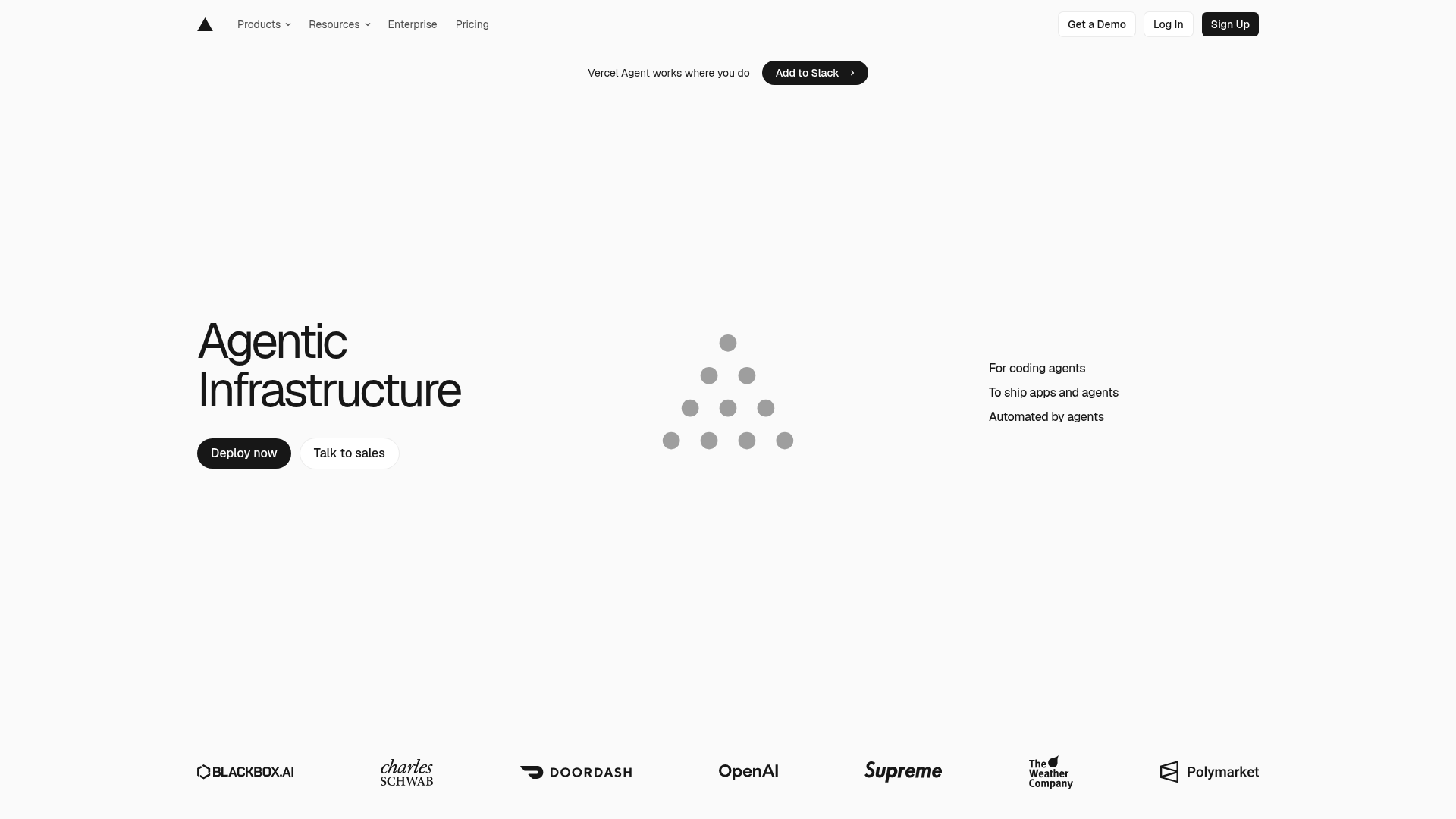
This design system captures the aesthetic and functional essence of Vercel's "Agentic Infrastructure" page. It aims for a modern, minimalist, and highly performant feel, emphasizing clarity, efficiency, and a sophisticated user experience. The design principles are rooted in Vercel's core values: speed, reliability, and developer empowerment.
Voice & Feel
The Vercel design system communicates a voice that is:
- Modern & Minimalist: Clean lines, ample white space, and a focused color palette.
- Precise & Efficient: Every element serves a purpose; no unnecessary clutter.
- Sophisticated & Professional: High-quality visuals, subtle animations, and a polished user experience.
- Developer-Centric: Designed to be intuitive and empowering for technical users, reflecting cutting-edge technology.
- Confident & Authoritative: The bold typography and strong contrasts convey leadership in the tech space.
The overall feel is one of speed, clarity, and innovation. Interactions should feel immediate and delightful, with a focus on delivering information and functionality without distraction.
Export
# Agentic Infrastructure - Vercel Design System

## Overview

This design system captures the aesthetic and functional essence of Vercel's "Agentic Infrastructure" page. It aims for a modern, minimalist, and highly performant feel, emphasizing clarity, efficiency, and a sophisticated user experience. The design principles are rooted in Vercel's core values: speed, reliability, and developer empowerment.

## Color System

The color palette is stark and professional, relying heavily on monochrome with subtle grays to define hierarchy and visual breaks. A single, vibrant blue is used sparingly for interactive elements or key highlights, reinforcing a tech-forward and clean aesthetic.

| Name         | Hex       | Description                                  |
| :----------- | :-------- | :------------------------------------------- |
| Primary      | `#000000` | Dominant brand color, often used for text.   |
| Secondary    | `#FFFFFF` | Used for backgrounds, cards, and prominent text on dark. |
| Accent       | `#000000` | Reinforces primary, potentially for interactive elements. |
| Background   | `#F8F8F8` | Light, off-white main page background.       |
| Surface      | `#FFFFFF` | Pure white for cards, modals, or distinct sections. |
| Text Primary | `#000000` | Standard black for main content.             |
| Text Secondary | `#555555` | Softer gray for less emphasized text, descriptions. |

**Palette:**

- `#000000` (Black)
- `#FFFFFF` (White)
- `#F8F8F8` (Light Gray Background)
- `#555555` (Medium Gray Text)
- `#EBEBEB` (Very Light Gray, often for borders or subtle dividers)
- `#BDBDBD` (Light Gray, for icons or disabled states)
- `#0072F5` (Vibrant Blue, for active states, links, primary actions)
- `#BEF4EB` (Very Light Teal, potentially for subtle highlights or badge backgrounds)
- `#171717` (Dark Gray, for subtle dark backgrounds or text on light)
- `#FAFAFA` (Off-white, very subtle variation of F8F8F8)

## Typography

Vercel utilizes a modern, geometric sans-serif typeface, GeistSans, across its interface to maintain a consistent, crisp, and highly readable experience. The hierarchy is established through size and weight variations, with minimal use of color for distinction.

**Font Families:**

- **Primary / Body / Paragraph:** `GeistSans`, sans-serif
- **Heading:** `GeistSans`, sans-serif

**Font Sizes:**

- **H1:** `64px` (Very large, for hero sections or main titles)
- **H2:** `56px` (Large, for section titles)
- **Body / Paragraph:** `14px` (Standard readable size for content)

**Usage Notes:**

- Headings are bold and impactful, designed to capture attention.
- Body text is clean and legible, optimized for digital screens.
- Line heights and letter spacing should be carefully considered to enhance readability, typically defaulting to 1.5x for body text.

## Spacing & Radius

A consistent spacing system, based on a 4px base unit, ensures visual harmony and proper element alignment. The subtle border-radius adds a touch of modern softness without compromising the clean, sharp aesthetic.

**Spacing Unit:**

- **Base Unit:** `4px`
- All padding, margins, and gaps should be multiples of `4px` (e.g., `4px`, `8px`, `12px`, `16px`, `24px`, `32px`, `48px`, `64px`).

**Border Radius:**

- **Default:** `6px`
- Applied consistently to buttons, cards, input fields, and other interactive or contained elements. This provides a soft, approachable feel while maintaining a professional look.

## Voice & Feel

The Vercel design system communicates a voice that is:

-   **Modern & Minimalist:** Clean lines, ample white space, and a focused color palette.
-   **Precise & Efficient:** Every element serves a purpose; no unnecessary clutter.
-   **Sophisticated & Professional:** High-quality visuals, subtle animations, and a polished user experience.
-   **Developer-Centric:** Designed to be intuitive and empowering for technical users, reflecting cutting-edge technology.
-   **Confident & Authoritative:** The bold typography and strong contrasts convey leadership in the tech space.

The overall feel is one of speed, clarity, and innovation. Interactions should feel immediate and delightful, with a focus on delivering information and functionality without distraction.

## Implementation Notes (Tailwind Tokens)

This section provides a guide for implementing the design system using Tailwind CSS custom configurations.

```css
/* tailwind.config.js */
module.exports = {
  theme: {
    extend: {
      colors: {
        'primary': 'var(--color-primary, #000000)',
        'secondary': 'var(--color-secondary, #FFFFFF)',
        'accent': 'var(--color-accent, #000000)',
        'background': 'var(--color-background, #F8F8F8)',
        'surface': 'var(--color-surface, #FFFFFF)',
        'text-primary': 'var(--color-text-primary, #000000)',
        'text-secondary': 'var(--color-text-secondary, #555555)',
        'palette-black': 'var(--color-palette-black, #000000)',
        'palette-white': 'var(--color-palette-white, #FFFFFF)',
        'palette-light-background': 'var(--color-palette-light-background, #F8F8F8)',
        'palette-medium-gray': 'var(--color-palette-medium-gray, #555555)',
        'palette-light-border': 'var(--color-palette-light-border, #EBEBEB)',
        'palette-gray-icon': 'var(--color-palette-gray-icon, #BDBDBD)',
        'palette-blue-interactive': 'var(--color-palette-blue-interactive, #0072F5)',
        'palette-teal-highlight': 'var(--color-palette-teal-highlight, #BEF4EB)',
        'palette-dark-gray-subtle': 'var(--color-palette-dark-gray-subtle, #171717)',
        'palette-off-white': 'var(--color-palette-off-white, #FAFAFA)',
      },
      fontFamily: {
        geist: ['GeistSans', 'sans-serif'],
      },
      fontSize: {
        'h1': '64px',
        'h2': '56px',
        'body': '14px',
      },
      spacing: {
        '1': '4px',    // base unit
        '2': '8px',
        '3': '12px',
        '4': '16px',
        '5': '20px',
        '6': '24px',
        '8': '32px',
        '10': '40px',
        '12': '48px',
        '16': '64px',
      },
      borderRadius: {
        'DEFAULT': '6px',
        'sm': '6px', // Standard radius for most elements
      },
    },
  },
  plugins: [],
}
```

```css
/* src/styles.css or equivalent global CSS file */
@tailwind base;
@tailwind components;
@tailwind utilities;

/* Define CSS Variables for dynamic themes or easier access */
:root {
  /* Colors */
  --color-primary: #000000;
  --color-secondary: #FFFFFF;
  --color-accent: #000000;
  --color-background: #F8F8F8;
  --color-surface: #FFFFFF;
  --color-text-primary: #000000;
  --color-text-secondary: #555555;

  --color-palette-black: #000000;
  --color-palette-white: #FFFFFF;
  --color-palette-light-background: #F8F8F8;
  --color-palette-medium-gray: #555555;
  --color-palette-light-border: #EBEBEB;
  --color-palette-gray-icon: #BDBDBD;
  --color-palette-blue-interactive: #0072F5;
  --color-palette-teal-highlight: #BEF4EB;
  --color-palette-dark-gray-subtle: #171717;
  --color-palette-off-white: #FAFAFA;

  /* Typography */
  --font-geist: GeistSans, sans-serif;

  /* Spacing & Radius */
  --spacing-unit: 4px;
  --border-radius-default: 6px;
}

/* Base styles for GeistSans - if not using @font-face in CSS, ensure font is imported */
/* Example for GeistSans: */
/* @font-face {
  font-family: 'GeistSans';
  src: url('/fonts/GeistSans-Regular.woff2') format('woff2');
  font-weight: 400;
  font-style: normal;
}
@font-face {
  font-family: 'GeistSans';
  src: url('/fonts/GeistSans-Bold.woff2') format('woff2');
  font-weight: 700;
  font-style: normal;
} */

html {
  font-family: var(--font-geist);
}
```Frequently asked questions
You copy the color and typography values into your Tailwind configuration or your CSS variables and use them as a consistent base.
Didn't find your question? We're happy to help.
Get in touch