Nerd Stack
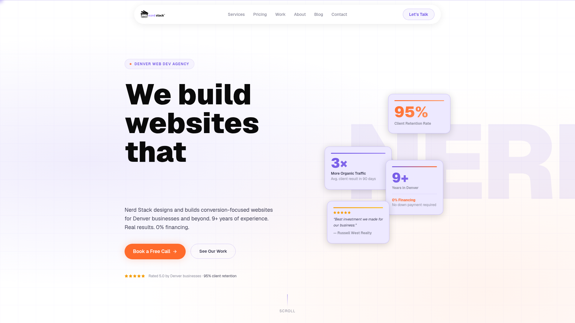
Nerd Stack is a Denver web development agency with 9+ years of experience. We build conversion-focused websites that generate leads for small and medium businesses. 0% financing available.
Color system
Names come from the color value itself, so the same color is called the same everywhere. Click a swatch to copy its hex value.
- 6 brand colours against 4 neutrals. The brand works with several chromatic colours side by side.
- Text on the ground sits at 15.5 to 1 and reaches AAA.
- The accent #6C3AEB sits at 5.8 to 1 on the ground and carries body copy as well.
- The ground #F9F9FC sits at 98 per cent lightness, so the scheme is built light. Flipping it means checking every pair again.
Brand colors
Neutrals
Contrast
Typography
- One typeface for everything: Geist. Hierarchy has to come from size and weight alone.
- The scale runs from 18px to 96px, a factor of 5.3 across 3 steps.
- From the second step to the first it is 2. A heading separates from the text by size alone.
GeistAaBbCc 0123| Step | Size | Sample |
|---|---|---|
| h1 | 96px | Nerd Stack |
| h2 | 48px | Nerd Stack |
| body | 18px | Nerd Stack |
Spacing and shape
- The base unit is 4px. Every spacing value is a multiple of it, and that is why things line up down the page.
- A single corner radius, 2px, applies everywhere. The edges stay hard.
SpacingBase 4px
- xs4px
- sm8px
- md16px
- lg24px
- xl32px
- 2xl48px
- 3xl64px
Border radius
- default2px
Guidelines
Overview
This document outlines the core design principles and system for Nerd Stack, focusing on creating a conversion-focused, professional, and approachable aesthetic. The design aims to be clean, modern, and reinforce the agency's expertise in web development.
Voice and Feel
The tone is professional, expert, and approachable. The design should convey trust and competence, highlighting the agency's experience and results-driven approach. It should feel modern, efficient, and user-centric, instilling confidence in potential clients.
Export
# DESIGN.md: Nerd Stack

## Overview

This document outlines the core design principles and system for Nerd Stack, focusing on creating a conversion-focused, professional, and approachable aesthetic. The design aims to be clean, modern, and reinforce the agency's expertise in web development.

## Color System

The color palette is designed to be vibrant yet professional, with a strong primary accent.

| Role           | Hex       | Description                                  |
| :------------- | :-------- | :------------------------------------------- |
| Primary        | `#FE7B3E` | Key brand color, used for calls to action.   |
| Secondary      | `#FFFFFF` | Dominant neutral, clean and spacious.        |
| Accent         | `#6C3AEB` | Supporting accent for highlights and links.  |
| Background     | `#F9F9FC` | Light, subtle background for content areas.  |
| Surface        | `#FFFFFF` | Used for cards, modals, and distinct elements.|
| Text Primary   | `#202020` | Main body text, bold and readable.          |
| Text Secondary | `#7C7C7C` | Secondary text, less prominence.            |

### Palette

*   `#FE7B3E` (Primary)
*   `#6C3AEB` (Accent)
*   `#FFFFFF` (White)
*   `#F9F9FC` (Light Background)
*   `#202020` (Dark Text)
*   `#7C7C7C` (Gray Text)
*   `#CFCFF0` (Light Purple/Gray)
*   `#DBDBDB` (Light Gray)
*   `#E2DDFB` (Lighter Purple)
*   `#E5DDFB` (Even lighter Purple)

## Typography

The typography focuses on readability and a modern, technical feel using the Geist typeface.

### Font Families

*   **Primary:** Geist
*   **Heading:** Geist

### Font Stacks

*   **Heading:** `Geist, sans-serif`
*   **Body:** `Geist, sans-serif`
*   **Paragraph:** `Geist, sans-serif`

### Font Sizes

*   **H1:** 96px
*   **H2:** 48px
*   **Body (Default):** 18px

## Spacing & Radius

Consistent spacing and subtle rounding contribute to a clean and organized layout.

*   **Base Spacing Unit:** 4px (All spacing values should be multiples of 4)
*   **Border Radius:** 2px (Subtle rounding on interactive elements and containers)

## Voice and Feel

The tone is professional, expert, and approachable. The design should convey trust and competence, highlighting the agency's experience and results-driven approach. It should feel modern, efficient, and user-centric, instilling confidence in potential clients.

## Implementation Notes (Tailwind CSS)

```css
/* Color Variables */
:root {
  --color-primary: #FE7B3E;
  --color-secondary: #FFFFFF;
  --color-accent: #6C3AEB;
  --color-background: #F9F9FC;
  --color-surface: #FFFFFF;
  --color-text-primary: #202020;
  --color-text-secondary: #7C7C7C;

  --color-palette-1: #FE7B3E; /* primary */
  --color-palette-2: #6C3AEB; /* accent */
  --color-palette-3: #FFFFFF;
  --color-palette-4: #F9F9FC;
  --color-palette-5: #202020;
  --color-palette-6: #7C7C7C;
  --color-palette-7: #CFCFF0;
  --color-palette-8: #DBDBDB;
  --color-palette-9: #E2DDFB;
  --color-palette-10: #E5DDFB;
}

/* Typography Variables */
:root {
  --font-geist: Geist, sans-serif;
  --font-size-h1: 96px;
  --font-size-h2: 48px;
  --font-size-body: 18px;
}

/* Spacing Variables */
:root {
  --spacing-unit: 4px; /* Base for all spacing: padding, margin, gap */
  --border-radius: 2px;
}
```

```javascript
// tailwind.config.js
module.exports = {
  theme: {
    extend: {
      colors: {
        primary: 'var(--color-primary)',
        secondary: 'var(--color-secondary)',
        accent: 'var(--color-accent)',
        background: 'var(--color-background)',
        surface: 'var(--color-surface)',
        text: {
          DEFAULT: 'var(--color-text-primary)',
          primary: 'var(--color-text-primary)',
          secondary: 'var(--color-text-secondary)',
        },
        palette: {
          1: 'var(--color-palette-1)',
          2: 'var(--color-palette-2)',
          3: 'var(--color-palette-3)',
          4: 'var(--color-palette-4)',
          5: 'var(--color-palette-5)',
          6: 'var(--color-palette-6)',
          7: 'var(--color-palette-7)',
          8: 'var(--color-palette-8)',
          9: 'var(--color-palette-9)',
          10: 'var(--color-palette-10)',
        }
      },
      fontFamily: {
        geist: ['var(--font-geist)'],
      },
      fontSize: {
        'h1': 'var(--font-size-h1)',
        'h2': 'var(--font-size-h2)',
        'body': 'var(--font-size-body)',
      },
      borderRadius: {
        'DEFAULT': 'var(--border-radius)',
        'sm': 'var(--border-radius)', // Use for smaller elements
        // Define other sizes if needed, e.g., 'md': 'calc(var(--border-radius) * 2)'
      },
      spacing: {
        'xs': 'calc(var(--spacing-unit) * 2)', // 8px
        'sm': 'calc(var(--spacing-unit) * 4)', // 16px
        'md': 'calc(var(--spacing-unit) * 6)', // 24px
        'lg': 'calc(var(--spacing-unit) * 8)', // 32px
        'xl': 'calc(var(--spacing-unit) * 12)', // 48px
        // Add more as needed, always based on 'var(--spacing-unit)'
      }
    },
  },
  plugins: [],
};
```Frequently asked questions
You copy the color and typography values into your Tailwind configuration or your CSS variables and use them as a consistent base.
Didn't find your question? We're happy to help.
Get in touch