Systra Studios
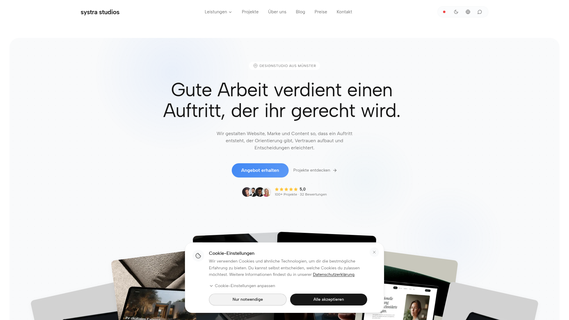
Systra Studios ist ein Designstudio aus Münster: Webdesign, Branding, Social Media und KI-Web-Apps. Persönliche Beratung, faire Festpreise, 5,0★ auf Google.
Color system
Names come from the color value itself, so the same color is called the same everywhere. Click a swatch to copy its hex value.
- 5 brand colours against 5 neutrals. The brand works with several chromatic colours side by side.
- Text on the ground sits at 15.6 to 1 and reaches AAA.
- The accent #FFB22B sits at 1.7 to 1 on the ground and is a surface, not text.
- The ground #F9FAFB sits at 98 per cent lightness, so the scheme is built light. Flipping it means checking every pair again.
Brand colors
Neutrals
Contrast
Typography
- 2 typefaces: Manrope, Albert Sans. The first one covers Heading.
- The scale runs from 11px to 64px, a factor of 5.8 across 3 steps.
- From the second step to the first it is 1.5. A heading separates from the text by size alone.
Albert Sans, Manrope, sans-serifAaBbCc 0123Albert SansAaBbCc 0123| Step | Size | Sample |
|---|---|---|
| h1 | 64px | Systra Studios |
| h2 | 42px | Systra Studios |
| body | 11px | Systra Studios |
Spacing and shape
- The base unit is 4px. Every spacing value is a multiple of it, and that is why things line up down the page.
- A single corner radius, 24px, applies everywhere. Everything reads distinctly soft.
SpacingBase 4px
- xs4px
- sm8px
- md16px
- lg24px
- xl32px
- 2xl48px
- 3xl64px
Border radius
- default24px
Guidelines
Overview
This document outlines the core design principles and system for Systra Studios, focusing on a clean, modern, and trustworthy aesthetic. The design aims to be approachable yet professional, reflecting the studio's expertise in web design, branding, and AI solutions.
Voice and Feel
The brand's voice and feel are:
- Professional & Expert: Demonstrating deep knowledge in web design, branding, and AI.
- Approachable & Personal: Emphasizing "persönliche Beratung" and a client-first approach.
- Modern & Innovative: Reflecting the use of AI and contemporary design trends.
- Trustworthy & Reliable: Backed by 5-star Google reviews and "faire Festpreise."
- Clear & Concise: Direct communication, avoiding jargon where possible.
Visually, this translates to:
- Clean layouts with ample whitespace.
- Clear hierarchy provided by typography and color.
- Subtle animations and interactions to enhance user experience without distraction.
- High-quality imagery and thoughtful iconography.
Export
# DESIGN.md: Systra Studios

## Overview

This document outlines the core design principles and system for Systra Studios, focusing on a clean, modern, and trustworthy aesthetic. The design aims to be approachable yet professional, reflecting the studio's expertise in web design, branding, and AI solutions.

## Color System

The color palette is designed to be vibrant and professional, using a bright primary blue balanced with a warm accent and neutral tones for readability.

*   **Primary:** `#4D8DF5` (Systra Blue) - Represents trust, professionalism, and innovation. Used for main calls to action, important links, and focal UI elements.
*   **Secondary:** `#FFFFFF` (Pure White) - Used for backgrounds, surface elements, and text contrast.
*   **Accent:** `#FFB22B` (Systra Gold) - Adds warmth and highlights key information or interactive elements.
*   **Background:** `#F9FAFB` (Light Gray) - A subtle, soft background color to improve readability and reduce eye strain.
*   **Surface:** `#FFFFFF` (Pure White) - For cards, modals, and distinct content blocks.
*   **Text Primary:** `#202020` (Dark Gray) - Main body text color for high readability.
*   **Text Secondary:** `#6B7280` (Medium Gray) - For secondary information, captions, and less emphasized text.

**Palette:**
*   `#4D8DF5`
*   `#FFB22B`
*   `#FFFFFF`
*   `#F9FAFB`
*   `#202020`
*   `#6B7280`
*   `#E5E7EB` (Light Gray/Border)
*   `#18181A` (Darkest Gray)
*   `#3E84F4` (Primary Hover/Active)
*   `#B7EAD9` (Subtle UI accent/illustration)

## Typography

A combination of modern sans-serif fonts is used to ensure clarity and a professional feel, while maintaining an approachable tone.

*   **Headings:** `Manrope`, `Albert Sans`, sans-serif
*   **Body/Paragraphs:** `Albert Sans`, `Manrope`, sans-serif

**Font Sizes:**
*   `h1`: 64px
*   `h2`: 42px
*   `body`: 11px (This seems unusually small; consider adjusting for standard readability, e.g., 16px as a base.)

## Spacing & Radius

Consistent spacing and rounded corners contribute to a clean, user-friendly interface.

*   **Base Unit:** 4px. All spacing (padding, margin, gap) should be multiples of 4px.
    *   Examples: 4px, 8px, 12px, 16px, 20px, 24px, 32px, 48px, etc.
*   **Border Radius:** 24px - Used consistently for cards, buttons, and input fields to give a soft, modern feel.

## Voice and Feel

The brand's voice and feel are:

*   **Professional & Expert:** Demonstrating deep knowledge in web design, branding, and AI.
*   **Approachable & Personal:** Emphasizing "persönliche Beratung" and a client-first approach.
*   **Modern & Innovative:** Reflecting the use of AI and contemporary design trends.
*   **Trustworthy & Reliable:** Backed by 5-star Google reviews and "faire Festpreise."
*   **Clear & Concise:** Direct communication, avoiding jargon where possible.

Visually, this translates to:
*   Clean layouts with ample whitespace.
*   Clear hierarchy provided by typography and color.
*   Subtle animations and interactions to enhance user experience without distraction.
*   High-quality imagery and thoughtful iconography.

## Implementation Notes (Tailwind CSS)

```css
:root {
  /* Colors */
  --color-primary: #4D8DF5;
  --color-secondary: #FFFFFF;
  --color-accent: #FFB22B;
  --color-background: #F9FAFB;
  --color-surface: #FFFFFF;
  --color-text-primary: #202020;
  --color-text-secondary: #6B7280;

  --color-palette-1: #4D8DF5; /* Primary */
  --color-palette-2: #FFB22B; /* Accent */
  --color-palette-3: #FFFFFF; /* White */
  --color-palette-4: #F9FAFB; /* Background */
  --color-palette-5: #202020; /* Text Primary */
  --color-palette-6: #6B7280; /* Text Secondary */
  --color-palette-7: #E5E7EB; /* Light Gray/Border */
  --color-palette-8: #18181A; /* Darkest Gray */
  --color-palette-9: #3E84F4; /* Primary Hover/Active */
  --color-palette-10: #B7EAD9; /* Subtle UI accent/illustration */

  /* Typography */
  --font-family-heading: "Manrope", "Albert Sans", sans-serif;
  --font-family-body: "Albert Sans", "Manrope", sans-serif;
  --font-family-paragraph: "Albert Sans", "Manrope", sans-serif;

  --font-size-h1: 64px;
  --font-size-h2: 42px;
  --font-size-body: 1rem; /* Adjusted for standard readability; original 11px is very small. Consider 16px base. */

  /* Spacing & Radius */
  --spacing-unit: 4px; /* Base for multiples */
  --border-radius-base: 24px;
}
```

**Tailwind Config Example (`tailwind.config.js`):**

```javascript
module.exports = {
  theme: {
    extend: {
      colors: {
        primary: 'var(--color-primary)',
        secondary: 'var(--color-secondary)',
        accent: 'var(--color-accent)',
        background: 'var(--color-background)',
        surface: 'var(--color-surface)',
        textPrimary: 'var(--color-text-primary)',
        textSecondary: 'var(--color-text-secondary)',
        'palette-1': 'var(--color-palette-1)',
        'palette-2': 'var(--color-palette-2)',
        'palette-3': 'var(--color-palette-3)',
        'palette-4': 'var(--color-palette-4)',
        'palette-5': 'var(--color-palette-5)',
        'palette-6': 'var(--color-palette-6)',
        'palette-7': 'var(--color-palette-7)',
        'palette-8': 'var(--color-palette-8)',
        'palette-9': 'var(--color-palette-9)',
        'palette-10': 'var(--color-palette-10)',
      },
      fontFamily: {
        heading: 'var(--font-family-heading)',
        body: 'var(--font-family-body)',
        paragraph: 'var(--font-family-paragraph)', // Can often just use 'body'
      },
      fontSize: {
        h1: 'var(--font-size-h1)',
        h2: 'var(--font-size-h2)',
        body: 'var(--font-size-body)',
      },
      borderRadius: {
        DEFAULT: 'var(--border-radius-base)',
        'base': 'var(--border-radius-base)', // Explicit alias
      },
      spacing: {
        '1': 'calc(1 * var(--spacing-unit))', // 4px
        '2': 'calc(2 * var(--spacing-unit))', // 8px
        '3': 'calc(3 * var(--spacing-unit))', // 12px
        '4': 'calc(4 * var(--spacing-unit))', // 16px
        '5': 'calc(5 * var(--spacing-unit))', // 20px
        '6': 'calc(6 * var(--spacing-unit))', // 24px
        '8': 'calc(8 * var(--spacing-unit))', // 32px
        '12': 'calc(12 * var(--spacing-unit))',// 48px
        // Add more as needed, or use default Tailwind spacing for finer increments if `var(--spacing-unit)` isn't applied globally.
      },
    },
  },
  plugins: [],
};
```Frequently asked questions
You copy the color and typography values into your Tailwind configuration or your CSS variables and use them as a consistent base.
Didn't find your question? We're happy to help.
Get in touch