
Superside
We’re the only AI-powered creative service built to scale alongside in-house teams, providing enterprises with fast, flexible, and reliable creative solutions that help drive business growth.
Color system
Names come from the color value itself, so the same color is called the same everywhere. Click a swatch to copy its hex value.
- 7 brand colours against 3 neutrals. The brand works with several chromatic colours side by side.
- Text on the ground sits at 12.3 to 1 and reaches AAA.
- The accent #5CF5A2 sits at 10.6 to 1 on the ground and carries body copy as well.
- The ground #1A2B27 sits at 14 per cent lightness, so the scheme is built dark. Flipping it means checking every pair again.
Brand colors
Neutrals
Contrast
Typography
- 2 typefaces: Inter Tight, Inter. The first one covers Heading.
- The scale runs from 18px to 88px, a factor of 4.9 across 3 steps.
- From the second step to the first it is 1.2. The gap is tight, so a heading needs weight or space on top.
Inter Tight, Inter, Arial, sans-serifAaBbCc 0123InterAaBbCc 0123| Step | Size | Sample |
|---|---|---|
| h1 | 88px | Superside |
| h2 | 72px | Superside |
| body | 18px | Superside |
Spacing and shape
- The base unit is 4px. Every spacing value is a multiple of it, and that is why things line up down the page.
- A single corner radius, 0px, applies everywhere. The edges stay hard.
SpacingBase 4px
- xs4px
- sm8px
- md16px
- lg24px
- xl32px
- 2xl48px
- 3xl64px
Border radius
- default0px
Guidelines
Overview
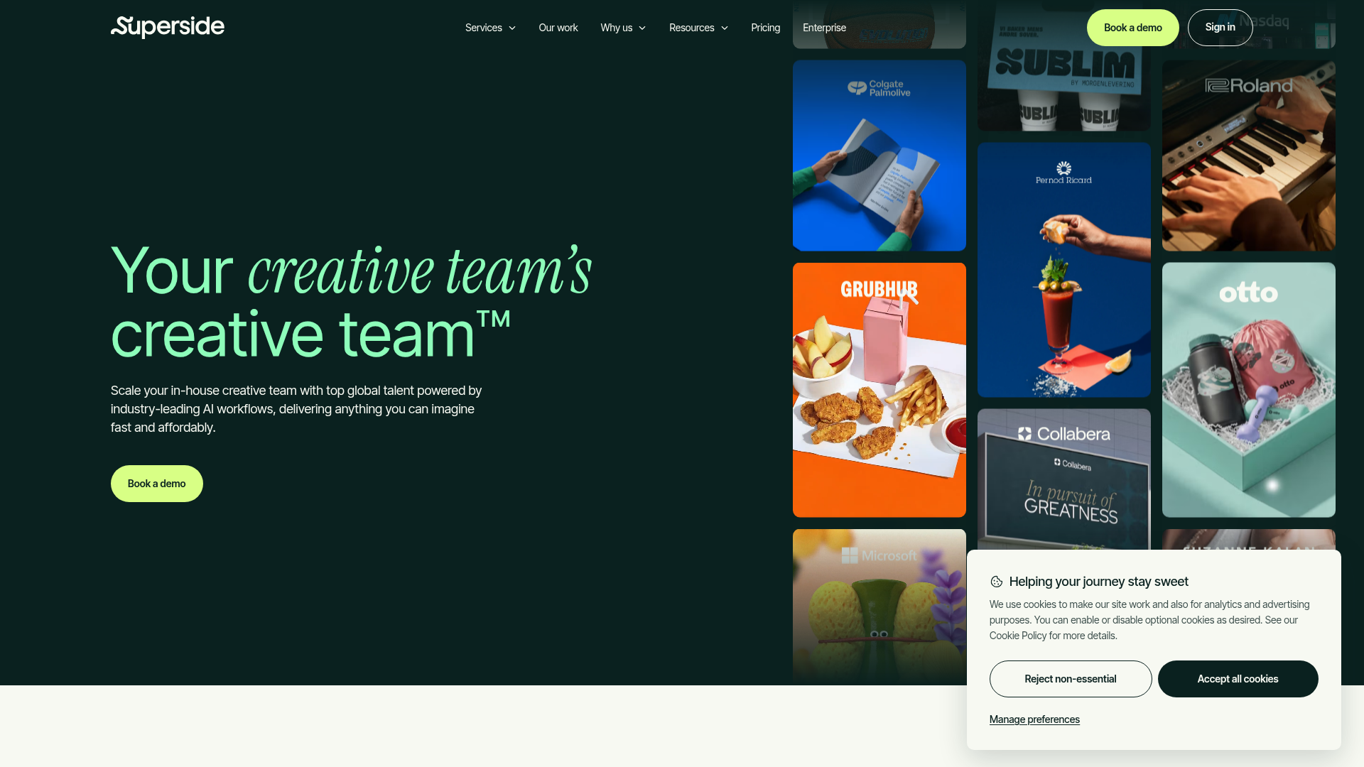
Superside provides an AI-powered creative service designed to scale alongside in-house teams. This design system reflects a modern, technology-forward, and trustworthy brand presence. The aesthetic combines vibrant accents with sophisticated dark tones, ensuring clarity and engagement across all user touchpoints.
Core Principles
- Modern & Dynamic: Utilizes bold typography and a striking color palette to convey innovation.
- Reliable & Trustworthy: Maintains a professional feel through clean layouts and considered spacing.
- User-Centric: Designed for clarity and ease of use, reflecting the service's efficiency.
Voice & Feel
Superside's voice is confident, intelligent, and empowering. It emphasizes expertise and innovation, speaking directly to enterprise needs with clarity and professionalism.
- Tone: Professional, innovative, direct, supportive.
- Language: Clear, concise, solution-oriented. Avoid jargon where possible, but embrace industry-specific terms when communicating expertise.
- Brand Personality: A trusted partner, an industry leader, a sophisticated problem-solver.
- Visual Feel: High-tech, clean, premium, and dynamic. The vibrant greens suggest growth and freshness, while the dark backgrounds and sharp edges provide a sense of depth and modernity.
Export
# Superside Design System

## Overview

Superside provides an AI-powered creative service designed to scale alongside in-house teams. This design system reflects a modern, technology-forward, and trustworthy brand presence. The aesthetic combines vibrant accents with sophisticated dark tones, ensuring clarity and engagement across all user touchpoints.

### Core Principles
- **Modern & Dynamic:** Utilizes bold typography and a striking color palette to convey innovation.
- **Reliable & Trustworthy:** Maintains a professional feel through clean layouts and considered spacing.
- **User-Centric:** Designed for clarity and ease of use, reflecting the service's efficiency.

## Color System

The Superside color system balances energetic greens with deep, foundational tones, complemented by neutral and accessible text colors.

### Core Palette
- **Primary:** `hsl(77 99% 70%)` (`#D8FE63`) - A vibrant, energetic green, signifying innovation and growth.
- **Secondary:** `hsl(172 41% 13%)` (`#132D28`) - A deep, rich green-blue, providing a strong foundation and sophistication.
- **Accent:** `hsl(156 82% 66%)` (`#5CF5A2`) - A bright, refreshing green, used for highlights and calls to action.
- **Background:** `hsl(167 17% 13%)` (`#1A2B27`) - A dark, immersive background tone that enhances content visibility.
- **Surface:** `hsl(30 39% 95%)` (`#F4F1ED`) - A light, near-white tone for contrast and content areas.

### Text & Neutrals
- **Text Primary:** `hsl(210 11% 92%)` (`#EAEAEB`) - High-contrast text for dark backgrounds.
- **Text Secondary:** `hsl(210 3% 67%)` (`#ADACA7`) - Subtler text for secondary information or less emphasis.
- **Gray:** `hsl(0 0% 25%)` (`#404040`) - A darker neutral gray.

### Extended Palette (Contextual)
- `hsl(172 17% 21%)` (`#2C403C`) - A darker muted green, often for secondary background elements or subtle depth.
- `hsl(25 93% 56%)` (`#F87528`) - A bold orange, potentially for alerts, errors, or specific highlight needs.

## Typography

Superside uses `Inter Tight` for headings and `Inter` for body text, creating a strong visual hierarchy and modern appeal.

### Font Families
- **Heading:** `Inter Tight` (Primary for all headings)
- **Body/Paragraph:** `Inter` (Primary for all body and paragraph text)

### Font Stacks
- **Headings:** `"Inter Tight", "Inter", Arial, sans-serif`
- **Body & Paragraphs:** `"Inter Tight", "Inter", Arial, sans-serif` (Note: `Inter Tight` is specified in the JSON for body/paragraph, but `Inter` is a more common choice for legibility in body copy. We follow the JSON data but note the potential for refinement).

### Font Sizes (Base & Key Sizes)
- **H1:** `88px`
- **H2:** `72px`
- **Body:** `18px`

Further typographic scales (H3-H6, paragraph sizes) should be derived systematically to maintain consistency.

## Spacing & Radius

Superside adopts a modular spacing system for consistent layouts, with a focus on sharp, modern aesthetics through minimal border radius.

### Spacing
- **Base Unit:** `4px`
- All spacing (margins, padding, gaps) should be multiples of `4px` (e.g., `4px`, `8px`, `12px`, `16px`, `20px`, `24px`, `32px`, `48px`, `64px`, `96px`).

### Border Radius
- **Default:** `0px` - Sharp edges contribute to a modern and precise aesthetic.
- (If subtle rounding is needed for specific elements like buttons, it should be a very small, consistent value like `2px` or `4px` and explicitly defined.)

## Voice & Feel

Superside's voice is confident, intelligent, and empowering. It emphasizes expertise and innovation, speaking directly to enterprise needs with clarity and professionalism.

- **Tone:** Professional, innovative, direct, supportive.
- **Language:** Clear, concise, solution-oriented. Avoid jargon where possible, but embrace industry-specific terms when communicating expertise.
- **Brand Personality:** A trusted partner, an industry leader, a sophisticated problem-solver.
- **Visual Feel:** High-tech, clean, premium, and dynamic. The vibrant greens suggest growth and freshness, while the dark backgrounds and sharp edges provide a sense of depth and modernity.

## Implementation Notes (Tailwind Tokens)

This section provides Tailwind CSS variable definitions for easy integration.

```css
/* Color System */
:root {
  --color-primary: #D8FE63;
  --color-secondary: #132D28;
  --color-accent: #5CF5A2;
  --color-background: #1A2B27;
  --color-surface: #F4F1ED;
  --color-text-primary: #EAEAEB;
  --color-text-secondary: #ADACA7;

  /* Extended Palette */
  --color-gray-dark: #404040;
  --color-green-dark-muted: #2C403C; /* Based on #2C403C */
  --color-orange-bold: #F87528; /* Based on #F87528 */
}

/* Typography */
:root {
  --font-family-heading: "Inter Tight", sans-serif;
  --font-family-body: "Inter Tight", sans-serif; /* As per JSON; consider "Inter" for legibility */

  --font-size-h1: 88px;
  --font-size-h2: 72px;
  --font-size-body: 18px;
}

/* Spacing & Radius */
:root {
  --spacing-unit: 4px; /* Base unit for all spacing */
  --border-radius-default: 0px;
}
```

```javascript
// tailwind.config.js example for extending theme
module.exports = {
  theme: {
    extend: {
      colors: {
        primary: 'var(--color-primary)',
        secondary: 'var(--color-secondary)',
        accent: 'var(--color-accent)',
        background: 'var(--color-background)',
        surface: 'var(--color-surface)',
        'text-primary': 'var(--color-text-primary)',
        'text-secondary': 'var(--color-text-secondary)',
        gray: {
          dark: 'var(--color-gray-dark)',
        },
        green: {
          'dark-muted': 'var(--color-green-dark-muted)',
        },
        orange: {
          bold: 'var(--color-orange-bold)',
        },
      },
      fontFamily: {
        heading: ['var(--font-family-heading)'],
        body: ['var(--font-family-body)'],
      },
      fontSize: {
        'h1': 'var(--font-size-h1)',
        'h2': 'var(--font-size-h2)',
        'body': 'var(--font-size-body)',
      },
      spacing: {
        '1': 'var(--spacing-unit)', // 4px
        '2': 'calc(var(--spacing-unit) * 2)', // 8px
        '3': 'calc(var(--spacing-unit) * 3)', // 12px
        '4': 'calc(var(--spacing-unit) * 4)', // 16px
        '5': 'calc(var(--spacing-unit) * 5)', // 20px
        '6': 'calc(var(--spacing-unit) * 6)', // 24px
        // ... extend as needed
      },
      borderRadius: {
        'none': 'var(--border-radius-default)',
        // Add specific small radii like 'sm': '2px' if needed
      },
    },
  },
  plugins: [],
};
```Frequently asked questions
You copy the color and typography values into your Tailwind configuration or your CSS variables and use them as a consistent base.
Didn't find your question? We're happy to help.
Get in touch