Resend
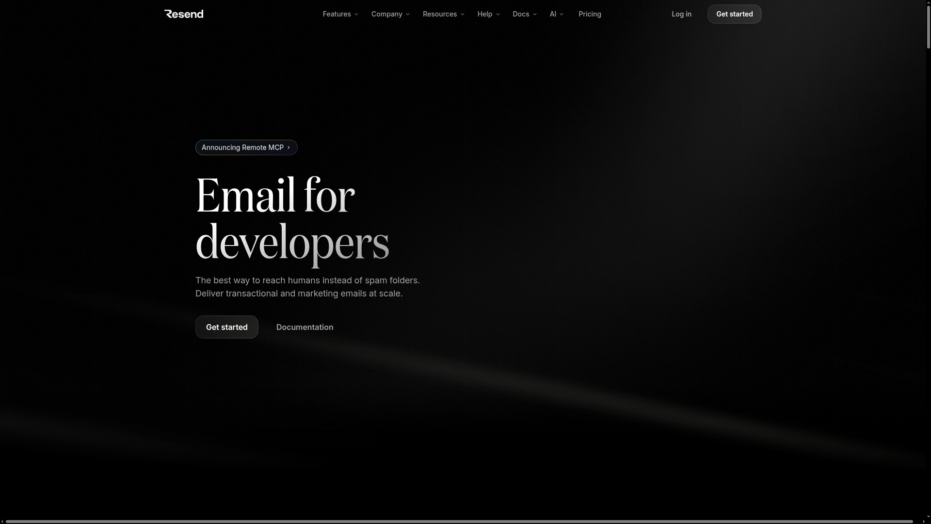
The best way to reach humans instead of spam folders. Deliver transactional and marketing emails at scale.
Color system
Names come from the color value itself, so the same color is called the same everywhere. Click a swatch to copy its hex value.
- 5 brand colours against 4 neutrals. The brand works with several chromatic colours side by side.
- Text on the ground sits at 21 to 1 and reaches AAA.
- The accent #9146FF sits at 4.5 to 1 on the ground and carries body copy as well.
- The ground #000000 sits at 0 per cent lightness, so the scheme is built dark. Flipping it means checking every pair again.
Brand colors
Neutrals
Contrast
Typography
- 2 typefaces: ABCFavorit, Inter. The first one covers Heading.
- The scale runs from 18px to 96px, a factor of 5.3 across 3 steps.
- From the second step to the first it is 1.7. A heading separates from the text by size alone.
domaine, ui-sans-serif, system-ui, sans-serif, Apple Color Emoji, Segoe UI Emoji, Segoe UI Symbol, Noto Color EmojiAaBbCc 0123InterAaBbCc 0123| Step | Size | Sample |
|---|---|---|
| h1 | 96px | Resend |
| h2 | 56px | Resend |
| body | 18px | Resend |
Spacing and shape
- The base unit is 4px. Every spacing value is a multiple of it, and that is why things line up down the page.
- A single corner radius, 4px, applies everywhere. The edges stay hard.
SpacingBase 4px
- xs4px
- sm8px
- md16px
- lg24px
- xl32px
- 2xl48px
- 3xl64px
Border radius
- default4px
Guidelines
Overview
This document outlines the core design principles and specifications for the Resend website. It aims to provide a consistent and coherent user experience, reflecting a modern, developer-centric, and professional aesthetic. The design emphasizes clarity, performance, and a sleek, dark-themed interface.
Voice and Feel
The Resend brand communicates with a voice that is:
- Developer-Centric: Clear, direct, and technical without being overly jargon-heavy. Empathetic to developer workflows and pain points.
- Modern & Sleek: Reflects cutting-edge technology, with a minimalist and sophisticated aesthetic.
- Confident & Authoritative: Positions Resend as a leader in email solutions, instilling trust and reliability.
- Concise & Efficient: Gets straight to the point, valuing user time and understanding.
- Empowering: Provides powerful tools and resources, enabling developers to achieve their goals effectively.
The overall feel is one of efficiency, power, and elegant simplicity, designed to appeal to a technical audience who values performance and clean design.
Export
# Resend Design System

## Overview

This document outlines the core design principles and specifications for the Resend website. It aims to provide a consistent and coherent user experience, reflecting a modern, developer-centric, and professional aesthetic. The design emphasizes clarity, performance, and a sleek, dark-themed interface.

## Color System

The color palette is built around a dark background, accented by a vibrant purple and clean neutrals. This combination ensures high contrast and readability while maintaining a sophisticated look.

*   **Primary:** `#343537` (Dark Charcoal - Used for primary UI elements, backgrounds of secondary components)
*   **Secondary:** `#FFFFFF` (White - Prominent for text on dark backgrounds, key highlights)
*   **Accent:** `#9146FF` (Vibrant Purple - Used sparingly for calls to action, interactive elements, and brand emphasis)
*   **Background:** `#000000` (Black - Dominant background color)
*   **Text Primary:** `#FFFFFF` (White - Default text color on dark backgrounds)
*   **Text Secondary:** `#BDBDBD` (Light Gray - Secondary text, descriptions, subtle information)

### Palette

*   `#343537` (Dark Charcoal)
*   `#9146FF` (Vibrant Purple)
*   `#000000` (Black)
*   `#FFFFFF` (White)
*   `#BDBDBD` (Light Gray)
*   `#24272D` (Dark Grey-Blue - Likely for subtle accents or deeper backgrounds)
*   `#00A3FF` (Bright Blue - Used for specific interactive elements or highlights)
*   `#4983C2` (Moderate Blue - Potentially for links or less aggressive highlights)
*   `#3B9EFF` (Sky Blue - Another shade for interactivity or subtle branding)

## Typography

The typography selection combines a modern sans-serif for body text with a distinctive serif for headings, creating a balance of professionalism and character.

*   **Primary Font Family:** `Inter` (for body text, paragraphs)
*   **Heading Font Family:** `ABCFavorit` (for headings)

### Font Stacks

*   **Heading:** `domaine`, `ui-sans-serif`, `system-ui`, `sans-serif`, `"Apple Color Emoji"`, `"Segoe UI Emoji"`, `"Segoe UI Symbol"`, `"Noto Color Emoji"`
*   **Body:** `Inter`, `ui-sans-serif`, `system-ui`, `sans-serif`, `"Apple Color Emoji"`, `"Segoe UI Emoji"`, `"Segoe UI Symbol"`, `"Noto Color Emoji"`
*   **Paragraph:** `Inter`, `ui-sans-serif`, `system-ui`, `sans-serif`, `"Apple Color Emoji"`, `"Segoe UI Emoji"`, `"Segoe UI Symbol"`, `"Noto Color Emoji"`

### Font Sizes

*   **H1:** `96px`
*   **H2:** `56px`
*   **Body:** `18px`

Other heading sizes and text sizes should be derived proportionally from these base values, ensuring a consistent typographic scale.

## Spacing & Radius

A modular spacing system and consistent border-radius contribute to a clean and structured layout.

*   **Base Spacing Unit:** `4px` (All padding, margin, and gap values should be multiples of 4px)
*   **Border Radius:** `4px` (Applied consistently to buttons, cards, and other UI elements for a subtle softness)

## Voice and Feel

The Resend brand communicates with a voice that is:

*   **Developer-Centric:** Clear, direct, and technical without being overly jargon-heavy. Empathetic to developer workflows and pain points.
*   **Modern & Sleek:** Reflects cutting-edge technology, with a minimalist and sophisticated aesthetic.
*   **Confident & Authoritative:** Positions Resend as a leader in email solutions, instilling trust and reliability.
*   **Concise & Efficient:** Gets straight to the point, valuing user time and understanding.
*   **Empowering:** Provides powerful tools and resources, enabling developers to achieve their goals effectively.

The overall feel is one of efficiency, power, and elegant simplicity, designed to appeal to a technical audience who values performance and clean design.

## Implementation Notes

This section provides Tailwind CSS variable tokens for easy integration.

```css
/* Color System */
:root {
  --color-primary: #343537;
  --color-secondary: #FFFFFF;
  --color-accent: #9146FF;
  --color-background: #000000;
  --color-text-primary: #FFFFFF;
  --color-text-secondary: #BDBDBD;

  --color-palette-dark-charcoal: #343537;
  --color-palette-vibrant-purple: #9146FF;
  --color-palette-black: #000000;
  --color-palette-white: #FFFFFF;
  --color-palette-light-gray: #BDBDBD;
  --color-palette-dark-grey-blue: #24272D;
  --color-palette-bright-blue: #00A3FF;
  --color-palette-moderate-blue: #4983C2;
  --color-palette-sky-blue: #3B9EFF;
}

/* Typography */
:root {
  --font-family-primary: "Inter", ui-sans-serif, system-ui, sans-serif, "Apple Color Emoji", "Segoe UI Emoji", "Segoe UI Symbol", "Noto Color Emoji";
  --font-family-heading: "ABCFavorit", domaine, ui-sans-serif, system-ui, sans-serif, "Apple Color Emoji", "Segoe UI Emoji", "Segoe UI Symbol", "Noto Color Emoji";

  --font-size-h1: 96px;
  --font-size-h2: 56px;
  --font-size-body: 18px;
}

/* Spacing & Radius */
:root {
  --spacing-unit: 4px; /* For calculating multiples */
  --border-radius: 4px;
}
```

```javascript
// tailwind.config.js
module.exports = {
  theme: {
    extend: {
      colors: {
        primary: 'var(--color-primary)',
        secondary: 'var(--color-secondary)',
        accent: 'var(--color-accent)',
        background: 'var(--color-background)',
        text: {
          primary: 'var(--color-text-primary)',
          secondary: 'var(--color-text-secondary)',
        },
        palette: {
          'dark-charcoal': 'var(--color-palette-dark-charcoal)',
          'vibrant-purple': 'var(--color-palette-vibrant-purple)',
          black: 'var(--color-palette-black)',
          white: 'var(--color-palette-white)',
          'light-gray': 'var(--color-palette-light-gray)',
          'dark-grey-blue': 'var(--color-palette-dark-grey-blue)',
          'bright-blue': 'var(--color-palette-bright-blue)',
          'moderate-blue': 'var(--color-palette-moderate-blue)',
          'sky-blue': 'var(--color-palette-sky-blue)',
        },
      },
      fontFamily: {
        body: 'var(--font-family-primary)',
        heading: 'var(--font-family-heading)',
      },
      fontSize: {
        h1: 'var(--font-size-h1)',
        h2: 'var(--font-size-h2)',
        body: 'var(--font-size-body)',
      },
      borderRadius: {
        DEFAULT: 'var(--border-radius)',
      },
      spacing: {
        // Example usage: p-1 maps to 1 * base unit = 4px, p-2 to 2 * base unit = 8px, etc.
        // You would typically generate these dynamically or define specific scales.
        // For custom values, direct `calc` can be used: `p-[calc(var(--spacing-unit)*2)]`
        '1': 'calc(var(--spacing-unit) * 1)', // 4px
        '2': 'calc(var(--spacing-unit) * 2)', // 8px
        '3': 'calc(var(--spacing-unit) * 3)', // 12px
        '4': 'calc(var(--spacing-unit) * 4)', // 16px
        '5': 'calc(var(--spacing-unit) * 5)', // 20px
        '6': 'calc(var(--spacing-unit) * 6)', // 24px
        '8': 'calc(var(--spacing-unit) * 8)', // 32px
        '10': 'calc(var(--spacing-unit) * 10)', // 40px
        '12': 'calc(var(--spacing-unit) * 12)', // 48px
        '16': 'calc(var(--spacing-unit) * 16)', // 64px
      },
    },
  },
  plugins: [],
};
```Frequently asked questions
You copy the color and typography values into your Tailwind configuration or your CSS variables and use them as a consistent base.
Didn't find your question? We're happy to help.
Get in touch