
Lovable
Build apps, websites, and digital products faster using Lovable's AI-powered platform, no deep coding skills required.
Color system
Names come from the color value itself, so the same color is called the same everywhere. Click a swatch to copy its hex value.
- 5 brand colours against 5 neutrals. The brand works with several chromatic colours side by side.
- Text on the ground sits at 13.1 to 1 and reaches AAA.
- The accent #AE55EF sits at 3 to 1 on the ground and is enough for large text and controls, not for body copy.
- The ground #DAE0FF sits at 93 per cent lightness, so the scheme is built light. Flipping it means checking every pair again.
Brand colors
Neutrals
Contrast
AaText on background
13.06AAA
AaSecondary text on background
4.40AA large
AaLabel on primary
21.00AAA
AaText on surface
17.04AAA
Typography
- One typeface for everything: Camera Plain Variable. Hierarchy has to come from size and weight alone.
- The scale runs from 20px to 48px, a factor of 2.4 across 3 steps.
- From the second step to the first it is 2.4. A heading separates from the text by size alone.
Camera Plain VariableHeading · Body
Camera Plain Variable, ui-sans-serif, system-ui, sans-serifAaBbCc 0123| Step | Size | Sample |
|---|---|---|
| h2 | 48px | Lovable |
| h1 | 20px | Lovable |
| body | 20px | Lovable |
Spacing and shape
- The base unit is 4px. Every spacing value is a multiple of it, and that is why things line up down the page.
- A single corner radius, 7px, applies everywhere. That keeps the corners tight.
SpacingBase 4px
- xs4px
- sm8px
- md16px
- lg24px
- xl32px
- 2xl48px
- 3xl64px
Border radius
- default7px
Export
### Overview

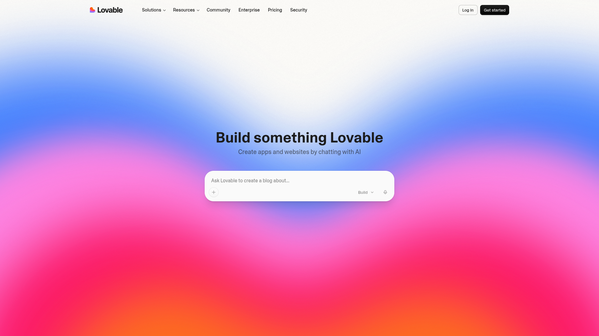
Lovable.dev's design system emphasizes a clean, modern, and high-tech aesthetic, reflecting its core mission of AI-powered development. The design aims for clarity and elegance, making sophisticated tools feel intuitive and accessible. A vibrant accent color provides energy, contrasting with a largely monochromatic base palette that ensures content takes center stage.

### Color System

The color palette is meticulously crafted to convey innovation and professionalism, punctuated by a striking accent to highlight key actions and information.

*   **Primary:** `#000000` (Black) - Used for strong visual elements, primary text where extra emphasis is needed.
*   **Secondary:** `#FFFFFF` (White) - Foundation for backgrounds and crucial contrasting elements.
*   **Accent:** `#AE55EF` (Vibrant Purple) - Highlights interactive elements, calls to action, and key information, bringing a distinct modern vibe.
*   **Background:** `#DAE0FF` (Light Blue/Lavender) - A soft, ethereal background color that provides a serene and inviting canvas.
*   **Surface:** `#FFFFFF` (White) - Used for cards, panels, and distinct content blocks, ensuring readability and separation.
*   **Text Primary:** `#1C1C1C` (Dark Grey) - Main body text color, offering excellent readability against light backgrounds.
*   **Text Secondary:** `#666666` (Medium Grey) - For secondary information, labels, and less prominent text, providing visual hierarchy.
*   **Palette Additions:**
    *   `#EBEBEB` (Light Grey) - Subtle borders, dividers, or background shadows.
    *   `#CAD6FF` (Soft Blue) - Lighter shades for backgrounds or subtle distinction.
    *   `#343434` (Darker Grey) - For deeper contrast than text secondary, often for icons or subtle shadows.
    *   `#D958E8` (Brighter Purple) - A slightly more intense version of the accent, for hover states or even stronger emphasis.

### Typography

The typographic system uses a single, distinctive typeface to maintain a cohesive and recognizable brand voice across all content.

*   **Font Family:** `Camera Plain Variable`
    *   **Fallback Stack:** `ui-sans-serif, system-ui, sans-serif`
*   **Heading Font Family:** `Camera Plain Variable`
*   **Body Font Family:** `Camera Plain Variable`
*   **Paragraph Font Family:** `Camera Plain Variable`

**Font Sizes:**
*   **H1:** `20px` - Used for page titles and most prominent headings.
*   **H2:** `48px` - Secondary headings, larger content sections. (Note: H1 `20px` and H2 `48px` suggests a specific hierarchy. H1 might be intended for general content titles, while H2 is for larger, display-style headings.)
*   **Body:** `20px` - Standard text size for paragraphs and general content, ensuring readability.

### Spacing & Radius

A consistent spacing scale and singular border radius contribute to the system's overall harmony and professionalism.

*   **Base Unit:** `4px`
    *   All spacing (paddings, margins, gaps) should ideally be multiples of `4px` to maintain visual rhythm.
*   **Border Radius:** `7px`
    *   Applied consistently to interactive elements, cards, and containers for a modern, approachable feel without being overly soft.

### Voice and Feel

The Lovable.dev brand communicates a message of **innovation, efficiency, and empowerment**.

*   **Voice:**
    *   **Authoritative yet Approachable:** Confident in its technological prowess but clear and simple in its communication to a broad audience.
    *   **Direct & Concise:** Gets straight to the point, valuing user time.
    *   **Inspiring & Visionary:** Evokes the excitement of building and creating.
*   **Feel:**
    *   **Modern & High-Tech:** Clean lines, sharp contrasts, and sophisticated typography.
    *   **Intuitive & Streamlined:** Designed to make complex processes feel simple.
    *   **Professional & Reliable:** Instills trust in the platform's capabilities.
    *   **Vibrant & Engaging:** The accent color and dynamic layouts prevent the design from feeling sterile.

### Implementation Notes (Tailwind Tokens)

To integrate this design system effectively with Tailwind CSS, use the following custom configuration.

```css
/* tailwind.config.js - extend section */
module.exports = {
  theme: {
    extend: {
      colors: {
        primary:         'var(--color-primary)',         // #000000
        secondary:       'var(--color-secondary)',       // #FFFFFF
        accent:          'var(--color-accent)',          // #AE55EF
        background:      'var(--color-background)',      // #DAE0FF
        surface:         'var(--color-surface)',         // #FFFFFF
        'text-primary':  'var(--color-text-primary)',    // #1C1C1C
        'text-secondary':'var(--color-text-secondary)',  // #666666
        'gray-100':      'var(--color-gray-100)',        // #EBEBEB
        'blue-100':      'var(--color-blue-100)',        // #CAD6FF
        'gray-800':      'var(--color-gray-800)',        // #343434
        'accent-dark':   'var(--color-accent-dark)',     // #D958E8
      },
      fontFamily: {
        sans:     ['var(--font-primary)', 'ui-sans-serif', 'system-ui', 'sans-serif'],
        heading:  ['var(--font-heading)', 'ui-sans-serif', 'system-ui', 'sans-serif'],
      },
      fontSize: {
        'h1': ['var(--font-size-h1)', { lineHeight: '1.2' }], // Assuming line-height for headings
        'h2': ['var(--font-size-h2)', { lineHeight: '1.2' }],
        'body': ['var(--font-size-body)', { lineHeight: '1.5' }], // Standard line-height for body
      },
      spacing: {
        '1': '4px',
        '2': '8px',
        '3': '12px',
        '4': '16px',
        '5': '20px',
        '6': '24px',
        '8': '32px',
        '10': '40px',
        '12': '48px',
        '16': '64px',
        '20': '80px',
      },
      borderRadius: {
        'DEFAULT': 'var(--border-radius)', // 7px
      },
    },
  },
};

/* global.css or equivalent - CSS Custom Properties */
:root {
  /* Colors */
  --color-primary: #000000;
  --color-secondary: #FFFFFF;
  --color-accent: #AE55EF;
  --color-background: #DAE0FF;
  --color-surface: #FFFFFF;
  --color-text-primary: #1C1C1C;
  --color-text-secondary: #666666;
  --color-gray-100: #EBEBEB;
  --color-blue-100: #CAD6FF;
  --color-gray-800: #343434;
  --color-accent-dark: #D958E8;

  /* Typography */
  --font-primary: 'Camera Plain Variable';
  --font-heading: 'Camera Plain Variable';
  --font-size-h1: 20px;
  --font-size-h2: 48px;
  --font-size-body: 20px;

  /* Spacing & Radius */
  --spacing-base-unit: 4px; /* For reference, not directly used in Tailwind utility classes */
  --border-radius: 7px;
}

/* Font loading for Camera Plain Variable */
/* Ensure 'Camera Plain Variable' is loaded, e.g., via @font-face in global.css */
/*
@font-face {
  font-family: 'Camera Plain Variable';
  src: url('/fonts/CameraPlain-Variable.woff2') format('woff2');
  font-weight: 100 900;
  font-display: swap;
}
*/
```
FAQ
Frequently asked questions
You copy the color and typography values into your Tailwind configuration or your CSS variables and use them as a consistent base.
Didn't find your question? We're happy to help.
Get in touch