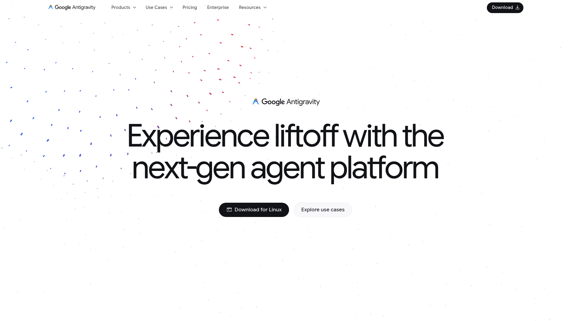
Google Antigravity
Experience liftoff with the next-gen agent platform
Color system
Names come from the color value itself, so the same color is called the same everywhere. Click a swatch to copy its hex value.
- 8 brand colours against 2 neutrals. The brand works with several chromatic colours side by side.
- Text on the ground sits at 17 to 1 and reaches AAA.
- The accent #353535 sits at 12.3 to 1 on the ground and carries body copy as well.
- The ground #FFFFFF sits at 100 per cent lightness, so the scheme is built light. Flipping it means checking every pair again.
Brand colors
Neutrals
Contrast
Typography
- One typeface for everything: Google Sans Flex. Hierarchy has to come from size and weight alone.
- The scale runs from 24px to 80px, a factor of 3.3 across 3 steps.
- From the second step to the first it is 1.9. A heading separates from the text by size alone.
Google Sans Flex, Google Sans, sans-serifAaBbCc 0123| Step | Size | Sample |
|---|---|---|
| h1 | 80px | Google Antigravity |
| h2 | 42px | Google Antigravity |
| body | 24px | Google Antigravity |
Spacing and shape
- The base unit is 4px. Every spacing value is a multiple of it, and that is why things line up down the page.
- A single corner radius, 5px, applies everywhere. That keeps the corners tight.
SpacingBase 4px
- xs4px
- sm8px
- md16px
- lg24px
- xl32px
- 2xl48px
- 3xl64px
Border radius
- default5px
Guidelines
Overview
This document outlines the core design principles and system specifications for the Google Antigravity website. The design emphasizes a sophisticated, modern, and engaging experience, reflecting the platform's innovative nature.
Voice and Feel
The Google Antigravity website conveys a sense of innovation, sophistication, and a forward-thinking future. The tone is confident and visionary, yet accessible and user-friendly. The visual design is clean, modern, and expansive, with a focus on clarity and engaging interactions. Elements should feel lightweight and dynamic, reflecting the "liftoff" and "antigravity" concepts, while maintaining Google's signature professionalism.
Export
# DESIGN.md: Google Antigravity

## Overview

This document outlines the core design principles and system specifications for the Google Antigravity website. The design emphasizes a sophisticated, modern, and engaging experience, reflecting the platform's innovative nature.

## Color System

The color palette is built around a strong dark primary and light secondary, with subtle accents to create visual interest.

| Role         | Hex      | Description                               |
| :----------- | :------- | :---------------------------------------- |
| `primary`    | `#1C1C1C` | Dominant dark color for backgrounds/text. |
| `secondary`  | `#FFFFFF` | Used for contrast, often backgrounds.     |
| `accent`     | `#353535` | Subtle dark accent for UI elements.       |
| `background` | `#FFFFFF` | Default background for most sections.     |
| `surface`    | `#FFFFFF` | Used for card backgrounds, elevated areas. |
| `textPrimary`| `#1C1C1C` | Main text color for readability.          |
| `textSecondary`| `#1C1C1C` | Secondary text color, often for emphasis. |

**Palette:**

* `#1C1C1C` (Dark Grey)
* `#353535` (Medium Grey)
* `#FFFFFF` (White)
* `#E7E7E7` (Light Grey)
* `#E22C80` (Pink/Magenta - Accent)
* `#37319D` (Deep Purple - Accent)
* `#5E449F` (Medium Purple - Accent)
* `#C5BDAD` (Taupe/Light Brown - Accent)
* `#1A73E8` (Google Blue - Accent)
* `#2FA1D6` (Light Blue - Accent)

## Typography

The typography centers on "Google Sans Flex" for a clean, modern, and highly legible experience across all content.

| Element    | Font Family        | Fallback Fonts           | Font Size | Weight     |
| :--------- | :----------------- | :----------------------- | :-------- | :--------- |
| `h1`       | `Google Sans Flex` | `Google Sans`, `sans-serif` | `80px`    | (implied)  |
| `h2`       | `Google Sans Flex` | `Google Sans`, `sans-serif` | `42px`    | (implied)  |
| `body`/`p` | `Google Sans Flex` | `Google Sans`, `sans-serif` | `24px`    | (implied)  |

**Font Stacks:**

*   **Heading:** `Google Sans Flex`, `Google Sans`, `sans-serif`
*   **Body/Paragraph:** `Google Sans Flex`, `Google Sans`, `sans-serif`

## Spacing & Radius

Consistent spacing and subtle rounding contribute to a harmonious and approachable interface.

*   **Base Unit:** `4px` (All spacing values should be multiples of 4)
*   **Border Radius:** `5px` (Applied to interactive elements and containers for a soft edge)

## Voice and Feel

The Google Antigravity website conveys a sense of **innovation, sophistication, and a forward-thinking future**. The tone is **confident and visionary**, yet **accessible and user-friendly**. The visual design is **clean, modern, and expansive**, with a focus on **clarity and engaging interactions**. Elements should feel **lightweight and dynamic**, reflecting the "liftoff" and "antigravity" concepts, while maintaining Google's signature professionalism.

## Implementation Notes (Tailwind CSS Tokens)

```css
:root {
  /* Colors */
  --color-primary: #1C1C1C;
  --color-secondary: #FFFFFF;
  --color-accent: #353535;
  --color-background: #FFFFFF;
  --color-surface: #FFFFFF;
  --color-text-primary: #1C1C1C;
  --color-text-secondary: #1C1C1C;

  /* Palette - for specific use cases or extended theming */
  --color-palette-dark-grey: #1C1C1C;
  --color-palette-medium-grey: #353535;
  --color-palette-white: #FFFFFF;
  --color-palette-light-grey: #E7E7E7;
  --color-palette-pink: #E22C80;
  --color-palette-deep-purple: #37319D;
  --color-palette-medium-purple: #5E449F;
  --color-palette-taupe: #C5BDAD;
  --color-palette-google-blue: #1A73E8;
  --color-palette-light-blue: #2FA1D6;

  /* Typography - Font Families */
  --font-family-primary: 'Google Sans Flex', 'Google Sans', sans-serif;
  --font-family-heading: 'Google Sans Flex', 'Google Sans', sans-serif;
  --font-family-body: 'Google Sans Flex', 'Google Sans', sans-serif;

  /* Typography - Font Sizes */
  --font-size-h1: 80px;
  --font-size-h2: 42px;
  --font-size-body: 24px; /* Default paragraph/body text */

  /* Spacing */
  --spacing-unit: 4px; /* Base unit for all spacing */

  /* Border Radius */
  --border-radius-default: 5px;
}
```

```js
// tailwind.config.js
module.exports = {
  theme: {
    extend: {
      colors: {
        primary: 'var(--color-primary)',
        secondary: 'var(--color-secondary)',
        accent: 'var(--color-accent)',
        background: 'var(--color-background)',
        surface: 'var(--color-surface)',
        textPrimary: 'var(--color-text-primary)',
        textSecondary: 'var(--color-text-secondary)',
        // Palette colors
        'palette-dark-grey': 'var(--color-palette-dark-grey)',
        'palette-medium-grey': 'var(--color-palette-medium-grey)',
        'palette-white': 'var(--color-palette-white)',
        'palette-light-grey': 'var(--color-palette-light-grey)',
        'palette-pink': 'var(--color-palette-pink)',
        'palette-deep-purple': 'var(--color-palette-deep-purple)',
        'palette-medium-purple': 'var(--color-palette-medium-purple)',
        'palette-taupe': 'var(--color-palette-taupe)',
        'palette-google-blue': 'var(--color-palette-google-blue)',
        'palette-light-blue': 'var(--color-palette-light-blue)',
      },
      fontFamily: {
        primary: 'var(--font-family-primary)',
        heading: 'var(--font-family-heading)',
        body: 'var(--font-family-body)',
      },
      fontSize: {
        h1: 'var(--font-size-h1)',
        h2: 'var(--font-size-h2)',
        body: 'var(--font-size-body)',
      },
      spacing: {
        'unit': 'var(--spacing-unit)', // Use for custom spacing, e.g., p-unit-2 for 8px
        // Auto-generated spacing from Tailwind's default scale should also be available.
      },
      borderRadius: {
        DEFAULT: 'var(--border-radius-default)',
      },
    },
  },
  plugins: [],
}
```This is how Systra sections look in the colors of Google Antigravity.
Three real sections from the library, rendered live, with the extracted colors. Layout, spacing and motion stay as they are.
421 sections in 23 categories would be ready in this style.
From hero to pricing to footer. In your editor your agent pulls the code straight from the MCP server, with the colors from this analysis.
Frequently asked questions
You copy the color and typography values into your Tailwind configuration or your CSS variables and use them as a consistent base.
Didn't find your question? We're happy to help.
Get in touch