
Home \ Anthropic
Anthropic is an AI safety and research company that's working to build reliable, interpretable, and steerable AI systems.
Color system
Names come from the color value itself, so the same color is called the same everywhere. Click a swatch to copy its hex value.
- 7 brand colours against 2 neutrals. The brand works with several chromatic colours side by side.
- Text on the ground sits at 15.9 to 1 and reaches AAA.
- The accent #1B1B1B sits at 15.9 to 1 on the ground and carries body copy as well.
- The ground #F8F6F1 sits at 96 per cent lightness, so the scheme is built light. Flipping it means checking every pair again.
Brand colors
Neutrals
Contrast
AaText on background
15.95AAA
AaSecondary text on background
1.82too low
AaLabel on primary
17.22AAA
Typography
- 2 typefaces: Anthropic Serif, Georgia. The first one covers Heading.
- The scale runs from 24px to 64px, a factor of 2.7 across 3 steps.
- From the second step to the first it is 1. The gap is tight, so a heading needs weight or space on top.
Anthropic SerifHeading
Anthropic Sans, Arial, sans-serifAaBbCc 0123GeorgiaBody
GeorgiaAaBbCc 0123| Step | Size | Sample |
|---|---|---|
| h1 | 64px | Home \ Anthropic |
| h2 | 64px | Home \ Anthropic |
| body | 24px | Home \ Anthropic |
Spacing and shape
- The base unit is 4px. Every spacing value is a multiple of it, and that is why things line up down the page.
- A single corner radius, 3px, applies everywhere. The edges stay hard.
SpacingBase 4px
- xs4px
- sm8px
- md16px
- lg24px
- xl32px
- 2xl48px
- 3xl64px
Border radius
- default3px
Guidelines
Overview
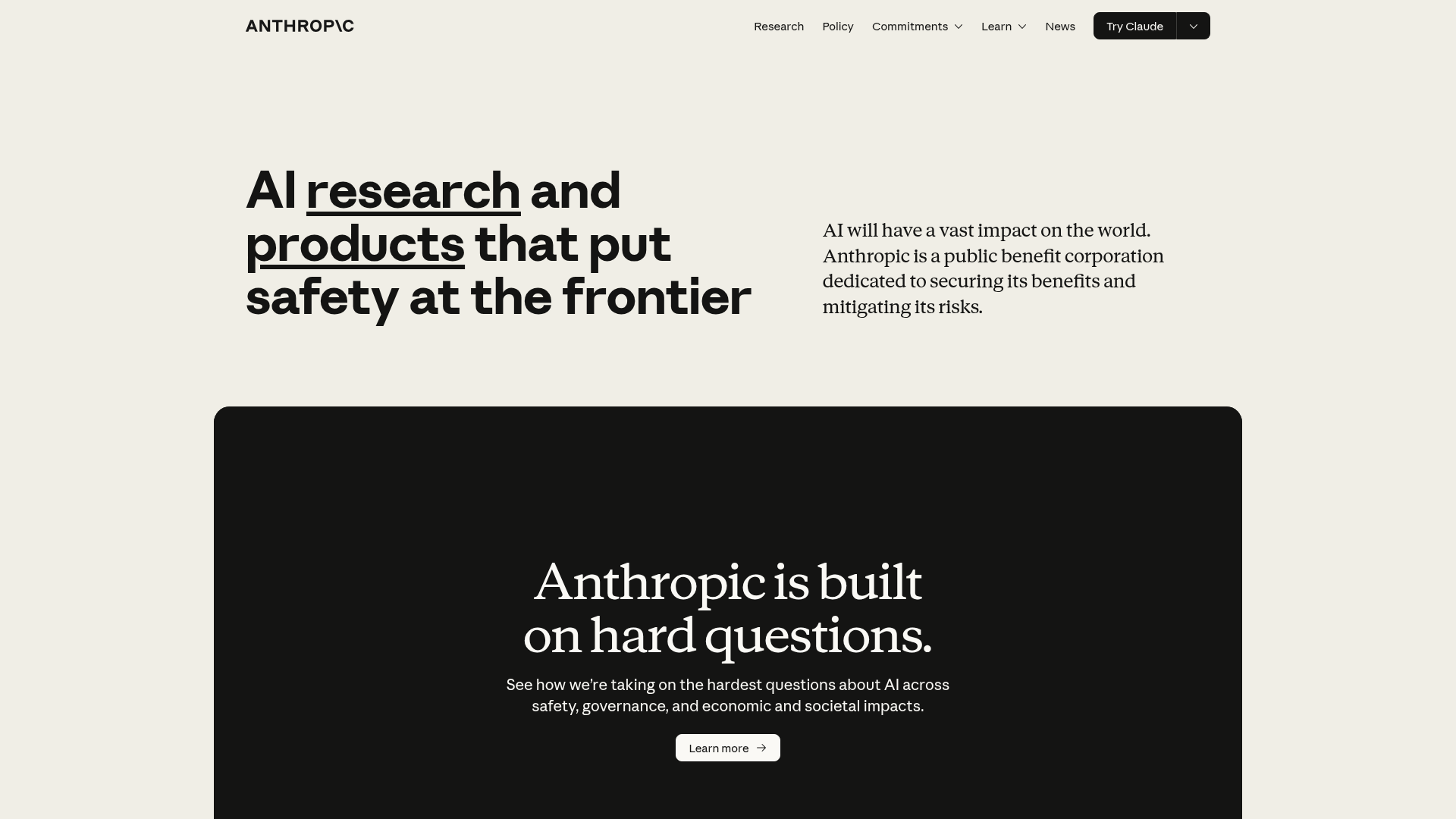
The Anthropic design system prioritizes a clean, sophisticated, and trustworthy aesthetic. It combines classic typography with a muted color palette to convey reliability and intellectual depth. The design emphasizes clarity and legibility, creating a refined user experience.
Voice and Feel
The Anthropic design language conveys:
- Sophistication: Achieved through classic typography and a refined color palette.
- Reliability: Understated design elements foster trust and seriousness.
- Clarity: Prioritizes legibility and a logical information hierarchy.
- Intellectual: Evokes a sense of academic rigor and thoughtful innovation.
- Warmth: The use of off-white and warm grey softens the otherwise strong charcoal tones.
Export
# DESIGN.md: Anthropic Design System

## Overview

The Anthropic design system prioritizes a clean, sophisticated, and trustworthy aesthetic. It combines classic typography with a muted color palette to convey reliability and intellectual depth. The design emphasizes clarity and legibility, creating a refined user experience.

## Color System

The color palette is minimalist yet distinctive, using a neutral base with thoughtful accents to guide the user.

- **Primary:** `#1B1B1B` (Deep Charcoal) - Dominant text and foundational elements.
- **Secondary:** `#FFFFFF` (White) - Backgrounds for contrast.
- **Accent:** `#1B1B1B` (Deep Charcoal) - Used for emphasis, often blending with primary elements.
- **Background:** `#F8F6F1` (Off-White Beige) - Primary page background, providing a soft, warm base.
- **Surface:** `#1B1B1B` (Deep Charcoal) - Used for cards, containers, or elevated elements.
- **Text Primary:** `#1B1B1B` (Deep Charcoal) - Main body text.
- **Text Secondary:** `#C3B7A8` (Warm Grey) - Subtler text, secondary information.

**Palette:**
- `#1B1B1B` (Deep Charcoal)
- `#F8F6F1` (Off-White Beige)
- `#C3B7A8` (Warm Grey)
- `#FFFFFF` (White)
- `#C6613F` (Burnt Orange) - **Accent/Call to Action**
- `#3898EC` (Bright Blue) - **Accent/Interactive**
- `#D97757` (Terracotta) - **Accent**
- `#F0EEE6` (Light Beige) - **Subtle Background/Hover**
- `#141413` (Near Black) - **Deepest Contrast**

## Typography

A blend of classic serif and modern sans-serif fonts provides a sophisticated yet readable typographic hierarchy.

- **Font Families:**
    - **Primary:** `Georgia` (Fallback for body text)
    - **Heading:** `Anthropic Serif` (Custom/Brand specific)
- **Font Stacks:**
    - **Heading:** `'Anthropic Sans'`, `Arial`, `sans-serif`
    - **Body:** `'Anthropic Serif'`, `Georgia`, `serif`
    - **Paragraph:** `'Anthropic Serif'`, `Georgia`, `serif`
- **Font Sizes:**
    - `h1`: `64px`
    - `h2`: `64px`
    - `body`: `24px`

## Spacing & Radius

A conservative approach to spacing and a minimal border-radius contribute to a clean and structured layout.

- **Base Unit:** `4px` (Used for consistent scaling of margins, paddings, and gaps)
- **Border Radius:** `3px` (Subtle rounded corners for elements, providing a soft touch without distraction)

## Voice and Feel

The Anthropic design language conveys:

-   **Sophistication:** Achieved through classic typography and a refined color palette.
-   **Reliability:** Understated design elements foster trust and seriousness.
-   **Clarity:** Prioritizes legibility and a logical information hierarchy.
-   **Intellectual:** Evokes a sense of academic rigor and thoughtful innovation.
-   **Warmth:** The use of off-white and warm grey softens the otherwise strong charcoal tones.

## Implementation Notes (Tailwind CSS)

```css
/* Color Palette */
:root {
  --color-primary: #1B1B1B;
  --color-secondary: #FFFFFF;
  --color-accent: #1B1B1B; /* Same as primary for brand alignment */
  --color-background: #F8F6F1;
  --color-surface: #1B1B1B;
  --color-text-primary: #1B1B1B;
  --color-text-secondary: #C3B7A8;

  --color-palette-deep-charcoal: #1B1B1B;
  --color-palette-off-white-beige: #F8F6F1;
  --color-palette-warm-grey: #C3B7A8;
  --color-palette-white: #FFFFFF;
  --color-palette-burnt-orange: #C6613F;
  --color-palette-bright-blue: #3898EC;
  --color-palette-terracotta: #D97757;
  --color-palette-light-beige: #F0EEE6;
  --color-palette-near-black: #141413;
}

/* Tailwind Configuration (tailwind.config.js) */
module.exports = {
  theme: {
    extend: {
      colors: {
        primary: 'var(--color-primary)',
        secondary: 'var(--color-secondary)',
        accent: 'var(--color-accent)',
        background: 'var(--color-background)',
        surface: 'var(--color-surface)',
        textPrimary: 'var(--color-text-primary)',
        textSecondary: 'var(--color-text-secondary)',
        palette: {
          'deep-charcoal': 'var(--color-palette-deep-charcoal)',
          'off-white-beige': 'var(--color-palette-off-white-beige)',
          'warm-grey': 'var(--color-palette-warm-grey)',
          'white': 'var(--color-palette-white)',
          'burnt-orange': 'var(--color-palette-burnt-orange)',
          'bright-blue': 'var(--color-palette-bright-blue)',
          'terracotta': 'var(--color-palette-terracotta)',
          'light-beige': 'var(--color-palette-light-beige)',
          'near-black': 'var(--color-palette-near-black)',
        },
      },
      fontFamily: {
        heading: ['"Anthropic Sans"', 'Arial', 'sans-serif'],
        body: ['"Anthropic Serif"', 'Georgia', 'serif'],
        paragraph: ['"Anthropic Serif"', 'Georgia', 'serif'],
      },
      fontSize: {
        'h1': '64px',
        'h2': '64px',
        'body': '24px',
      },
      spacing: {
        '1': '4px',    /* baseUnit * 1 */
        '2': '8px',    /* baseUnit * 2 */
        '3': '12px',   /* baseUnit * 3 */
        '4': '16px',   /* baseUnit * 4 */
        '5': '20px',   /* baseUnit * 5 */
        '6': '24px',   /* baseUnit * 6 */
        '8': '32px',   /* baseUnit * 8 */
        '10': '40px',  /* baseUnit * 10 */
        '12': '48px',  /* baseUnit * 12 */
        // ... extend as needed based on common multipliers
      },
      borderRadius: {
        'DEFAULT': '3px',
        'sm': '3px', /* Use for consistency or to explicitly define */
        // No other explicit radii, stick to DEFAULT
      },
    },
  },
  plugins: [],
};
```
FAQ
Frequently asked questions
You copy the color and typography values into your Tailwind configuration or your CSS variables and use them as a consistent base.
Didn't find your question? We're happy to help.
Get in touch