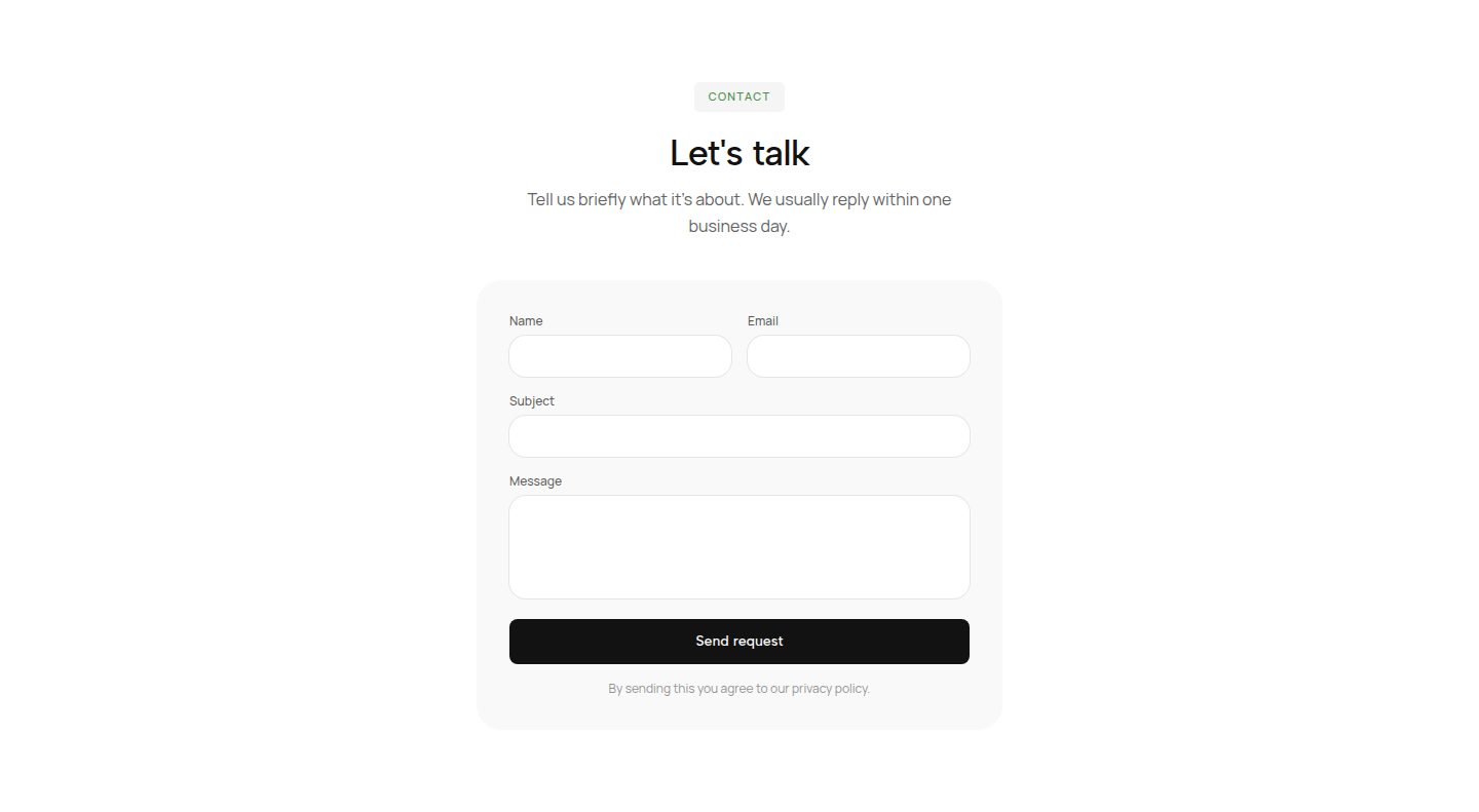
Most forms report their errors at the wrong moment. Either everything is red before anybody has typed a single character, because :invalid matches an empty required field at the first paint of the page. Or nothing shows until somebody submits, and then the page jumps to a collected message nobody reads. Between the two sits the version that avoids both, and it needs no library: :user-invalid waits until somebody has actually used a field and left it again, and only speaks up then. The pseudo-class has been in Firefox since April 2021, in Safari since 16.5 in May 2023 and in Chrome since 119 in October 2023; since 2 May 2026 Baseline lists it as widely available. According to Chrome Platform Status it is used on roughly 0.2 percent of all page loads. This guide shows what it takes off your hands, where the message belongs, what is left for JavaScript afterwards and how the new select and field-sizing fit into the same form.
- :invalid and :user-invalid test the same rule but at different moments. :invalid applies from the first paint, :user-invalid only after input and leaving the field, or after an attempt to submit.
- The state then keeps itself in sync. Once a field has been flagged, the browser rechecks on every keystroke and removes the marking as soon as the value is right.
- Colour on its own is not a message. The sentence saying what is missing belongs visibly under the field and bound to it through aria-describedby.
- Little is left for JavaScript: custom error texts through setCustomValidity, checks the browser does not know about, and the behaviour on submit. The moments and the states come from CSS.
Why is my form red before anybody has typed?
Because :invalid describes the state of a value and not the state of a conversation. A required field with no content is invalid, from the moment the page is painted. The rule is right, the moment is not: nobody has done anything wrong, yet the interface reports an error.
The usual answer to this is a workaround. The form gets a class that is only set on the first attempt to submit, and every rule hangs off it. Or each field gets a listener on blur that sets a class and a second one on input that takes it away again. Both work, and both are state management for something the browser already knows.
The opposite direction is just as common and just as unpleasant: no feedback at all until somebody submits. Baymard reports that 31 percent of the sites it reviewed do without any checking while the form is being filled in. Finding out only at the end that a postcode is too short means scrolling back and remembering what was there.
The rule was never the problem. The moment was.
What does :user-invalid do differently from :invalid?
It takes the person's involvement into the condition. :user-invalid only matches a field once its value has been changed and the field left, or once somebody has submitted. Before that it matches nothing, even when the value is wrong by the rules. The same logic in the other direction is called :user-valid and suits the tick that confirms an entry has landed.
That removes precisely the three listeners you would otherwise write. The first hit comes on leaving the field, a correction is picked up while typing, and an attempt to submit marks everything missing in one go. None of it has to be stored, reset or restored on a re-render, because it is not state in code but a query in the stylesheet.
Support is no longer an obstacle. Firefox has known the pseudo-class since version 88 in April 2021, Safari since 16.5 in May 2023, Chrome and Edge since version 119 in early November 2023. That put it in every engine by the end of 2023, and since 2 May 2026 it counts as widely available. Even so, according to Chrome Platform Status it appears on only about 0.2 percent of page loads, roughly a tenth as often as field-sizing, which was only finished two years later.
/* red from the first paint, before anyone typed */input:invalid { border-color: #c0392b;} /* red once the field was used and left */ input:user-invalid { border-color: #c0392b;} input:user-valid { border-color: #1f8a4c;}
Where does the error message belong in the markup?
Under the field, inside the document, and announced on the field. The bubble the browser shows on submit does none of that: it sits outside the document, disappears after a few seconds, cannot be styled and only ever shows one error at a time. As a fallback it is fine, as the only feedback it is not.
Your own message needs three things. It sits as an element after the field so that CSS can reach it from the field. It hangs on the field through aria-describedby so that a screen reader reads it together with the label. And it is only visible when it applies, driven by the same pseudo-class that colours the border.
The route from the field to the message goes through the sibling combinator, the route to the whole field block through :has. You need the latter as soon as more than one element should react, for instance when the format hint should disappear once the error message appears. Both have been available in every major browser since December 2023.
- The label stays visible. A placeholder used as a label disappears while typing, exactly when you would need it to check. The WebAIM review of one million home pages reports missing labels on 51 percent of pages and 33.1 percent of fields for 2026.
- The text states the form. Instead of Invalid date, better As day, month, year, for example 04/11/2026. Naming the expected form saves the second and third attempt.
- The message is not a surprise. A region with aria-live set to polite announces changes without interrupting what is being read. For the submit attempt, focus on the first faulty field is usually enough, and without novalidate the browser sets it on its own.
<div class="field"> <label for="mail">Email</label> <input id="mail" type="email" required aria-describedby="mail-error mail-hint" /> <p id="mail-error" class="error"> We need a full address, like name@studio.com </p> <p id="mail-hint" class="hint">Only used for the receipt.</p></div> .error { display: none; color: #c0392b; } input:user-invalid ~ .error { display: block; } .field:has(input:user-invalid) .hint { display: none; }
What is left for JavaScript afterwards?
Three things, and none of them is state management. The first are rules the browser does not know, because they involve more than one field or need an answer from the server. The second are custom texts for rules it does know but whose default message does not fit the form. The third is the behaviour on submit, when the form does not reload.
For the first two there is setCustomValidity. The method writes a text into the field's validity message, and as long as that text is not empty the field counts as invalid. That makes :invalid and :user-invalid apply to your own rules exactly as they do to built-in ones, and the styling stays the same. The only thing that matters is resetting it: without a call with an empty string the field stays invalid forever.
On submit the browser takes on more than most people assume. Without novalidate it checks every field, prevents the submit, moves focus to the first faulty field and shows its message. If you submit yourself, with fetch for instance, you need checkValidity as the condition and reportValidity when the browser messages should appear.
const end = form.elements.end; const checkRange = () => { const tooEarly = end.value && end.value < form.elements.start.value; end.setCustomValidity(tooEarly ? 'End date comes after the start date.' : '');}; end.addEventListener('input', checkRange);form.elements.start.addEventListener('input', checkRange);
- A listener on blur sets a touched class, a second one on input takes it away.
- An object in state holds, per field, whether it was touched and whether it is currently faulty.
- On submit a loop runs over every field and sets all the classes by hand.
- After a render with new values the classes are gone and have to be set again.
- input:user-invalid matches after input and leaving, without a line of script.
- The browser rechecks on every keystroke and removes the marking again by itself.
- An attempt to submit marks every missing field at once, untouched ones included.
- A re-render changes nothing, because the state is not stored anywhere.
How do the new select and field-sizing fit in?
They solve the other two reasons forms get rebuilt. The first is the select, which until recently could not be styled and was therefore replaced in almost every project by a hand-built menu of div elements, with everything that hangs off that: keyboard, announcement, position at the edge of the screen. Since appearance set to base-select on the field and on ::picker(select), the menu itself can be styled, and ::checkmark and ::picker-icon are the parts inside it.
Support is younger here. Chrome shipped it in version 135 in April 2025, Safari in version 27 in September 2026, Firefox not yet. The behaviour is the same as with the carousel made of markers and buttons: where appearance is not understood, the familiar select stays in place and nobody sees half an interface. So it is an addition, not a decision, and according to State of HTML 2025, 49.8 percent of respondents had never heard of it.
The second reason is the text area meant to grow along. For years that meant a script measuring and setting the height, which ended up as a dependency in every React project. field-sizing set to content turns it into one line. Chrome has had it since version 123 in March 2024, Safari since 26.2 in December 2025 and Firefox since version 152 in June 2026, which is when it reached Baseline.
select,select::picker(select) { appearance: base-select;} select::picker(select) { border: 1px solid currentColor; border-radius: 12px; padding: 0.25rem;} option:checked::checkmark { color: #e03e10;} textarea { field-sizing: content; min-block-size: 4lh;}
How do you know a form is finished?
By four passes that take a quarter of an hour together and that find the most in this order. They do not test the rules but the moments, because the rules are usually right and the moments rarely are.
The first pass is the empty one: load the page, touch nothing, look. Nothing may be red, no button may be greyed out, no hint may be missing. The second is the wrong one: type something incomplete into every field, tab on and read what is there. Every message must name the expected form, and none may appear before the field has been left.
The third is the impatient one: submit immediately without filling anything in. Every missing field must be marked at once, focus must sit in the first of them, and the page must not jump. The fourth is the one without a mouse: tab through the whole form, selects with the arrow keys, submit with Enter. If the ring stays visible throughout and the order of the fields matches the order on screen, the form is finished.
What remains afterwards is the part no stylesheet takes on: the question of whether the field is needed at all. Every field that disappears is one validation less, one message less and one reason less to abandon the form. The best error handling is the kind that never becomes necessary.
For the rest, the balance of this approach holds: what used to be a library with a state object is now two pseudo-classes, a sibling combinator and a few lines for the rules that are your own. And the state that causes the least trouble is the one nobody stores.
Test the moments, not the rules. The rules are usually right.