
Vercel
The autonomous stack for every app and agent.
Farbsystem
Namen entstehen aus dem Farbwert selbst, damit dieselbe Farbe überall gleich heißt. Klick auf ein Feld kopiert den Hex-Wert.
- 3 Markenfarben gegen 7 neutrale Töne. Die Marke arbeitet mit mehreren Buntfarben nebeneinander.
- Text auf Grund steht bei 19.8 zu 1 und erreicht AAA.
- Der Akzent #000000 steht bei 19.8 zu 1 auf dem Grund und trägt damit auch Fließtext.
- Der Grund #F8F8F8 liegt bei 97 Prozent Helligkeit, die Anlage ist also hell gedacht. Wer sie umdreht, muss jedes Paar neu prüfen.
Markenfarben
Neutrale
Kontrast
Typografie
- Eine Schrift für alles: GeistSans. Die Hierarchie muss hier allein über Größe und Gewicht entstehen.
- Die Skala reicht von 14px bis 64px, das ist Faktor 4.6 über 3 Stufen.
- Von der zweiten auf die erste Stufe sind es 1.1. Der Abstand ist knapp, die Überschrift braucht zusätzlich Gewicht oder Raum.
GeistSansAaBbCc 0123| Stufe | Größe | Beispiel |
|---|---|---|
| h1 | 64px | Vercel |
| h2 | 56px | Vercel |
| body | 14px | Vercel |
Abstände und Ecken
- Die Basiseinheit ist 4px. Jeder Abstand auf der Seite ist ein Vielfaches davon, und deshalb sitzen Dinge untereinander auf denselben Linien.
- Ein einziger Eckenradius, 6px, gilt überall. Das hält die Kanten knapp.
AbständeBasis 4px
- xs4px
- sm8px
- md16px
- lg24px
- xl32px
- 2xl48px
- 3xl64px
Eckenradius
- default6px
Leitplanken
Overview
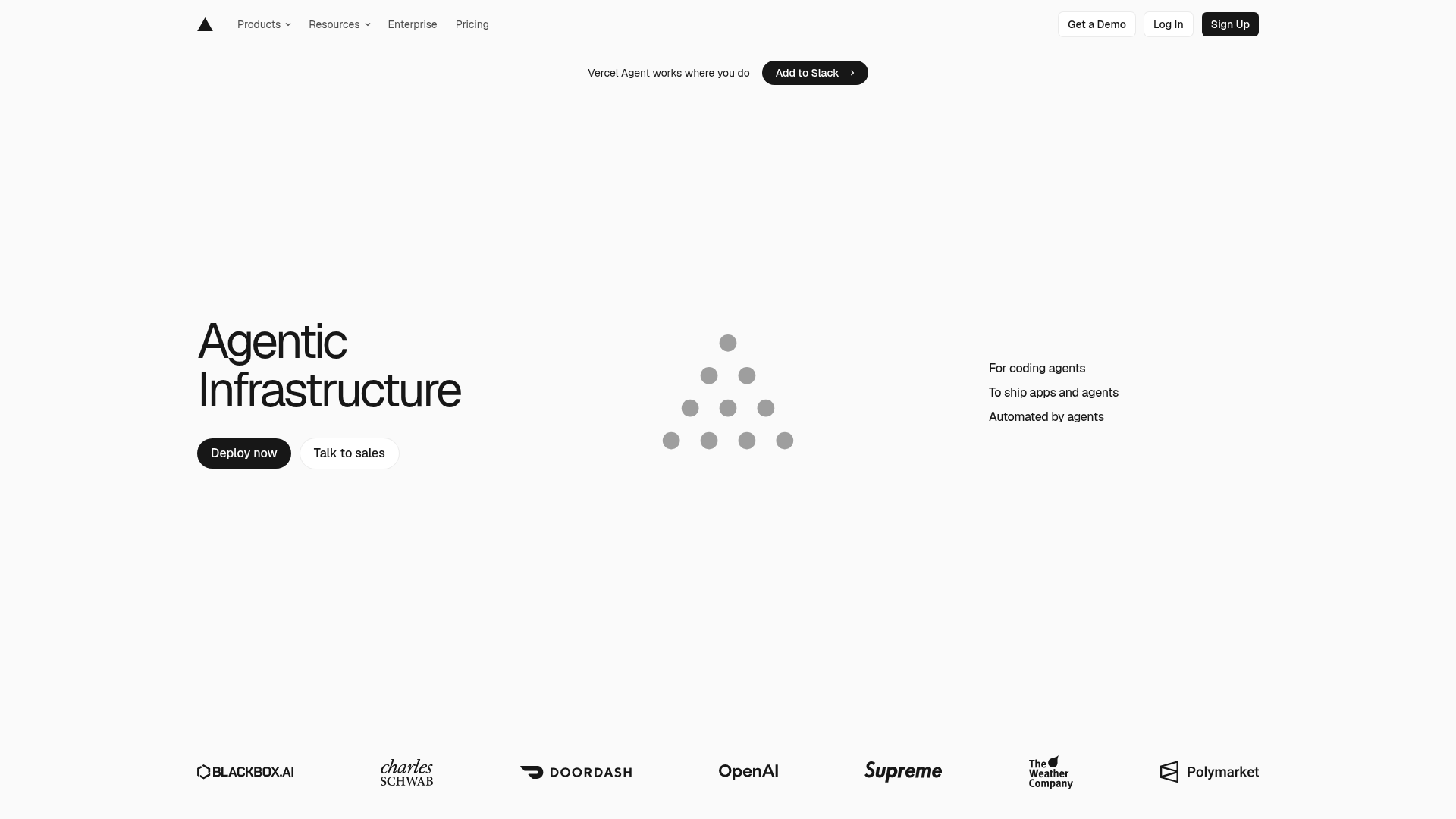
This design system captures the aesthetic and functional essence of Vercel's "Agentic Infrastructure" page. It aims for a modern, minimalist, and highly performant feel, emphasizing clarity, efficiency, and a sophisticated user experience. The design principles are rooted in Vercel's core values: speed, reliability, and developer empowerment.
Voice & Feel
The Vercel design system communicates a voice that is:
- Modern & Minimalist: Clean lines, ample white space, and a focused color palette.
- Precise & Efficient: Every element serves a purpose; no unnecessary clutter.
- Sophisticated & Professional: High-quality visuals, subtle animations, and a polished user experience.
- Developer-Centric: Designed to be intuitive and empowering for technical users, reflecting cutting-edge technology.
- Confident & Authoritative: The bold typography and strong contrasts convey leadership in the tech space.
The overall feel is one of speed, clarity, and innovation. Interactions should feel immediate and delightful, with a focus on delivering information and functionality without distraction.
Übernehmen
# Agentic Infrastructure - Vercel Design System

## Overview

This design system captures the aesthetic and functional essence of Vercel's "Agentic Infrastructure" page. It aims for a modern, minimalist, and highly performant feel, emphasizing clarity, efficiency, and a sophisticated user experience. The design principles are rooted in Vercel's core values: speed, reliability, and developer empowerment.

## Color System

The color palette is stark and professional, relying heavily on monochrome with subtle grays to define hierarchy and visual breaks. A single, vibrant blue is used sparingly for interactive elements or key highlights, reinforcing a tech-forward and clean aesthetic.

| Name         | Hex       | Description                                  |
| :----------- | :-------- | :------------------------------------------- |
| Primary      | `#000000` | Dominant brand color, often used for text.   |
| Secondary    | `#FFFFFF` | Used for backgrounds, cards, and prominent text on dark. |
| Accent       | `#000000` | Reinforces primary, potentially for interactive elements. |
| Background   | `#F8F8F8` | Light, off-white main page background.       |
| Surface      | `#FFFFFF` | Pure white for cards, modals, or distinct sections. |
| Text Primary | `#000000` | Standard black for main content.             |
| Text Secondary | `#555555` | Softer gray for less emphasized text, descriptions. |

**Palette:**

- `#000000` (Black)
- `#FFFFFF` (White)
- `#F8F8F8` (Light Gray Background)
- `#555555` (Medium Gray Text)
- `#EBEBEB` (Very Light Gray, often for borders or subtle dividers)
- `#BDBDBD` (Light Gray, for icons or disabled states)
- `#0072F5` (Vibrant Blue, for active states, links, primary actions)
- `#BEF4EB` (Very Light Teal, potentially for subtle highlights or badge backgrounds)
- `#171717` (Dark Gray, for subtle dark backgrounds or text on light)
- `#FAFAFA` (Off-white, very subtle variation of F8F8F8)

## Typography

Vercel utilizes a modern, geometric sans-serif typeface, GeistSans, across its interface to maintain a consistent, crisp, and highly readable experience. The hierarchy is established through size and weight variations, with minimal use of color for distinction.

**Font Families:**

- **Primary / Body / Paragraph:** `GeistSans`, sans-serif
- **Heading:** `GeistSans`, sans-serif

**Font Sizes:**

- **H1:** `64px` (Very large, for hero sections or main titles)
- **H2:** `56px` (Large, for section titles)
- **Body / Paragraph:** `14px` (Standard readable size for content)

**Usage Notes:**

- Headings are bold and impactful, designed to capture attention.
- Body text is clean and legible, optimized for digital screens.
- Line heights and letter spacing should be carefully considered to enhance readability, typically defaulting to 1.5x for body text.

## Spacing & Radius

A consistent spacing system, based on a 4px base unit, ensures visual harmony and proper element alignment. The subtle border-radius adds a touch of modern softness without compromising the clean, sharp aesthetic.

**Spacing Unit:**

- **Base Unit:** `4px`
- All padding, margins, and gaps should be multiples of `4px` (e.g., `4px`, `8px`, `12px`, `16px`, `24px`, `32px`, `48px`, `64px`).

**Border Radius:**

- **Default:** `6px`
- Applied consistently to buttons, cards, input fields, and other interactive or contained elements. This provides a soft, approachable feel while maintaining a professional look.

## Voice & Feel

The Vercel design system communicates a voice that is:

-   **Modern & Minimalist:** Clean lines, ample white space, and a focused color palette.
-   **Precise & Efficient:** Every element serves a purpose; no unnecessary clutter.
-   **Sophisticated & Professional:** High-quality visuals, subtle animations, and a polished user experience.
-   **Developer-Centric:** Designed to be intuitive and empowering for technical users, reflecting cutting-edge technology.
-   **Confident & Authoritative:** The bold typography and strong contrasts convey leadership in the tech space.

The overall feel is one of speed, clarity, and innovation. Interactions should feel immediate and delightful, with a focus on delivering information and functionality without distraction.

## Implementation Notes (Tailwind Tokens)

This section provides a guide for implementing the design system using Tailwind CSS custom configurations.

```css
/* tailwind.config.js */
module.exports = {
  theme: {
    extend: {
      colors: {
        'primary': 'var(--color-primary, #000000)',
        'secondary': 'var(--color-secondary, #FFFFFF)',
        'accent': 'var(--color-accent, #000000)',
        'background': 'var(--color-background, #F8F8F8)',
        'surface': 'var(--color-surface, #FFFFFF)',
        'text-primary': 'var(--color-text-primary, #000000)',
        'text-secondary': 'var(--color-text-secondary, #555555)',
        'palette-black': 'var(--color-palette-black, #000000)',
        'palette-white': 'var(--color-palette-white, #FFFFFF)',
        'palette-light-background': 'var(--color-palette-light-background, #F8F8F8)',
        'palette-medium-gray': 'var(--color-palette-medium-gray, #555555)',
        'palette-light-border': 'var(--color-palette-light-border, #EBEBEB)',
        'palette-gray-icon': 'var(--color-palette-gray-icon, #BDBDBD)',
        'palette-blue-interactive': 'var(--color-palette-blue-interactive, #0072F5)',
        'palette-teal-highlight': 'var(--color-palette-teal-highlight, #BEF4EB)',
        'palette-dark-gray-subtle': 'var(--color-palette-dark-gray-subtle, #171717)',
        'palette-off-white': 'var(--color-palette-off-white, #FAFAFA)',
      },
      fontFamily: {
        geist: ['GeistSans', 'sans-serif'],
      },
      fontSize: {
        'h1': '64px',
        'h2': '56px',
        'body': '14px',
      },
      spacing: {
        '1': '4px',    // base unit
        '2': '8px',
        '3': '12px',
        '4': '16px',
        '5': '20px',
        '6': '24px',
        '8': '32px',
        '10': '40px',
        '12': '48px',
        '16': '64px',
      },
      borderRadius: {
        'DEFAULT': '6px',
        'sm': '6px', // Standard radius for most elements
      },
    },
  },
  plugins: [],
}
```

```css
/* src/styles.css or equivalent global CSS file */
@tailwind base;
@tailwind components;
@tailwind utilities;

/* Define CSS Variables for dynamic themes or easier access */
:root {
  /* Colors */
  --color-primary: #000000;
  --color-secondary: #FFFFFF;
  --color-accent: #000000;
  --color-background: #F8F8F8;
  --color-surface: #FFFFFF;
  --color-text-primary: #000000;
  --color-text-secondary: #555555;

  --color-palette-black: #000000;
  --color-palette-white: #FFFFFF;
  --color-palette-light-background: #F8F8F8;
  --color-palette-medium-gray: #555555;
  --color-palette-light-border: #EBEBEB;
  --color-palette-gray-icon: #BDBDBD;
  --color-palette-blue-interactive: #0072F5;
  --color-palette-teal-highlight: #BEF4EB;
  --color-palette-dark-gray-subtle: #171717;
  --color-palette-off-white: #FAFAFA;

  /* Typography */
  --font-geist: GeistSans, sans-serif;

  /* Spacing & Radius */
  --spacing-unit: 4px;
  --border-radius-default: 6px;
}

/* Base styles for GeistSans - if not using @font-face in CSS, ensure font is imported */
/* Example for GeistSans: */
/* @font-face {
  font-family: 'GeistSans';
  src: url('/fonts/GeistSans-Regular.woff2') format('woff2');
  font-weight: 400;
  font-style: normal;
}
@font-face {
  font-family: 'GeistSans';
  src: url('/fonts/GeistSans-Bold.woff2') format('woff2');
  font-weight: 700;
  font-style: normal;
} */

html {
  font-family: var(--font-geist);
}
```So sehen Systra-Sections in den Farben von Vercel aus.
Drei echte Abschnitte aus der Bibliothek, live gerendert, mit den ausgelesenen Farben. Layout, Abstände und Bewegung bleiben, wie sie sind.
421 Sections in 23 Kategorien stünden in diesem Stil bereit.
Von Hero über Preise bis Footer. Im Editor holt sich dein Agent den Code direkt über den MCP-Server, samt Farben aus dieser Analyse.
Häufige Fragen
Du kopierst die Farb- und Typografie-Werte in deine Tailwind-Konfiguration oder deine CSS-Variablen und nutzt sie so als konsistente Basis.
Deine Frage war nicht dabei? Wir helfen gern weiter.
Kontakt aufnehmen