Nerd Stack
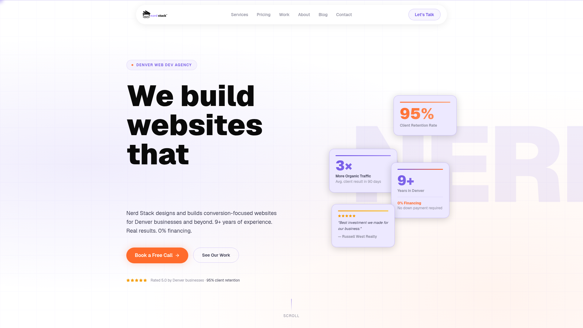
Nerd Stack is a Denver web development agency with 9+ years of experience. We build conversion-focused websites that generate leads for small and medium businesses. 0% financing available.
Farbsystem
Namen entstehen aus dem Farbwert selbst, damit dieselbe Farbe überall gleich heißt. Klick auf ein Feld kopiert den Hex-Wert.
- 6 Markenfarben gegen 4 neutrale Töne. Die Marke arbeitet mit mehreren Buntfarben nebeneinander.
- Text auf Grund steht bei 15.5 zu 1 und erreicht AAA.
- Der Akzent #6C3AEB steht bei 5.8 zu 1 auf dem Grund und trägt damit auch Fließtext.
- Der Grund #F9F9FC liegt bei 98 Prozent Helligkeit, die Anlage ist also hell gedacht. Wer sie umdreht, muss jedes Paar neu prüfen.
Markenfarben
Neutrale
Kontrast
Typografie
- Eine Schrift für alles: Geist. Die Hierarchie muss hier allein über Größe und Gewicht entstehen.
- Die Skala reicht von 18px bis 96px, das ist Faktor 5.3 über 3 Stufen.
- Von der zweiten auf die erste Stufe sind es 2. Eine Überschrift löst sich damit allein über die Größe vom Text.
GeistAaBbCc 0123| Stufe | Größe | Beispiel |
|---|---|---|
| h1 | 96px | Nerd Stack |
| h2 | 48px | Nerd Stack |
| body | 18px | Nerd Stack |
Abstände und Ecken
- Die Basiseinheit ist 4px. Jeder Abstand auf der Seite ist ein Vielfaches davon, und deshalb sitzen Dinge untereinander auf denselben Linien.
- Ein einziger Eckenradius, 2px, gilt überall. Die Kanten bleiben damit hart.
AbständeBasis 4px
- xs4px
- sm8px
- md16px
- lg24px
- xl32px
- 2xl48px
- 3xl64px
Eckenradius
- default2px
Leitplanken
Overview
This document outlines the core design principles and system for Nerd Stack, focusing on creating a conversion-focused, professional, and approachable aesthetic. The design aims to be clean, modern, and reinforce the agency's expertise in web development.
Voice and Feel
The tone is professional, expert, and approachable. The design should convey trust and competence, highlighting the agency's experience and results-driven approach. It should feel modern, efficient, and user-centric, instilling confidence in potential clients.
Übernehmen
# DESIGN.md: Nerd Stack

## Overview

This document outlines the core design principles and system for Nerd Stack, focusing on creating a conversion-focused, professional, and approachable aesthetic. The design aims to be clean, modern, and reinforce the agency's expertise in web development.

## Color System

The color palette is designed to be vibrant yet professional, with a strong primary accent.

| Role           | Hex       | Description                                  |
| :------------- | :-------- | :------------------------------------------- |
| Primary        | `#FE7B3E` | Key brand color, used for calls to action.   |
| Secondary      | `#FFFFFF` | Dominant neutral, clean and spacious.        |
| Accent         | `#6C3AEB` | Supporting accent for highlights and links.  |
| Background     | `#F9F9FC` | Light, subtle background for content areas.  |
| Surface        | `#FFFFFF` | Used for cards, modals, and distinct elements.|
| Text Primary   | `#202020` | Main body text, bold and readable.          |
| Text Secondary | `#7C7C7C` | Secondary text, less prominence.            |

### Palette

*   `#FE7B3E` (Primary)
*   `#6C3AEB` (Accent)
*   `#FFFFFF` (White)
*   `#F9F9FC` (Light Background)
*   `#202020` (Dark Text)
*   `#7C7C7C` (Gray Text)
*   `#CFCFF0` (Light Purple/Gray)
*   `#DBDBDB` (Light Gray)
*   `#E2DDFB` (Lighter Purple)
*   `#E5DDFB` (Even lighter Purple)

## Typography

The typography focuses on readability and a modern, technical feel using the Geist typeface.

### Font Families

*   **Primary:** Geist
*   **Heading:** Geist

### Font Stacks

*   **Heading:** `Geist, sans-serif`
*   **Body:** `Geist, sans-serif`
*   **Paragraph:** `Geist, sans-serif`

### Font Sizes

*   **H1:** 96px
*   **H2:** 48px
*   **Body (Default):** 18px

## Spacing & Radius

Consistent spacing and subtle rounding contribute to a clean and organized layout.

*   **Base Spacing Unit:** 4px (All spacing values should be multiples of 4)
*   **Border Radius:** 2px (Subtle rounding on interactive elements and containers)

## Voice and Feel

The tone is professional, expert, and approachable. The design should convey trust and competence, highlighting the agency's experience and results-driven approach. It should feel modern, efficient, and user-centric, instilling confidence in potential clients.

## Implementation Notes (Tailwind CSS)

```css
/* Color Variables */
:root {
  --color-primary: #FE7B3E;
  --color-secondary: #FFFFFF;
  --color-accent: #6C3AEB;
  --color-background: #F9F9FC;
  --color-surface: #FFFFFF;
  --color-text-primary: #202020;
  --color-text-secondary: #7C7C7C;

  --color-palette-1: #FE7B3E; /* primary */
  --color-palette-2: #6C3AEB; /* accent */
  --color-palette-3: #FFFFFF;
  --color-palette-4: #F9F9FC;
  --color-palette-5: #202020;
  --color-palette-6: #7C7C7C;
  --color-palette-7: #CFCFF0;
  --color-palette-8: #DBDBDB;
  --color-palette-9: #E2DDFB;
  --color-palette-10: #E5DDFB;
}

/* Typography Variables */
:root {
  --font-geist: Geist, sans-serif;
  --font-size-h1: 96px;
  --font-size-h2: 48px;
  --font-size-body: 18px;
}

/* Spacing Variables */
:root {
  --spacing-unit: 4px; /* Base for all spacing: padding, margin, gap */
  --border-radius: 2px;
}
```

```javascript
// tailwind.config.js
module.exports = {
  theme: {
    extend: {
      colors: {
        primary: 'var(--color-primary)',
        secondary: 'var(--color-secondary)',
        accent: 'var(--color-accent)',
        background: 'var(--color-background)',
        surface: 'var(--color-surface)',
        text: {
          DEFAULT: 'var(--color-text-primary)',
          primary: 'var(--color-text-primary)',
          secondary: 'var(--color-text-secondary)',
        },
        palette: {
          1: 'var(--color-palette-1)',
          2: 'var(--color-palette-2)',
          3: 'var(--color-palette-3)',
          4: 'var(--color-palette-4)',
          5: 'var(--color-palette-5)',
          6: 'var(--color-palette-6)',
          7: 'var(--color-palette-7)',
          8: 'var(--color-palette-8)',
          9: 'var(--color-palette-9)',
          10: 'var(--color-palette-10)',
        }
      },
      fontFamily: {
        geist: ['var(--font-geist)'],
      },
      fontSize: {
        'h1': 'var(--font-size-h1)',
        'h2': 'var(--font-size-h2)',
        'body': 'var(--font-size-body)',
      },
      borderRadius: {
        'DEFAULT': 'var(--border-radius)',
        'sm': 'var(--border-radius)', // Use for smaller elements
        // Define other sizes if needed, e.g., 'md': 'calc(var(--border-radius) * 2)'
      },
      spacing: {
        'xs': 'calc(var(--spacing-unit) * 2)', // 8px
        'sm': 'calc(var(--spacing-unit) * 4)', // 16px
        'md': 'calc(var(--spacing-unit) * 6)', // 24px
        'lg': 'calc(var(--spacing-unit) * 8)', // 32px
        'xl': 'calc(var(--spacing-unit) * 12)', // 48px
        // Add more as needed, always based on 'var(--spacing-unit)'
      }
    },
  },
  plugins: [],
};
```Häufige Fragen
Du kopierst die Farb- und Typografie-Werte in deine Tailwind-Konfiguration oder deine CSS-Variablen und nutzt sie so als konsistente Basis.
Deine Frage war nicht dabei? Wir helfen gern weiter.
Kontakt aufnehmen