Systra Studios
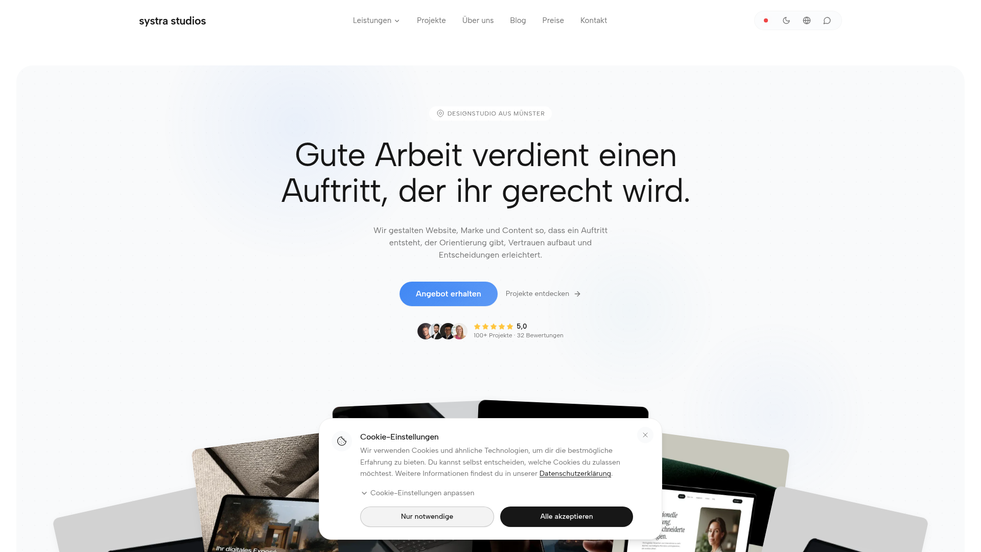
Systra Studios ist ein Designstudio aus Münster: Webdesign, Branding, Social Media und KI-Web-Apps. Persönliche Beratung, faire Festpreise, 5,0★ auf Google.
Farbsystem
Namen entstehen aus dem Farbwert selbst, damit dieselbe Farbe überall gleich heißt. Klick auf ein Feld kopiert den Hex-Wert.
- 5 Markenfarben gegen 5 neutrale Töne. Die Marke arbeitet mit mehreren Buntfarben nebeneinander.
- Text auf Grund steht bei 15.6 zu 1 und erreicht AAA.
- Der Akzent #FFB22B steht bei 1.7 zu 1 auf dem Grund und ist damit eine Fläche und kein Text.
- Der Grund #F9FAFB liegt bei 98 Prozent Helligkeit, die Anlage ist also hell gedacht. Wer sie umdreht, muss jedes Paar neu prüfen.
Markenfarben
Neutrale
Kontrast
Typografie
- 2 Schriften: Manrope, Albert Sans. Die erste steht für Heading.
- Die Skala reicht von 11px bis 64px, das ist Faktor 5.8 über 3 Stufen.
- Von der zweiten auf die erste Stufe sind es 1.5. Eine Überschrift löst sich damit allein über die Größe vom Text.
Albert Sans, Manrope, sans-serifAaBbCc 0123Albert SansAaBbCc 0123| Stufe | Größe | Beispiel |
|---|---|---|
| h1 | 64px | Systra Studios |
| h2 | 42px | Systra Studios |
| body | 11px | Systra Studios |
Abstände und Ecken
- Die Basiseinheit ist 4px. Jeder Abstand auf der Seite ist ein Vielfaches davon, und deshalb sitzen Dinge untereinander auf denselben Linien.
- Ein einziger Eckenradius, 24px, gilt überall. Alles wirkt damit deutlich weich.
AbständeBasis 4px
- xs4px
- sm8px
- md16px
- lg24px
- xl32px
- 2xl48px
- 3xl64px
Eckenradius
- default24px
Leitplanken
Overview
This document outlines the core design principles and system for Systra Studios, focusing on a clean, modern, and trustworthy aesthetic. The design aims to be approachable yet professional, reflecting the studio's expertise in web design, branding, and AI solutions.
Voice and Feel
The brand's voice and feel are:
- Professional & Expert: Demonstrating deep knowledge in web design, branding, and AI.
- Approachable & Personal: Emphasizing "persönliche Beratung" and a client-first approach.
- Modern & Innovative: Reflecting the use of AI and contemporary design trends.
- Trustworthy & Reliable: Backed by 5-star Google reviews and "faire Festpreise."
- Clear & Concise: Direct communication, avoiding jargon where possible.
Visually, this translates to:
- Clean layouts with ample whitespace.
- Clear hierarchy provided by typography and color.
- Subtle animations and interactions to enhance user experience without distraction.
- High-quality imagery and thoughtful iconography.
Übernehmen
# DESIGN.md: Systra Studios

## Overview

This document outlines the core design principles and system for Systra Studios, focusing on a clean, modern, and trustworthy aesthetic. The design aims to be approachable yet professional, reflecting the studio's expertise in web design, branding, and AI solutions.

## Color System

The color palette is designed to be vibrant and professional, using a bright primary blue balanced with a warm accent and neutral tones for readability.

*   **Primary:** `#4D8DF5` (Systra Blue) - Represents trust, professionalism, and innovation. Used for main calls to action, important links, and focal UI elements.
*   **Secondary:** `#FFFFFF` (Pure White) - Used for backgrounds, surface elements, and text contrast.
*   **Accent:** `#FFB22B` (Systra Gold) - Adds warmth and highlights key information or interactive elements.
*   **Background:** `#F9FAFB` (Light Gray) - A subtle, soft background color to improve readability and reduce eye strain.
*   **Surface:** `#FFFFFF` (Pure White) - For cards, modals, and distinct content blocks.
*   **Text Primary:** `#202020` (Dark Gray) - Main body text color for high readability.
*   **Text Secondary:** `#6B7280` (Medium Gray) - For secondary information, captions, and less emphasized text.

**Palette:**
*   `#4D8DF5`
*   `#FFB22B`
*   `#FFFFFF`
*   `#F9FAFB`
*   `#202020`
*   `#6B7280`
*   `#E5E7EB` (Light Gray/Border)
*   `#18181A` (Darkest Gray)
*   `#3E84F4` (Primary Hover/Active)
*   `#B7EAD9` (Subtle UI accent/illustration)

## Typography

A combination of modern sans-serif fonts is used to ensure clarity and a professional feel, while maintaining an approachable tone.

*   **Headings:** `Manrope`, `Albert Sans`, sans-serif
*   **Body/Paragraphs:** `Albert Sans`, `Manrope`, sans-serif

**Font Sizes:**
*   `h1`: 64px
*   `h2`: 42px
*   `body`: 11px (This seems unusually small; consider adjusting for standard readability, e.g., 16px as a base.)

## Spacing & Radius

Consistent spacing and rounded corners contribute to a clean, user-friendly interface.

*   **Base Unit:** 4px. All spacing (padding, margin, gap) should be multiples of 4px.
    *   Examples: 4px, 8px, 12px, 16px, 20px, 24px, 32px, 48px, etc.
*   **Border Radius:** 24px - Used consistently for cards, buttons, and input fields to give a soft, modern feel.

## Voice and Feel

The brand's voice and feel are:

*   **Professional & Expert:** Demonstrating deep knowledge in web design, branding, and AI.
*   **Approachable & Personal:** Emphasizing "persönliche Beratung" and a client-first approach.
*   **Modern & Innovative:** Reflecting the use of AI and contemporary design trends.
*   **Trustworthy & Reliable:** Backed by 5-star Google reviews and "faire Festpreise."
*   **Clear & Concise:** Direct communication, avoiding jargon where possible.

Visually, this translates to:
*   Clean layouts with ample whitespace.
*   Clear hierarchy provided by typography and color.
*   Subtle animations and interactions to enhance user experience without distraction.
*   High-quality imagery and thoughtful iconography.

## Implementation Notes (Tailwind CSS)

```css
:root {
  /* Colors */
  --color-primary: #4D8DF5;
  --color-secondary: #FFFFFF;
  --color-accent: #FFB22B;
  --color-background: #F9FAFB;
  --color-surface: #FFFFFF;
  --color-text-primary: #202020;
  --color-text-secondary: #6B7280;

  --color-palette-1: #4D8DF5; /* Primary */
  --color-palette-2: #FFB22B; /* Accent */
  --color-palette-3: #FFFFFF; /* White */
  --color-palette-4: #F9FAFB; /* Background */
  --color-palette-5: #202020; /* Text Primary */
  --color-palette-6: #6B7280; /* Text Secondary */
  --color-palette-7: #E5E7EB; /* Light Gray/Border */
  --color-palette-8: #18181A; /* Darkest Gray */
  --color-palette-9: #3E84F4; /* Primary Hover/Active */
  --color-palette-10: #B7EAD9; /* Subtle UI accent/illustration */

  /* Typography */
  --font-family-heading: "Manrope", "Albert Sans", sans-serif;
  --font-family-body: "Albert Sans", "Manrope", sans-serif;
  --font-family-paragraph: "Albert Sans", "Manrope", sans-serif;

  --font-size-h1: 64px;
  --font-size-h2: 42px;
  --font-size-body: 1rem; /* Adjusted for standard readability; original 11px is very small. Consider 16px base. */

  /* Spacing & Radius */
  --spacing-unit: 4px; /* Base for multiples */
  --border-radius-base: 24px;
}
```

**Tailwind Config Example (`tailwind.config.js`):**

```javascript
module.exports = {
  theme: {
    extend: {
      colors: {
        primary: 'var(--color-primary)',
        secondary: 'var(--color-secondary)',
        accent: 'var(--color-accent)',
        background: 'var(--color-background)',
        surface: 'var(--color-surface)',
        textPrimary: 'var(--color-text-primary)',
        textSecondary: 'var(--color-text-secondary)',
        'palette-1': 'var(--color-palette-1)',
        'palette-2': 'var(--color-palette-2)',
        'palette-3': 'var(--color-palette-3)',
        'palette-4': 'var(--color-palette-4)',
        'palette-5': 'var(--color-palette-5)',
        'palette-6': 'var(--color-palette-6)',
        'palette-7': 'var(--color-palette-7)',
        'palette-8': 'var(--color-palette-8)',
        'palette-9': 'var(--color-palette-9)',
        'palette-10': 'var(--color-palette-10)',
      },
      fontFamily: {
        heading: 'var(--font-family-heading)',
        body: 'var(--font-family-body)',
        paragraph: 'var(--font-family-paragraph)', // Can often just use 'body'
      },
      fontSize: {
        h1: 'var(--font-size-h1)',
        h2: 'var(--font-size-h2)',
        body: 'var(--font-size-body)',
      },
      borderRadius: {
        DEFAULT: 'var(--border-radius-base)',
        'base': 'var(--border-radius-base)', // Explicit alias
      },
      spacing: {
        '1': 'calc(1 * var(--spacing-unit))', // 4px
        '2': 'calc(2 * var(--spacing-unit))', // 8px
        '3': 'calc(3 * var(--spacing-unit))', // 12px
        '4': 'calc(4 * var(--spacing-unit))', // 16px
        '5': 'calc(5 * var(--spacing-unit))', // 20px
        '6': 'calc(6 * var(--spacing-unit))', // 24px
        '8': 'calc(8 * var(--spacing-unit))', // 32px
        '12': 'calc(12 * var(--spacing-unit))',// 48px
        // Add more as needed, or use default Tailwind spacing for finer increments if `var(--spacing-unit)` isn't applied globally.
      },
    },
  },
  plugins: [],
};
```Häufige Fragen
Du kopierst die Farb- und Typografie-Werte in deine Tailwind-Konfiguration oder deine CSS-Variablen und nutzt sie so als konsistente Basis.
Deine Frage war nicht dabei? Wir helfen gern weiter.
Kontakt aufnehmen