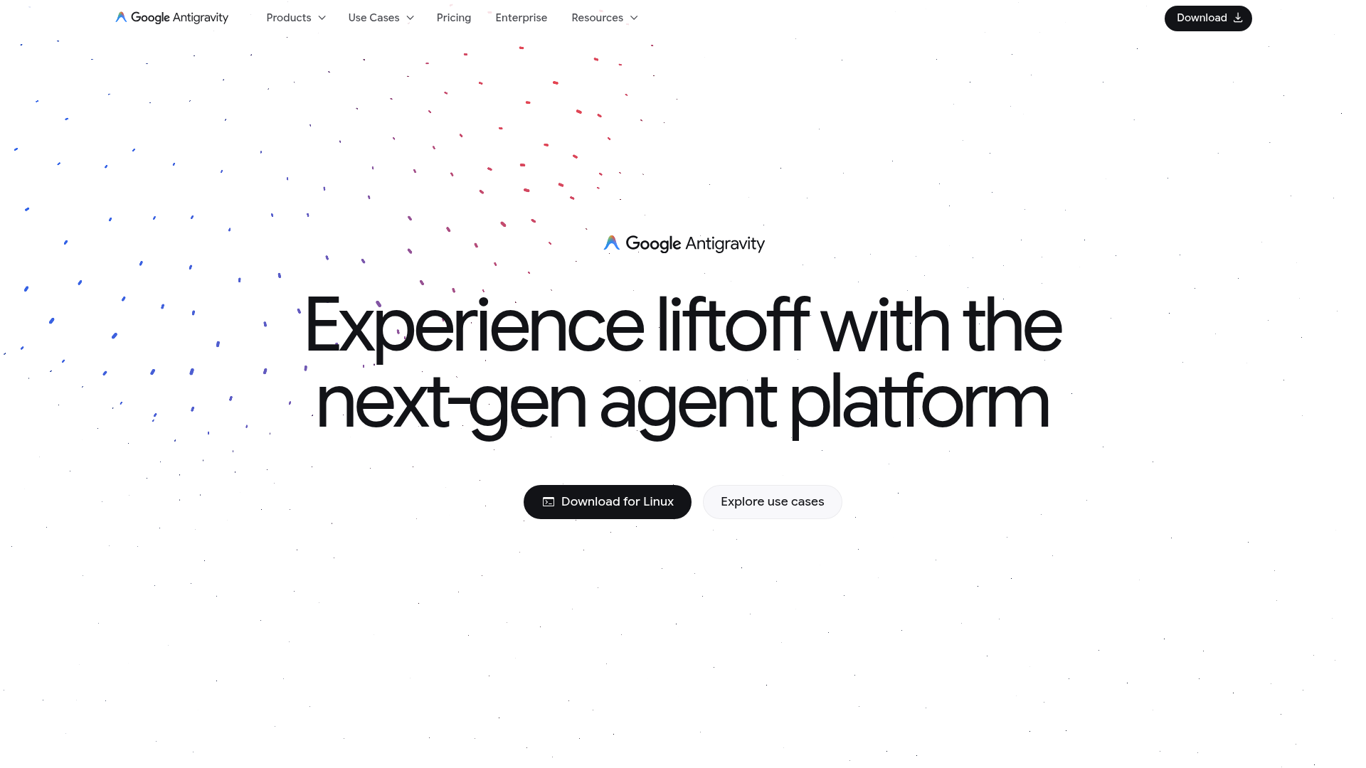
Google Antigravity
Experience liftoff with the next-gen agent platform
Farbsystem
Namen entstehen aus dem Farbwert selbst, damit dieselbe Farbe überall gleich heißt. Klick auf ein Feld kopiert den Hex-Wert.
- 8 Markenfarben gegen 2 neutrale Töne. Die Marke arbeitet mit mehreren Buntfarben nebeneinander.
- Text auf Grund steht bei 17 zu 1 und erreicht AAA.
- Der Akzent #353535 steht bei 12.3 zu 1 auf dem Grund und trägt damit auch Fließtext.
- Der Grund #FFFFFF liegt bei 100 Prozent Helligkeit, die Anlage ist also hell gedacht. Wer sie umdreht, muss jedes Paar neu prüfen.
Markenfarben
Neutrale
Kontrast
Typografie
- Eine Schrift für alles: Google Sans Flex. Die Hierarchie muss hier allein über Größe und Gewicht entstehen.
- Die Skala reicht von 24px bis 80px, das ist Faktor 3.3 über 3 Stufen.
- Von der zweiten auf die erste Stufe sind es 1.9. Eine Überschrift löst sich damit allein über die Größe vom Text.
Google Sans Flex, Google Sans, sans-serifAaBbCc 0123| Stufe | Größe | Beispiel |
|---|---|---|
| h1 | 80px | Google Antigravity |
| h2 | 42px | Google Antigravity |
| body | 24px | Google Antigravity |
Abstände und Ecken
- Die Basiseinheit ist 4px. Jeder Abstand auf der Seite ist ein Vielfaches davon, und deshalb sitzen Dinge untereinander auf denselben Linien.
- Ein einziger Eckenradius, 5px, gilt überall. Das hält die Kanten knapp.
AbständeBasis 4px
- xs4px
- sm8px
- md16px
- lg24px
- xl32px
- 2xl48px
- 3xl64px
Eckenradius
- default5px
Leitplanken
Overview
This document outlines the core design principles and system specifications for the Google Antigravity website. The design emphasizes a sophisticated, modern, and engaging experience, reflecting the platform's innovative nature.
Voice and Feel
The Google Antigravity website conveys a sense of innovation, sophistication, and a forward-thinking future. The tone is confident and visionary, yet accessible and user-friendly. The visual design is clean, modern, and expansive, with a focus on clarity and engaging interactions. Elements should feel lightweight and dynamic, reflecting the "liftoff" and "antigravity" concepts, while maintaining Google's signature professionalism.
Übernehmen
# DESIGN.md: Google Antigravity

## Overview

This document outlines the core design principles and system specifications for the Google Antigravity website. The design emphasizes a sophisticated, modern, and engaging experience, reflecting the platform's innovative nature.

## Color System

The color palette is built around a strong dark primary and light secondary, with subtle accents to create visual interest.

| Role         | Hex      | Description                               |
| :----------- | :------- | :---------------------------------------- |
| `primary`    | `#1C1C1C` | Dominant dark color for backgrounds/text. |
| `secondary`  | `#FFFFFF` | Used for contrast, often backgrounds.     |
| `accent`     | `#353535` | Subtle dark accent for UI elements.       |
| `background` | `#FFFFFF` | Default background for most sections.     |
| `surface`    | `#FFFFFF` | Used for card backgrounds, elevated areas. |
| `textPrimary`| `#1C1C1C` | Main text color for readability.          |
| `textSecondary`| `#1C1C1C` | Secondary text color, often for emphasis. |

**Palette:**

* `#1C1C1C` (Dark Grey)
* `#353535` (Medium Grey)
* `#FFFFFF` (White)
* `#E7E7E7` (Light Grey)
* `#E22C80` (Pink/Magenta - Accent)
* `#37319D` (Deep Purple - Accent)
* `#5E449F` (Medium Purple - Accent)
* `#C5BDAD` (Taupe/Light Brown - Accent)
* `#1A73E8` (Google Blue - Accent)
* `#2FA1D6` (Light Blue - Accent)

## Typography

The typography centers on "Google Sans Flex" for a clean, modern, and highly legible experience across all content.

| Element    | Font Family        | Fallback Fonts           | Font Size | Weight     |
| :--------- | :----------------- | :----------------------- | :-------- | :--------- |
| `h1`       | `Google Sans Flex` | `Google Sans`, `sans-serif` | `80px`    | (implied)  |
| `h2`       | `Google Sans Flex` | `Google Sans`, `sans-serif` | `42px`    | (implied)  |
| `body`/`p` | `Google Sans Flex` | `Google Sans`, `sans-serif` | `24px`    | (implied)  |

**Font Stacks:**

*   **Heading:** `Google Sans Flex`, `Google Sans`, `sans-serif`
*   **Body/Paragraph:** `Google Sans Flex`, `Google Sans`, `sans-serif`

## Spacing & Radius

Consistent spacing and subtle rounding contribute to a harmonious and approachable interface.

*   **Base Unit:** `4px` (All spacing values should be multiples of 4)
*   **Border Radius:** `5px` (Applied to interactive elements and containers for a soft edge)

## Voice and Feel

The Google Antigravity website conveys a sense of **innovation, sophistication, and a forward-thinking future**. The tone is **confident and visionary**, yet **accessible and user-friendly**. The visual design is **clean, modern, and expansive**, with a focus on **clarity and engaging interactions**. Elements should feel **lightweight and dynamic**, reflecting the "liftoff" and "antigravity" concepts, while maintaining Google's signature professionalism.

## Implementation Notes (Tailwind CSS Tokens)

```css
:root {
  /* Colors */
  --color-primary: #1C1C1C;
  --color-secondary: #FFFFFF;
  --color-accent: #353535;
  --color-background: #FFFFFF;
  --color-surface: #FFFFFF;
  --color-text-primary: #1C1C1C;
  --color-text-secondary: #1C1C1C;

  /* Palette - for specific use cases or extended theming */
  --color-palette-dark-grey: #1C1C1C;
  --color-palette-medium-grey: #353535;
  --color-palette-white: #FFFFFF;
  --color-palette-light-grey: #E7E7E7;
  --color-palette-pink: #E22C80;
  --color-palette-deep-purple: #37319D;
  --color-palette-medium-purple: #5E449F;
  --color-palette-taupe: #C5BDAD;
  --color-palette-google-blue: #1A73E8;
  --color-palette-light-blue: #2FA1D6;

  /* Typography - Font Families */
  --font-family-primary: 'Google Sans Flex', 'Google Sans', sans-serif;
  --font-family-heading: 'Google Sans Flex', 'Google Sans', sans-serif;
  --font-family-body: 'Google Sans Flex', 'Google Sans', sans-serif;

  /* Typography - Font Sizes */
  --font-size-h1: 80px;
  --font-size-h2: 42px;
  --font-size-body: 24px; /* Default paragraph/body text */

  /* Spacing */
  --spacing-unit: 4px; /* Base unit for all spacing */

  /* Border Radius */
  --border-radius-default: 5px;
}
```

```js
// tailwind.config.js
module.exports = {
  theme: {
    extend: {
      colors: {
        primary: 'var(--color-primary)',
        secondary: 'var(--color-secondary)',
        accent: 'var(--color-accent)',
        background: 'var(--color-background)',
        surface: 'var(--color-surface)',
        textPrimary: 'var(--color-text-primary)',
        textSecondary: 'var(--color-text-secondary)',
        // Palette colors
        'palette-dark-grey': 'var(--color-palette-dark-grey)',
        'palette-medium-grey': 'var(--color-palette-medium-grey)',
        'palette-white': 'var(--color-palette-white)',
        'palette-light-grey': 'var(--color-palette-light-grey)',
        'palette-pink': 'var(--color-palette-pink)',
        'palette-deep-purple': 'var(--color-palette-deep-purple)',
        'palette-medium-purple': 'var(--color-palette-medium-purple)',
        'palette-taupe': 'var(--color-palette-taupe)',
        'palette-google-blue': 'var(--color-palette-google-blue)',
        'palette-light-blue': 'var(--color-palette-light-blue)',
      },
      fontFamily: {
        primary: 'var(--font-family-primary)',
        heading: 'var(--font-family-heading)',
        body: 'var(--font-family-body)',
      },
      fontSize: {
        h1: 'var(--font-size-h1)',
        h2: 'var(--font-size-h2)',
        body: 'var(--font-size-body)',
      },
      spacing: {
        'unit': 'var(--spacing-unit)', // Use for custom spacing, e.g., p-unit-2 for 8px
        // Auto-generated spacing from Tailwind's default scale should also be available.
      },
      borderRadius: {
        DEFAULT: 'var(--border-radius-default)',
      },
    },
  },
  plugins: [],
}
```So sehen Systra-Sections in den Farben von Google Antigravity aus.
Drei echte Abschnitte aus der Bibliothek, live gerendert, mit den ausgelesenen Farben. Layout, Abstände und Bewegung bleiben, wie sie sind.
421 Sections in 23 Kategorien stünden in diesem Stil bereit.
Von Hero über Preise bis Footer. Im Editor holt sich dein Agent den Code direkt über den MCP-Server, samt Farben aus dieser Analyse.
Häufige Fragen
Du kopierst die Farb- und Typografie-Werte in deine Tailwind-Konfiguration oder deine CSS-Variablen und nutzt sie so als konsistente Basis.
Deine Frage war nicht dabei? Wir helfen gern weiter.
Kontakt aufnehmen