
Home \ Anthropic
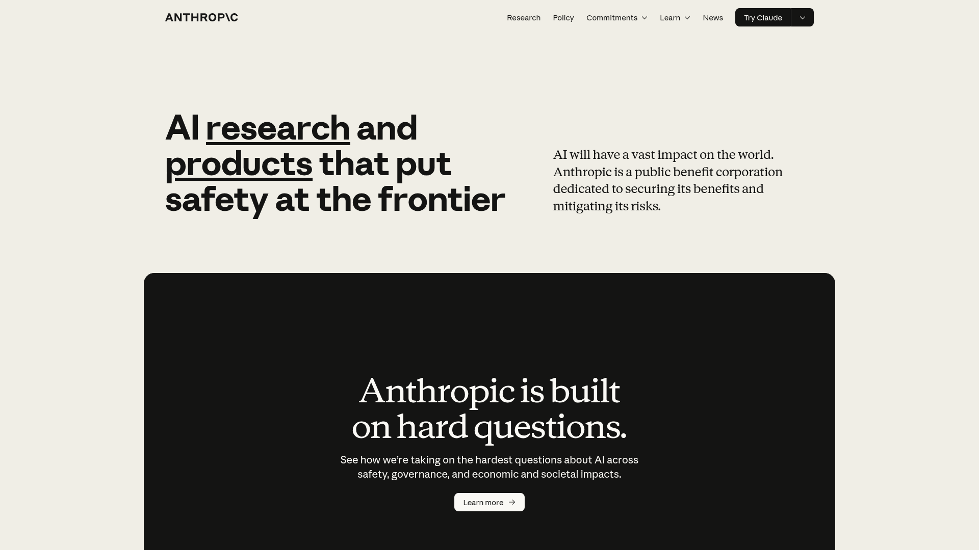
Anthropic is an AI safety and research company that's working to build reliable, interpretable, and steerable AI systems.
Farbsystem
Namen entstehen aus dem Farbwert selbst, damit dieselbe Farbe überall gleich heißt. Klick auf ein Feld kopiert den Hex-Wert.
- 7 Markenfarben gegen 2 neutrale Töne. Die Marke arbeitet mit mehreren Buntfarben nebeneinander.
- Text auf Grund steht bei 15.9 zu 1 und erreicht AAA.
- Der Akzent #1B1B1B steht bei 15.9 zu 1 auf dem Grund und trägt damit auch Fließtext.
- Der Grund #F8F6F1 liegt bei 96 Prozent Helligkeit, die Anlage ist also hell gedacht. Wer sie umdreht, muss jedes Paar neu prüfen.
Markenfarben
Neutrale
Kontrast
Typografie
- 2 Schriften: Anthropic Serif, Georgia. Die erste steht für Heading.
- Die Skala reicht von 24px bis 64px, das ist Faktor 2.7 über 3 Stufen.
- Von der zweiten auf die erste Stufe sind es 1. Der Abstand ist knapp, die Überschrift braucht zusätzlich Gewicht oder Raum.
Anthropic Sans, Arial, sans-serifAaBbCc 0123GeorgiaAaBbCc 0123| Stufe | Größe | Beispiel |
|---|---|---|
| h1 | 64px | Home \ Anthropic |
| h2 | 64px | Home \ Anthropic |
| body | 24px | Home \ Anthropic |
Abstände und Ecken
- Die Basiseinheit ist 4px. Jeder Abstand auf der Seite ist ein Vielfaches davon, und deshalb sitzen Dinge untereinander auf denselben Linien.
- Ein einziger Eckenradius, 3px, gilt überall. Die Kanten bleiben damit hart.
AbständeBasis 4px
- xs4px
- sm8px
- md16px
- lg24px
- xl32px
- 2xl48px
- 3xl64px
Eckenradius
- default3px
Leitplanken
Overview
The Anthropic design system prioritizes a clean, sophisticated, and trustworthy aesthetic. It combines classic typography with a muted color palette to convey reliability and intellectual depth. The design emphasizes clarity and legibility, creating a refined user experience.
Voice and Feel
The Anthropic design language conveys:
- Sophistication: Achieved through classic typography and a refined color palette.
- Reliability: Understated design elements foster trust and seriousness.
- Clarity: Prioritizes legibility and a logical information hierarchy.
- Intellectual: Evokes a sense of academic rigor and thoughtful innovation.
- Warmth: The use of off-white and warm grey softens the otherwise strong charcoal tones.
Übernehmen
# DESIGN.md: Anthropic Design System

## Overview

The Anthropic design system prioritizes a clean, sophisticated, and trustworthy aesthetic. It combines classic typography with a muted color palette to convey reliability and intellectual depth. The design emphasizes clarity and legibility, creating a refined user experience.

## Color System

The color palette is minimalist yet distinctive, using a neutral base with thoughtful accents to guide the user.

- **Primary:** `#1B1B1B` (Deep Charcoal) - Dominant text and foundational elements.
- **Secondary:** `#FFFFFF` (White) - Backgrounds for contrast.
- **Accent:** `#1B1B1B` (Deep Charcoal) - Used for emphasis, often blending with primary elements.
- **Background:** `#F8F6F1` (Off-White Beige) - Primary page background, providing a soft, warm base.
- **Surface:** `#1B1B1B` (Deep Charcoal) - Used for cards, containers, or elevated elements.
- **Text Primary:** `#1B1B1B` (Deep Charcoal) - Main body text.
- **Text Secondary:** `#C3B7A8` (Warm Grey) - Subtler text, secondary information.

**Palette:**
- `#1B1B1B` (Deep Charcoal)
- `#F8F6F1` (Off-White Beige)
- `#C3B7A8` (Warm Grey)
- `#FFFFFF` (White)
- `#C6613F` (Burnt Orange) - **Accent/Call to Action**
- `#3898EC` (Bright Blue) - **Accent/Interactive**
- `#D97757` (Terracotta) - **Accent**
- `#F0EEE6` (Light Beige) - **Subtle Background/Hover**
- `#141413` (Near Black) - **Deepest Contrast**

## Typography

A blend of classic serif and modern sans-serif fonts provides a sophisticated yet readable typographic hierarchy.

- **Font Families:**
    - **Primary:** `Georgia` (Fallback for body text)
    - **Heading:** `Anthropic Serif` (Custom/Brand specific)
- **Font Stacks:**
    - **Heading:** `'Anthropic Sans'`, `Arial`, `sans-serif`
    - **Body:** `'Anthropic Serif'`, `Georgia`, `serif`
    - **Paragraph:** `'Anthropic Serif'`, `Georgia`, `serif`
- **Font Sizes:**
    - `h1`: `64px`
    - `h2`: `64px`
    - `body`: `24px`

## Spacing & Radius

A conservative approach to spacing and a minimal border-radius contribute to a clean and structured layout.

- **Base Unit:** `4px` (Used for consistent scaling of margins, paddings, and gaps)
- **Border Radius:** `3px` (Subtle rounded corners for elements, providing a soft touch without distraction)

## Voice and Feel

The Anthropic design language conveys:

-   **Sophistication:** Achieved through classic typography and a refined color palette.
-   **Reliability:** Understated design elements foster trust and seriousness.
-   **Clarity:** Prioritizes legibility and a logical information hierarchy.
-   **Intellectual:** Evokes a sense of academic rigor and thoughtful innovation.
-   **Warmth:** The use of off-white and warm grey softens the otherwise strong charcoal tones.

## Implementation Notes (Tailwind CSS)

```css
/* Color Palette */
:root {
  --color-primary: #1B1B1B;
  --color-secondary: #FFFFFF;
  --color-accent: #1B1B1B; /* Same as primary for brand alignment */
  --color-background: #F8F6F1;
  --color-surface: #1B1B1B;
  --color-text-primary: #1B1B1B;
  --color-text-secondary: #C3B7A8;

  --color-palette-deep-charcoal: #1B1B1B;
  --color-palette-off-white-beige: #F8F6F1;
  --color-palette-warm-grey: #C3B7A8;
  --color-palette-white: #FFFFFF;
  --color-palette-burnt-orange: #C6613F;
  --color-palette-bright-blue: #3898EC;
  --color-palette-terracotta: #D97757;
  --color-palette-light-beige: #F0EEE6;
  --color-palette-near-black: #141413;
}

/* Tailwind Configuration (tailwind.config.js) */
module.exports = {
  theme: {
    extend: {
      colors: {
        primary: 'var(--color-primary)',
        secondary: 'var(--color-secondary)',
        accent: 'var(--color-accent)',
        background: 'var(--color-background)',
        surface: 'var(--color-surface)',
        textPrimary: 'var(--color-text-primary)',
        textSecondary: 'var(--color-text-secondary)',
        palette: {
          'deep-charcoal': 'var(--color-palette-deep-charcoal)',
          'off-white-beige': 'var(--color-palette-off-white-beige)',
          'warm-grey': 'var(--color-palette-warm-grey)',
          'white': 'var(--color-palette-white)',
          'burnt-orange': 'var(--color-palette-burnt-orange)',
          'bright-blue': 'var(--color-palette-bright-blue)',
          'terracotta': 'var(--color-palette-terracotta)',
          'light-beige': 'var(--color-palette-light-beige)',
          'near-black': 'var(--color-palette-near-black)',
        },
      },
      fontFamily: {
        heading: ['"Anthropic Sans"', 'Arial', 'sans-serif'],
        body: ['"Anthropic Serif"', 'Georgia', 'serif'],
        paragraph: ['"Anthropic Serif"', 'Georgia', 'serif'],
      },
      fontSize: {
        'h1': '64px',
        'h2': '64px',
        'body': '24px',
      },
      spacing: {
        '1': '4px',    /* baseUnit * 1 */
        '2': '8px',    /* baseUnit * 2 */
        '3': '12px',   /* baseUnit * 3 */
        '4': '16px',   /* baseUnit * 4 */
        '5': '20px',   /* baseUnit * 5 */
        '6': '24px',   /* baseUnit * 6 */
        '8': '32px',   /* baseUnit * 8 */
        '10': '40px',  /* baseUnit * 10 */
        '12': '48px',  /* baseUnit * 12 */
        // ... extend as needed based on common multipliers
      },
      borderRadius: {
        'DEFAULT': '3px',
        'sm': '3px', /* Use for consistency or to explicitly define */
        // No other explicit radii, stick to DEFAULT
      },
    },
  },
  plugins: [],
};
```So sehen Systra-Sections in den Farben von Home \ Anthropic aus.
Drei echte Abschnitte aus der Bibliothek, live gerendert, mit den ausgelesenen Farben. Layout, Abstände und Bewegung bleiben, wie sie sind.
421 Sections in 23 Kategorien stünden in diesem Stil bereit.
Von Hero über Preise bis Footer. Im Editor holt sich dein Agent den Code direkt über den MCP-Server, samt Farben aus dieser Analyse.
Häufige Fragen
Du kopierst die Farb- und Typografie-Werte in deine Tailwind-Konfiguration oder deine CSS-Variablen und nutzt sie so als konsistente Basis.
Deine Frage war nicht dabei? Wir helfen gern weiter.
Kontakt aufnehmen